Whitney Tilson’s email to investors discussing the two big conclusions about the coronavirus pandemic.

Q3 2020 hedge fund letters, conferences and more
Below I will show data to support two big conclusions about the coronavirus pandemic:
1) The current wave of the pandemic is likely to be somewhat worse than what I estimated in my past three e-mails (on October 16, October 28, and November 6).
2) What we're seeing across the country is consistent with what the herd immunity threshold theory would predict – namely, areas that were hardest hit earlier this year (and thus built up some level of population immunity – though, to be clear, not full herd immunity) are being least affected right now, and vice versa.
In addition, I continue to believe these parts of what I wrote in my October 16 e-mail:
- We believe this wave will be... the last one. We are now in the "burnout" phase of the pandemic.
- Nearly all major regions and population centers in the U.S. are at or will soon reach the herd immunity threshold (roughly 20% to 30% prevalence), so the spread of the virus should slow substantially (even without considering the potential positive impact of the many new vaccines and therapies being developed in record time).
(To be clear, the herd immunity threshold is not the same as herd immunity. The latter is when 70% or more of the population has been infected or vaccinated and things can return to normal. Almost nowhere in the world has reached this level. But a critical intermediate point is the herd immunity threshold, which is reached when 20% to 30% of the population has been exposed (based on rough estimates from various scientists). It means that – when combined with basic precautions like mask-wearing, social distancing, protecting the most vulnerable, no big masses of people, especially indoors, etc. [pretty much what Sweden did, minus the masks] – the R0 of the virus drops below 1 and the virus starts to peter out.)
Overview
In my October 16 e-mail, I wrote:
Near-term news flow will likely be negative as the third wave burns through previously less-affected areas: based on our analysis of state hospitalization data, we expect that reported daily deaths will peak in six to 12 weeks at around 1,000 to 1,200 (less than half the peak levels reached in April), and will remain elevated for at least three weeks.
The first part of my prediction has certainly come true: the headlines have been terrible, as new cases are hitting all-time highs nearly every day... the number of Americans hospitalized with COVID has now surpassed the prior peaks in April and July... and daily deaths are trending upward, as these charts show:
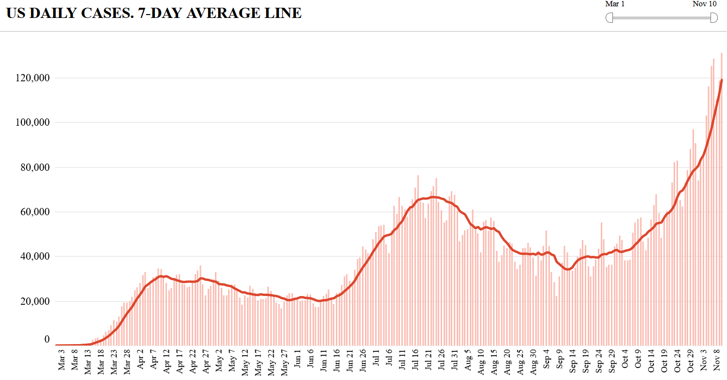
The only good news here is that daily deaths haven't spiked as much as cases and hospitalizations, but keep in mind that this is a lagging indicator, so they're sure to go higher. It's hard to know how much higher, but almost certainly more than my earlier forecast of peaking around 1,000 to 1,200.
Forced to guess, I suspect the current wave – measured by daily deaths – will end up looking more like that of the second wave (with some daily peaks around 1,500), not the super-deadly first wave (with peaks in the range of 2,000 to 3,000 per day), thanks to two major factors: a) younger and healthier people being infected today... and b) better medicines and treatment protocols, both of which are resulting in much lower mortality rates.
Quick aside: the increase in cases is only approximately 1/3 due to more testing. As this chart shows, the U.S. is doing roughly 70% more tests relative to late September versus a 200% increase in cases:
Turning to my second point, while this third wave is worse than I expected, its pattern is consistent with what the herd immunity threshold theory would predict. Take a look at this well-done chart (source) showing current hospitalizations per million residents, in which I've highlighted the state worst hit in the first wave, New York... those hit worst in the second wave (the "FACT" states of Florida, Arizona, California, and Texas)... and the three states getting hit worst right now (South Dakota, North Dakota, and Montana).
This chart shows the hospitalizations per million over the course of the pandemic for the seven states I want to focus on (source):
What these two charts are showing is exactly what the herd immunity threshold theory predicts: the areas that were hit hardest in the early waves have largely been spared in this wave – and vice versa.
Let's take a look at the data for each of these states, in some cases drilling down to the city or county level, starting with New York and my hometown of NYC...
These EV stocks are soaring higher than Tesla
Few people are paying attention to the little-known EV stocks soaring up to 30%, 100%, and almost 200% higher than Tesla in 2020. Here's the list.
The Office Economy Just DIED – Here's How You Could Get Rich From It
It's official: The office as we know it is DEAD, and a brand-new economic shift has happened almost overnight. Click here to see the No. 1 stock that could skyrocket 80% from this exciting new trend FREE.
New York and New York City
Here are the metrics for New York state (source):
Most of the COVID cases in the state are concentrated in New York City, so let's do a deep dive there.
At first glance, the city's data is alarming, as cases and hospitalizations have tripled and doubled, respectively, in the last three months, as these charts show:
When we put this in perspective, however, comparing today's levels to what the city saw in March and April (source), you can see that the recent increases are slight (especially in the context of the city's population of 8.4 million):
Best of all, deaths remain extremely low:
My conclusion for NYC: we're in good shape (though I'm glad everyone in my neighborhood is wearing masks and being careful).
Florida is doing fine.
Arizona is seeing a bit more of an uptick than Florida, but it's far from its July peak, as we'd expect.
California looks more like Florida – in decent shape.
Texas looks more like Arizona.
If you drill down into the outbreak, however, you'll see that it's consistent with the herd immunity threshold.
In Harris County (Houston), which was hit hard in July, there has been almost no increase in COVID hospitalizations:
Similarly, in Dallas, ER visits and hospital occupancy remain well below their July peak and there has been no increase in deaths despite elevated hospitalizations for more than a month, as these three charts show:
If the first- and third-largest cities in Texas aren't driving most of the increase in hospitalizations, what is? The answer appears to be the sixth-largest city, El Paso, which accounts for roughly 1/3 of the statewide increase.
As a result, the media has descended on El Paso, with hysterical headlines talking about funeral homes and morgues – here are articles from The Texas Tribune (Funeral homes and hospitals in parts of Texas brace for new wave of coronavirus infections and deaths) and the front page of today's New York Times (As Hospitalizations Soar, El Paso Brings In New Mobile Morgues).
Yet what's happening here shouldn't be surprising because, as you can see in this chart, El Paso wasn't hit hard in July:
Montana, North Dakota, and South Dakota
Lastly, let's turn to the three states being hardest hit currently.
Coronavirus pandemic conclusion: the story is the same for these three states (and most of the surrounding states as well). They were almost completely unaffected by the first two waves of the pandemic, but as a result, their populations built up no immunity. Hence, they were especially vulnerable if the rest of the country was unable to get the pandemic fully under control. Sadly, this is exactly what happened – and the previously unaffected states are paying a big price.
Conclusion
It's hard to know how much worse things will get across the country, especially in the Midwest. But based on the chart I showed earlier on hospitalizations per million by state since the beginning of the pandemic, I think we're close to a peak on that metric.
If so, deaths per day will likely peak a couple of weeks afterward.
Thus, I continue to believe these parts of what I wrote in my October 16 e-mail:
- We believe this wave will be... the last one. We are now in the "burnout" phase of the pandemic.
- Nearly all major regions and population centers in the U.S. are at or will soon reach the herd immunity threshold (roughly 20% to 30% prevalence), so the spread of the virus should slow substantially (even without considering the potential positive impact of the many new vaccines and therapies being developed in record time).
Best regards,
Whitney