Since early 2009, being “long” (that is, owning) the U.S. equity market has made a lot of investors a lot of money.
As measured by the S&P 500, U.S. equities have returned 230 percent over this period. With the exception of a few small corrections here and there, this particular bull market has brought investors consistent annual returns, with low volatility.
- Q2/H1 Hedge Fund Letters - Letters, Conferences, Calls, And More
- Baupost Letter Points To Concern Over Risk Parity, Systematic Strategies During Crisis
- AI Hedge Fund Robots Beating Their Human Masters
But sooner or later all good things must end. And there are a lot of reasons to think that the end is coming soon.
We recently wrote how one Federal Reserve governor, John C. Williams, the head of the Federal Reserve Bank of San Francisco, stated that investors should all be prepared for continued weak economic growth in the future.
He highlighted two key factors. First, he mentioned decreasing productivity growth (i.e., workers are not increasing their output per time worked anywhere near as fast as they used to). He also said that spurring growth from monetary policy changes isn’t going to work anymore – because the strategies of cutting interest rates again and printing more money are exhausted. They just won’t fix anything.
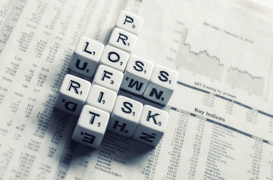
Disappointing growth is just one part of the problem for U.S. markets. The other, far more concerning issue, regards equity market valuations.
The most recently released Federal Reserve minutes, from late July, put it succinctly, saying that “vulnerabilities associated with asset valuation pressures had edged up from notable to elevated, as asset prices remained high or climbed further”.
You don’t need fluency in “Fedspeak” to understand this. The Fed is saying that stock market valuations are high.
Overpriced equities
The Cyclically Adjusted Price-Earnings (CAPE) ratio is a longer-term inflation-adjusted valuation measure for equity markets.
The idea behind this longer-term earnings ratio, rather than the typical P/E ratio (which looks at the previous, or next, 12 months, is that the CAPE smoothes out shorter-term volatility and instead focuses on longer-term real (i.e., inflation adjusted) earnings as a measure of market value.
As the chart below shows, the CAPE is now at 30.5 times earnings. That’s higher than any time in history, except for the late ‘90s dotcom bubble, and the stock market bubble of the late 1920’s.
Some might argue that this 10-year average includes the Global Financial Crisis (GFC), and the appalling earnings immediately following it. Therefore, our earnings denominator (the “E” in P/E) is too low, and as a result, the P/E ratio appears too high.
If you believe that’s the case, then take a look at the following two charts from GMO, a global investment management firm.
The first chart shows the median price-to-sales and median CAPE ratios for the S&P 500.
----------Recommended Link-----------
 To everyone who thinks the Chinese middle class boom is an ‘old story’ – this is why you’re wrong
LEARN MORE HERE.
------------------------------------------------
The idea behind using the median value (rather than the mean, which is usually what is meant by “average”) is to give an idea of broad equity market valuations. If you look solely at the S&P 500 Index as a whole, it’s possible that a handful of expensive large cap stocks could mask the existence of cheaper smaller cap stocks. Using the median value addresses this.
Is the bubble about to burst?
As you can see, the current median CAPE is approaching its GFC and dotcom peaks. And the price-to-sales ratio, which divides the median market cap by its total sales, is at its highest ever level.
The chart below applies an equity market screening measure developed by the father of value investing Benjamin Graham.
This looks for stocks which have:
- an earnings yield of at least twice the benchmark treasury or government bond yield,
- a dividend yield of at least two-thirds of the respective aforementioned bond yield,
- a total debt load of less than two-thirds of book value,
- and a Graham Dodd P/E (price divided by 10-year earnings) of less than 16 times.
This screening measure shows the percentage of stocks in different global equity markets that meet these above criteria.
In the U.S., there are no stocks whatsoever that pass the test now. And you can see that the only markets where there are a substantial number of stocks that fit this deep value screen are based in Asia.
What can investors do about it?
The purpose of bringing these charts to your attention isn’t to strike fear into the hearts of people who own U.S. shares. Rather, we’re looking to highlight a substantial potential risk that you could be carrying right now, especially if you’re overly exposed to the U.S. equity market.
As we’ve written previously, the “Trump Trade” looks like it’s all but dead.
In May, I wrote “A stock market can rally on promises, but it takes concrete results to keep the rally going. Right now we are not seeing political results come out of the Washington political circus. The Trump stock market honeymoon is ending. President Trump is finding out that getting anything through Congress, even one controlled by his own party, is exceptionally difficult.”
Fast forward a few months, and once again we’re looking at another round of political pinball as President Trump threatens to shut down the federal government if Congress doesn’t budget funds to build his border wall. And on the geopolitical front, it’s only a matter of time before tensions with North Korea flare up again.
This could be a good opportunity to take a look through your portfolio and cut out some positions that aren’t giving you much upside but still leave you exposed to a correction in stocks.
Good investing,
Save