Jeff Saut of Raymond James
Picture this: you’re an investor starting out in the 1940s after World War II came to an end. Your own experience in the contemporary history of the stock market would’ve taught you that bonds were the safer, and superior, asset allocation over the long-term. Indeed, Wall Street history showed that the rate of return on bonds had matched the stock return over 70 some years, with far less volatility and risk! That is a longer track record than the Ibbotson memory bank, which every “bull” snorts about to prove that stocks are the superior asset allocation for today’s investors. Moreover, there was always the horrible memory of the Great Crash to humble any upstart who dared to say, “This time is different.”
No wonder this unforgettable, and painfully, learned experience spawned a generation, which developed the accepted market model that whenever the dividend yield on stocks approached bond yields … equities became risky. The savvy seers of that time build their investing models, and their Wall Street careers, on giving market advice based on the stock dividend and bond yield relationship. Verily, until 1958 stocks generally continued that relationship, providing higher yields than the interest rate return on bonds.
Then came 1958, when the dividend yield on the major equity indexes slipped below the interest rate on bonds. The savvy seers of the time turn cautious to bearish and warned that stocks were becoming overvalued and risky. No wonder, as their own memory bank, their entire investing history proved this. After all, stocks were already riskier and legally junior to bonds, providing no promise of a return of capital. So when stock yields went below bond yields – look out – it had always worked before.
But, “This time was different.” Their models didn’t seem to work. Stocks kept going higher and the gap between the current return for stocks versus bonds got larger and larger. Shockingly, to the then pundits, stocks leapt 60% in real terms in the 10 years after 1958, up through 1968. As the market went higher and higher, during those 10 years, some of those once savvy seers turned even more bearish. Now their once loyal listeners tuned them out, calling them stopped clocks. “This was a new era” causing those old stopped clocks to fail to recognize that modern investors appreciate the growth characteristics of stocks more than the stodgy fixed return on bonds. Moreover, the reinvestment of profits to ensure future earnings expansion was more important than the dividend return. Money managers seeking superior portfolio performance were more than willing to pay up for higher growth. Then came the 1968 to 1974, double-dip bear market, and most of the gains from the 1958 to 1968 bull run were given back.
Now fast-forward to the 1966 to 1982 period where stocks virtually went nowhere and topped out every time they had a peek-a-boo “look” above Dow 1000. Another group of savvy seers, meanwhile, had developed yet another classic, time-honored model of valuation based on historical Dow/S&P yields, and book values, as well as P/E ratios. Their models had been back tested and continued to prove accurate. Hereto, they worked well until late 1982, much like the previous cycle’s venerable pundits’ models had worked prior to 1958. Then the August 1982 bull market began its run above 1000. It leaped to 2722 by August 1987. It went on to overcome the crash in October 1987, and the bank/real estate threat, along with the Iraq/ Kuwait episode in 1990. By the spring of 1998 it had run up to more than 9200. As the market went higher and higher some of those second-generation, once savvy seers saw their models flash warning after warning. However, anyone who got out of stocks on the basis of such metrics was left behind and lost out on a lot of profits. Those who stubbornly stuck with their valuation measures in many cases turned even more bearish.
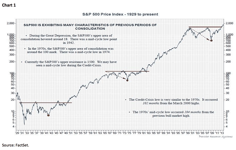
Now I want you to study the attendant chart (see chart 1). Notice there have been three “range-bound” markets since 1929. Pay particular attention to the 1966 to 1982 rangy market. I was in the business back then and when the market finally broke decisively above the 1000 ceiling, which had actually existed since 1964, the pundits of that era ignored the pricing action of the markets and stubbornly clung to their valuation metrics that had worked during the 1966 to 1982 timeframe. Accordingly they stay bearish for years and finally felt vindicated with the 1987 crash by stating, “I told you so.” In retrospect, however, the crash was one heck of a buying opportunity, but those negative nabobs never bought. Go back and study the chart again. Note that every time the stock market has broken decisively above the top side of a 10+ years “range-bound” market, it has ALWAYS been a new secular bull market.
More recently, we decisively broke out of the 2000 to 2012 trading range market in 1Q13 when both the D-J Industrial Average (INDU/16302.77) and the D-J Transportation Average (TRAN/7515.18) traded to new all-time highs. Yet, hereto many seers of the new millennium era continue to stubbornly cling to the models that worked over that 12-year timeframe. The valuation measure du jour this time is the Cyclically Adjusted Price-Earnings Ratio (CAPE), which has kept those using it out of the rally for the last five years. CAPE is defined as price divided by the average of 10 years of earnings adjusted for inflation. Granted, CAPE has had a decent track record in the past, but in previous missives I have argued why I think the earnings experiences we had between 2000 – 2010 were aberrations that have left the CAPE showing stocks were overvalued for the last five years. I think the American Industrial Renaissance (onshoring) and the move to Energy Independence are transformative and profoundly bullish over the long-term. Think of it like layering Saudi Arabian oil on top of America’s industrial might . . . indeed, transformative.
Santayana once said, “Those who cannot remember the past are condemned to repeat it.” Yet in the stock market those who remembered history in 1958, and again in 1982, were doomed to become prisoners of their models and condemned to skepticism. The same is likely to happen here. To be sure, if you don’t change your indicators for the changing causal relationships, you are doomed to fail.
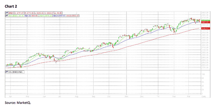
The call for this week: All of the major indices I monitor remain above their respective key moving averages, suggesting there is more room on the upside. Dow Theory confirms that the primary trend of the equity markets is “up.” Moreover, the Financials continue to be strong, which is a good sign because typically the banks top out months prior to a top in the overall markets. That said, “Up mornings and down afternoons is not particularly good near-term market action;” and, that is exactly what we got last Friday. Yes, I know it was a quadruple “Witch Twitch,” but to give back the opening 125-point early morning gain, and then close down 28 points, is not good action. The S&P 500 (SPX/1866.52) did about the same, except in its case it made a new intraday all-time and then closed near the low end of the range for Friday’s session. Not to be outdone, the NASDAQ 100 (NDX/3653.07) actually registered what a technical analyst would term a bearish engulfing candlestick chart pattern on Friday on very heavy volume (see chart 2). Meanwhile, the Relative Strength Line for the INDU fell to a new reaction low, ditto has been the action for the NY Composite Index. Consequently, if the SPX closes below its 21-day moving average of 1860.35 it suggests a pullback to the 1835 – 1840 support level; and if we breach that level, a deeper decline towards the 1780 – 1800 zone should be in store. This morning, however, the SPX futures are better by about 4 points and there is a full charge of energy in my proprietary models. The question then becomes, “Is it going to be released on the upside or the downside?”