
A big crash will make investors realize how badly they need better ways to understand and track risk.
Table Of Contents:
- How Close Is The Cliff
- Transformational Times: For Markets, But Also For Systemic Risk
- Complexity Markets: A Conceptual Framework
- Introducing the System Resilience Indicator (‘SRI’): A Quantitative Indicator Of System-Level Market Fragility
The analysis that follows leverages on the collaboration of Fasanara’s open network of friends and partners; this time it is Andrea Marcello Mambuca, PhD student in Applied Mathematics, King’s College London. The analysis is also again powered by our Fasanara Analytics team, a proud addition to the Fasanara family this year. Within it, Alessandro Balata was instrumental. Mirco Lamperti, developer at Fasanara Capital, was then helpful in integrating new findings and techniques to our previous studies on quant warning signals. The analysis today is not intended to be a finished product, but rather a work-in-progress, along the way of truth-seeking within heavily manipulated markets (‘Fake Markets’), aiming at framing systemic risks in new inventive ways, more in tune with the transformational times we live in. Any feedback/critique, please reach out, happy to collaborate and expand the nodes in our open network!

Q3 hedge fund letters, conference, scoops etc
How Close Is The Cliff?
How do you assess the vicinity of a major market crash? Do we have the right conceptual framework and tools to monitor the build-up of systemic risks and the approaching of a seismic shift? How can we go about quantifying market fragility and inherent vulnerability of the financial system?
In institutional markets and policymaking inner circles, we still think we know how and have it all figured out. In a show of hubris, despite the Great Financial Crisis of 2007-2008, the models used for the task are more of the same, variations of what used to be there before the crisis. The Efficient Market Hypothesis (‘EMH’) still holds, and volatility is still the basic ingredient for most risk management models, considered to be the best available measurement of risk. This runs counter to ever- recurring empirical evidence: the EMH has been proven to fall short of explaining real world dynamics, while volatility is a bad predictor of impending chaos on systemic-scale (if anything, as warned by Hyman Minsky, it is its bedrock!). Behavioral finance helped ameliorate the shortages of the EMH, while agent-based modeling / stress testing / expected shortfalls helped fill the deficiencies of vol- based models of risk: however, both of them failed to produce any new-age broad- ranging framework of analysis, nor did they produce much in terms of practical toolkit for investors to use.
The dominant narrative still holds it true that a ‘bubble can be known only in retrospect’ and timing is impossible to determine’ for a crash and such and such, therefore not demanding additional speculative search. This may be too easy an excuse, a case of astonishing plausible deniability and drop of responsibility, at a
time when heavy interventionism in public markets is otherwise perpetuated without remorse, for the better part of a decade now. So, as a Central Banker, I can get markets to move the way I want by outright asset purchase programs on bonds and/or equities, but I cannot be held to blame if there is short-circuit, nor do I have a responsibility to monitor for it. Bizarre? Not really, as neither for asset managers nor central bankers there is much ‘skin in the game’ (we discuss it on pages 70-73 at this link). When we let human nature run wild, led and misled by perverse incentives, it will do as it did invariably across history, stopping at nothing until it crashes.
Transformational Times: For Markets, But Also For Systemic Risk
Systemic risks are morphing in nature from the far and recent past: they relate more and more to the structure of the market itself and less so to traditional sources such as banks and leverage/lending (market risk becomes systemic risk). This happens as the industry of institutionalized asset management goes through transformational times and is heavily impacted by a confluence of global macro trends:
- new technologies: the rise of passive asset management, ArtificiaI Intelligence / Machine Learning, the 4th Industrial Revolution;
- a range of ETFs giving direct market access to retail-type investors,
- emerging patterns of consumer behavior for millennials when it comes to financial products;
- new-age of coordinated global central banks’ manipulation of price discovery for mainstream risk assets: world-scale central planning through the drug cartel of QE, QQE, NIRP, ZIRP, TARP, TLTRO, APP, OPERATION TWIST, RATE SETTINGS;
- related-problems of extreme income inequality and rising political and geo- political risks: nationalism, populism, de-globalisation of global commerce, end of Pax Americana, the rise of China.
When it comes to systemic ricks, macro-prudential policymakers have all eyes on the banking sector as the historical culprit of potential faults, but chances are that next time around the largest risks will instead materialize out of the financial market itself (we discuss it in this e-Book on pag 40).
In present times, systemic risks are emerging properties of a complex dynamic financial network that is going through a secular transformation, and the framework of analysis around them needs a proper updating too. At Fasanara, we try to wrap our heads around it reaching out to the disciplines of Complexity Theory, Systems Theory for clues.
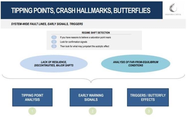
Complexity Markets: A Conceptual Framework
The financial network is no different than other complex dynamic systems in physics, ecosystems, geology and social sciences. In so doing, they relate closely to the dynamics of criticality for energy, epidemics, epileptic seizures, extinctions, glaciations, earthquakes, the human brain, the climate. As such, we can learn a great deal from universal properties valid for all of them. Common concepts in Complexity Theory parlance apply to financial markets as much as they do to any of those fields and disciplines: critical transitions, tipping points and critical thresholds, positive feedback loops and basin of attractions, non-linearity and far-from- equilibrium dynamics, stochastic stressors and outbursts into chaos, phase transition zones and unstable equilibria. As such, we frame the analysis around ‘Complexity Markets’, and attempt at embedding the dynamics of criticality for complex systems by using the conceptual framework here exemplified
- Analysis of Tipping Points (‘TPA’): break-down and independent valuation of the key dimensions of potential expansion of the financial system (which is to understand its basin of attraction). This is where we determine that the system has become inherently fragile, vulnerable to small shocks and unable to recover from perturbations, ready to transition
- Analysis of Early Warning Signals (‘EWSA’): if we have reasons to believe the system has become inherently fragile, we look for confirmation signals to help assess a probability and time-scale of transition. What are the crash hallmarks and how can they help determine a probability of critical transition, the crisis signposts that indicate that system degradation has gone on long enough and a severe rupture approaches in General properties of complex systems in transition offer clues: critical slowing down, flickering/bi-modality, variance, autocorrelation/memory, skewness of swings, correlation/spatial patterns, pockets of stress.
- Analysis of Butterflies Effects (‘BEA’): what are the small stressors that can provide the final push off the cliff – for example political risk, populism / tariffs / de-globalisation, China-US’s Thucydides trap, idiosyncratic stories (Turkey, Italy, Brazil), interest rates reborn after a 40 years decline
We discuss it at length in this presentation and video slideshow: TIPPING POINTS & CRASH HALLMARKS.
The Quest For A Quantitative Indicator Of System-level Market Fragility
Having laid out the conceptual framework, we now discuss the toolkit for spotting trends in system-level market fragility.
The idea is not one of finding a Holy Grail closed-end formula, but rather a technical support in navigation. To build a family of indicators that can integrate a broader toolkit for systemic risk detection.
On the basis of what discussed above, we know we have to be on the lookout for signals emerging from the structure of the market itself. The quantitative indicator that follows is then related to the structure of the market, its price dynamics and the behavior of its economic agents.
The product consists of three main ingredients:
- Accepted measures of system resilience /fragility in physics and energy systems: global network Entropy, the Ricci Curvature, graph diameter, shortest average path, maximal Lyapunov exponent;
- Early warning signals typical of complex systems in transition: things like critical slowing down, flickering/bi-modality, variance, autocorrelation/memory, skewness of swings, correlation/spatial patterns, pockets of stress (as discussed in earlier notes: pages 29-30 of this presentation).
- Select conventional market indicators, in detecting shifts in behavior/sentiment for economic
In a recent study, we analyzed the structure of the market for the largest Asset Management shops and passive ETFs, as the most probable fault lines in the market crust. Those are still our top picks for warning signals’ detection. However, their relevance became systemic only in very recent years, and that prevents a full analysis of past crises for validation purposes. Therefore, for the purposes of this introductory note to our models, we have applied the quantitative study to longer standing indexes: the S&P500 and the Nasdaq. Those happen to be also the largest equity bubbles globally and across history, according to most valuation criteria universally accepted. So, it may help spend time there.
Introducing the System Resilience Indicator ('SRI')
In the graph below, you see the results for our system-level resilience indicator for both the S&P500 and the Nasdaq, on a time series of the past 20 years.
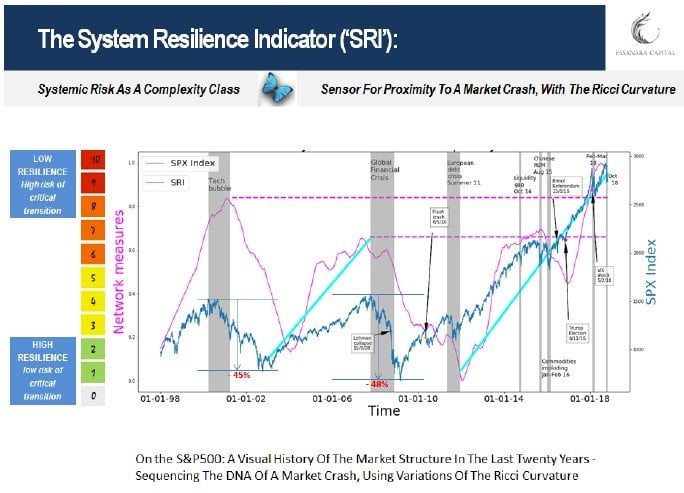
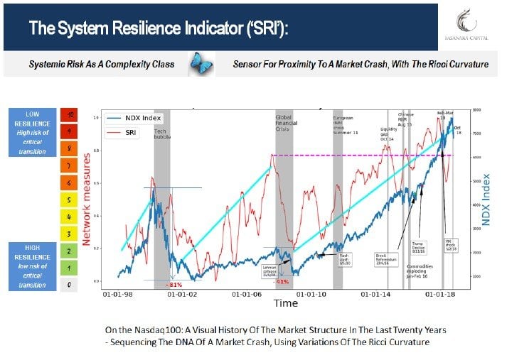
Shaky Foundations For Twin Bubbles: The Cliff Is Near
The incidental evidence from the graphs is easy to see, and comes in confirmation of our qualitative assessment for the current fragile state of affairs for global risk assets: system-level resilience deteriorated to a point where it is now worse than at the worst moments during the Global Financial Crisis and the DotCom bubble bust. Nothing to do with the banking system or the leverage in the system (although it is higher now than back then!), but fragility lies in the structure itself of the market. Nothing to do with valuations of global assets (although they are more extreme now than back then, and anytime before then), but rather the reason why those valuations got so over-extended, under the push of intense monetary intervention and positive feedback loops with the private investors community (investment strategies, buybacks, etc.).
Using the SRI as a feedback measure helps see how over-extended the market instability has gotten to in recent years. It is interesting to notice the impact of the Trump factor. Heavily expansionary fiscal policy at the end of the cycle, on top of extraordinary global monetary abundance, equated to an infusion of steroids to US risk assets, and had the effect to propel the market system further out into far from equilibrium dynamics, where system instability flashes an intense red.
The topological structure of the market signals that the Trump factor may have been an external powerful stressor on already fragile markets, blowing them in thin air / overshooting territory. To use an analogy, it’s like you in-avertedly stepped into a mountain lake covered by thin ice, as spring approaches. Then, a powerful wind propels you all the way to the center of the lake, far from safe land. As you moved fast, your body weight was not enough to break the ice. But, as speed decreases and gravitational forces set in, and as the weather heats up and the ice melts some more, chances are that …
Trump, if he wins tonight, could send markets higher again, possibly into new altitudes. This would only exacerbate market fragility, as here measured, pushing farther away from safe shorelines.
What Is The Ricci Curvature. How Does It Differ From Entropy
One of the basic ingredients at the core of our quantitative indicator is the Ricci Curvature, a notion similar to the more widely known quantity called Entropy.
Famously, the Entropy in a system measures the rate at which information is generated within it. When representing the market as a network, looking at the
interdependence between near nodes, Entropy captures a topological market organization and its changes during periods of market stress. It derives from the Second Law of Thermodynamics, and has been at the core of the Boltzmann equation (pages 9-11 in this presentation). It is an information-based quantity that can be extremely useful in understanding the stability or instability of the market system. However, we think that the Ricci Curvature can be even more helpful.
The less-known Ricci curvature is a well-defined mathematical object coming from differential geometry and it plays also an important role in the Einstein equation in the context of general relativity. In its essence, if the market is to be represented by nodes (the agents), edges and links (the strength of interactions), the Ricci Curvature reflects the interdependence between distant nodes. It can be taken as a geometric proxy measure of financial system instability. To our purposes, the Ricci Curvature can be considered more wide-ranging than Entropy as it considers the market network not only locally but across distant nodes, so in a way more comprehensively to the specific purposes of our search.
Briefly and intuitively, the local curvature of a geometrical object (“sectional curvature”) can be (i) positive (sphere-looking), (ii) zero (flat surface), or (iii) negative (hyperbolic paraboloid-looking); accordingly, the shortest cycles (geodesics triangles) connecting given points of the geometrical object form standard triangles in the (ii) case, “puffier” in the (i) case and “skinnier” in the (iii) case. By taking the average of the sectional curvatures, one has the Ricci curvature.
As for the practical applications of our study, we are interested in building an indicator, based on the Ricci curvature, which contains the information on the topology of the network representing the underlying market; more in detail, the idea is to have a dynamical description of how the robustness of the market structure changes in time, and how potential trends pre-crisis emerge. This way, we have an estimate of the systemic risk in the financial system, and in the case of a shock in the market how the market itself would react given its topological network properties.
Technical Notes: The Construction Of The 'SRI' Sensor
The section that follows goes in more details on the construction methodology of the quantitative indicator of system instability.
Network Construction
Inspired by the relevant literature of complex financial networks (Onnela, 2003; Boginski, 2005; Tse, 2010; Sandhu, 2016), we constructed the model of the market structure on which we built our analysis. Generally speaking, a network is composed of nodes and edges (also named links) connecting them. Below we summarise the relevant steps for the network construction.
Firstly, we compute the correlation matrix ??? relative to the time window T (3 or 6 months) on the daily closing prices of the components (NASDAQ 100 and S&P 500, source: Bloomberg). Secondly, we considered a non-linear transformation of the correlation matrix which returns positive values in the interval (0-2), i.e., ??? = ![]() . The matrix ??? represents a “distance” between the nodes (or edges cost) of the network components: the smaller the distance the higher the correlation between stocks.
. The matrix ??? represents a “distance” between the nodes (or edges cost) of the network components: the smaller the distance the higher the correlation between stocks.
To simplify the fully-connected structure of the network, we build the minimal spanning tree (MST) of ???, and use a critical threshold θ to reintroduce connections that are too important to ignore (with a critical threshold θ for the pairwise correlation, the Prim algorithm simplifies the fully-connected structure of the correlation matrix). While the full matrix ??? would generate a fully-connected network, a spanning tree for such a network is a subset of the edges such that there is a path between every pair of nodes. A minimal spanning tree (MST) for such a network is a spanning tree for which the sum of the cost/length of the edges is minimal. This construction uses prices of the days ?1, ?2, … , ?? and returns a network at day ??. For the purposes of our analysis, where we are interested in the dynamics study of the network properties starting at time ??, we apply this procedure outlined above by shifting daily the time window while keeping fixed its length T; for example at day ??+1 one considers prices of the days ?2, ?3, … , ??+1, and so on, up to the last day of the dynamics studied.
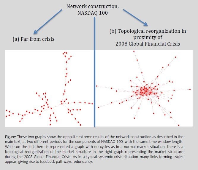
Figure 1 shows that this market structure model can distinguish between two opposite extreme situations. While during periods of relative stability the network results to be without cycles (known in the network literature as a tree graph), in a crisis the graph (and the market that it models) is characterised by many cycles: there are many not-unique (redundant) feedback pathways connecting highly correlated stocks. The message, as noted also in studies by Onnela et al. (2003), is that during periods of financial crisis there is a topological reorganization of the market structure, which is reflected also in a topological change in the network. Specifically, the shortest average path between nodes (representing the stocks) decreases during such time periods and the network “shrinks.” Nevertheless, it is worth to highlight that this topology change is partly due to the increase of the pairwise correlations during a crisis, as it naturally arises from the well-known herding effect. Constructing correlated graphs in a dynamic manner describes the market from a feedback perspective (by analysing its topology) as opposed to merely an average correlation between any two given pairs of stocks. Given any couple of nodes in the network (corresponding to a couple of stock, or components, in the underlying market), one would quantify this “pathways redundancy” within a topological perspective as a global property of the whole network, and this idea is elaborated here to propose an indicator for systemic risk in the underlying market.
The topology analysis appears to be relevant to infer stability properties of the financial system; but also, to go beyond the well-known use of pairwise correlation (increase of the average correlation between stocks during crises). In the next paragraph, we briefly introduce the main measures of robustness we have considered, which is the ability to withstand failures and shocks in complex networks, and can give an estimate of the market resilience to shocks.
The Ricci Curvature and Entropy
We discussed above how the network “shrinks” during financial crises, i.e., the shortest average path between nodes decreases, as more connections are established during such times. Now we show with a toy example that this idea can be translated in terms of the statistical physics framework.
Imagine a one-step random walk over a given network and we normalise for each node the distance matrix ??? to transitional probabilities, in such a way that at each time step the random walker moves from a node ? to one of its nearest-neighbours nodes (only nodes that are directly connected to ?) with a given probability, which depends indirectly on the correlation matrix ??? through the distance transformation described in the previous paragraph. While keeping fixed the topology of the network, if the average pairwise correlation ??? increases then the distances between a node and its nearest-neighbours decrease and therefore, the difference between those distances decreases as well. As a consequence of this increased similarity in the distance matrix, the transition probabilities for each node result to be more similar: the random walker gains more uncertainty in its dynamics. There is a quantity very well known in statistical physics which keeps track of the uncertainty as a global property of the network (or in general of the complex system): the entropy. Once the transitional probability matrix for a network representing the market structure has been specified, the entropy evaluates the robustness of the whole network by summing over each direct link the transition probability between a node and its nearest-neighbours. As shown in our previous cookie, the dynamical study of entropy can show general trends in the market structure.
Additionally, inspired by Sandhu et al. (2016), we consider the Ricci curvature. It can infer a geometrical perspective of the network, as it is meant to play a key role in analysing the market structure through the indirect links and its topological properties. Ricci curvature is a well-defined mathematical object coming from differential geometry and it plays also an important role in the Einstein equation in the context of general relativity. Briefly and intuitively, the local curvature of a geometrical object (“sectional curvature”) can be (i) positive (sphere-looking), (ii) zero (flat surface), or (iii) negative (hyperbolic paraboloid-looking); accordingly, the shortest cycles (geodesics triangles) connecting given points of the geometrical object form standard triangles in the (ii) case, “puffier” in the (i) case and “skinnier” in the (iii) case. By taking the average of the sectional curvatures, one can deduct the Ricci curvature.
In the context of complex networks, the discrete analogue of such a concept that can reproduce and distinguish the different sectional curvatures is the Ollivier-Ricci curvature, Ollivier (2007). Given two nodes ?, ? of a network, the Ollivier-Ricci curvature of the shortest pathway (geodesic) connecting ?, ? is defined to be
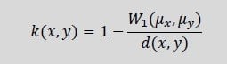
where ?(?, ?) is here the “hop-distance” between nodes ?, ? (i.e., an integer number indicating the shortest path between ?, ?); ??, ?? are probability measures made of the transition probabilities from ?, ? to each of their nearest-neighbours nodes; and finally, ?1 ![]() is the Wassertein-1 distance, which can be evaluated via linear programming (for details, see Sandhu et al. (2016)) which is a polynomial computational complexity algorithm. As for this discrete version of Ricci curvature, the lower bound of Ricci curvature is reached in a tree-like graph, while the upper bound in a fully-connected graph, as discussed by Wang et al., 2014. The network modelling the market structure is typically in between these two regimes, such that as the financial market gets closer to a financial crisis the Ricci curvature reaches larger values.
is the Wassertein-1 distance, which can be evaluated via linear programming (for details, see Sandhu et al. (2016)) which is a polynomial computational complexity algorithm. As for this discrete version of Ricci curvature, the lower bound of Ricci curvature is reached in a tree-like graph, while the upper bound in a fully-connected graph, as discussed by Wang et al., 2014. The network modelling the market structure is typically in between these two regimes, such that as the financial market gets closer to a financial crisis the Ricci curvature reaches larger values.
The key point of the Ricci computation is that ?(?, ?) is evaluated for any couple of nodes ?, ?, independently of the link connecting them being direct or indirect (in our case, it exists surely one path connecting them, by definition of spanning tree in the previous paragraph). The information on the geometrical property of the pathway connecting ?, ? is contained in ?1 ![]() , and its ratio with the hopping distance ?(?, ?) gives the required network curvature for the couple ?, ?. In order to have a global property of the whole system, one finally computes the average Ricci curvature for all the couples of nodes ?, ? in the given network under analysis.
, and its ratio with the hopping distance ?(?, ?) gives the required network curvature for the couple ?, ?. In order to have a global property of the whole system, one finally computes the average Ricci curvature for all the couples of nodes ?, ? in the given network under analysis.
The analysis continues .. Until next time!
Andrea Marcello Mambuca1 – PhD Alessandro Balata - Fasanara Analytics Mirco Lamperti - Analyst
Francesco Filia – CIO
Fasanara Capital ltd. www.fasanara.com


