Capitalism in inherently deflationary. It’s primary goal is to produce more, better products at lower prices. THAT is deflationary. It is government spending which seeks none of the above that is inflationary. As spending wanes, inflation should remain low.
“Davidson” submits:
US GDP data was updated this morning. Everyday reveals new data with which to view what has been the greatest experiment in human history. That experiment is democracy as documented by the US Constitution. That democracy has worked and continues to work is revealed in our economic history. Unfortunately we continue to wallow in pessimism when we need to be better able to read this stuff.
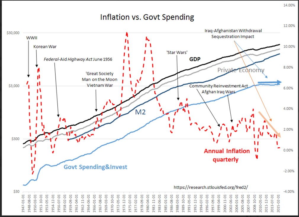
This chart is us! The US has more measures of its economy than any other entity in history. Our best information begins in 1947! This information has been updated and refined with the best techniques available ever since. New measures have been added along the way as needed. Contrary to the belief of many, across many changes of political parties, this data has remained politically neutral. It is a fair representation to the best of our abilities of what we have accomplished. The St Louis Fed FRED site presents just under 300,000 current and historical data series free to the public in Excel downloads. It is truly amazing what we do here that is not done anywhere else.
No other society has been so open to examination and criticism by its citizens period! Yet, there are many who seem to favor economies which allow far less examination and certainly permit far less criticism from its citizens.
The data represented here is called ‘Nominal’ which means not-adjusted-for-inflation. US Inflation is represented as the DASHED RED LINE, GDP as the BLACK LINE, the Private Economy as the GRAY LINE, M2 Money Supply as the DARK BLUE LINE and Government Spending & Investment as the LIGHT BLUE LINE.
Notable in this chart is inflation which has been in decline since hitting 11% in April 1980 and on an annual basis is near the lowest levels ever reached in our economic history. Inflation is one of several economic measures which continues to confuse so many about the progress of the US economy. Inflation is part of every price-based measure activity unless the measure is specifically adjusted. Once a price series has been inflation adjusted, we call it ‘Real’. Real GDP is GDP adjusted for inflation because GDP is measured using the prices of goods and services.Real GDP + Inflation = Nominal GDP
In the chart below you will see a line for the Private Economy. GDP includes all goods and services including spending by government. Government taxes profits and earnings and spends on regulation with the goal of keeping the whole system fair and open to its citizens. Government also spends on goods and services which individual states cannot justify or organize on their own such as a national postal system, national highway system, military for national defense and bodies for governance of national issues. To the degree that government spending improves its citizens economic outcomes many view this as beneficial. There have been periods of surges of government spending which have clearly impacted many who would argue it was not beneficial. The positives or negatives of government spending are steeped in political philosophies and not the thrust of this note. This note is only meant to comment on our current misreading of this particular economic cycle.
Observations:
Inflation Observations:
1) Surges in Government Spending correlate to surges in inflation shortly afterwards
2) M2 growth surges with Government Spending and has been interpreted for decades (Milton Friedman) that inflation was always a monetary phenomenon
3) For the 1st time in our economic history, we can see that inflation’s rise/decline is tied to a rise/decline in government spending, (M2 has risen dramatically w/o inflation impact)
Private Economy Observations:
1) Government Spending by being flat has slowed GDP growth
2) The Private Economy is growing faster than GDP as can be seen by its sharper uptrend than that in GDP(Subtract Government Spending from GDP to get activity of the Private Economy)
3) Private Economy is about the same as the last period of economic expansion.
Today’s low inflation and slower than historical GDP growth comes from the reduction in Government Spending. That Government Spending is inflationary goes against at least the past 70yrs of accepted perceptions of our most revered economic thinking. Individuals spend hard earned income with a keen appreciation of the value received and this type of spending always seeks the lowest price for value received. Individual spending has rarely been inflationary.
This is the first time that we can actually separate the growth in M2 from that of Inflation. It is what makes this period in our economic history extraordinary. Unfortunately, our Fed is still thinking that inflation is caused by M2 growth and that inflation is somehow a measure of health in our economy. Part of this reasoning is the often repeated fear that Hourly Wage growth is below historical trend. I disagree as the facts do not support this.
I repeat observations made in earlier notes:
1) Low inflation from less Government Spending makes for lower Nominal GDP-this is just fine as the Private Economy is growing normally.
2) Low inflation makes for low historical Hourly Wage growth-this is just fine as Real Personal Disposable Income is rising at a decent pace as are Real Retail Sales
3) All levels of economic activity adjusted for inflation are just fine!
Much of the current pessimism has resulted from making comparisons of past ‘Nominal’ to current ‘Nominal’ economic measure. When one makes the inflation adjustments, economic activity is trending at a similar pace to the mid-1990s.
My recommendation is to remain positive in the face of many who continue to repeat pessimistic views.
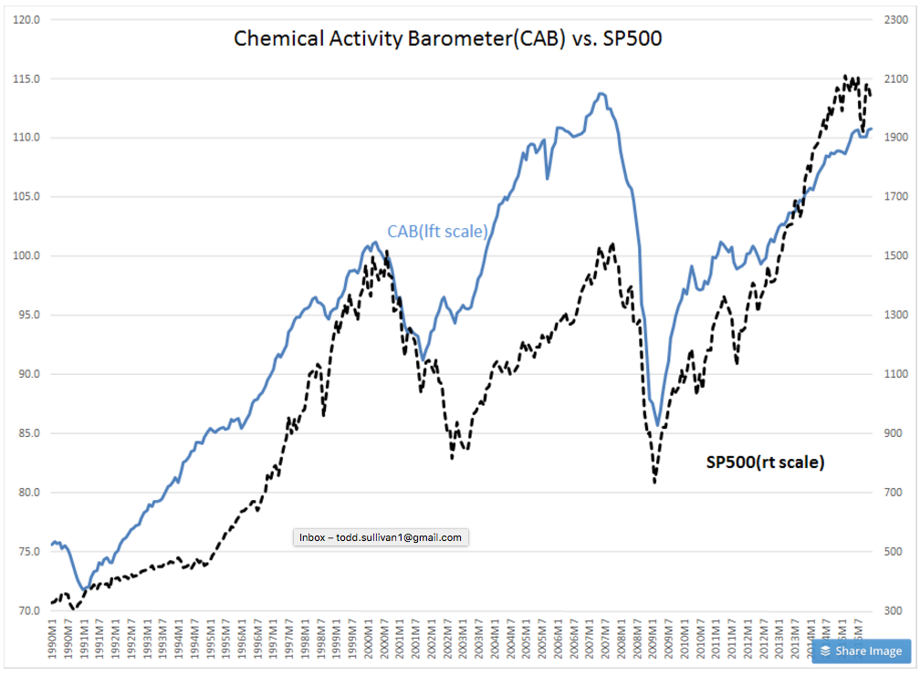
The Chemical Activity Barometer(CAB) was reported this morning. The CAB is shown as theBLUE LINE vs the SP500 ($SPY) as the DASHED BLACK LINE in the chart below. Nothing to be negative about with this indicator!