Following on from the popular “Top 10 PE10 Part 2” post, there were a few questions from readers about where various other countries sit in the rankings. So here is a follow-up post, the PE10 part 3! As requested, first up is table showing the rankings for 45 countries on the PE10 valuation metric (price divided by rolling 10-year average earnings). As noted, there are a couple of rankings in there that may come as a surprise.
Get The Full Ray Dalio Series in PDF
Get the entire 10-part series on Ray Dalio in PDF. Save it to your desktop, read it on your tablet, or email to your colleagues
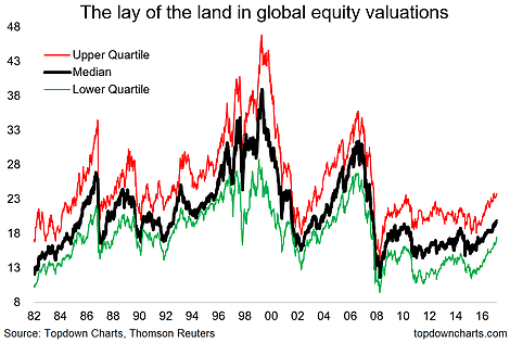
But since we are casting the net wider on the snapshot of rankings, I also wanted to explore a couple of alternative metrics. A sort of meta-analysis or statistically descriptive group of indicators (breadth and dispersion), and the results are equally insightful. Pretty much the key takeaway is that at a global level, PE10 valuations do not appear to show a generalized pattern of overvaluation across countries. On these models you could suggest that the current bull market has plenty of legs to run.
The key takeaways from this third look at the PE10 valuation for global equities are:
-Aside from the extremes at the top and bottom, there is a big middle ground in the rankings.
-The general level of valuations has gone up notably in the past 12-18 months, but the general level of valuations is not yet extreme by historical standards (about average).
-Valuation breadth shows a transition period as the proportion of "cheap" countries quickly dissipates, yet the proportion of "expensive" countries is still mild.
-Dispersion across markets is low by historical standards.
1. Full PE10 Ranking Across Countries: Here's what you've all been waiting for - the full table of PE10 valuation rankings, from number 1 (Denmark) through to number 45 (Greece), and all those in between. One that a couple of people asked about was China, which stands at 19.0x (same as Hong Kong, and below Taiwan's 20.2x), this compares to the low point for China of 14.1x in May 2014 (before the big bull market there, and the second low point of 15.6x in Feb 2016 after the bubble burst). As the subsequent charts show this notable change in stockmarket valuation is part of a wider trend of valuation re-rating that we are seeing across the globe...

2. Historical Context: This chart provides some historical context for the general level of global PE10 equity valuations. By looking at the upper and lower quartiles we can also get a feel for the dispersion and breadth of valuations - but more on that in the next two charts.

3. Breadth? This graph provides a unique look at the breadth of countries with certain valuation characteristics. I've gone with a relatively arbitrary "below 15 = cheap" and "above 25 = expensive" as the 2 criteria. The chart is quite interesting. Perhaps unsurprisingly the late 1990's saw the greatest incidence (and fairly prolonged at that) of overvaluation on this criteria. The 2007 period was another notable example of widespread overvaluation, and of course the other standout is the pre-87-crash spike.
On the flip-side the years following the global financial crisis have seen the most prolonged period where there has been a significant number of undervalued countries (directly in the wake of the financial crisis, and then another spike in cheapness around the Eurozone crisis, and then the EM/commodity dump). At the moment we are entering into a transition period...

4. Dispersion? The final chart looks at a rather odd metric and I'm still even wondering how useful it may or may not be. It looks at the standard deviation of PE10 readings observed across countries, as well as the inter-quartile range (upper minus lower quartiles), and the max minus min readings. One thing I would note is how extreme the dispersion was between countries at the height of the dot com boom and again at the 2008 peak (oh, and also just before the 1987 crash). At this point it's still at relatively low levels.

For more and deeper insights on global economics and asset allocation, and some more good charts you may want to
subscribe to the Weekly Macro Themes. Click through for free look or a trial.


Cryptocurrency
Gambling
Investing
Net Worth
Personal Finance
Stocks