An average year for the S&P500 So Far [CHARTS]

0
An average year for the S&P500 So Far [CHARTS]
Seasonality is something that matters in markets, economics, and life!  Most people have heard of the term “sell in May” (and the rest of the saying implies you should come back in October), and the stats tend to back that up – on average.  Seasonality can help with market timing calls, but my view is that it should be a contributing factor; an additional piece of context, rather than the core thesis.  With that all said, let’s take a quick look at seasonality for the S&P500.

Get The Full Ray Dalio Series in PDF

Get the entire 10-part series on Ray Dalio in PDF. Save it to your desktop, read it on your tablet, or email to your colleagues

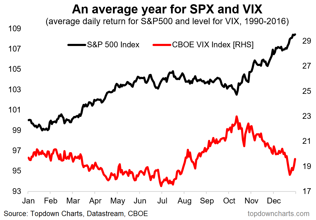
In this analysis I've taken a look not just at seasonality in price (based on average daily percentage change by business day of the year), but also at seasonality in the VIX or CBOE Volatility Index. This 2 dimensional view gives you an appreciation for seasonality in both risk and return - which are 2 sides of the same coin, and equally important factors in portfolio construction. The bottom line is that as seasonality turns negative for price from around June-July, it turns positive (higher volatility) for the VIX from around June.  So whether it's price or volatility - the next quarter is historically typically more volatile and negatively biased return-wise.
The chart below shows an average year in the life of the S&P500 both on price and the level of the VIX. From July price sees negative seasonality, and the VIX sees positive seasonality.

542496 a26892c8763a44568748c1863d36c173~mv2

Looking at the S&P500 trading through 2017 vs the historical average pattern, it's lining up fairly closely, and the implication is that on seasonality alone, markets may become more choppy in the coming weeks and months, with an elevated risk of a correction.

542496 3ee75acc03354c14996a10853301b86b~mv2

For more and deeper insights on the global markets, good charts, and actionable investment ideas you may want to subscribe to the Weekly Macro Themes - our institutional service.  Click through for a FREE TRIAL.
Gates Capital Management Reduces Risk After Rare Down Year [Exclusive]

Gates Capital Management's ECF Value Funds have a fantastic track record. The funds (full-name Excess Cash Flow Value Funds), which invest in an event-driven equity and credit strategy, have produced a 12.6% annualised return over the past 26 years. The funds added 7.7% overall in the second half of 2022, outperforming the 3.4% return for Read More

Topdown Charts: "chart driven macro insights" Based in Queenstown, New Zealand, Topdown Charts brings you independent research and analysis on global macro themes and trends. Topdown Charts covers multiple economies, markets, and asset classes with a distinct chart-driven focus. We are not bound by technical or fundamental dogma, and instead look to leverage any relevant factor to capture the theme. As such, here you will find some posts that are purely technical strategy, some that just cover economics and data, and some posts that use multiple inputs to tell the story and identify the opportunities. Callum Thomas Head of Research Callum is the founder of Topdown Charts. He previously worked in investment strategy and asset allocation at AMP Capital in the Multi-Asset division. Callum has a passion for global macro investing and has developed strong research and analytical expertise across economies and asset classes. Callum's approach is to utilise a blend of factors to inform the macro view.
Previous article Mario Gabelli’s Three Entertainment Bets
Next article Warren Buffett: Classic Investing Wisdom From The Man Who Was Rejected By Harvard & Initially By Ben Graham

No posts to display