
Across a number of markets and asset classes, the past few weeks have served as a wake-up call, a reminder that volatility can return at pace. While it’s normal for various measures of volatility and risk aversion to spike during a selloff or correction, my view is that this is just the start of a new regime of higher volatility. The charts below outline how this looks to be in process, and give some insight into how volatility has evolved across time.
The global macro backdrop certainly lends itself to a transition to higher volatility, and we’ve already had a taste of this with a falling US dollar, rising commodity prices, and spiking bond yields. The economic and policy backdrop underpins this, yet there is still cause for optimism in that the economic outlook remains solid, and earnings are on an improving path. So while rising volatility is often associated with risk, it can also be a time of rising opportunity.
The key takeaways on the outlook for stockmarket volatility are:
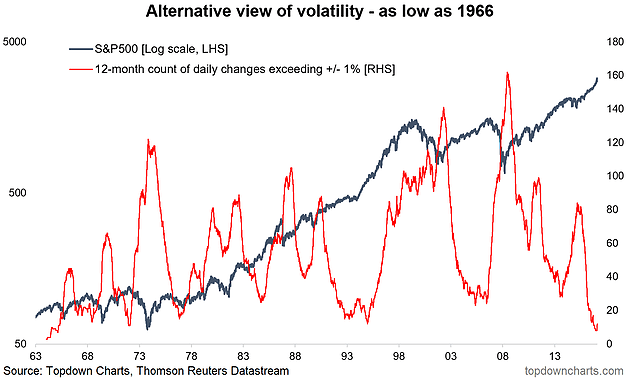
-An alternative view on realized price volatility is turning up from a 50-year low.
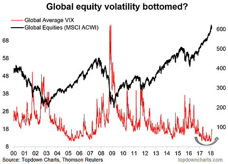
-Global equity implied volatility is turning up, which makes sense given the backdrop of a maturing cycle, turning tides in monetary policy, and increasing valuations.
-With the global economic outlook still solid, it could end up being a 1990’s-style shift in volatility.
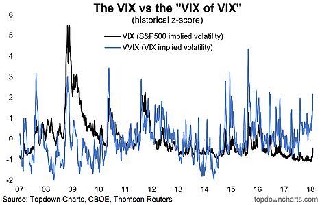
-Shorter term, the VVIX appears to be flagging a higher VIX.
- Alternative Volatility View: This alternative view of volatility – the rolling annual count of daily price moves exceeding +/- 1% – shows just how profoundly low volatility has been in the new bull market. With the price action of the past week this volatility indicator has started to turn (from the lowest levels since 1966). It could end up being just a flash in the pan, but my view is it is the start of the process of turning up. A key open question is whether this is a return of volatility like in the late 1990’s or something more like the mid-2000’s. I am leaning toward the former – which would basically be a more erratic bull market.
- Global Equity Volatility: Already, on the global front, average implied equity volatility across the major global equity markets had been in a clear bottoming process. In the 2018 Outlook article, I noted how this is likely a bottom in implied volatility on a global level as 3 key themes coalesce: a maturing cycle globally, a turning of the global monetary policy tides, and increasing valuations across asset classes and markets. This is the riskier part of the cycle as investor sentiment starts to change.
- The VIX of VIX: A possible trend toward generally higher levels of volatility appears to have been flagged by the CBOE VVIX (implied volatility of the VIX, or “the VIX of VIX”). And the apparent, albeit relatively loose, link with the VIX seems to suggest the VIX heads or stays higher from here. Thinking about the macro backdrop, greater volatility across some of the key macro variables is going to be key in determining the risk and opportunity backdrop this year. An apparent bear market in the US dollar, rising bond yields, rising commodity prices, and greater uncertainty on the path of monetary policy could mean that while the overall growth and inflation (and hence earnings) outlook remains positive, the price movements across asst classes will become increasingly volatile as we enter the later innings of the cycle.
For more and deeper insights on global economics and asset allocation, and some more good charts you may want to subscribe to the Weekly Macro Themes. Click through for free look or a trial.
Follow us on:
LinkedIn https://www.linkedin.com/company/topdown-charts
Twitter http://www.twitter.com/topdowncharts
Article by Callum Thomas, Top Down Charts


