Smart investors know that the key to choosing which stock to buy or sell is a proper analysis of every stock’s price history.
Even if you have heard rumours about a particular company that imply its explosive future growth or its imminent demise, these rumours would have already left their footprint on that company’s traded stock price. Market is as fast – if not faster – than rumours! It is therefore important that you have access to both real time and historical data of all those stocks that fall under your radar screen.
In my previous article about live feeds in Excel I explained how you may get access to such feeds. In the current article I will confront the question about how you may analyse the historical data of several stocks in order to pick up the one with the best future prospects.

Q3 hedge fund letters, conference, scoops etc
You might have heard that professional traders go one step further and apply some sort of mathematical transformation on the raw stock prices to produce a time series of numbers, called technical indicators. Many online brokers even supply you with ready-made popular indicators, like Moving Average, MACD (Moving Average Convergence Divergence), RSI (Relative Strength Index) and OBV (On-Balance Volume).
If you think these tools could help you make a profit, think again! These indicators are so commonplace that whatever they imply for the stock’s prospects is already priced in the quoted price before you can blink your eye! In other words, if they convey a positive signal, the market will swallow enough buy orders to raise the stock price to a level that is not still a bargain by the time you look at this signal!
Because professional traders know this fact, they use their own custom technical indicators either by devising unique mathematical algorithms or tweaking those already in place.
Guess what? You need to do the same! Not of course by solving differential equations, but by building your own custom analysis in Excel. All you need is some sort of utility that can dump the raw numbers in your spreadsheet. Then you could make yourself a cup of coffee to boost your imagination, raise your sleeves and beat everybody else! You can do it because Excel puts you in front of the steering wheel and lets you manipulate the data in any way you want.
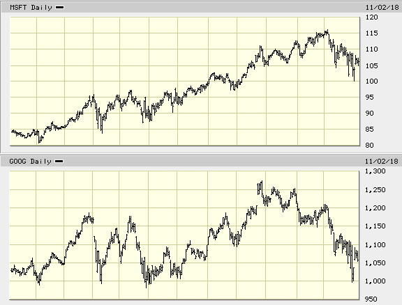
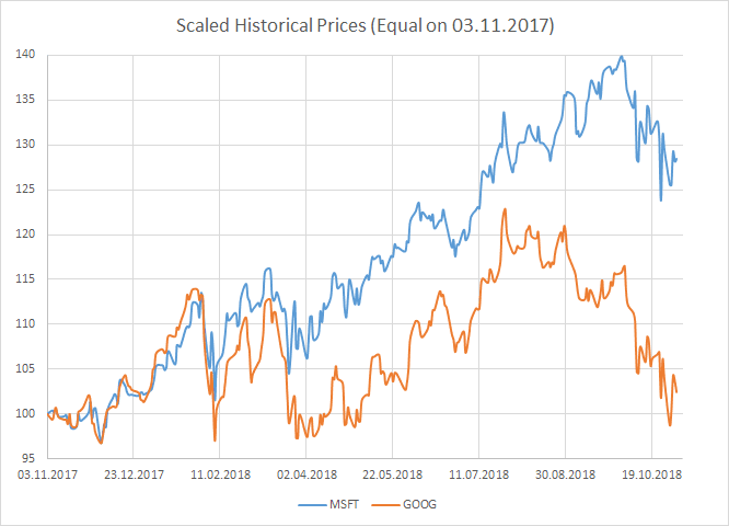
As a practical and very simple example, imagine you want to compare the past performance of Microsoft vs Google. Most trading tools would easily display two separate price history charts, one for Microsoft (ticker MSFT) and one for Google (ticker GOOG) that could look like this:
Great! Right? But still, wiser have you not become!
What you really want, is having two curves plotted against each other on the same space. Rather than relying on broker toolkits, how about plotting the chart yourself? All you need is having two columns of prices in an Excel spreadsheet and create a two-curve chart out of them.
Getting the MSFT Historical Data in Excel
While you can easily download the historical prices from a site such as Yahoo Finance, I would advise you to use the Excel Deriscope Add-In because a) is made by me :-) b) comes with an integrated wizard that greatly assists you with the analysis of market data in the spreadsheet c) supports several live feeds providers d) is locally installed (not SAAS), which means nobody can spy on your data and e) is practically free with a very low one-off price for lifetime ownership.
The following 20-seconds video shows how you may use the wizard to create the spreadsheet formulas that return the historical Microsoft prices from Yahoo Finance:
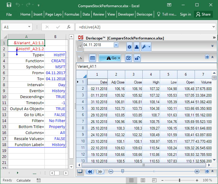
As you see in the image below, the wizard has created exactly two formulas:
The first formula in cell A2 is =ds(A3:B18) and returns the text &HistYF_A2:1.2 that is a unique label of an object that contains the specifications of your historical data request to be sent to Yahoo’s server.
The second formula in cell A1 is =dsLive(A2) and does the real job: It contacts Yahoo’s server with the request defined in its input argument A2 and returns the text &Variant_A1:1.1, which uniquely identifies the object that contains the received feeds.
The wizard’s taskpane on the right always displays the contents of the object associated with the currently selected cell. In the case here, cell A1 is selected and therefore the wizard displays the feeds (MSFT historical data) received from Yahoo Finance in tabular form consisting of 7 columns:
Getting both the MSFT and GOOG Historical Data in Excel
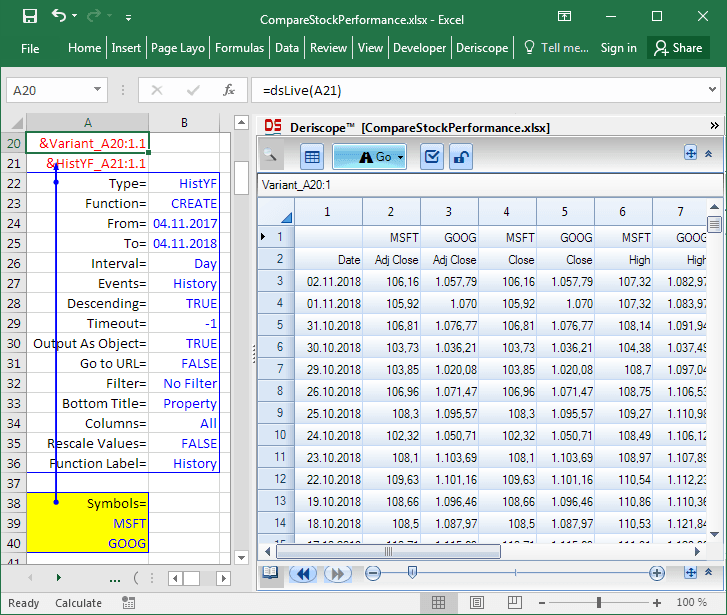
Before showing you how to place the received feeds in the spreadsheet grid so that you can work with them, let us try to add a second ticker symbol in the request object defined in cell A2.
Below you see one possible method that can be readily extended to handle many more additional ticker symbols. The ticker symbols (here MSFT and GOOG) are entered under the Symbols= key in the yellow highlighted rows.
As before, the request is sent to Yahoo’s server through the formula =dsLive(A21) in cell A20 and the wizard displays the received feeds because cell A20 is currently selected. Due to the existence of two tickers, the output table now consists of 13 columns: The date column plus 6 columns per ticker.
Keeping only the Adjusted Close Columns
Chances are that you don’t want to mess with all these columns, especially if more than two stocks are involved. In most cases you would rather focus on only the first group of columns that report the close prices adjusted for dividends and splits.
This is easily achieved with the yellow highlighted Columns= and Column List= entries below. The wizard then displays only the first column per each ticker, which happens to be the adjusted close column:
Bringing the Feeds into the Spreadsheet Grid
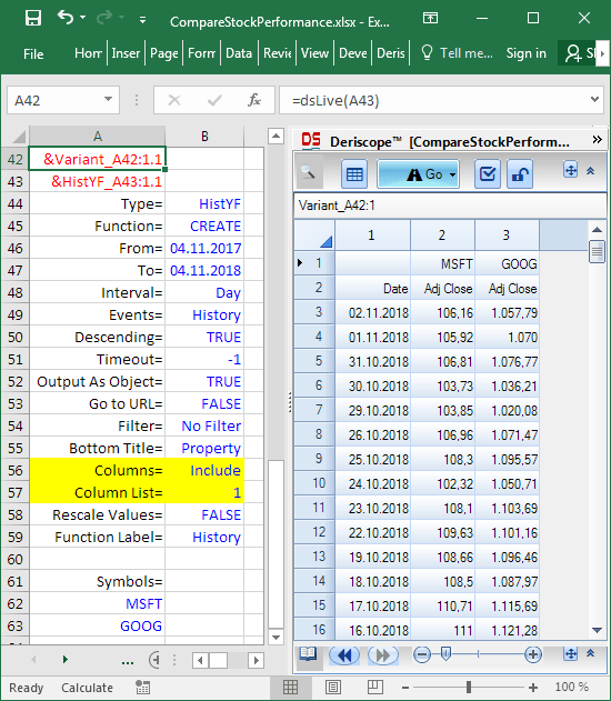
Now is the right time to think about transferring to the spreadsheet grid the feeds currently displayed in the wizard, so that you can start doing some useful work with them. While you may copy the taskpane data and paste them subsequently in the spreadsheet as values, what you really want is a spreadsheet formula that returns the feeds while being linked to the request specifications held by the object &HistYF_A43:1.1 in cell A43.
The wizard can create this formula for you by clicking on the Go button as this 20-seconds video demonstrates:
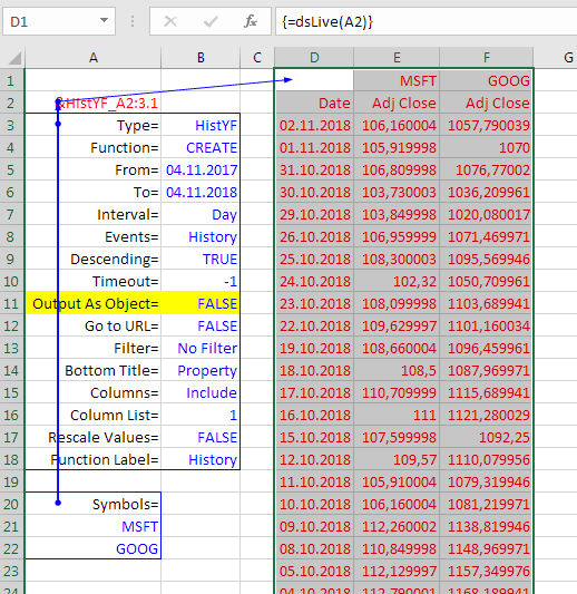
While this method is convenient for getting the spreadsheet array formula with the correct size (254 rows and 3 columns in this example), it is probably simpler and more efficient to avoid creating the data object in cell A42 and instruct the formula dsLive() to return the received feeds directly to the spreadsheet.
The image below shows how this is done. The request object in cell A2 is constructed with Output As Object= FALSE (highlighted yellow), which causes the array formula {=dsLive(A2)} over the range D1:F254 to return the feeds, rather than a handle name:
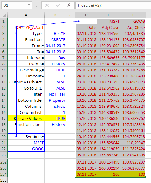
Rescaling and Creating the Chart
Do not even try to create a chart in Excel with two curves representing the adjusted close prices of MSFT and GOOG! The vertical axis would need to include the range from 100 to 1,000 in order to accommodate the prices of both stocks. As a result, the MSFT curve would appear as a flat line at the bottom of the chart due to its variations being hardly visible.
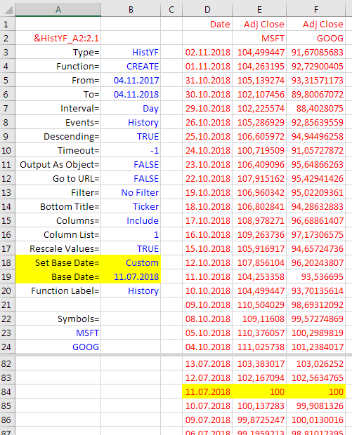
The only sensible solution is to rescale all prices so that both stocks assume the same price of 100 at some defined point of time, typically at the earliest reported date. Deriscope does this automatically when you set Rescale Values= TRUE as shown below:
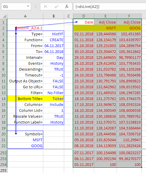
Creating a two-curve chart in Excel out of these three columns is as easy as selecting the whole data range and hitting the appropriate Excel ribbon button. But in order to get the correct MSFT and GOOG labels on the chart, these must appear directly above the data in cells E2 and F2. You can achieve this by setting Bottom Title= Ticker as shown below:
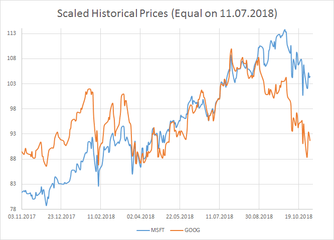
Sometimes it makes sense to focus on the stock price evolution taken place after some specific date, for example the 11.07.2018. Rather than requesting a whole new series of historical data commencing on that date, it may be easier to set the date on which both stocks assume the same price of 100 to a custom date that is different than the earliest reported date. This is achieved by setting Set Base Date= Custom and Base Date= 11.07.2018 as shown below:
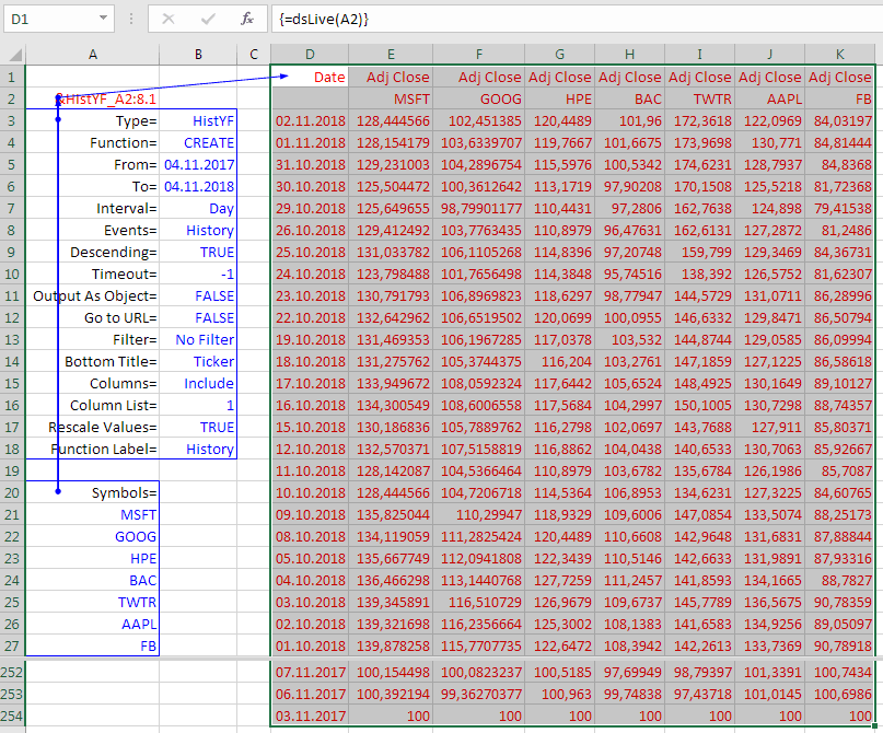
Extending to Several Stocks
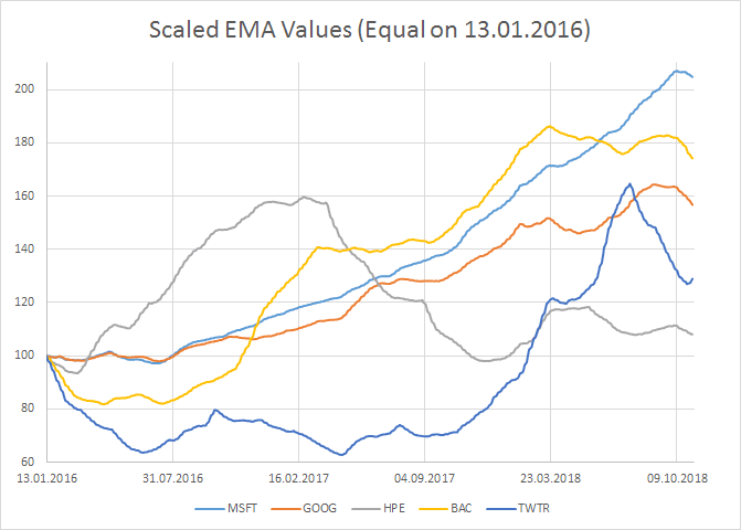
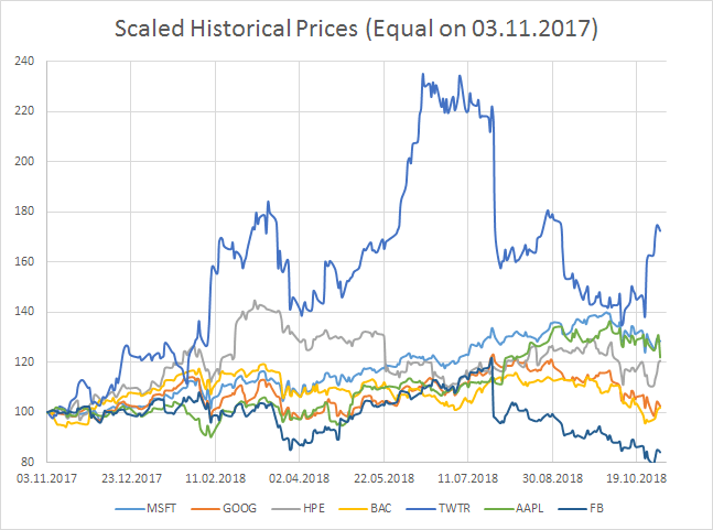
Quite similar to the Yahoo Finance capability of displaying combined charts of arbitrarily many stocks on their online site, Deriscope carries no limit to the number of ticker symbols that may be added to the request object. The following images show the simultaneous charting of the scaled historical prices of seven US blue chips:
Technical Indicators of Several Stocks
The above techniques are not limited to stock prices. Historical time series of over 50 technical indicators are available through the Alpha Vantage provider and may be dumped in the spreadsheet in a similar fashion.
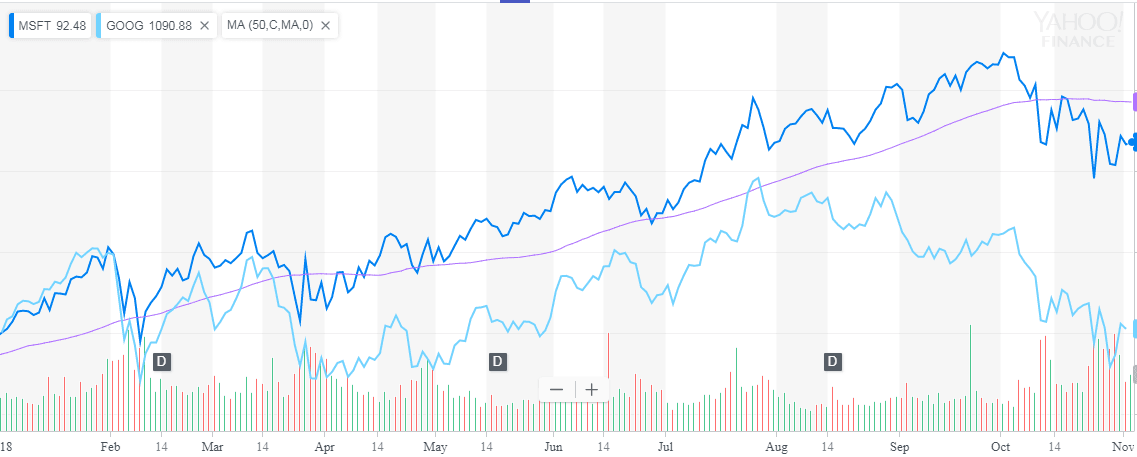
It may be worth to note here that even Yahoo Finance is not capable of simultaneously plotting technical indicators of several stocks on the same chart. You may for example request a comparison chart of MSFT and GOOG prices and also add the moving average indicator of MSFT, but it is not possible to overlay the moving average indicator of GOOG as well, as the next image from the Yahoo Finance site betrays:
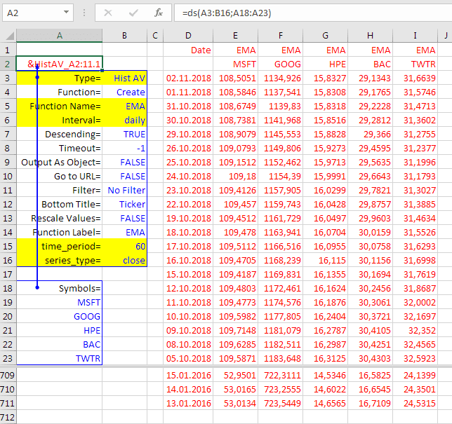
As an example, you may request from the Alpha Vantage server the EMA (Exponential Moving Average) time series of 5 stocks by setting up an object of type Hist AV with the help of the wizard. The next image shows such an object created in cell A2, where the interesting entries are highlighted with yellow color. On the right, the array spreadsheet formula {=dsLive(A2)} returns the received feeds over a range consisting of 6 columns and 711 rows:
Since EMA numbers represent averages of stock prices over specific time intervals, they suffer from the same comparison problem like raw stock prices. For example, they generally cannot be placed on the same chart and even if they could, no meaningful comparison could be drawn out of them. We may though apply the same remedy as above and rescale all numbers so that they start with 100, by setting Rescale Values= TRUE. This would produce the following chart: