
A juvenile red-tailed hawk took up residence near our farmhouse soon after we moved onto the property, now eight years ago. The girls named him Indiana Jones, which is a wonderful name for a hawk, and his daily kreeeeeees thrill me every time I hear them. Red-tailed hawks are also known as chickenhawks, but we’ve never had a problem with Indiana in that regard, as he seems more than content to pillage our fields for ground squirrels, voles and the occasional snake. I am particularly happy for his attacks on the local vole population, as we lost a young apple tree to voles a few years back (they will eat the tender bark all the way around the thin trunk, “ringing” the tree and killing it). We don’t know if Indiana has been successful in finding a mate in one of the past few breeding seasons. We hope so. It’s a solitary life being a red-tailed hawk, all alone in your instinctive mastery of flight and field

Tyger Tyger, burning bright,
In the forests of the night;
What immortal hand or eye,
Could frame thy fearful symmetry?
[Four stanzas later …]
Tyger Tyger burning bright,
In the forests of the night:
What immortal hand or eye,
Dare frame thy fearful symmetry?
– William Blake (1757 – 1827)
It’s the single word change in the first and last stanza of Blake’s most famous poem, the shift from Could to Dare, that moves me as much as Indiana’s kreeeeeees. It’s at the heart of all of Blake’s work, this notion that not only is it a difficult thing to frame/model the symmetry/pattern of Nature as found in a raptor’s swooping flight or a tiger’s slouchy walk, but that it is a dangerous thing, too!
Of course, that’s exactly what we humans do all the freakin’ time.
Here are some amazing William Blake paintings on this theme.

Blake’s famous quote was “Art is the Tree of Life. Science is the Tree of Death.”, so I suppose it’s no great surprise that Isaac Newton was one of the main villains in Blake’s philosophy, which saw science — particularly fundamental science focused on divining the “laws” of nature — as part and parcel of an inherently repressive political regime hell-bent (literally) on imposing a stultifying order and uniformity on mankind. The old man in “The Ancient of Days” isn’t the God of Genesis bringing form to the Void, but a god of mostly evil — Urizen by name — using that same compass of Newton’s to measure the Void and begin the repressive march of Science with a capital S. And then there’s my personal fave … Blake’s doltish Adam, hypnotized by the Snake as he asserts our most potent means of control — the power of names, aka the power of abstraction, aka the power of symbolic representation, aka the power of Narrative.
William Blake is the OG Epsilon Theory.
Okay, Ben, thanks for the art history lesson. But what’s the point? These ETFs aren’t going to trade themselves, you know.
Yeah, I know. And that’s actually pretty close to the point I’m going to make. But it’s bigger than that, too, and to get there I need to make one more observation about red-tailed hawks, science and social history.
There is nothing abstract about a red-tailed hawk and its mastery of flight. There is no active contemplation and scenario modeling required for Indiana to glide on a thermal, spot a chipmunk sliding through the tall grass, and dive Stuka-like to rend his breakfast with beak and talon. It’s beautiful, sure, in a deadly sort of way familiar to anyone who observes markets or politics for a living. It’s a mystery that a part of my brain would desperately like to solve, double sure. But most of all … it’s REAL. It’s utterly authentic and true. Not only to Indiana and the chipmunk, but to me the Observer, too.
There is no separation from what Indiana IS and what Indiana DOES.
Marx called the separation from what one is and what one does “alienation”, and he applied it (of course) to his notion of class identity and class struggle, such that in capitalist societies a worker was separated from the meaning of his labor. When you’re a cog in a machine, moving widgets around on an assembly line, there’s no connection to the finished product. You ARE a human but you DO as a machine. That’s alienation, and it’s a heartbreaker.
Now Marx being Marx, naturally he thought of this notion of alienation as it applied to the terrible but inevitable seizure of the means of production by the capitalist class from the working class (to be followed by the capitalist class eating itself, but that’s another story). And that’s fine. But the concept of alienation goes much farther than that. Alienation applies just as much to Team Elite and us awful capitalists as it does to the “working class”. More so.
Meaning what? Meaning that I’ll tell you the story of Neb Tnuh, investor and citizen, and you tell me if it sounds familiar.
Neb has a hard time talking with real people these days. Neb just doesn’t … connect … with people the way he used to. He doesn’t have much to say. He mumbles a lot. He imagines long and involved conversations with people in his head, but that’s where they stay. In his head. He gets lost in his own thoughts. Hmm, “lost” isn’t quite right. Trapped is more like it. Trapped in a maze of social abstractions, both in markets and in politics, blared at him from all sides, without pause or relief.
Sartre famously said that hell is other people. For Neb, hell is other people who want to talk about markets or politics. It’s not that Neb is so certain that he has the answer for what’s going on, for why his Twitter feed is a dumpster fire, for why the markets seem like a bad joke and why politics seem like “Black Mirror” re-runs. No, Neb is positive that he doesn’t have an answer, that he’s definitely not in on the joke. But he would rather carve out an eye with a rusty spoon than wrestle with civilians who want to tell him why Trump is so awful or why Trump is so great, why Bitcoin is going to $100,000 or why Bitcoin is going to zero, why the “fundamentals are sound” or why the fundamentals are sound EXCEPT for this one issue which will bring the whole house of cards tumbling down ANY DAY NOW, why the Fed is the source of all evil in the world or why the NRA is the source of all evil in the world or why the Democrats / Republicans are the source of all evil in the world, why Amazon is going to take over the world or why Amazon … actually, no one ever takes the other side of that argument, which is kinda interesting to Neb.
So obviously Neb is a real barrel of laughs at parties, which he shuns like the plague today even though he remembers that he used to like parties. The circle of real people that he actively feels comfortable being around has shrunk and shrunk and shrunk until he can count them on his fingers. And unless they are in the trenches of this mental war of abstracted social constructs, Neb increasingly has a hard time connecting even with them. He increasingly talks past and through the people who are the most important to him, like his wife and daughters. They’re not on this abstracted battleground (thank god!), but as the war takes up more and more mental space there’s just not enough room for much else.
On the flip side of that coin, it’s easier and easier for Neb to talk with complete strangers on social media platforms, precisely because these entities (some human, some not) are entirely abstracted. He doesn’t even have to work very hard at “naming” the strangers as Adam named the beasts, because they depict themselves as symbolic representations of this tribe or that. It’s all so easy for Neb to lose himself in this ocean of social abstraction and Turing tests, because he’s fluent in the symbolic languages of mathematics, history and pop culture. And so he swims in that ocean, compulsively even, until he’s forgotten whether or not there was ever a shore.
Neb Tnuh is profoundly alienated.
Who Neb Tnuh IS — a free man in a real world — is almost totally separated from what Neb Tnuh DOES — abstracted other-regarding behaviors for abstracted others — both as an investor and as a citizen.
What’s driving Neb’s alienation? It’s what William Blake warned about. It’s the abstraction of the real world and real human activities into mental constructs, which are then established as “the real things” that we must interact with in order to succeed. It’s Magical Thinking, which is ALWAYS used in service to a political structure of social control.
But it’s worse than Blake imagined. Driven by a global policy response to the Great Financial Crisis and by the universal spread of new media technologies, the scope and scale of abstraction in service to political ends has evolved to levels unparalleled in human history. Yeah, this time is different.
The simple abstraction of nature is something that’s been alienating the Neb Tnuhs of the world since Archimedes was drawing figures in the sand and got a Roman sword in the gut for his troubles. What’s different today is that the abstractions themselves have become abstracted farther and farther away from their ostensible real-world source, such that the abstractions have become — and I’m using this word in its technical sense — cartoons. We’ve “progressed” from abstracting the principles of flight from red-tailed hawks to abstracting the principles of social influence from the abstracted principles of red-tailed hawks. We model the model in order to instill fear or greed or pleasure or patriotism. Constantly. Everywhere.
Today we abstract social behaviors, not Newtonian physics.
Today we abstract at scale through digitization.
THIS is the true Triumph of Abstraction. It’s the Triumph of the Cartoon.
I’ll give you two examples. These cartoons will seem like small examples, tiny things. But they’re not. Hundreds of billions of dollars of wealth has been created (and lost) because of the first of these cartoons, as recently as the other Friday. A Presidential election was impacted by the second cartoon. And it’s not the Presidential election you’re thinking of. Although that one, too.
Example 1 — In the beginning, there was a desire to model the employment patterns of the U.S. economy to help policymakers figure out what was actually going on. So in 1884 (!) Congress established the Bureau of Labor Statistics (BLS) to do some counting and abstracting, and since 1915 (!) the BLS has been surveying employers to estimate how many Americans are working and how much they’re being paid. On the first Friday of every month, the BLS releases its report on the real-world employment patterns in the U.S. for the prior month. This data is an abstraction, to be sure, full of seasonal adjustments and model estimations, but it is a first level abstraction. This is not the cartoon.
One of the standard calculations that the BLS reports is the percentage change on a year-over-year basis in how much workers are being paid. Usually this wage growth report takes a backseat to the more famous “jobs report” of how many jobs were added or subtracted from the U.S. economy in the prior month and the even more famous “unemployment report” (which is actually based on an entirely different survey) of the percentage of Americans who were actively looking for work but were unable to find jobs. But when everyone and his cousin is either worried about wage inflation or hoping for wage increases, then the wage growth “number” takes on enormous importance. It’s the depiction and the narrative around the BLS wage growth calculation that is the cartoon. And that cartoon is everything for markets today.
On Friday, February 2, the BLS reported a January wage growth number of 2.9%, far “hotter” than consensus estimates and widely taken as evidence that (finally) inflationary pressures were showing up in wages. The following week markets sold off as hard as they have in years, in large part because it seemed that central bankers were now terribly “behind the curve” when it comes to inflation, and that they would be forced to tighten faster and more dramatically than “promised” via prior forward guidance.
On Friday, March 9, the BLS reported a February wage growth number of 2.6%, well below consensus estimates and widely taken as evidence that — together with the massive increase in jobs — we were actually in a “Goldilocks” investment world that was neither running too hot to force the Fed’s hand nor too cold to slow down expectations of real-world growth and expansion. What a difference a month makes! All major market indices had glorious days, with the NASDAQ setting a new all-time high
What if I told you that both of these wage growth numbers were misleading abstractions of what they claimed to be?
What if I told you that you’ve been whipsawed by a cartoon, and you’re going to be whipsawed again?
Here’s what I’m talking about, and if you want to double-check the math or the numbers it’s all available on the BLS website. For historical data, this is a good place to start.
The most basic way to look at wages for a monthly report would be to count up how much all workers got paid in that prior month. But that doesn’t work for a month-to-month comparison because different months have meaningfully different numbers of days. Unless you’re getting paid on a monthly or twice-monthly basis, then you’re going to be making less in February than you are in January. So the BLS uses the work week as their basic apples-to-apples comparison basis.
On this most basic abstraction of wages, annual wage growth for January (the Feb. 2 announcement) was 2.8% and annual wage growth for February (the Mar. 9 announcement) was 2.9%.
Wait, what? That’s not at all what we were told. It’s not quite as hot for January, and it’s clearly not Goldilocks for February. What’s going on here?
As far back as I can trace the theater of BLS reports — and that’s how one should think about these market data reports, as theatrical productions consciously designed to impact behavior — the “number” that’s reported isn’t the apples-to-apples comparison of weekly wages. Instead, it’s hourly wages. Why? Because back in 1915 this is how most people got paid. The abstracted idea of hourly wages connects with people more than the abstracted idea of weekly wages. It’s a more effective tool for eliciting a behavioral response, so that’s why our theatrical effort focuses on it every month.
But here’s the problem with the hourly wage abstraction. It requires introducing a new data estimation into the mix, one that has nothing (or at least very little) to do with the real-world concept we’re trying to represent, which is whether you’re taking home more money today than you did last year. That additional layer of abstraction is the average length of the work week.
Now this data estimation changes very little from month to month. Unlike the difference in work days from month to month, which can be meaningful and is incredibly easy to measure, the difference in work hours from week to week is an immaterial and almost certainly statistically spurious estimation. Here are the average number of hours in the work week since 2012.
Since 2012, the average length of the work week has been as low as 34.3 hours and as high as 34.6 hours. For more than SIX YEARS, the maximum deviation from the mean has been less than NINE MINUTES, less than ONE-HALF OF ONE PERCENT of the total work week. This is the flattest line you will ever see in any time series, and any month-to-month deviation from the mean is almost certainly a spurious statistical estimation. Meaning that the month-to-month differences in the average work week are so far inside your margin of error for this sampling and estimation process that you can have ZERO confidence that you are abstracting anything real. This is as bogus of an abstraction as you will ever see.
And yet it makes all the difference in the world for hourly wage calculations!
Why was the February wage growth number reported on March 9th as 2.6% rather than 2.9%?
Because the average work week in February 2018 was randomly estimated as being six minutes longer than it was a year ago
Everything you read about what the March 9th wage growth number meant for your portfolio — the entire Goldilocks narrative of a “contained” wage inflation number combined with strong job growth — is based on a statistically spurious result. Everything. It’s all made up. None of it is real.
And yet, on the basis of the Goldilocks narrative, which was the all-day headline of the Wall Street Journal and the talking point of every Missionary on CNBC that Friday, the S&P 500 was up more than 1.7% on the day. That’s $415 BILLION of market wealth created in the S&P 500 alone, in one day, from a cartoon representation of annualized wage growth in the U.S. economy.
Now here’s the kicker. Unless the average work week in March randomly declines 12 minutes versus the February average work week, it’s all going to happen again on April 6th. Why? Because the March 2017 work week was 34.3 hours long. So even if weekly pay increases by more than 3% in March, which is like the Maginot Line of wage inflation numbers, when the curtain rises at 8:30 AM ET on April 6th, we will be told by the theater performers that the wage inflation “number” is still a very manageable 2.6% or something like that. And in the immortal words of Monty Python, there will be much rejoicing.
But by the same token, at some point this year we will have a perfectly random 12 or 18 minute estimated decline in the average work week, and the 2017 comp will be a month with a randomly high average work week. On that first Friday of that fateful month, we will have a “shockingly” high wage inflation number, “proving” that the Fed is way behind the curve, with breathless coverage of swooning markets on CNBC. In the immortal words of Monty Python, there will much gnashing of teeth as the Killer Bunny emerges from its cave.
It’s the Triumph of the Cartoon, and as an investor it puts me at war with myself. Do I invest on the basis of reality, meaning the fact that wage inflation is, in fact, picking up in a remarkably steady fashion in the real economy? Or do I invest on the basis of Narrative abstractions that I can anticipate being presented and represented to markets at regularly scheduled moments of theater? Because the investment strategy for the one is almost diametrically opposed to the investment strategy for the other.
I’ll probably do the latter. I’ll probably act on the basis of abstracted and doubly abstracted cartoons of reality because that’s what I think everyone else is going to react to (the Common Knowledge Game), rather than act on the basis of what I truly believe is happening in the real world.
And that’s where the alienation comes from.
But that’s just my alienation as an investor. I am equally if not more alienated as a citizen.
Example 2 — Sticking with the labor statistics genre of abstraction in the service of Narrative creation, let’s turn to the weekly theater of new unemployment claims, presented every Thursday morning at 8:30 AM. This is, historically speaking, a decidedly uninteresting and low prestige data series, to the degree that the Bureau of Labor Statistics does not compile the data and abstracted reports themselves, but have handed it off to a lonely backwater the Employment and Training Administration of the Labor Department.
Starting with the Great Recession, however, interest in all macro data reports soared to new heights, and as the only weekly U.S. government report of any note whatsoever, CNBC began to build a regular feature around the new unemployment claims report in mid-2009. Over the next three or four years, anyone who was actively involved in markets would know whether or not the weekly initial unemployment data had surprised to the upside (bad news, as that meant that more people than expected had filed for unemployment claims for the first time) or surprised to the downside (good news, as fewer people than expected had filed). These reports were presented as a Big Deal, and markets moved markedly up and markedly down on the news. Not for more than a day or a half day, typically, but they moved.
Almost always, the number surprised to the downside (good news) as “green shoots” of recovery spread across our great nation from 2009 through November 2012, when — oh wait! — we had a Presidential election. In truth, these abstracted reports, purporting to give an accurate snapshot of weekly developments in the real-world employment situation in the U.S., were a joke over this time period. They were a constructed cartoon.
The chart below is a frequency distribution (also called a histogram) of the errors made in the reporting of weekly unemployment claims from September 30, 2009 through the November 2012 election.
Frequency Distribution of Weekly Unemployment Data Reporting Errors
September 30, 2009 – November 2012 Election (n=162)
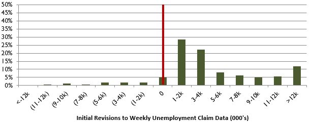
Source: Employment and Training Administration. For illustrative purposes only.
What you’re seeing here is the percentage of weekly reports that showed an error in the original reporting versus the initial revisions posted one week later (there are then final revisions posted two or more weeks later). The bars to the right of the red line are positive revisions, meaning that the revised reports showed more people than originally reported filing for unemployment. In other words, the original report made a “good news!” mistake by under-reporting the true number of first-time unemployment claimants.
In a bias-free world, you would have errors equally on one the left side of the red line as on the right side of the red line, and they would form some sort of normal distribution (a bell curve) centered on that red line of zero revisions. Obviously enough, these revisions are anything but normally distributed. They are bizarrely and incontrovertibly skewed enormously to the “good news!” bias side of all this. I mean … I could give you p-tests and other calculations of statistical significance, but this picture is worth a thousand words. There is a greater chance that the sun will go nova tonight and destroy the Earth in a paroxysm of incinerating plasma than for these errors in initial jobless claims to be the work of chance alone.
And I know what you’re thinking, because I thought the same thing when I first compiled this data for a 2013 Epsilon Theory note (“Heeeere Comes Lucky!”). Maybe these reports have always been so jaded, so wrong, so cartoonish in their bias. But no.
Here’s the histogram of the errors made in the reporting of weekly unemployment claims during the Bush Administration from September 30, 2005 through the November 2008 election. Same time frame, same number of observations. Totally different pattern.
Frequency Distribution of Weekly Unemployment Data Reporting Errors
September 30, 2005 – November 2008 Election (n=163)
Source: Employment and Training Administration. For illustrative purposes only.
There are a few weeks with slight over-reporting of unemployment claims and a few more weeks of more pronounced under-reporting of unemployment claims, but by and large this is a picture of a reasonably accurate and only slightly biased data report. Compared to the same time period in the first Obama term, there is no comparison.
Here are the aggregate numbers that underpin these graphs.
In the first Obama term, original Labor Department reports understated initial jobless claims by 858,000 people relative to initial revisions. Compared to final revisions, the original estimates look even worse, understating jobless claims by 884,000.
In the second Bush term, original Labor Department reports understated jobless claims by 292,000 relative to initial revisions. Compared to final revisions, the original Bush-era reports understated jobless claims by only 5,000 people.
Were there more initial jobless claims in the Obama time period than in the Bush time period? Yes, but only approximately 25% more. The total errors versus initial revisions, on the other hand, increased almost 300% over the comparable time periods, the total errors versus final revisions increased more than 18,000% over the comparable time periods, and the skew towards under-reporting actual claims (not just the number of wrongly reported claims but the degree of wrongness) is even more pronounced.
These are the facts.
So I want to be very careful in what I say next.
What I am NOT saying is that there was a conscious conspiracy to skew the employment Narrative of the real economy in a good news direction. The reported abstraction of initial unemployment claims is constructed from a compilation of abstractions from each individual state, and in the disarray of state government post-Great Financial Crisis, no doubt these first level abstractions were chronically late and poorly estimated, requiring significant revisions in subsequent weeks.
What I AM saying is that this systematic error was clearly visible and known to the BLS, which is staffed with very smart people, and they could have fixed it if they had wanted to. The BLS adjusts raw data all the time, and there are obvious statistical adjustments that could be applied to this obvious systematic error. But the BLS chose not to fix it, or rather they chose to allow the Employment and Training Adminstration to continue making these egregious errors.
Until after the election.
On September 12, 2013, reported weekly unemployment claims were shockingly low — only 292,000 Americans had filed for initial unemployment benefits in the prior week, the lowest number in more than seven years and a decline of more than 30,000 applicants from the prior week. Huzzah! This economy is finally starting to hum! As it turns out, however, the low number was because neither Nevada nor California had filed their data with the Labor Department on time. As it further turns out, the Employment and Training Administration knew that the number was way off for this reason, but published it anyway without explanation. As it further turns out, the Labor Department informed a few reporters of the mistake in an embargoed fashion, which meant that the “news” of the embedded error in the filing was dribbled out by private news agencies after the official release.
The problem with all this for the Labor Department wasn’t the ridiculous process that drove a ridiculous error. After all, this had been the practice for years. The problem for the Labor Department was that their act of theater was now publicly revealed as an act of theater. The multi-level data abstraction was revealed as a constructed cartoon. So the Labor Department asked Keith Hall, a former BLS commissioner, and “several” unnamed economists (i.e., current BLS commissioners) to tell the Wall Street Journal that the methodology and bureaucratic oversight of the Employment and Training Adminstration had to be improved. And it was. I guess.
The kicker, of course, is that this cartoon Narrative regarding real-world employment patterns had a significant impact on the 2012 election. That’s not my view. That’s the view of Obama’s Chief Strategist for both Presidential campaigns, David Axelrod. Take a look at what says about the unemployment rate in a panel discussion organized by his Institute of Politics: Campaign Strategists: 2012 Explained. It’s a long video, but for anyone interested in U.S. politics it’s a must-see. Why did Obama win in November? Because the unemployment rate went down in the months leading up to the election. The economy got better, as evidenced and interpreted by the unemployment rate, and that swung a lot of undecided voters. Per David Axelrod, that’s what won the election.
Now did the weekly initial claims data play a big role in shaping that cartoon interpretation of the U.S. economy going into the November 2012 elections? I dunno. This particular act of theater was more widely distributed on CNBC than on CNN, so it didn’t get the sort of audience of, say, the unemployment “number” itself. But it wasn’t useless, either.
Let’s just say that I think a lot of people owe Jack Welch an apology.
To be clear, this is neither a Democrat nor Republican thing. It’s an us thing.
I mean … “emails”? Are you freakin’ kidding me? Cartoons aren’t just created to mobilize positive sentiment and supportive social behaviors (although that’s pretty much all we see in capital markets, because it’s a positive-sum game, not zero-sum like politics). The negative cartoon-ification of Hillary Clinton was both the most vicious and the most effective gambit in the last 100 years of American politics. To be sure, The Clintons™ brought soooo much of this on themselves. If there’s ever been a political candidate more ripe to be transformed into a negative cartoon than Hillary Clinton, I am unaware of who that might be. But where Donald Trump embraces and actively creates his obvious cartoonishness, Hillary Clinton had her cartoon imposed on her unwillingly, to disastrous result. Today’s key to political and economic success is controlling your own cartoon. Yes, this is why Trump won.
Once you start looking for these cartoons, you will see them EVERYWHERE.
It’s not a Karl Marx world of alienation. It’s a Groucho Marx world of alienation.
So where does this end?
You hear a lot of people talk about an inevitable Minsky Moment, where financial system instability is revealed in an Emperor’s New Clothes instant, and the whole central bank-led house of cards comes tumbling down. I’m a big fan of Hyman Minsky, but I don’t believe that a Minsky Moment is nigh, for the most part because Minsky saw central banks as the solution to financial instability, not the cause. I wrote about my views on the Minsky Moment here, back in 2014.
But I do think we are close to what I want to call an Icarus Moment.
The myth of Icarus is one of the Old Stories, meaning that its narrative power spans geography, culture and time. The Greeks alone had at least two Icarus narratives, both the younger myth that we all know and the older myth of Phaeton driving the chariot of the sun to his death.
What is an Icarus Moment?
It’s the price we pay for our hubris in modeling Nature past the point where our human brains and human bodies can handle the strain of our application of those models. It’s our forfeit for daring to frame the fearful symmetry of a jungle cat. It’s flying too close to the sun. It’s the destructive consequences of overweening pride in our pursuit of greater and greater abstraction that drives greater and greater alienation at greater and greater scale.
An Icarus Moment is a Fall.
It’s the Fall of Rome and the Fall of Troy. It’s the Fall of Man. It’s the Fall of the Mississippi Company and the South Sea Company. It’s the Fall of Enron and the Fall of Corzine. It’s the Fall of Residential Mortgage-Backed Securities. It’s the Fall of every too-clever-by-half coyote in the history of man, both in politics and in markets.
It’s the Fall of Donald Trump. It’s the Fall of Bitcoin. It’s the Fall of the Euro. It’s the Fall of Pax Americana. It’s the Fall of Central Bank Omnipotence. Hubristic conceits one and all, now operating as cartoons of their former selves.
Why do I think we’re near an Icarus Moment?
Three reasons.
First, it’s the overwhelming dominance of abstraction and symbolic representation in our social lives, in turn leading to bewildered and profound alienation.
Our politics are now completely consumed by trope and fiat news, such that our identities as Democrats or Republicans no longer have recognizable meaning. The Donald Trump cartoon of the Mad King? The Russia/China cartoon of the Foreign Peril? The Bezos/Gates/Buffett cartoon of the Oligarch? The Bitcoin/Silicon Valley cartoon of the New? The CNN/Fox/CNBC cartoon of the Circus? Tropes all, combined and recombined in engaging fashion as if written for a Hollywood script (which is itself a trope). Who we ARE as citizens and voters is no longer reflected in what we DO as citizens and voters, and that’s the very essence of alienation
Our markets are now completely consumed by factors and narratives, such that our identities as value investors or growth investors no longer have recognizable meaning. Value investing and growth investing, which have been the dominant ideologies of markets for the past 70 years or so, are no longer meaningful processes where research into individual real-world companies has any usefulness whatsoever. Instead, they have been abstracted into “factors”, into a modeled quality of a modeled quality of a real-world company. We no longer invest to own a fractional share of a corporation’s cash flows and opportunities (an individual stock). We no longer invest to own an abstraction of that fractional ownership share across multiple companies (an index). Today we invest to own an abstraction of a quality of the abstraction of fractional ownership shares across multiple companies (a factor). And even these factors are muted to the point of triviality by the algorithmically unpredictable shifts of the Three-Body Problem. My guess is that 80% of investment research and management jobs in the financial services sector add zero value today and will be gone in less than 20 years.
Second, it’s the return of hubris as the ancient Greeks conceived it, an aggressive pride where the strong delight in attempts to shame the weak. You see it constantly from our White House. You see it constantly on Twitter and throughout social media. You see it whenever rapacious, know-nothing narcissism is celebrated as leadership even as civility, expertise and service are mocked as cuckery. Which is to say you see it everywhere.
Pride goeth before destruction, and a haughty spirit before a Fall.
Yeah, I know I sound like a grumpy grandpa when I write something like this. Yeah, I know that this is a Bible quote. It’s also THE plot of every Greek tragedy. You think we’re wiser than Aeschylus, than Sophocles, than Euripides? You think we’re smarter than Socrates, than Plato, than Aristotle? You think our politicians have got anything on Cleon, on Alcibiades? Bollocks. This is the human condition, people! There is NOTHING new under the sun when it comes to human behavior, and this is how the story of aggressive pride ALWAYS ends. We’ve transformed Pride from the deadliest of the Seven Deadly Sins into the foremost of Virtues, particularly in our children and our celebrities, and that’s the biggest tragedy of any age.
Third, from a game theoretic perspective, we are transforming all of our cooperative games into competitive games. I’ve written about this in two Epsilon Theory notes — “The Silver Age of the Central Banker” and “Virtue Signaling, or … Why Clinton is in Trouble” — so I won’t repeat all that here. The basic idea, though, is that most games we play as a nation in the international arena or as political parties in the domestic arena have multiple equilibria, multiple balancing points that are as good as it gets for the players and where it is irrational to take actions that would break away from those balancing points. On two occasions — after the Revolutionary War for domestic games and after World War II for international games — political leaders in the United States established/enforced an equilibrium that is largely cooperative at the meta-game level (I’m using cooperative in the non-technical sense of the word), to the benefit of ALL players. What we are doing now is unilaterally and intentionally breaking those equilibrium positions — in both international and domestic games — to “drop down” to competitive equilibria where ALL players are worse off. Why? Because it makes for an effective political cartoon. We’re tough! We’re fighters! We’re winners! Again, bollocks.
But because these competitive equilibria are, in fact, equilibria, they stick. They stick until you have an enormously destructive event — an Icarus Moment — that breaks this equilibrium and creates “room” for a dominant player to reestablish the cooperative “regime”. Or not. Sometimes, as it was for Groucho, the Icarus Moment is an all-encompassing war. Sometimes, as it was for Karl, the Icarus Moment is a lot of medium-sized wars and domestic conflicts. Sometimes, as it was for Augustine, the Icarus Moment is a slow-motion dissipation of the City of Man, where the Oligarchs and the Generals hollowed out the greatest country in the world for a century in a long series of little Icarus Moments until some second-rate foreign power finally put out the lights in the West for a millennium.
So what do we do about all this?
As investors, I think we must take a profoundly agnostic perspective on capital markets. That means that we don’t trust anything we hear or read. That means we ask WHY we are being told something with as much or more attention as we ask WHAT we are being told. That means that we don’t trust our own biases. That means that we recognize our long-standing investment processes to identify value or growth as a bias, not as some eternal investment truth.
The bottom line here is that we all have to make the same alienated decision as Neb Tnuh. Recognizing that we are being played, do we embrace the game-playing and focus on the Narrative ebbs and flows for our investment decisions? Or do we push away from the casino table that our doubly and triply abstracted markets have become, in favor of securities that are at least closer to real-world economic activities? We can’t isolate ourselves from abstracted markets and an Icarus Moment. But we can insulate ourselves. Exactly two years ago I wrote a long note on exactly this, called “Hobson’s Choice”. It’s held up pretty well, I think.
Oh yeah, one more thing. When an Icarus Moment happens, you want to be long volatility.
As citizens, I think our actions depend on where we are in life. For me, now in the autumn of life (early autumn, one hopes!), it’s a matter of reconnecting to the real world of real people and real animals. It’s a matter of repairing the damage — and it IS damage — that alienation creates. That’s why I have a farm. That’s why I write Epsilon Theory. It’s therapy.
More broadly, though, here’s the principle I want to live by: don’t be Daedalus.
Don’t become so consumed with your own powers of abstraction and ability to create weapons and labyrinths that you end up in a prison yourself. Don’t be the guy who straps those wings onto Icarus and sees his son fall to his death. The game ain’t worth the candle.
Or in terms of a recent note: don’t be a coyote who ignores the meta-game.
For my children, for anyone in the spring and summer of life, it’s a different principle: don’t be Icarus.
Don’t confuse a knowledge of Science and its languages of abstraction for wisdom. Wisdom comes from an ability to think critically about abstraction and its uses and misuses for political and economic power. Anyone can learn a language, like mathematics. Anyone can apply that language to abstracted questions of social behavior, like economics. Everyone is so focused on STEM. Everyone is tripping over themselves to hire physicists or math majors. Not me. I want to hire comparative literature majors. I want to hire history majors. Why? Because it’s training in how to think about the WHY and not just the WHAT; because it’s training in the universal language of symbolic representation, which is words and story, not math.
Or in terms of a recent note: don’t believe the coyote-math.
Long volatility and short abstraction
That’s my algorithm for living in the Cartoon Age, both as an investor and as a citizen.
It’s a lonely perch, because it doesn’t scale. You’ll never get rich and you’ll never get elected President being long volatility and short abstraction. But it’s real. It’s my personal equilibrium.
Everyone sees a hawk and wishes they could fly. But that’s not the hawk’s great secret.
The great secret is living such that Being and Doing are as one.
And we can all do that.
Article by W. Ben Hunt, Ph.D. - Salient Partners