Original article at UPFINA
We’ve discussed the meaning of the 10 year bond yield at length in a couple articles. For almost this entire bull market, the point that low yields are causing stocks to go up has been repeated endlessly. That call didn’t matter much when yields were going down because it simply implied investors should ride the wave. However, when yields started to rise, it created a controversy as some investors went bearish. The market correction in February was used to support this logic. It’s a major call to say rising yields will cause stocks to fall because yields have been rising steadily on increased growth and inflation expectations. It’s the equivalent of saying the bull run is over because the economy has gotten ‘too hot.’

We showed analysis which reported that the average market usually starts to get negatively impacted by rates when the 10 year yield hits 5%. Then we showed how sensitivity analysis pushed the magic number down to 3.5%. Next, we made the realization that the bond market has been in a few regimes so it’s wrong to average out each situation. Sometimes rising yields are bad and other times they aren’t. This long trek to find the true meaning of the 10 year bond yield has led us to the most important analytical chart in macroeconomics and finance. While data is cheaper than ever, some charts still go above the call of duty by providing analysis which makes them unique. The chart below is a thing of beauty.
Higher Yields Shouldn’t Be A Death Knell For Stocks
The Market’s Sensitivity To Yields Depends On Economic Growth
The chart shows how sensitive the P/E multiple is to rising yields. As we know, the 10 year yield has had different effects on multiples throughout history. This chart graphs the sensitivity of the stock market to the 10 year yield by looking at a few GDP growth regimes. The sensitivity depends on how fast the economy is growing. As you can see, there are curves which show each GDP growth regime’s sensitivity to rates.
Intuitively, this chart makes sense. When real GDP growth is low, real rates should be low. If real rates are low, but the treasury yield is high, it means there’s inflation. Low growth and high inflation is stagflation, which is terrible. That’s why the grey blue dotted line immediately falls. The higher GDP growth gets, the higher the 10 year bond yield’s sweet spot. That’s because real rates rise with growth. Very high yields would only be good with very high growth. High GDP growth and low treasury yields are a situation which is theoretical because there has never been a period where the 10 year bond yield was 1.5% and the economy was growing at 4%. That would happen in a deflationary situation because real yields should be higher than 1.5%.
This economic expansion has seen 5 years with GDP growth of 2-3% and 3 years of 1-2% growth. Since the economy is expected to be boosted by the tax cut, we’ll look at the 2%-3% growth line. It shows that historically the best 10 year treasury yield is 4.9%. It shows that rising yields are a good thing since the 10 year yield is currently below 3%. For the current GDP growth and yield environment, the stock market is expensive based on 2018 estimates. It’s fairly valued based on 2019 estimates. This chart shows that the worries about the 10 year bond yield in early February were overdone.
The Chart Of Doom
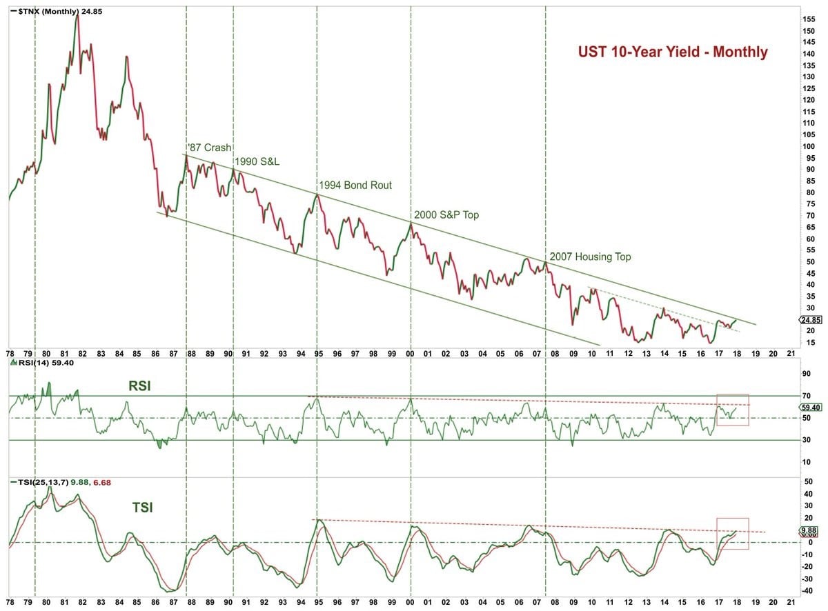
The chart below is one of the main reasons why investors began to believe that the 10 year bond yield was causing stocks to fall.
Long Term Downtrend In The 10 Year Bond Yield Is Being Tested
As you can see, the chart above shows the multi-decade long down trend in the 10 year bond yield. The chart has labels for when the 10 year bond yield tested the top end of the channel. Each label is an economic crisis. This implies that the economy is about to be in an economic crisis since the top of the channel was touched in 2018. This is poor analysis. Firstly, if you look closely, there are two examples where it touches the top end without a problem. There’s one in 2006 and one in 1989. Just because economic growth peaked at previous points where the top end of the channel was hit, doesn’t mean this cycle is over. It would be a positive for the 10 year bond to break out of this channel and form a new sideways trend because the current downtrend implies negative rates in the next cycle and eventually a situation where rates are never positive again.
TINA Trade That Wasn’t
Another reason why investors are worried about rising yields is the belief in the TINA trade. This means stocks are being supported by investors having no alternative because bond yields are so low. We disagree with this notion because bond investors and stock investors have different risk profiles. That being said, there are some sectors like utilities which get hurt by higher rates. Utilities have been hurt in the first two months of 2018. These stocks act like bonds.
The chart below shows the historical percentage of stocks with a higher dividend yield than the 10 year bond yield.
Rising Yields Mean Less Firms’ Dividends Have Higher Yields Than the 10 Year Bond
This was the first cycle with a lot of companies having dividends higher than the 10 year bond yield. If the low yields are the only thing holding stocks up, then how come the 1990s had very few firms with higher dividend yields than the 10 year yield, yet stocks were the most expensive ever? There have been a few years in this cycle where multiples were higher than the curve in the chart above. However, throughout history, low yields haven’t justified expensive valuations. Therefore, based on the above relationship and historical comparison, increasing yields, which is only one variable in the complex system of economics, do not suggest that stocks would immediately fall. Through the journey of questioning the narrative on the relationship between stocks and bonds, we have come across a great reference point chart which shows that when yields rise above 3%, all hell won’t break loose.
Disclaimer: Before making any investment decision you must read and accept our full disclaimer at www.upfina.com/disclaimer


