Every family has its own holiday traditions; my family is no exception. One memorable Easter stands out.
My brother and I awoke quite early and raced to the living room to see what the Easter Bunny had left in our baskets (cavities, natch), and as the morning progressed, we started our annual Easter egg hunt. My parents excelled at hiding eggs to the point that no one could locate the final egg.
As you can imagine, eight-year-old Pat Reilly found this hilarious. Mom blamed Dad, Dad blamed the dog, but all for naught. The last egg had disappeared…but by the end of the week its stench had become unbearable! What had started out so well and progressed to everyone’s satisfaction eventually unwound in a pastel-colored mess.
The beginning of 2018 parallels this episode, at least from a fixed income perspective.
If that seems like a stretch, follow my thought process.
Something Stinks…
We awoke in 2018 with the bond market generally functioning normally, doing its supply-demand risk pricing thing. Rates backed up in January, but it wasn’t particularly noteworthy, until that singular inflationary data point on wages in the January U.S. jobs report ignited a firestorm of volatility and portended the end of the 35-year-old bull market in bonds (again).
Okay, it’s still a reach. But given the Easter season, cut me some slack.
How do fixed income investors apply this to the remainder of 2018? Effectively we want to find the rotten eggs before they start to stink up our portfolios. First, we want to close the feedback loop to understand drivers of total return. Second, we want to gain perspective on the current relative value outlook. Finally, we want to expand our analysis to other G8 markets, emerging market debt, and inflation-linked securities.
Closing the Feedback Loop
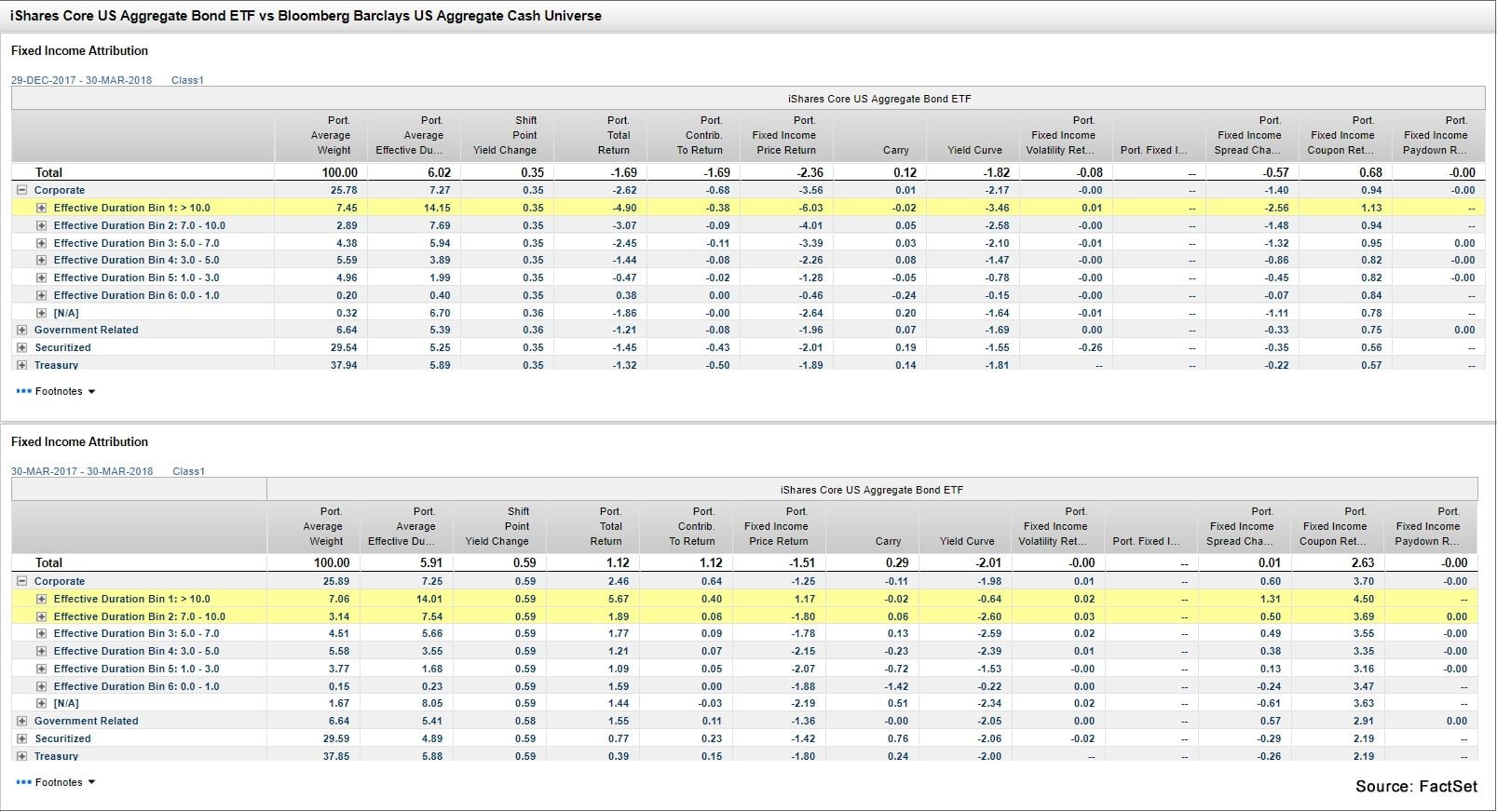
I used FactSet’s fixed income return attribution model to decompose the total return of the iShares Core US Aggregate Bond ETF (AGG-USA) over the first quarter and the past 12 months (Figure 1). I extended the model from the basic Price, Coupon, and Paydown returns to explore the impact of Carry, Yield Curve, and Spread. It should come as no surprise that this curve was a primary contributor to the downside given the rising rate environment, representing 182 and 201 bps of value lost during the quarter and year, respectively.
It is critical to understand the impact of the passage of time compared to the pace of rate increases. Looking at the first quarter, we would identify long duration bonds as the rotten egg in this portfolio (down 4.90% - yikes!). By taking a longer-term view, we see that the belly of the curve felt more pain relative to long bonds. This can be seen in the full year total return and yield curve components of the attribution.
Coupon and Carry returns mitigated these losses, most noticeably over the full year, where they contributed a combined 292 bps to total return. This long-run impact is a primary tenant of why I am not particularly fearful of the Fed’s current normalization approach.
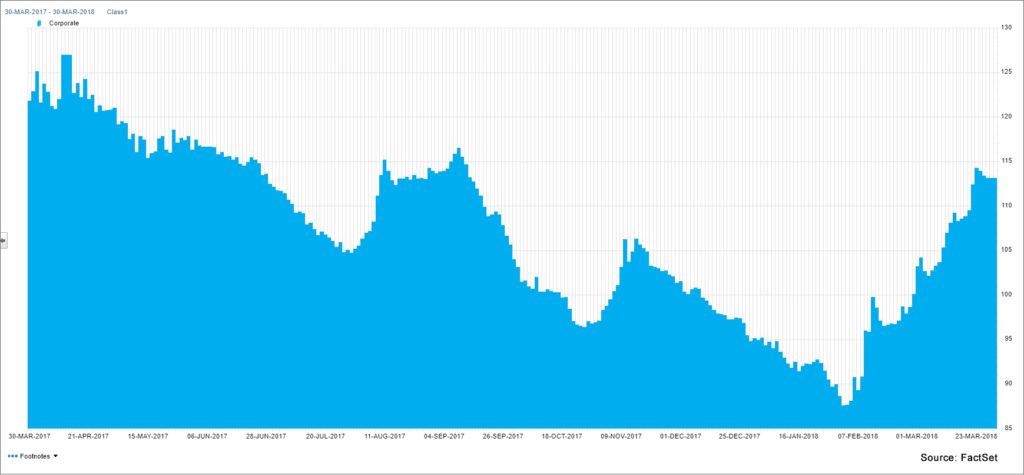
Another interesting observation is the divergence seen in Spread returns in each period. During Q1, spread widening stole 57 bps in a mark-to-market environment. However, over the past 12 months, spreads continued to tighten, especially in corporate debt, where spread moves accounted for 60 bps of alpha (Figure 2).
Our previous research indicates that spreads remain historically tight across the credit spectrum. The question becomes “is anything attractive from a risk/reward perspective or is credit a rotten egg overall?”
Relative Value
Typically, relative value is measured by comparing a spread (OAS, I-Spread, G-Spread, etc.) for a security vs. a population of similar term, rating, or sector/industry securities. Some may fit an industry or sector curve to conduct rich/cheap analysis.
More recently, duration times spread (DTS) has emerged as a popular approach to compare the proportionality inherent in term and credit structure (e.g. an investor should be indifferent between a bond with a spread duration of 2 and spread of 300 bps and one with a spread duration of 6 and spread of 100 bps because they exhibit the same DTS).
DTS is easy to explain and calculate. Fundamental analysis across issuers is still required, but it makes understanding the trade-offs in valuation (and avoiding potentially rotten eggs) more apparent.
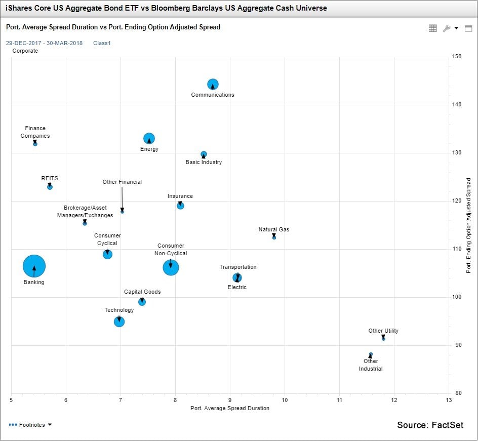
In Figure 3, I visualize DTS differently; spread duration is the X-axis, OAS is the Y-axis, and the size of the bubble is the average weight. We can see that across Corporates, all else equal, we can capture excess spread for a similar amount of spread risk by investing in Communications over Basic Industry. Likewise, we can capture excess spread with less spread risk by investing in Energy over Basic Industry. This is a great addition to the toolkit. It’s intuitive, draws on common measures, and updates dynamically.
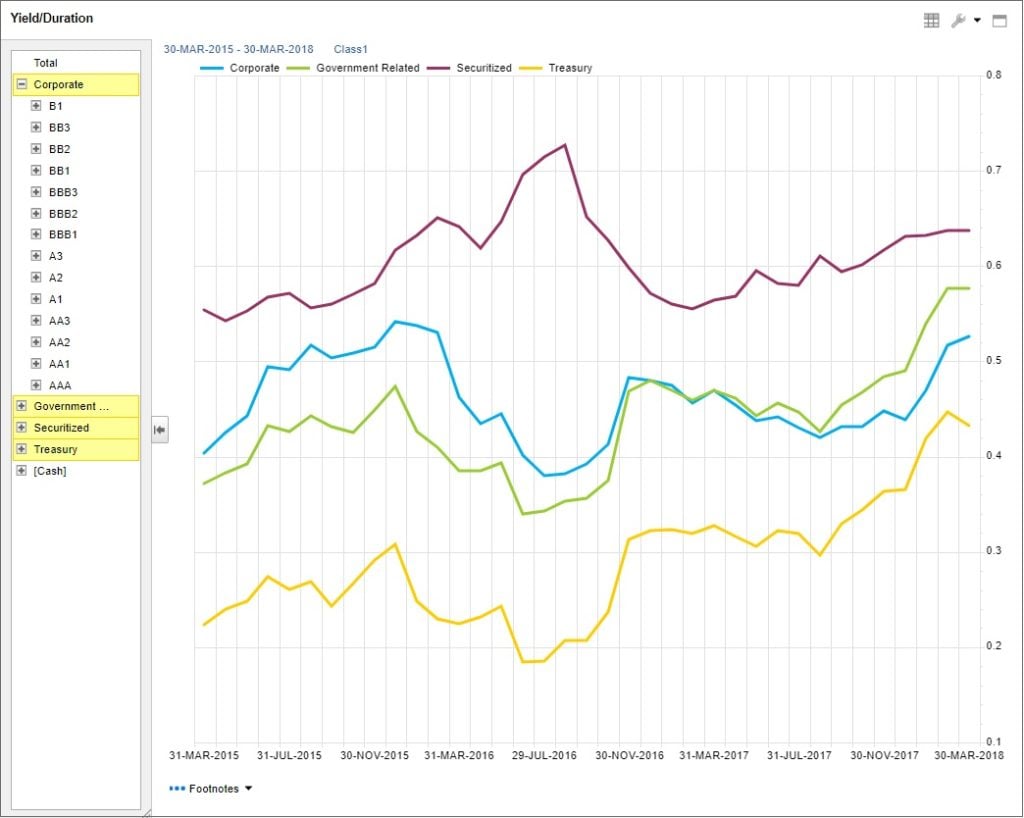
Another view of relative value from a risk-adjusted perspective is looking at YTW/Effective Duration, where we calculate option-adjusted units of income per units of interest rate risk. Figure 4 indicates that securitized assets appear to have compensated investors most attractively over the past three years; however, prepayment risk may indicate a rotten egg to some. Government related assets appear to be more attractive than broad corporate paper under this metric over the past year. That is not to say that there is no value in corporate bonds, but issuer analysis and security selection are key.
Where should U.S. fixed income investors look? It depends on your horizon. I see a Goldilocks scenario (not too hot, not too cold) continuing to unfold over the rest of 2018. One increase from the Fed is in the books, and communication around a desire for another two hikes fits with the speed and scope of the recovery.
The unwinding of the balance sheet seems to be occurring smoothly, inflation remains subdued (despite stirrings in wage data), and the leadership change at the Fed has been a non-event. Longer duration bonds should perform well over an intermediate horizon, but beware of short-term pain. One should also remain cognizant of spread normalization. Consumer cyclicals should continue to rally, while defensive or physical asset-heavy issuers will act as a cushion should volatility spike again. Against this backdrop it is also worth considering other G8 markets, emerging markets, or inflation-linked securities.
Of course, all of this could go sideways. The full impact of the U.S. tax bill is unknown, an infrastructure plan could yet evolve, and trade policy appears to be an experiment in chaos theory. These will impact market rates and risk appetite independent of FOMC action at some point.
Attractiveness of Other Markets
Much of the same could be said about other markets. The eurozone bull market continues to develop as incremental progress on Brexit seems to cancel out noise from Italian politics (for now). The ECB remains on schedule to wind down quantitative easing and move away from ZIRP. Inflation and real GDP support a risk-on environment. In the UK, a slight break in the latest monthly inflation numbers supports easing the pressure a bit, though a BOE hike is anticipated in May.
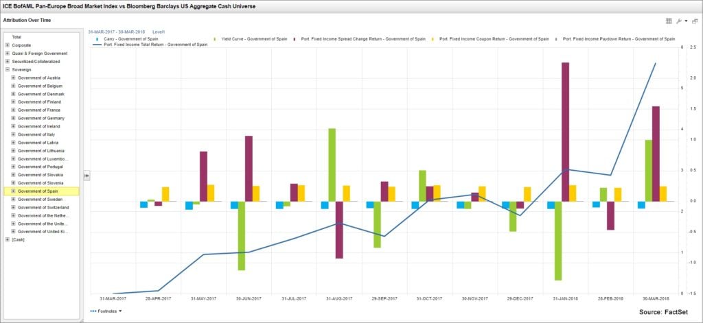
The first quarter and one-year horizon tell a similar attribution story to the U.S. in terms of curve impact, with significant spread tightening over both periods in Italian, Portuguese, and Spanish paper in the ICE BAML Pan-Europe Broad Market Index (Figure 5).
Emerging market corporates weathered the recent volatility splendidly, with hard currency bonds (CEMB-US) outperforming U.S. corporates by 99 bps in Q1 and the entire U.S. Aggregate by 218 bps over the past year (Figure 6). Rising rates stung EM government securities (EMB-US) in Q1, but the full year picture is similar to corporates. Local currency debt (LEMB-US) outperformed significantly over both time frames. In general, a weaker dollar buoys the case for inclusion for the foreseeable future while a higher yield remains attractive to investors. This is a diversification play at a minimum.
Finally, in teasing a future Insight article, let’s look at inflation-protected securities. Relative to the broader U.S. market, TIPS will outperform in a hawkish environment and underperform in a dovish environment. The attractiveness of these securities lies not in the coupon or duration exposure, but in the principal or coupon uptick earned when inflation spikes.
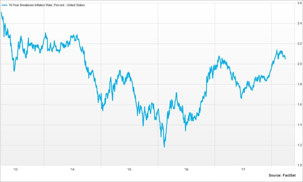
The breakeven rates (the difference between the yield of a nominal bond and an inflation-linked bond of the same maturity) for the U.S. 10-year is currently 2.05% and has been trending up since bottoming out in February 2016 (Figure 7). If your thesis and analysis support a rate of inflation higher than that in the long run, TIPS would be a great diversification play that helps your portfolio avoid the loss of purchasing power over time, which is the rottenest egg of all.
Wrapping up this outlook, I hope that connecting the dots via performance attribution, relative value analysis, and exploring markets outside of U.S. core fixed income provide you with additional tools and perspectives in your hunt for the Easter egg that is alpha.
Article by Pat Reilly, FactSet

