
The best state pension plan is only 42% funded
March 4, 2016
was in Florida this week attending the 32nd Annual Chicago Board of Options Exchange (CBOE) Risk Management Conference. Attendees were mostly asset managers and larger pension and endowment managers. Several comments stood out to me; particularly the one above from Paul R.T. Johnson, Jr., Board Member of the State University Retirement System. “42% funded?” He added that the good news is that his is the most funded of all the states. Yikes.
The state government will need roughly $131 billion to cover benefits already earned by public workers, with only $46 billion in expected assets to cover the costs, or about 35 cents on the dollar. The other $85 billion represents the unfunded liability, an obligation the state must meet but for which no funding source exists. (Analysis by Charles N. Wheeler III.)
42% or 35% — whatever. Pension systems here and there are a mess. We’ll be hearing more like this in the coming few years. Indeed, “hole” is hardly an appropriate word. “Abyss” and “chasm” come readily to mind, with “bottomless pit” not too far away,” adds Mr. Wheeler.
Our elected officials will be after us for more taxes and the money the monthly pension recipients were promised will be cut. The fact that they are incapable of managing the country, no less the economy, seems to be coming to a head. Not to run down a pension trap rabbit hole here today, let’s just keep this issue on our radar.
One of my favorite sessions was the panel that included Johnson and investment leadership from the State of Wisconsin Investment Board, Texas Tech University System and the Employees Retirement System of Texas. The panel was moderated by Neil Rue, CFA and Managing Director of Pension Consulting Alliance, LLC. Super smart.
The largest pensions and endowments are getting into trading options. As Mr. Rue puts it, he is trying to get them from their current place to a better place (downside risk mitigation). He suggests the need to commit 10% to 20% of a portfolio or the hedging will provide little help. He recommends to his clients one-half of an equity portfolio using covered calls and put protection. Mr. Rue’s firm consults on $5 billion plus plans.
This is good news for their increased participation makes for tighter markets and greater liquidity. Following are several other notable quotes:
- “When you reduce both your wins and losses, the power of compounding makes you more money.” Ari Paul, CFA, Portfolio Manager, The University of Chicago, Office of Investments.
- “Many endowments sold equity exposure at the worst time, whether out of fear, solvency concerns or liquidity needs.” Ari Paul
- “Tail risk hedging helps you make better long-term decisions…helps you control behavior and keep your head in the game.” Ari Paul
- “Downside hurts much more than upside might give benefit…clients get this.” Neil Rue, CFA, Managing Director, Pension Consulting Alliance, LLC
- “Nothing like a 50% drawdown in the market to get people to change their minds.” Neil Rue
- “Options add value, implementation is the key.” Mike Nichols, CAIA, Investment Officer, Texas Tech University System.
- “You want to be mentally right to play your “A” game when the moment is right.” Ari Paul
I’m thinking I’m really starting to like these guys. The tools exist. I share one of my strategies and a few concluding thoughts below.
Let’s take a look at the February month-end valuations. I’m often asked about valuations relative to inflation and interest rates. To answer this question, I include several interesting charts. Bottom line is that the market remains overvalued despite current low inflation and low interest rates. As the great Art Cashin says, “Stick With the Drill – Stay Wary, Alert and Very, Very Nimble.” Grab a coffee and jump on in.
? If you are not signed up to receive my weekly On My Radar e-newsletter, you can subscribe here. ?
Included in this week’s On My Radar:
- Valuations, Inflation and Interest Rates
- Recession Watch – High Global Recession Probability, Low U.S. Recession Risk
- Several Takeaways From the CBOE Risk Management Conference
- Trade Signals – Aggressive Rally, Now What? – Posted 3-2-16
Valuations, Inflation and Interest Rates
Median P/E
My favorite valuation indicator has long been the Median price to earnings ratio or P/E. The P/E Ratio is the measure of the share price relative to the annual net income earned per share outstanding. It can be measured by looking at a specific company such as Apple (“AAPL”) or by looking at a particular index like the S&P 500® Index.
The Median P/E is the one for which exactly half of all the stocks have higher ratios and half have lower. The P/E is the most commonly used stock valuation ratio. It allows investors to quickly gauge the valuation of a company based on its current reported earnings.
By focusing on the S&P 500® Index’s Median P/E, we can be assured that the valuation metric is not being skewed by individual outliers, such as may occur with one-time write-offs or other accounting maneuvers. The next chart is from Ned Davis Research (NDR), which takes the S&P 500® Index’s Median P/E Ratio based on trailing 12-month earnings.
I favor actual reported earnings over Wall Street’s forward estimates. The top red arrow suggests a point at which the S&P 500® Index (commonly referred to as “the market”) is overvalued. The blue arrow suggests fair value and the green arrow undervalued. I see this as the upside and downside ranges.
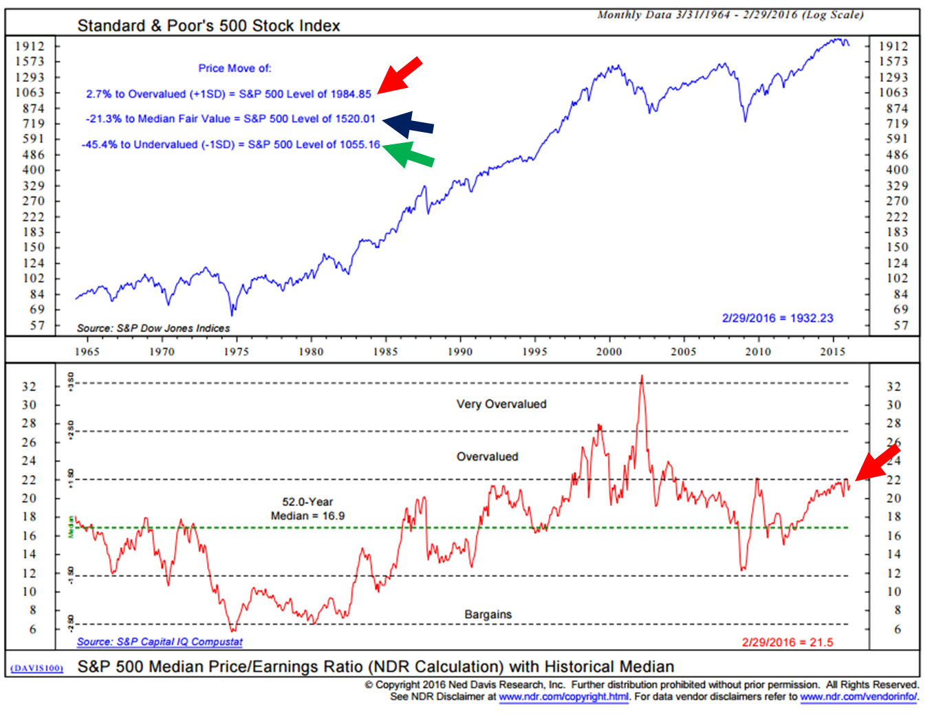
Look at the history since 1965, the only time the market moved more than 1 standard deviation was around the tech bubble period in the late 1990s and early 2000s (standard deviation is a measure of the dispersion of a set of data from its mean. The more spread apart the data, the higher the deviation.). Simply, it is not normal for stocks to travel too far away from its long-term valuation trend.
So, by this measure, the update is capped at 1984, fair value is suggested at 1520 (that’s when we want to get more aggressive on equities) and extremely attractive valuations are suggested at 1055.
Longtime readers will note that this range has come down over the recent months. The reason is that earnings have been coming down due in large part to serious issues in the energy sector (lower earnings).
Several months ago, I created the following chart for The Wall Street Journal. The point made was that Median P/E can tell us a lot about what the forward 10-year market returns are likely to be. Your starting point matters:

When your starting Median P/E was high (red arrows on left in chart above), your subsequent 10-year annualized returns were low (red arrows on the right). At the end of November 2015, Median P/E was 22.2. It is 21.5 as of the end of February 2016.
Look, 75% of the investable money will be self-directed by retirees and pre-retirees within four years. We are aging, folks. Can that money afford negative to low single-digit returns over the next ten years? Can pension plans, significantly underfunded, expect to return the 7%-8% bogey their actuaries have set? If they are intending to overweight to equity (absent hedges) and find income exposure (at today’s ultra-low yield), the math just doesn’t line up.
If we take all of the month-end Median P/Es since 1926 and ranked them into five groups that range from the cheapest priced to most expensively priced and looked at what happened to the equity returns ten years later, it looks like this:
We are in the highest quintile today, suggesting a probable return of 4.3%. Play defense and wait for a better opportunity to present. A 50% correction puts the S&P 500® Index at 1000 (it is at 2000 today). I’m not saying that is going to happen but, in recession, it could.
I’m going to start to get more interested in the market at 1500. I do believe in the long-term investment and innovative abilities of our publicly traded companies. I just like them much better when I’m buying them at a fair price.
Warren Buffett’s Favorite Valuation Measure
We can look at price to book, price to sales, versus profit margins, etc. or even Warren Buffett’s favorite Stock Market Cap as a Percent of GDP. Note as overvalued today as it was in 2007 (but clearly now down from it’s 5/31/2015 valuation high). They all show the same thing – the market is richly priced.
Average of Four Valuation Indicators
Source: dshort — Adviser Perspectives
P/E, Low Interest Rates and Low Inflation
The following is by Jill Mislinski via http://www.advisorperspectives.com/dshort/updates/Market-Valuation-Inflation-and-10-Year-Yields.php
In the months following the Great Financial Crisis we have essentially been in “uncharted” territory. Never in history have we had 20+ P/E10 ratios with yields below 2.5%. The latest monthly average of daily closes on the 10-year yield is at 1.78%, which is 25 bps higher than its all-time monthly average low of 1.53% in July 2012.
The closest we ever came to this in US history was a seven-month period from October 1936 to April 1937. During that timeframe the 10-year yield averaged 2.67%. How did the market fare? The S&P Composite hit an interim high (based on monthly averages of daily closes) in February 1937. The index plunged 44.9% over the next 15 months.
If we look to the Dow daily closes during that period, the index hit an interim high on March 3, 1937 and fell 49.1% to an interim trough on March 31, 1938 — 13 months later.
What can we conclude? We have been in “uncharted” territory. Despite the end of QE, many analysts assume that Fed intervention through its Zero Interest Rate Policy (ZIRP), will keep yields in the basement for a prolonged period, thus continuing to promote a risk-on skew to investment strategies despite weak fundamentals.
On the other hand, we could see a negative market reaction to a growing sense that Fed intervention may have its downside, resulting in an aberrant bond market and increased inflation/deflation risk.”
Let’s not forget that we are living in very unusual times.
Ok – put your quant goober goggles back on. Next is a look at P/E and Inflation.
“The inflation “sweet spot,” the range that has supported the highest valuations, is approximately between 1.4% and 3%. See, for example, the highlighted extreme valuations associated with the Tech Bubble arbitrarily as a P/E10 of 30 and higher. The chronology of the orange “bubble” on the chart is a clockwise loop of 56 months starting at the 6 o’clock position.
The P/E10 was 31.3 and the annual inflation rate for that month, June 1997, was 2.30%. The average inflation rate for the loop was 2.41%. The P/E10 peak of 44.2 in December 1999 was accompanied by a 2.68% annual inflation rate. Two months later the inflation rate topped 3% at 3.22%. The right side of the loop shows what happened thereafter. The ratio slipped below 30 for two months (the tail at the bottom of the loop) before its final three-month swan song in the 30+ range.
The latest P/E10 valuation is 24.0 at a 1.10% year-over-year inflation rate, which is below the sweet spot mentioned above.
And speaking of that 30 threshold for the P/E10, prior to the Tech Bubble, only two months in history had a ratio above 30: They were 31.5 and 32.6 in August and September of 1929, just before the Crash of 1929. Research estimates put the annual inflation rate during those two months at 1.17% and 0.00% (zero).”
Recession Watch Indicators
U.S. – Low Recession Risk
The problem with recessions is that the stock market’s worst declines come during recession (think -30%, -40%, -50% or more). Thus, we need to find a way to predict them as best we can in advance so that we don’t get run over.
The challenge with predicting what is going on in the economy is that we can always point to good news and find some bad news. Businesses stand on the economic front lines, so the price behavior of stocks can be a good signal about what may be happening in the economy. Therefore, equity price behavior serves as a relatively reliable leading economic indicator.
NDR did a study dating back to 1948. It found that the economy is in a period of expansion when the market is up more than 3.6% from its five-month smoothed trend line (moving average) and that the economy is in a period of contraction when the market finished the month more than -4.8% below its five-month smoothed trend line. Here’s the data:
- There have been 11 recessions since 1948.
- This process has identified nine of 11, missing the recessions in 1953 and 1961.
- Sometimes it signaled a month or so in advance and several times a month or so after recession started.
- Not perfect but 79% of its signals have proven correct.
As of the end of February 2016, no sign of U.S. recession. The S&P 500® Index closed the month just 2.4% below its smoothing.
Overall, I see the consumer is in pretty good shape, jobs and wages have been rising and energy costs are down. But debt was excessive in 2007 and a drag on growth prior to the Great Financial Crisis. Government debt alone has grown more than $9 trillion since then.
I believe excessive debt here and abroad and low to negative rates in much of the developed world is a drag on growth. And the expansion, goosed along by zero rates and QE, is aged and limping along.
Finally, we tend to get one or two recessions per decade. The last was in 2008/09. We are due.
Global Recession – High Recession Risk
The rest of the world is in weaker shape. The Baltic Dry Index has hit a new all-time low. Most directly, the index measures the demand for shipping capacity versus the supply of dry bulk carriers. The demand for shipping varies with the amount of cargo that is being traded or moved in various markets (supply and demand).
Baltic Dry Index (“BDIY:IND”) – From Bloomberg – last five years:
Global QE and NIRP to ZIRP anybody, Bueller, anybody???
Here is a longer view – middle clip next chart.
Source: NDR
Global trade has weakened! I know, I know, it is the commodity bear market driven by China’s post ghost city building phase and the energy oil glut, etc. etc. etc. But there are large paying jobs lost, expensive projects suspended… The global economy has a bad case of the Baltic flu. Let’s hope the U.S. doesn’t catch it next… We’ll continue to read the tea leaves.
We only know recessions in hindsight. I like to take a look at NDR’s Global Recession Probability Model each month. Right now, it is signaling a high probability of global recession.
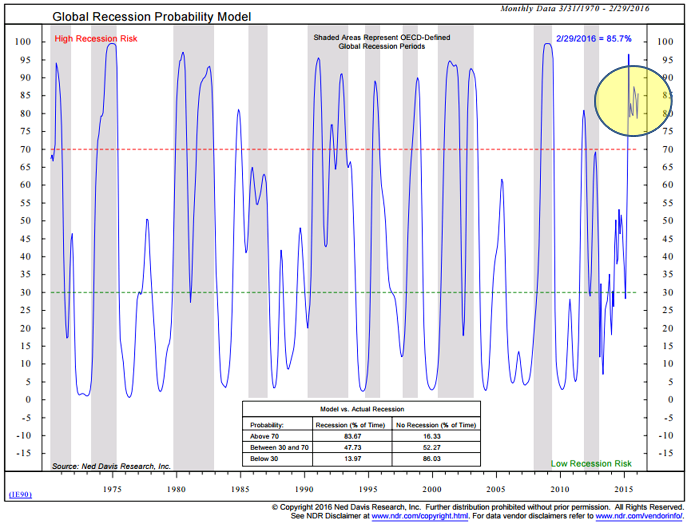
In the “what you can do” category: Consider hedging those EFA and EEM positions. Short or buy out-of-the-money puts on emerging markets via ETF puts such as Mexico (“EWW”), Brazil (“WEZ”) and Taiwan (“EWT”). I believe the next crisis is in European Sovereign debt. Global recession doesn’t help the European banks. They are extremely leveraged and we may be seeing the first cracks appearing. The pain seen Barclays and Deutsche Bank stocks has not gone unnoticed. There is a European Financial ETF (“EUFN”) that has put options. Not a specific recommendation for you. Speak to your financial advisor and never write naked put or call options.
Once again, as the great Art Cashin’s says each day, “Stick with the drill – stay wary, alert and very, very nimble.” If you are not reading his daily post, send me an email and I’ll forward to him to have you added to his list.
Trade Signals –


