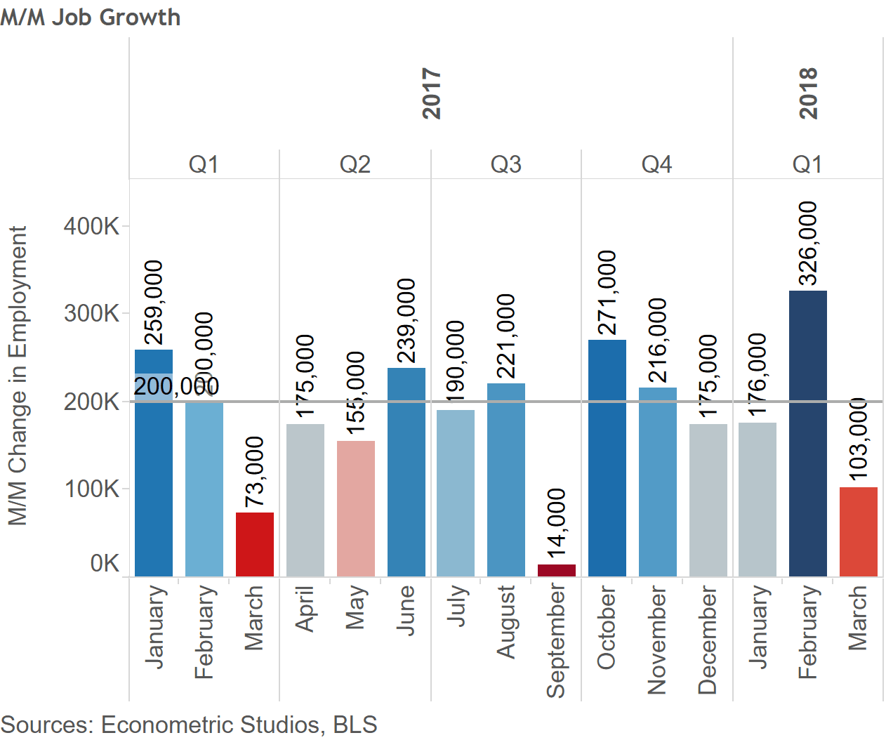
It’s jobs week. And this week’s jobs figure and unemployment rate stat could move the markets more than most. The market expects the month-over-month jobs figure to come in at 193k, a rebound from the weak 103k in March.
Should April’s figure come in weaker than expected, markets may actually take this as a negative signal. To some market observers, a weak report may even be a welcomed reversal from the “bad news is good news” mantra that we’ve been hearing for a long time now. Of course, too strong of a figure – above 250k, may send the markets sharply south.
Although the jobs figure will likely catch the lion’s share of market participants’ attention, perhaps more important will be the wage figure.
March’s wage growth figure came in at 2.42 percent year-over-year growth. This figure is decent, although nowhere near the boom year figures of above 4 percent in 1998, 2000, and 2006 through 2008.
The lack of a real strong boom in wages begs the question:
Is wage growth weak or strong during this expansion?
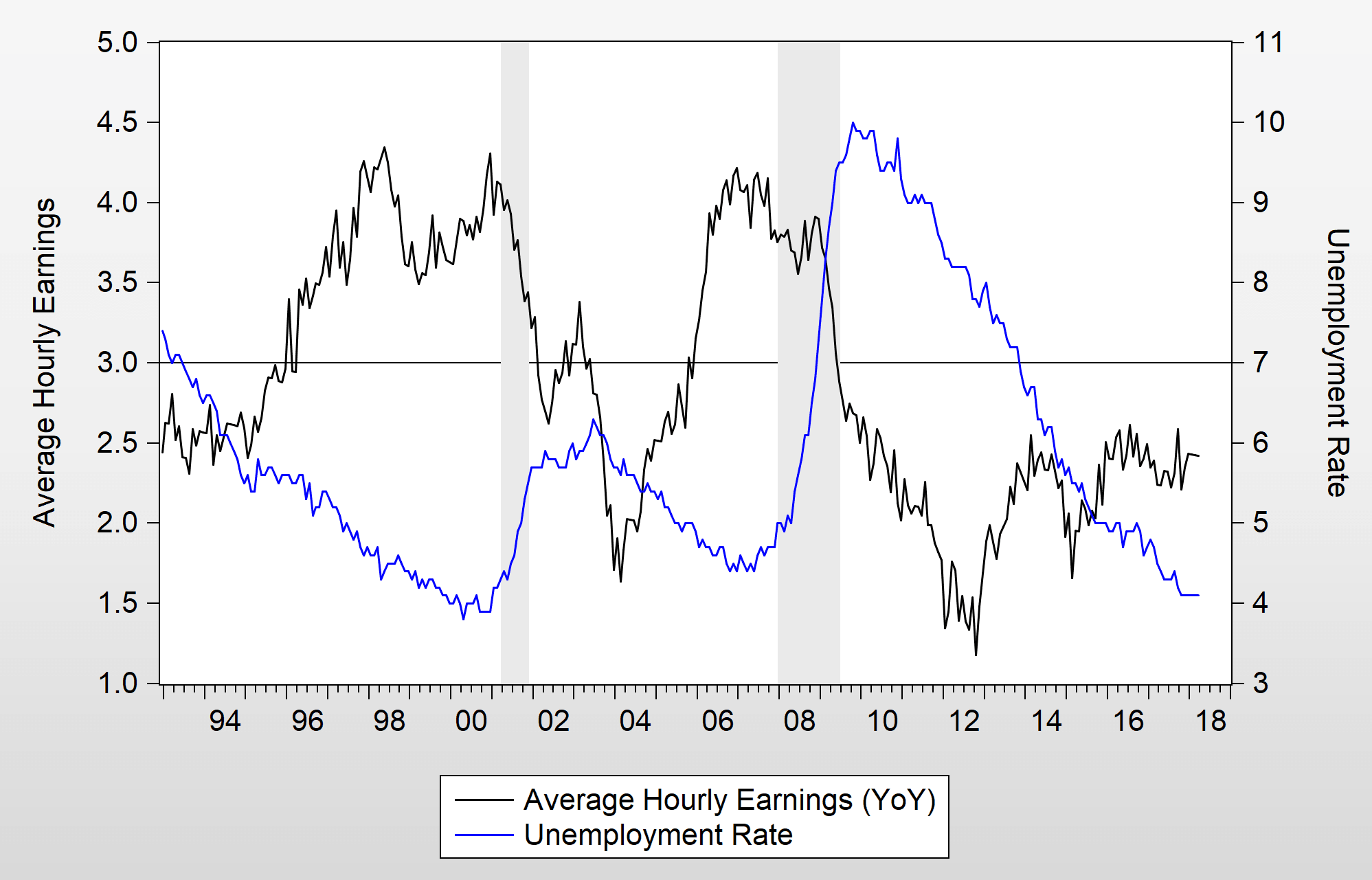
If you listen to any prognosticator, the answer is weak. Almost every economist will say the same. They simply point to the following figure and say that because wage growth is below 3 percent at this stage in the business cycle, wage growth is stubbornly weak.
Is it true?
How could one really answer the question of whether wages are too strong or too weak? Perhaps the most common answer among observers might be the Phillips Curve.
The Phillips Curve (courtesy of William Phillips, the original developer) posits that there is a trade-off between wages and the unemployment rate. In essence, when the unemployment rate is low, that means that labor is scarce, and therefore wages get bid up because of labor demand.
In contrast, when the unemployment rate is high, it means that the labor force is in a plenty, and therefore wage growth would be weak.
In statistics, this means that the linear relationship is negatively related – when one factor goes up, the other goes down and vice versa.
A Cruxed Phillips Curve
The following is a cruxed Phillips Curve, replacing the unemployment rate with the “non-employment rate” for individuals 15 to 64 years old (horizontal axis).
The vertical axis is the Employment Cost Index (ECI), which is a measure of wage growth.
As expected, the two are negatively related, implying that when the non-employment rate is lower, wage growth is higher and vice versa.
Now, look where the first quarter of 2018 is. It’s at the top right, labeled “2018 Q1”.
What’s so important about the 2018 Q1 figure? Well, it’s above the linear regression line, meaning that wages are higher – not lower – than what they should be.
Presuming the non-employment rate comes in at about 26.4 percent, wage growth should only be about 1.75 percent, not the 2.42 percent we’re seeing right now.
Bottom line: don’t be surprised if wage growth continues to come in below 3 percent. Wages actually appear overpriced, not underpriced.
Conclusion
In looking at a version of the Phillips Curve that has the ECI on the vertical axis and the non-employment rate for individuals aged 15-64 on the horizontal axis, it appears wage are too strong, not too weak – contrary to everything we’re hearing from labor market observers.