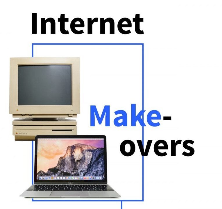
Remember in the 1990s, when everyone was so amazed by the internet, simply because it was the internet? An ever-expanding pool of websites and domains gradually putting a world of information at our fingertips.

Q1 hedge fund letters, conference, scoops etc, Also read Lear Capital:
Well now, more than a quarter century after the World Wide Web became publicly available, many of the original online interfaces seem outdated and just plain ugly. Advanced Dermatology, a Chicago-based center for cosmetic and dermatological took a look at some of the biggest digital ‘facelifts’ of websites that improved and rejuvenated after launching decades ago.
After all, the look and feel of the internet constantly changes to keep users interested and engaged. Many of those websites are virtually unrecognizable from their original launch.
Take for example, Netflix, which came online in 1999 as a generic white background webpage with hyperlinked text. The site’s first facelift came in 2008, when Netflix debuted its iconic red background and logo font. Ten years later, in 2018, Netflix changed its look once again, focusing on movie and show titles for online streaming.
The Twitter feed has undergone significant changes since launching in 2006. Did you know the original webpage’s background was brown, not Twitter blue? Over the years Twitter gradually tweaked its Twitter feed making user photos and banners more prominent on individual pages, and the Twitter feed a wider, more user-friendly experience.
Do you remember when Amazon only sold books? In 1994, Amazon launched its very own white background site with simple hyperlink text showcasing books you could purchase on the internet and have delivered to your home. As the years progressed, and Amazon took over more and more merchandise, its website updated and became more visually interesting. Now its homepage highlights Amazon-brand technology, deals and virtually any type of consumer good someone could want to purchase.
Among all the rejuvenations and digital refreshes, some websites have stayed classic. Google and Wikipedia have expanded the data within their search engines, but their interface remains largely unchanged.
When Wikipedia debuted in 2001, the globe sat in the top-right corner of the white homepage with simple categories of text beneath. The biggest change happened in 2009 when the Wikipedia globe moved to the center of the screen and was surrounded by the language options available, since then, Wikipedia has made only marginal changes to its home screen display.
Google’s homepage actually had more color back in 1998 when it launched. The blue, red, yellow, blue, green, red of “Google” were still there, but the company’s original homepage had a green bar beneath its search feature. They did away with that additional color in 2008 when Google solidified its sparse, but effective, home page display.
While many websites have, and will continue to change, update, refresh and rejuvenate, not every web giant is interested in changing its classic aesthetic.