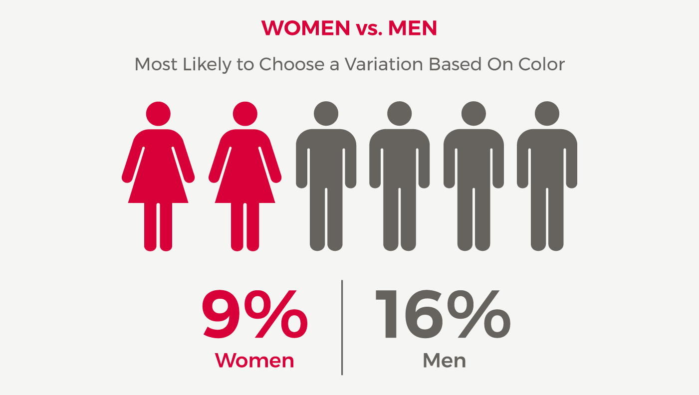
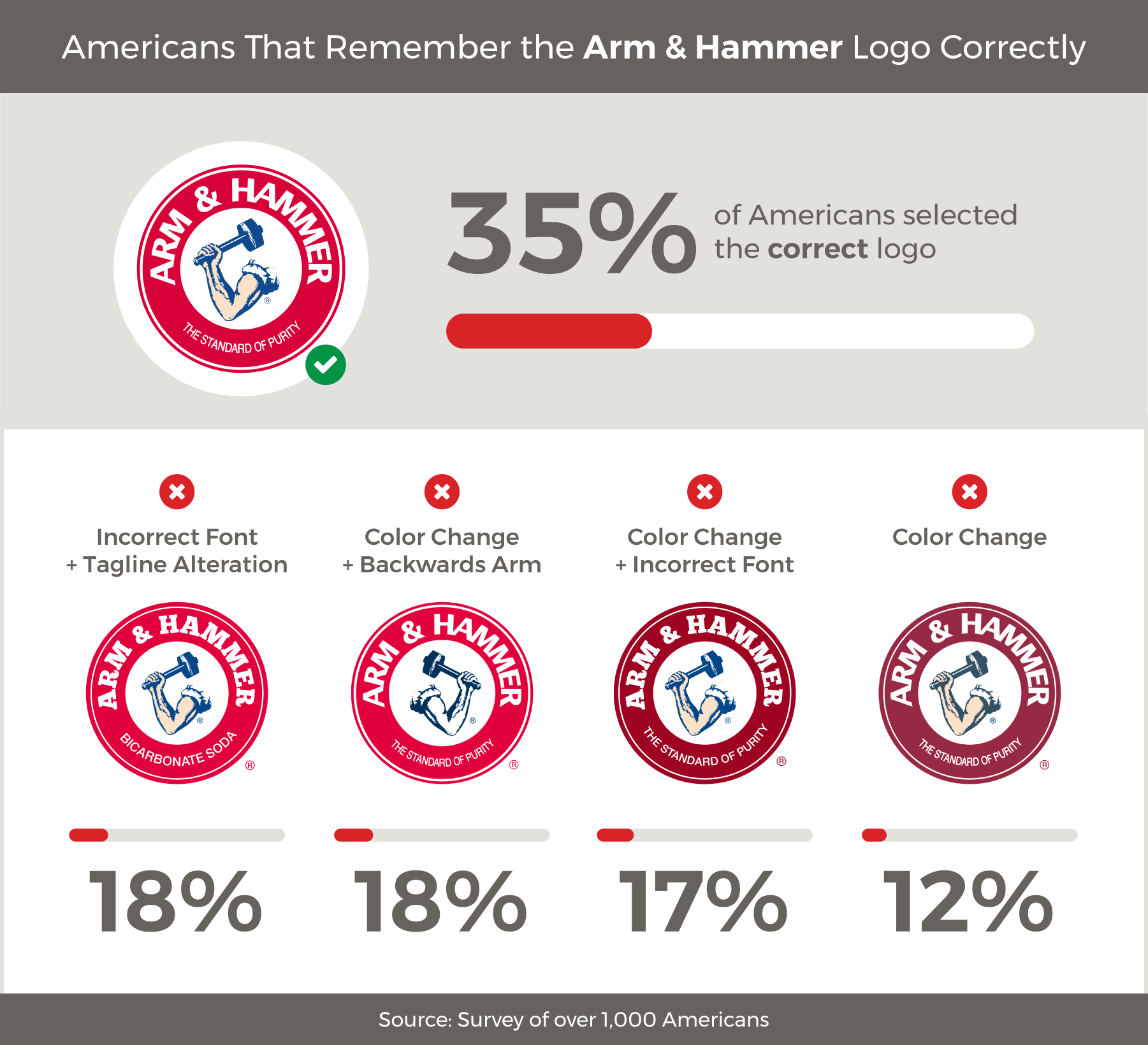
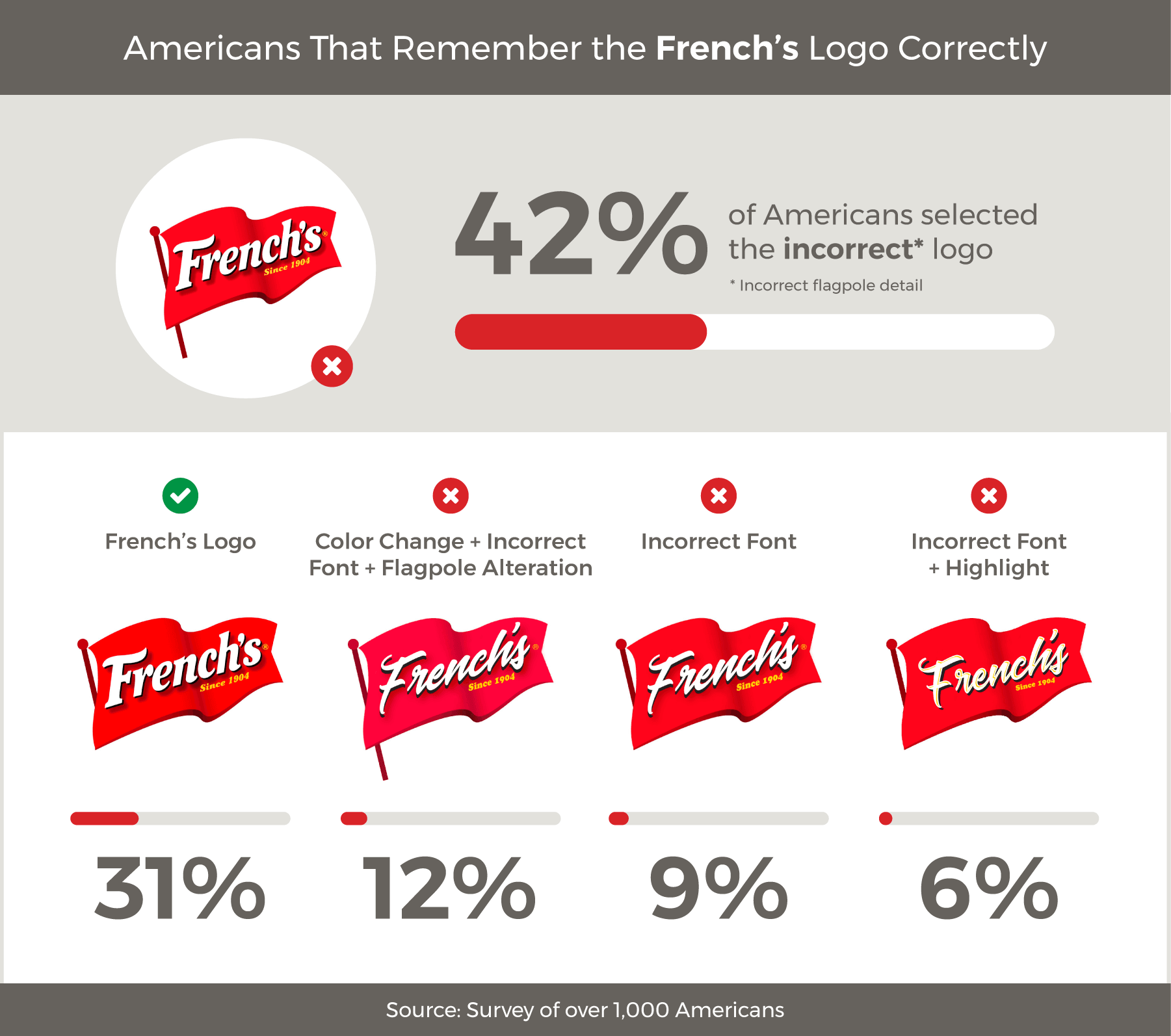
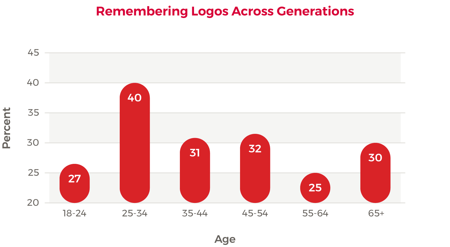
If you CAN properly identify the real logo on these very popular brands you are more perceptive than a pretty sizable majority of Americans. That’s what a recent study on branding (using data from over 8,000 people) shows very clearly. Major elements of a brand, such as color, font, and graphic detail have less impact than you might think.

Q1 hedge fund letters, conference, scoops etc, Also read Lear Capital:
Companies (especially those that have products to see the general public) pour over their logos to make sure they are communicating the exact message of their specific service or offering. Many even have additional subliminal pieces that give an impression of their mission (can you spot the forward pointing arrow in the FexEx Logo?) They also offer rebrands that are painstakingly beta tested in order to make sure that people know what they do and can remember them instantly without even having to read a description. Ideally the graphic itself does all the work.
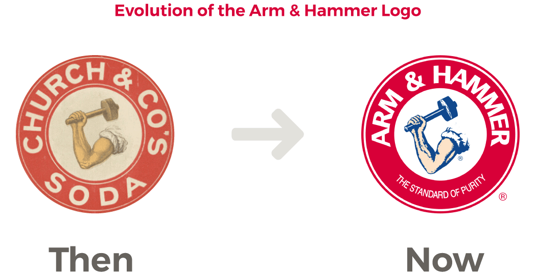
However, even with solid market domination and a long history in the business, these 8 companies can be misidentified. By now, their logos should be indelibly marked on our brains, but this study demonstrates just how variable and fickle a consumer can be. Who can remember, for example, if it was the Energizer Bunny or the Duracell Bunny (Trick question actually -- did you know at one point it was both?)
Does This Mean Branding Is A Waste Of Time?
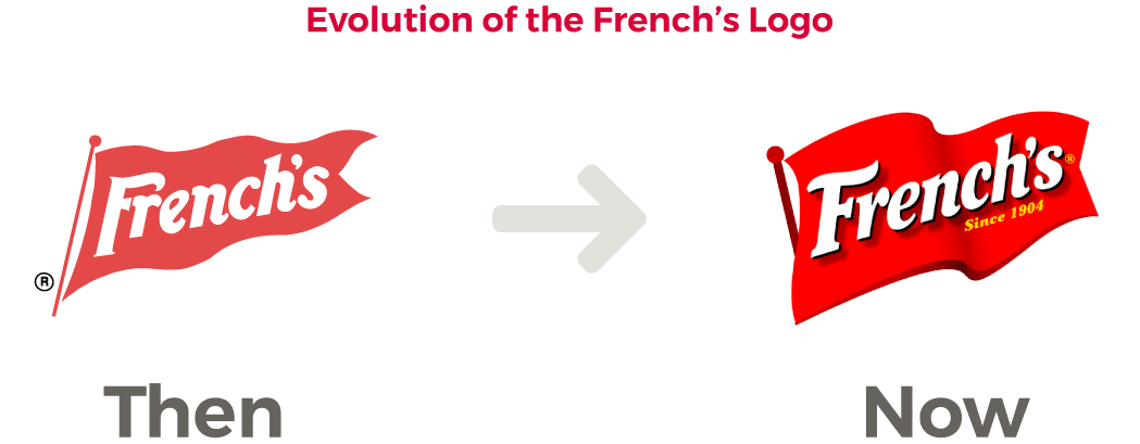
So, what can you get from this study other than the fact that people do not really focus 100% on branding detail? From a design point of view this allows some flexibility when you are considering a rebranding effort. It says that consumers still recognize a product even if the brand alters slightly to change with the times or a new niche in the market. The information below shows some very significant rebrands that seemed to work well -- for example: the Hunt’s Ketchup logo.
It’s easy to see how the new logo gives Hunts a certain place in the market by emphasizing freshness and the garden from which its tomatoes have grown, rather than the institutional original version. While consumers may not recall the exact font - the recognize what they are getting from the overall design.
Of course, rebranding doesn’t always go well. Large corporations like The Gap and Pepsi have produced recent branding shifts that were collectively understood as terrible or at least extremely underwhelming. The price tag on these logo tweaks can be incredible, so before you embark on rebranding, a good consideration might be -- is there a compelling reason to do it?
Take a look at the examples from the logo study below and see which products you use regularly that you don’t remember. It’s not just a question of your levels of perception -- it asks a larger question about what brands and branding does best?


