The intersection of data visualization and art is the perfect place to experiment.
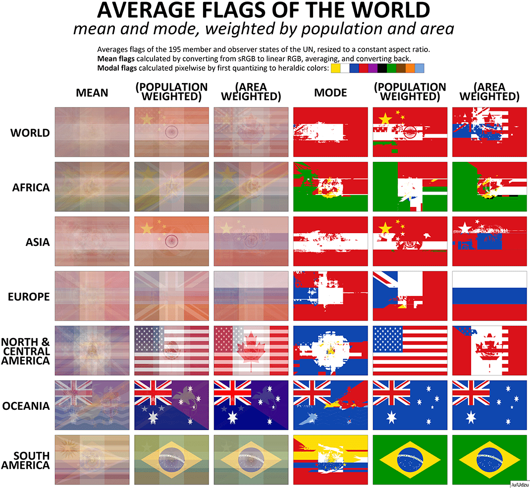
In today’s graphic from Reddit user Udzu, flags serve as the visual raw material for experimentation. The visualization uses flags to show the “weight” of a country’s population or land area within its respective region – a unique thought exercise worth digging into.
Vexillology, Visualized
When all the world’s flags are averaged, the result is a hazy rectangle with outlines of popular flag layouts (e.g. tricolor, triband). That said, one feature that does stand out is the Union Jack in the top left corner, showing that Great Britain’s historical influence lives on even through flag design.
Russia, even with its landmass divided in two, is prominent on both Europe and Asia’s area-weighted graphics.
Interestingly, Udzu also repeated the process using U.S. state flags. As one would expect, California and Texas dominate the population-weighted image. In the area-weighted version, Alaska’s big dipper flag and the word “Montana” become more prominent.
Examining the Building Blocks of Flags
Flags are fascinating for a number of reasons.
They’re loaded with history, charged with patriotic pride, and commonalities between flags often signal connections between the people who live in those respective countries.
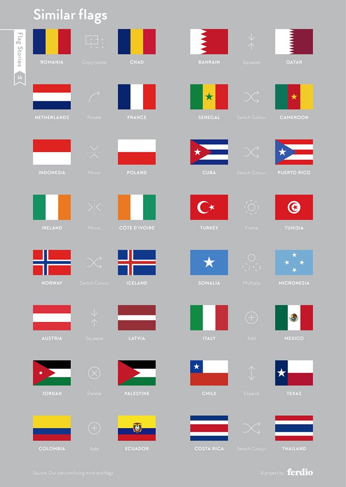
These serious considerations aside, flags are fun to look at from a design perspective. There are nearly two hundred official countries in the world, and many of them embrace similarly minimalist flag layouts. As a result, it’s no surprise that some of them are strikingly similar.
Source: Flag Stories
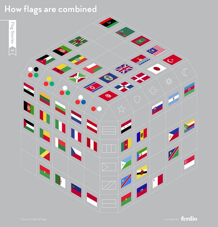
With many similar colors and layouts in the roster of national flags, it seems like every combination is taken.
However, as the visualization below identifies, a few specific combinations are still up for grabs.
Source: Flag Stories
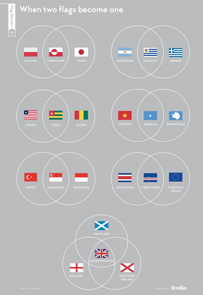
In case anyone out there is thinking of forming a new country, combining elements from different flags is a valid approach. Joking aside, the Union Jack really was created by combining aspects of the three older national flags of England, Scotland, and Northern Ireland.
Source: Flag Stories
Article By Nick Routley, Visual Capitalist


