Welcome back to part III of our pedantic posts about proper plots. In this edition, we start to look at graphical design, specifically the scale range and proportional sizes of the chart itself. When considering these settings for a graph, there are two slippery slopes to slide down which result in similar bad practices. The first is when a desire to create a pleasing visual design trumps maintaining the data integrity. The second is purposeful manipulation of these elements with the intent to mislead the reader visually. Given my faith in humanity, I believe the former much more common than the latter, but both can improperly alter the message the data conveys to the reader via the visual impression. Let’s look a little more closer at these delicate interactions between graph size/scale and the visual impacts with a few specific examples.

Q1 hedge fund letters, conference, scoops etc
The first is the case of the disappearing baseline, otherwise known by the more technical term, “y-axis jiggering.” Typically, in most financial graphs, the minimum value for the variable plotted on the y-axis is zero. We are ignoring special cases which may include negative value possibilities (such as new-age interested rates!)- these are a little more complicated. Often times, however, the graphic designer will elect to truncate the range of the y-axis values and not display the graph’s baseline y-value of zero. When you consider what this does visually, we are now seeing a completely different percentage changes in the data for the y-values. The nefarious use of this tactic is to sex up the variation, but sometimes it is done in a misguided attempt to “zoom in” for a close-up of the graphic action. But the end effect is to visually distort the relative changes in the data. So, unless your intent is to pimp out your graph, leave the origins in place when they reflect real possible values.
In the example below, the bottom of the w-axis look to be at about 58, not zero. If you are specifically discussing a change from a non-zero base value, you need to disclose this fact and consider presenting the percentage changes rather than absolute values. The reader needs to be able to place the data in a proper context. An alternative possibility is to show the baseline as a long-term average value and display changes from this, but this ought to be a deliberate choice and clearly labelled, not and random setting of the axis range by the author or Excel.
Disappearing baseline (y-axis manipulation)
Even more egregious, we sometimes see examples where the chart designer has the data scales take the backseat altogether. The chart below was intended to compare growth over time (towards a total market penetration percentage) for various entities. But rather than place a normal, year-based time scale along the x-axis, the author elected to overlap the 0% y-start value for all the entities to emphasize the relative growth rates. The implication is that instead of concentrating on the actual year, e.g. 2010, 2011, etc., we should be focusing on the relative year from the start point. In this case, the author should have used Year 1, Year 2, etc. as the x-axis values instead of leaving them off entirely. That would have alleviated the need to split TIT (Note: I’ve completely forgotten what this acronym was for, but it is, indeed, unfortunate) into two confusing intervals to highlight its slower growth. But the best practice might be to plot the actual years to invite reader consideration as to whether or not the overall economic performance for the sector in a given year impacted the relative growth rates. This goes back to the final point in the previous post regarding the inclusion of proper comparators in a graph. When you vary the design of a graph from the raw data values (in this case %’s and years), make sure you are not impacting the variation of the data by doing so.
Show data variation, not design variation)

These first two examples highlight issues with defining the x and y-axis scales intervals. But a graph may also include data points themselves which are undefined and/or unexplained. In the example below, we see a plot of annualized three year returns for different sectors of the economy. A few of the data points are labelled and the intent is to convince us of the low variability/high returns for the highlighted sectors. Unfortunately, we aren’t told what the comparison points are. Including all these labels in the graphs would be messy, but we should be informed as to what they are, possibly in an accompanying table. Perhaps they others are all unsurprisingly rambunctious investment classes, such as commodities or cryptocurrencies (although that one may fall off the right side of the chart into the next room). If the data is included in your chart, make sure you label it to provide your readers with the proper context.
Quoting data out of context
The above is a chart with“extra” data, but one of the most vexing potential problems is a graph wherein the presenter has elected not to show ALL of the available data. For example, perhaps we are only shown a few select years from a longer time series in order to highlight a desired trend and conceal specific data that belies it. Someone might also display only the linear portion of the data in a graph, but exclude values outside the displayed range which do not lie so neatly along the plotted line. Perhaps a nice, steady growth rate even reverses itself to a decline outside a range of data values included in the graph. The reader may thus be persuaded of a relationship in the data that doesn’t persist. As a reader, always consider whether there might be missing data in the graph- e.g. are we looking at a subset in a time series and not informed why? But as a graph designer, if you are excluding data, be prepared to justify your reasons!
Finally, let’s consider what happens when we manipulate the relative length/width proportions of the graph. This may be done with completely innocent intent—e.g., to simply shoehorn a chart into a specific location of a report. But if you make a chart tall and leggy, the viewer’s focus will be drawn to the vertical change. Size matters.
Take a look at this first example, which is approximately twice as tall as it is wide. Our eyes perceive a large vertical change and we think, gee that’s a pretty big upward movement. Perhaps it is, but we should be focusing on the quantitative changes, not the distorted aesthetic impressions.
Graph dimensions (height distortion)
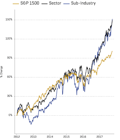
The opposite, however, happens when we squash a graph. Note that in the graph below the y-axis does not go to zero, which we’ve already highlighted as a potentially bad graphing practice. But consider if the y-axis did extend to zero with the current proportions (3-4 times wider than tall). The lines would appear to be mostly flat. The graph below is so broad in the beam that the author may have been forced to truncate the y-axis to prove that there’s actually been changes in those plotted estimate values! A more proportional sizing would have fixed this issue properly.
Graph dimensions (width distortion)
Okay, that’s it for the quantitative elements of your data, sizes and scales. Next up in our final post of this series, we’ll look at the more qualitative, aesthetic elements of your graph.
Article by Andrea Sefler, Broyhill Asset Management