Necessity is the mother of invention, and in the mid-1800s, understanding the spread of cholera was a matter of life and death.

Ruthless Efficiency
Cholera was a ruthlessly efficient killer, with both rapid onset and severe symptoms. By the time the disease made its way to London and New York in the early 1830s, hundreds of thousands of people had died across Europe, Africa, and Asia.
Not only our personal and national interests, […] it may be said without exaggeration, [that cholera] concerns the whole human race.
– Thomas Whiteside Hime
Needless to say, the human race was concerned. Thanks to high-speed printing press technology, daily newspaper circulations were rising dramatically, and this allowed journalists to experiment with new reporting techniques, including charting data.

At the time, the chart above was such a novel approach that it required four paragraphs to explain how to read it. People of that era were simply not used to seeing data in a visual form. At a glance though, the chart is extremely effective at communicating a grim message: cholera had ravaged New York City over the summer of 1849.
Despite the concerted push to eradicate the disease, the medical community was still largely in the dark about how to prevent future outbreaks. Because doctors could treat numerous patients without falling ill, it was assumed that a miasmic environment (i.e. slums, densely-packed housing) was causing the spread.
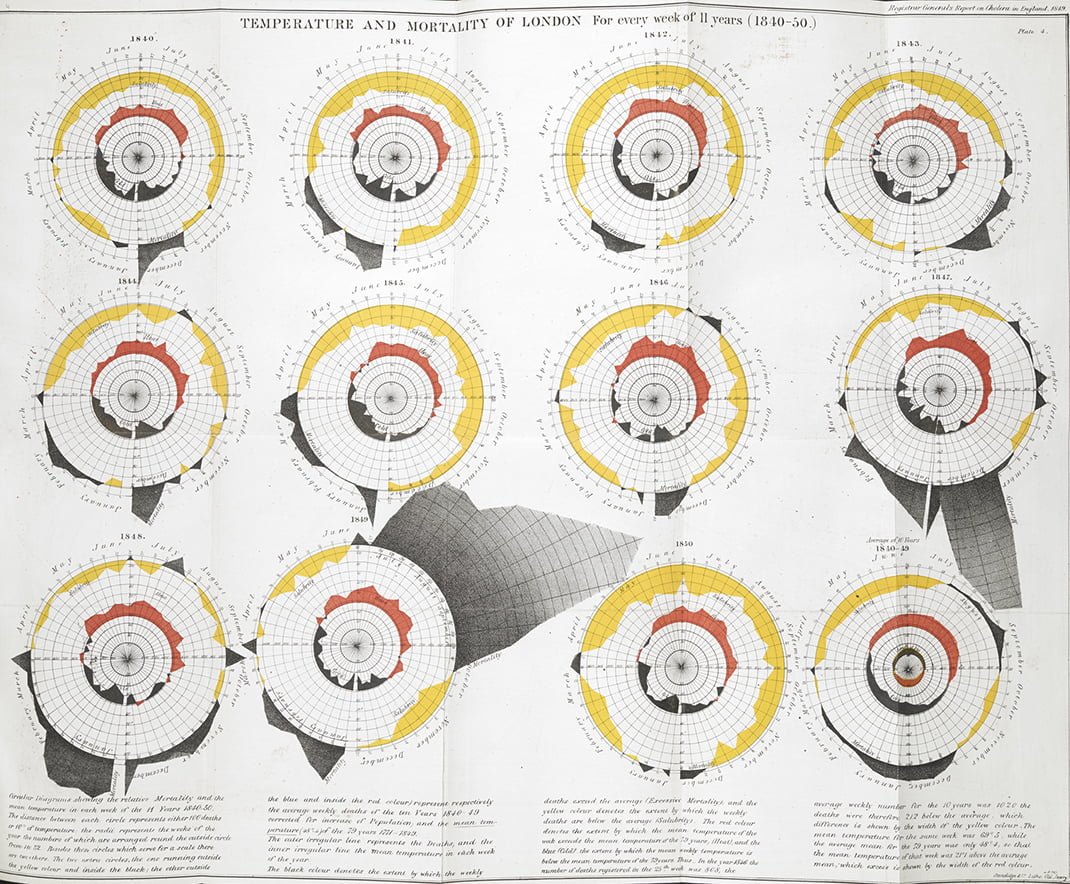
Data Viz in the Time of Cholera
Today, we have tools that allow us to map just about anything, but in the mid-1800s, mapping data was still an innovative concept.
As early as the 1830s, geographers began using spatial analysis to study cholera epidemiology. The heat map below shows which sections of Paris were hardest hit by a recent outbreak of cholera.
In 1854, Dr. John Snow was convinced that cholera was spreading via tainted water and decided to display neighborhood mortality data directly on a map. This method clearly revealed a cluster of cases around a specific pump.
View the full version of the map here
The result is one of the most influential maps in modern history.
In addition to the real-world utility the map provided in helping physicians understand how cholera was spreading, it also exemplified a seismic shift in thinking that opened up new avenues for data to be analyzed and displayed.
Despite the tragic circumstances of the time period, we can be thankful that the urgency of the situation allowed the world’s pioneering researchers, journalists, and physicians to experiment with new data visualization techniques to better understand the world.
Article by Nick Routley, Visual Capitalist


