
Original article at UpFina
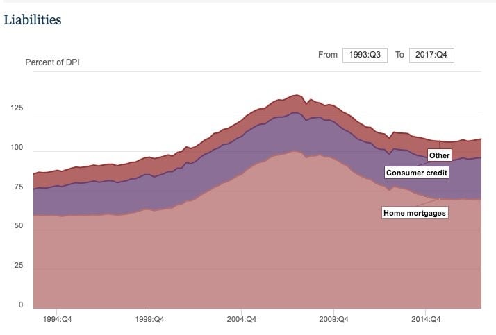
The most important line item for consumer liabilities is home mortgages because it’s the biggest segment. As you can see from the chart below, the home mortgage liabilities as a percentage of disposable income have followed the homeownership rate downwards following the 2008 recession.

Check out our H2 hedge fund letters here.
Liabilities To Disposable Income
This is unusual because recessions are supposed to be when deleveraging events occur, while leveraging usually occurs during expansions. As an aside, deleveraging is why some people call recessions healthy. However, there are two dimensions to every story. When recessions destroy bad debts, with it, the assets of the counterparty experience a similar fate, since every debt is someones asset. It would be great if individuals or companies never obtained bad debt in the first place, but it takes two parties to make the mistake, not just one.
The conclusion some people draw from this improvement in the deleveraging of mortgages as a function of household disposable income for the consumer’s balance sheet is that the expansion is just getting started. They say that the economy has many more years of growth for the liabilities to increase. That’s a misleading narrative because it implies the consumer leverage, when looking at real estate, will get as high as the last peak, which lead to the 2008 financial crisis. The liabilities to disposable income ratio is not likely to reach the previous peak during this business cycle because for most of America the 2008 financial crisis is still a painful memory. Additionally, there are new regulations on housing loans, whereby banks have raised their lending standards and borrowers don’t want to repeat the same mistakes again especially since over a million home mortgages are still underwater. This is not to say that certain city level housing markets aren’t in a bubble or that housing has become affordable for many, however as a whole, the real estate market is much healthier than it was leading up to 2008.
This Doesn’t Mean The Consumer Is In Better Shape Than The Last Cycle
The least likely time for a bubble to repeat itself in the same asset class is during the following business cycle because people are wary of making the same mistakes. The bubble in the Japanese stock market never again reached the peak it saw in 1989 when you look at the equity market’s size compared to global markets. The good news from this information is that another consumer deleveraging event of the size of 2008 won’t occur in the next recession. The bad news is it doesn’t mean the economy won’t see a recession until the previous debt height is reached.
The consumer deleveraging in this cycle was significant, with household debt service payments as a percentage of disposable personal income falling from 13.22% in Q4 2007 to as low as 9.89% in Q4 2012, with the rate currently below 10.5%. As you can see from the chart below, the household leverage went from the highest point in the past 37 years to the lowest point in the past 37 years.
Debt Service Payments Relative To Disposable Income
As we mentioned earlier, this mimics the collapse in the homeownership rate. This chart does a better job of explaining the situation than the first one because it looks at the payments versus disposable income. The ability of a homeowner to make the minimum payment tells us the likelihood of default on the loans. The ratio probably won’t reach 13% again during this cycle, but it could increase in the next few years without triggering an issue. The key caveat to the ‘everything is fine’ narrative is if interest rates increase, then the situation will worsen. The new auto loans, credit card loans, and student loans, which have driven non-mortgage liabilities up this cycle, will be more expensive to service.
Mortgage Interest Rates
The chart below is starker than the previous one because it only includes mortgage debt service payments.
Mortgage Payment As A Percentage Of Disposable Income
As you can see, the percentage peaked at an astronomical 7.2% in Q4 2007 and has been sliding lower ever since. The latest reading from Q3 2017 is 4.5%. The only time it has been lower in this chart is Q1 1980. This makes sense because interest rates are near historical lows and the homeownership rate is low.
The next important topic to discuss is the affect rising interest rates and rising house prices will have on the housing market. The chart below shows the year over year change in the mortgage payments, breaking down the data between changes in house prices and changes in rates.
Breakdown Of Mortgage Payment Changes
The current year over year increase in payments is about 10%. If it follows the base case, which expects rates and prices to rise, the total percentage increase could reach almost 20% in the next 12 months. That could be a problem for the housing market. Right now, it still looks healthy according to housing starts, new homes sales, and existing home sales. Don’t be deceived by the increase in growth in 2013-2014 and think increasing payments aren’t a big deal. The increase in that period came after housing prices had been falling for years, meaning the comparisons were easy.
The Peak That Won’t Be Revisited
To hammer home the point that the housing market won’t reach the bubble proportions seen in the previous cycle anytime soon, let’s look at the revolving home equity loans. As you can see below, the total home equity loans peaked at $611 billion in March 2009. They have since fallen to $371 billion in February 2018. That’s a decline in nominal terms. It’s an even larger decline as a percentage of home values because housing prices are above the previous peak. Even though housing prices have rebounded no one wants to make the same mistakes as before.
Revolving Home Loans
The chart below is even more obvious, which shows the total home equity cashed out.
Cashed Out Home Equity
Cashed out home equity reached over $80 billion at the peak in the previous cycle. Now it’s only at $13.8 billion. The concept of tapping into the equity in your house is a foreign concept again which is a good thing. Some articles claim consumers have untapped leverage, but do we really want to make the same mistakes as in the mid 2000s?
Conclusion
The consumer is in much better shape now than in 2007 because mortgage debt is not as big of a component for the typical consumer balance sheet. We’ll leave you with the chart below which promotes a bullish narrative for home builders.
Home Building Versus Population Growth
The chart shows a potential housing deficit looming because not enough houses have been built in the past 10 years when you compare it to the increase in population. One caveat is that millennials are forming households later in life and are preferring tiny homes or apartments to combat the rising costs, as well as renting versus home ownership. The supply of starter homes have been increasing recently as we wrote about in a previous article, and should accelerate in the next 10 years. Even though mortgage debt is a smaller component of consumers balance sheet, this time the problem is in credit cards, auto loans and student loans. Despite the reduced homeownership rate and a decline in the mortgage component of consumers balance sheets, there are signs that housing is becoming unaffordable.
Disclaimer: Before making any investment decision you must read and accept our full disclaimer at www.upfina.com/disclaimer


