Most investors are fairly familiar with the concept of seasonality in the stockmarket, with aphorisms such as “sell in May” baked into the market consciousness. But what about the bond market? Conventional wisdom would probably note that bonds and stocks tend to have a low or negative correlation, or at least agree with the logic that what’s good for stocks is usually bad for bonds, and vice versa.
In this post we look at the historical seasonality patterns for bond yields and a couple of key conclusions come out. The main one is that bond yields tend to rise in the first part of the year. This is particularly poignant given what’s going on in global sovereign bond market right now. Indeed, this seasonal tendency has no doubt helped exacerbate the rise in bond yields we have seen (which I have previously highlighted is driven by sentiment, technicals, macro/economic cycle, monetary policy, and valuations – a perfect storm for higher yields).
The main points of note on bond market seasonality are:
-There is a relatively clear historical seasonal pattern for bond yields.
-The historical tendency is for bond yields to rise (on average) in the first part of the year, and decline in the second part of the year.
-The historical seasonal pattern in bond prices is roughly consistent with the movement in stock prices, particularly in the Jan-June and June-Oct periods.
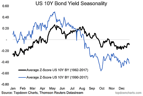
1. Bond Yield Seasonality: Although the experience over the very long term (1962 to 2017) is slightly different to the more recent historical period (1990 to 2017) the overall conclusion is the same – i.e. that bond yields have a historical seasonal tendency to rise in the first half of the year and to trend downward from around May-June before stabilizing from around October. This seasonal tendency adds to the case in sentiment, technicals, macro/economic cycle, monetary policy, and valuations – which has presented a perfect storm for the rise in bond yields that we have seen recently.

2. Price Seasonality: Taking a slightly different look, the second chart shows the price/index view for 10-year treasuries (vs yields view in the previous graph), and also brings in the S&P500 for context. The same overall conclusion applies i.e. that bonds tend to selloff in the first part of the year (lower bond prices = higher yields), and interestingly enough (as you might expect!) it more or less mirrors the action in the stockmarket. This makes intuitive sense, as for the most part what’s good for stocks is usually bad for bonds, and vice versa. There are of course many other factors at play and some complexities in this dynamic, but the chart certainly aligns with the traditional economic logic and provides food for thought on the market outlook this year.
Like what you see? Subscribe to our paid services for an extra level of insight and service.
Follow us on:


