Original article at UpFina
We’re going to dedicate another article to re-discovering the relationship between the 10 year bond and the stock market. With bond yields skyrocketing in the 4th quarter of 2017 and the first 2 months of 2018, it’s more important now than ever to understand the relationship. The confusing aspect, which started during the correction in early February 2018, is that the financial media headlines blame yields going up for the stock market decline, but the yields and stocks often act in correlation. In a previous article, we discussed that historically when the 10 year bond yield gets to 5%, stocks start declining when yields higher. The addendum to that point was that, based on recent action, it was concluded 3.5% was the new marker.
[REITs]Check out our H2 hedge fund letters here.
Does Historical Correlation Matter?
The criticism of looking at the dot plot of 2 year correlations between the S&P 500 and the 10 year treasury yield based on daily changes is that the chart is only based on a few different cycles. Back in the 1970s, the Fed was fighting inflation with high rates. When rates fell, there was a recession. The bond market has been in a bull market for about 4 decades. Even though there are many data points in the chart, bond yields have been going in one direction for most of it. It’s possible that if the yield increased, breaking out of its down trend, the relationship could change.
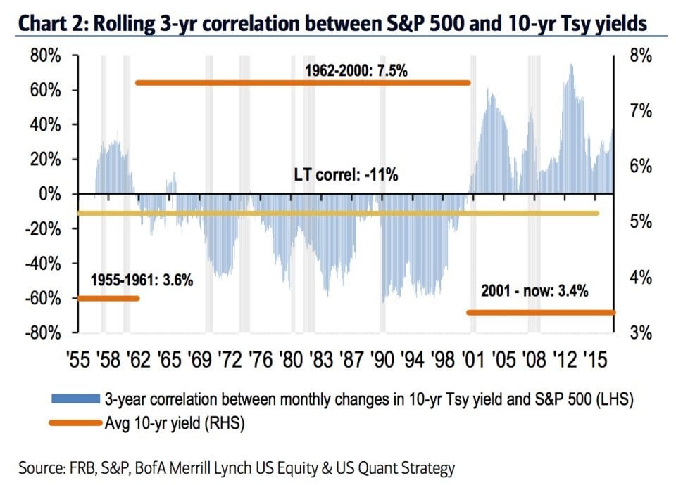
The chart below gets at this point as it shows the 3 year correlation between the 10 year yield and the S&P 500.
Treasury Yield & S&P 500 Correlation In 3 Regimes
It labels the average 10 year yield in 3 different regimes. In the 1955-1961 regime, the average yield was 3.6%. In the 1962-2000 regime, the average yield was 7.5%. the current regime which lasts from 2001 until today has an average yield of 3.4%. As you can see from the correlations, the average is -11%. There tends to be a positive correlation when yields are low and a negative correlation when yields are high. Therefore, looking at all the regimes together ruins the data. Obviously, the key point is figuring out which regime we’re headed into. Just because yields are low now, doesn’t mean yields will be low in the next 5 years.
Regional Fed Reports Have High Z-Scores
In a previous article, we highlighted the point by Robert Shiller which looks at 10 year periods to determine that the treasury yields are reflective of the past 10 years of inflation rather than the future 10 years of inflation. We shared that to show a variant opinion, but if you analyze the data in the same manner as we just did with bond and stock correlations, you’ll see there have only been a few inflation regimes since 1913. Secondly, we’d need to see that analysis work in other time periods, such as 5 years, before believing future inflation expectations and yields aren’t correlated. We’ve certainly seen a high correlation with yields and inflation in the past 5 months as yields have followed inflation expectations higher.
With that understanding in place, let’s look at inflation data to see where the 10 year bond yield might go in the next 12 months. The short 10 year bond yield positioning according to the CFTC is near its all time high which signals the trade is crowded. Another crowded position is the belief that inflation will increase in 2018. When the 10 year yield started its uptrend in September 2017, inflation was just bottoming after a timid year in 2017.
As you can see from the bottom chart below, the z-score for the regional Fed prices paid indexes is above 2.
Regional Fed Wage Growth & Prices Paid Z-Scores
This reflects future inflation growth just like the NY Fed index. This is the highest z-score since 2011. It appears that the z-score peaked a few months before the CPI growth peaked for the cycle in 2011. The CPI growth troughed in January 2015, but this chart troughs in early 2016. It appears there is a relationship between CPI and prices paid, but the timing varies. The CPI is 2.1% which is far below the cycle peak of 3.8%, unlike the z-score which is near its peak. A z-score of 2 means that this data is in the top 5%. The inflation expectations can’t get much higher, which could be bearish for the 10 year yield because the z-score probably won’t stay at this level.
The top chart above shows the z-score for wage growth from the regional Fed surveys. As you can see, the z-score is above 3. Data which is 3 standard deviations above normal is in the top 0.3%. This isn’t consistent with the Atlanta Fed wage growth tracker which was at 3.0% as of January 2018. It is somewhat related to the year over year total ECI growth which was 2.6% in Q4 2017 which was the fastest growth since the start of this business cycle. Keep in mind, that the regional Fed reports from February have come out, so they are ahead of the ECI and CPI data. These reports imply a sharp acceleration in wage growth. If this doesn’t happen, yields will probably fall.
Inflation Expected To Spike
The key takeaway when it comes to yields is that heightened inflation expectations are priced in. The chart below shows the latest core PCE and core CPI data along with the expectations for core CPI. It’s obvious that the low level inflation is at now won’t continue in 2018. It’s not enough to be short treasuries because you think inflation will increase. You need to think inflation will beat the expectations seen below to be short treasuries.
Core CPI Expectations
Conclusion
We explored the relationship between stocks and bonds. The correlation is far from consistent, so it’s not fair to expect stocks to fall when yields rise. Furthermore, there are only a few bond regimes which means there’s a dearth of information. There also may be a dearth of information in Shiller’s calculation in comparing yields and inflation. It’s also worth noting looking at 10 year blocks may not be the best way to view data. 10 years is an arbitrary period to select. If you believe yields rise with heightened inflation expectations, yields might fall in the next year because the regional Fed reports, which are the basis for many inflation estimates, have extremely high z-scores which probably won’t be maintained.
Disclaimer: Before making any investment decision you must read and accept our full disclaimer at www.upfina.com/disclaimer