“And then at the end of the day, the most important thing is how good you are at risk control.
Ninety-percent of any great trader is going to be the risk control.”
– Paul Tudor Jones
Last week I shared a personal story with you that, frankly, I very much enjoyed writing. It is a story about two good friends and years of hard work that has resulted in something that I believe may someday win a Nobel Prize. For my friend’s sake, I sure hope so. Some letters are easier to write than others. That one sure was fun. If you missed it, you can find it here. No guarantees, of course, risk exists, yet I do believe you and I could benefit.
Melt-up? Jeremy Grantham, co-founder and chief investment strategist of GMO, was in Barron’s yesterday writing about the likelihood of a melt-up in equity prices and what to look out for. To wit, he said,
I find myself in an interesting position for an investor from the value school. I recognize on one hand that this is one of the highest-priced markets in U.S. history. On the other hand, as a historian of the great equity bubbles, I also recognize that we are currently showing signs of entering the blow-off or melt-up phase of this very long bull market. (Emphasis mine.)
If you are a financial advisor, you probably feel a lot like this guy in the following cartoon… we work with hundreds of advisors and I can say first hand that collectively here, there and everywhere investors are calling their advisors looking to jump on the rocket ship. It’s reminiscent of periods past (e.g., 1999 all over again).

Grantham goes on to say, “The data on the high price of the market are clean and factual. We can be as certain as we ever get in stock market analysis that the current price is exceptionally high. In contrast, my judgment on the melt-up is based on a mish-mash of statistical and psychological factors based on previous eras, each one very different, so that much of the information available is not easily comparable. It also leans very heavily on a few U.S. examples. Yet, strangely, I find the less statistical data more compelling in this bubble context than the simple fact of overpricing.”
Re-read that last sentence. “More compelling” than the “fact of overpricing.” If you, like me, have studied and followed GMO’s 7-Year Real Return Forecasts, then you know their forecast-to-what-actually-occurred correlation is exceptionally high. In English, what they forecast is pretty close to the returns that were actually achieved. “More compelling”? OK, he has my attention.
Long-time readers know that despite my often-shared valuations and risk views, our equity market indicators, as posted in Trade Signals each week, remain risk-on. And I too find myself in the melt-up camp. Stock buybacks and the repatriation of over $2 trillion in offshore corporate dollars? Yes, a potential drive! Tax cuts? Animal spirits? Yes and yes. Crisis in Europe leading to capital flows to U.S. dollars and U.S. equities like what occurred in the late 1920s? Unfortunately, maybe a yes.
Grantham goes on to “…present the evidence, both statistical and touchy-feely, as clearly as (he) can.” He looks at great bubbles of the past as useful guides to the future. He points to “indicators of extreme euphoria” to be more important than just looking at the price level of the market. Currently, he believes there are not yet enough signs of euphoria to make this look like a late-stage bubble. He adds, “For a major investment bubble to burst it must first form, and this one has been very slow to do that, at least until recently.”
His detailed piece (you can find it here) looks at what is currently missing in the way of psychological and technical signs of a late-stage bubble and what is beginning to fall into place.
To which:
- Recently an academic paper titled “Bubbles for Fama” concluded that in the U.S. and almost all global markets, the strongest indicator – stronger than pure pricing or value – was indeed price acceleration.
- Until very recently it could justifiably be described as clawing its way steadily higher. But just recently, say the last six months, we have been showing a modest acceleration, the base camp, perhaps, for a final possible assault on the peak.
- Exhibit 3: Shows what things look like today.
- Exhibit 4: Shows what it would take to make the S&P 500 a “Classic Bubble.” Possible peak in 2018…
- Grantham has previously defined a great bubble as being “Excellent Fundamentals Euphorically Extrapolated.” Yet he had previously concluded that, in general, the fundamentals for recent years were disappointing and that investors, far from being euphoric, had instead been “climbing the wall of worry” as they say.
- But fundamentals are improving. The global economy is in sync for the first time in a dozen years and global profit margins are at a high. In the U.S., a corporate tax cut is on the way, which in today’s sticky, more monopolistic world, is unlikely to be quickly competed away as theory suggests, but very likely to further fatten the corporate share of the GDP pie and perhaps provide the oomph to keep stock prices rising.
Grantham says, “The historian has to emphasize the big picture: In general are investors getting clearly carried away? Are prices accelerating? Is the market narrowing? And, are at least some of the other early warnings from the previous great bubbles falling into place?”
What to watch for?
- Concentration is the essence of an escalating euphoria. By late-stage cycles, many buyers are fixating on “winners” with the purchase motive being further stock gains, rather than any logic of long-term value. Thus, as the market soars, attention is increasingly focused on those with the largest earnings and stock price gains, and interest in the B players falls away. (This concentration effect naturally favors larger companies, perhaps because they can better absorb a rising demand.)
That can be measured by looking at the Advance/Decline Line. For example, in the next chart, Grantham shows the blue Advance/Decline Line (the cumulative number of all the stocks on the NYSE that are advancing vs. declining). When fewer and fewer stocks are driving the market higher and higher while most of the stocks are declining, that’s a sign of what Jeremy is talking about. He showed that it looked like this in 1929:
Here is a look at what happened in the late 1990s:
- Bottom line: the number of advancing stocks to declining stocks peaks before price peaks. Watch for fewer stocks carrying the market higher.
Note the decline in the blue line (peaked in March 1998) and the S&P 500 went on to peak in March 2000 — two years later. Today, the NYSE Advance/Decline Line continues to make new highs.
- Bottom line: across the board the majority of stocks continue to be advancing. That’s a good market technical.
It looks like this in comparison to all the NYSE stocks:
- Red line shows the Advance/Decline line. It’s making new highs, as is the market.
Another sign is a comparison of higher risk stocks to lower risk stocks. Again, think more and more investors chasing into the same thing. Here is a look at the S&P 500 vs. lower risk stocks in 1929:
Before I go all-out quant geek on you, let’s skip right to the bottom line. It appears we have entered the early stages of euphoria. We should take note. Grantham’s missive goes on to talk about the current state of extreme overvaluation (you’ll find my updates on valuation and probable 7-, 10- and 12-year returns today), on the Fed’s role in recent bubbles and concludes with a summary of his personal views along with a “suggested action plan for everyone.” I share that concluding summary with you in the Grantham section below along with a link to his full piece.
But before you jump in, I co-hosted a one-hour webinar with good friend Robert Schuster, CFA, CMT, Senior Director of Ned Davis Research. The webinar is called “How to Invest in a Runaway Market.” Specifically, we talked about current conditions and explained how the NDR CMG U.S. Large Cap Long/Flat Index works. It’s a guided allocation approach that seeks growth while maintaining a level of protection in down markets. You can access a recording of the video by clicking here, and please do send me a note if you have any questions on how it works. You’ll also find the Long/Flat indicator posted each week in Trade Signals (also below). At CMG, we use this approach for one-third of our equity market exposure. I like diversifying to several participate-and-protect (risk-managed) equity strategies. Please note that this is not a recommendation for you to buy or sell any security. Please consult your investment advisor.
Grab that coffee and find your favorite chair. And maybe build a fire… It’s cold here in Philly and it is likely colder than normal where you live too. Let’s hope the pipes don’t freeze.
Included in this week’s On My Radar:
- Conclusion: “Bracing Yourself for a Possible Near-Term Melt-Up (A Very Personal View),” by Jeremy Grantham
- Valuations and Probable 7-, 10- and 12-year Returns
- Trade Signals — New Record High Set for S&P 500 Index
- Personal Note – Upcoming Conferences
Conclusion: “Bracing Yourself for a Possible Near-Term Melt-Up (A Very Personal View),” by Jeremy Grantham
You can find Grantham’s full piece here. Following are selected bullet points from his piece:
- The Fed’s role in recent bubbles — taking a different tack, we should look at the policy of what I call the Greenspan-Bernanke-Yellen Fed. This policy of pushing down generally on rates – lower highs and lower lows – over 25 years, accompanied by a lot of moral hazard, has very probably helped push asset prices higher. All three Chairmen at some time have specifically taken credit for helping the economy by generating a wealth effect from a higher market. Over the years, we have come to believe that moral hazard is more important in raising asset price levels than the interest rate level and availability of credit, although they may also help. The moral hazard – the asymmetric promise to help if times get tough but to leave you alone when times are rolling – had become increasingly well-understood, particularly during Greenspan’s first 15 years. It seems likely that such a policy as the Greenspan Put might culminate periodically in investment bubbles of the type it did indeed generate in the 2000 TMT bubble and the 2006 housing bubble. And the likelihood of bubbles forming no doubt increased because all three Fed bosses outspokenly denied that such bubbles were occurring even as they passed through 2-sigma levels (geek language for extreme rare events).
- Greenspan poetically argued in 1999 that the internet was driving away the dark clouds of ignorance and was issuing in a new era of permanently higher productivity. Think how encouraging this was to the bulls as the market in 1998 went past the 21x peak of 1929 and climbed remorselessly (and at an accelerating rate!) to 35x. Even more statistically remarkable was Bernanke’s dismissal of a clear 3-sigma U.S. housing market – a one in a thousand event normally – as “merely a reflection of a strong U.S. economy,” and that “U.S. housing prices had never declined!” That was accurate enough, but what it really meant – and was interpreted as meaning – was that U.S. housing prices would not decline in the future. But, of course, the U.S. housing market had never been tested by a 3-sigma bubble before!
- And the rest is history.
SB here: The point is don’t take extra comfort in the Fed.
Jeremy’s conclusion and favorite advice:
- Anyone around in 1999 and early 2000 has had a classic primer in these signs. We know we’re not there yet, but we can perhaps see some early movement: increasing vindictiveness to the bears for costing investors money; the crazy Bitcoins of the world (this is a true, crazy mini-bubble of its own I expect – it has certainly passed my “nephew test” of his obsessing about buying or not); and Amazon and the other handful of current heroes – here and globally – taking over more of the press coverage and a growing percentage of total market gains (Amazon +13%, the day before I started to write this, and Tencent doubling this year to a $500 billion market cap).
- The increasingly optimistic tone of press and TV coverage is also important. A mere six months ago, new market highs were hardly mentioned and learned bears were featured everywhere. Now, the newspaper and TV coverage is considerably more interested in market events. (This last comment reminds me of some advice for contrarians: There is usually a phase or two in each cycle where most investors expect a market gain or loss and it actually happens. The mass of investors usually ends up wrong in the end, but not all the time, for Heaven’s sake!)
- Other items worth mentioning are IPO windows and new record highs for corporate deals. We can have a satisfactory melt-up without them, but still one or the other is likely and both together are quite possible. I believe their presence would make a spectacular bust that much more likely.
- Finally, my favorite advice once again: Keep an eye on what the TVs at lunchtime eateries are showing. When most have talking heads yammering about Amazon, Tencent, and Bitcoin and not Patriot replays – just as late 1999 featured the latest in Pets.com – we are probably down to the last few months. Good luck. We’ll all need some.
SB again: I’d like to see my Philadelphia Eagles turn the tide on the Patriots, but our star quarterback is out for the season and while my kids are more optimistic than me, my fingers are crossed. Best to luck to your favorite team.
Finally, Jeremy’s summary… what he calls his guesses (his personal view).
- A melt-up or end-phase of a bubble within the next 6 months to 2 years is likely, i.e., over 50%. (Emphasis in original.)
- If there is a melt-up, then the odds of a subsequent bubble break or melt-down are very, very high, i.e., over 90%. (Emphasis in original.)
- If there is a market decline following a melt-up, it is quite likely to be a decline of some 50%. (Emphasis in original.)
He suggests everyone own as much Emerging Market equity exposure as your career or business risk can tolerate.
And for individual investors willing to speculate. (Emphasis mine.)
- Consider a small hedge of some high-momentum stocks primarily in the U.S. and possibly including a few of the obvious candidates in China. In previous great bubbles we have ended with sensational gains, both in speed and extent, from a decreasing number of favorites. This is the best possible hedge against the underperformance you will suffer if invested in a sensible relative-value portfolio in the event of a melt-up.
- [I]f we have the accelerating rally that has typified previous blow-off phases, you should be ready to reduce equity exposure, ideally by a lot if you can stand it, when either the psychological signs become extreme, or when, after further considerable gain, the market convincingly stumbles. If you can’t cope with this thought and can’t develop and execute an exit strategy, then sit tight and ignore all this advice, except for an overweighting of Emerging. I certainly recognize that leaping out of declining markets is a completely unrealistic idea for large, illiquid institutions and nerve-wracking enough for even the toughest-minded individuals. In this sense you can treat this paper as an academic exercise… the musings of an old student of the market, who thinks he sees the signs of an impending melt-up that will be painful for value investors.
- Is it better to be warned and suffer than be surprised and suffer? At least when warned, you can brace yourselves.
Consider ourselves forewarned. Thanks Jeremy… appreciate your work!
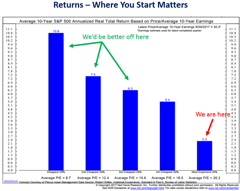
Next, a quick look at the extreme market valuations and the probable low to negative forward returns they forecast.
Valuations and Probable 7-, 10- and 12-year Returns
Following are a few valuation charts:
Here is a scatter graph with the market valuation on the vertical axis (log scale) and inflation on the horizontal axis. It includes some key highlights: 1) the extreme overvaluation and irrational period of the tech bubble, 2) the valuations since the start of last recession, 3) the average P/E10 and 4) where we are today.
Source
In the months following the Great Financial Crisis, we have essentially been in “uncharted” territory. Never in history have we had 20+ P/E10 ratios with yields below 2.5%. The latest monthly average of daily closes on the 10-year yield is at 2.40%, which is above its all-time monthly average low of 1.50% in July 2016.
What can we conclude? Despite the end of QE, many analysts assume that Fed intervention through its Zero Interest Rate Policy (ZIRP), will keep yields in the basement for a prolonged period, thus continuing to promote a risk-on skew to investment strategies despite weak fundamentals.
On the other hand, we could see a negative market reaction to a growing sense that Fed intervention may have its downside, resulting in an aberrant bond market and increased inflation/deflation risk.
Source
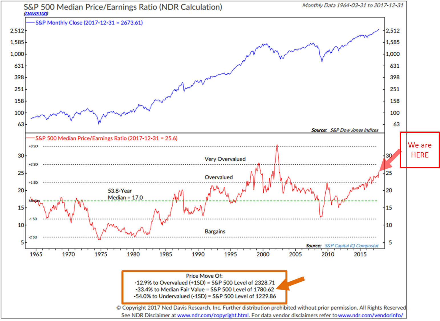
One of my favorites, “Median P/E.”
Here’s how you read the chart:
- Median P/E is the P/E in the middle out of all the stocks that make up the S&P 500 Index. I like it because it tends to take out the accounting games that may go on.
- Simply see it as a number for now (see the “We are HERE” annotation in red. Currently higher than all times prior except the late 1990 tech bubble).
- The orange box at the bottom measures “Median Fair Value, “ “Overvalued” and “Undervalued.” Today the S&P 500 Index is above 2,700. At December month end, the S&P was at 2,673.61.
- From the December 31, 2017 close to the median fair value (over the last 53.8 years) of 17 indicates the market is 33.4% overvalued.
- At today’s extreme high Median P/E, it is 12.9% higher than where history suggests “Overvalued” to be. Finally, bargains would be found at a 1 standard deviation move below fair value or 54% lower than where the market sat at year end.
Next is GMO’s most recent 7-year Real Equity Market Return Forecasts:
Here is how to read the chart:
- Take two aspirin and drink them down with your favorite beverage.
- The red arrow points to where they calculate returns to be for the S&P 500 Index, after inflation, over the coming seven years.
- In English, your $1 million dollars in 2018 will drop to approximately $658,198 by the year 2025.
Here is the math on that $1 million:
Source: CMG Capital Management Group
That’s not a recipe for baby boomer retirement success, which leads to my consistent point. Absent anything else, put a 200-day moving average stop-loss on everything you own. Not perfect, we may “melt-up” but you want to be in a position to take advantage of the opportunity the next great correction creates.
Finally, following is the 10-year subsequent return stats based on “Median P/E” and Dr. John Hussman’s 12-Year Return Analysis (not to be ignored).
Hussman’s 12-year Equity Market Return Forecast
Here’s how you read the chart:
- Take two more aspirin.
- The chart below shows his preferred valuation measure, which he introduced several years ago (nonfinancial market capitalization to corporate gross value-added, including estimated foreign revenues).
- The Market Cap/GVA is shown on an inverted log scale in blue. The red line shows S&P 500 average nominal total returns over the subsequent 12-year period.
- Simply, note the high degree of correlation. Meaning, how closely the subsequent 12-year return tracked the valuation measure.
- Current starting condition is the small green arrow pointing to coming negative compounded 12-year return forecast.
Source: Survival Tactics for a Hypervalued Market
May we get a beautiful “melt-up,” stay balanced, aware and successfully manage downside risk properly. If you are willing to jump all in on that rocket ship, judge your risk tolerance appropriately and diversify to several disciplined risk managed processes.
A 2018 top as Jeremy showed in his chart. No idea. Stay risk minded, tactical and nimble.
Trade Signals — New Record Set for the S&P 500 Index
S&P 500 Index — 2,701 (01-03-2018)
Notable this week:
The biggest indicator change this week is the “Don’t Fight the Tape or the Fed” indicator, which moved from a bullish (+1) reading to a neutral (0) reading. The indicator is a combination of the 10-year Treasury Yield change in trend (as a proxy for the “Fed”) and the “Tape,” which is a measure of the technical health of the broad equity market (currently strong trend/momentum).
Following are the historical returns (two different time frames) of the S&P 500 Index. Performance based on readings that range from +2 (very bullish) to -2 (extremely bearish):
Here’s how you read the chart:
- Yellow highlights indicate the current signal.
- Since 1980, a “0” reading has occurred 31.70% of the time, resulting in a 5.97% gain per annum for the S&P 500.
- Since 1999, a “0” reading has occurred 37.36% of the time and returns were lower at 4.65% (but overall pretty close).
- This signal suggests that we should expect lower returns.
- The indicator was a bullish +1 most of last year.
- The real bad stuff happens at -2. So we’ll watch out for -2.
Source: Ned Davis Research
Broad market indicators: Bullish trend continues for equities. The Ned Davis Research CMG U.S. Large Cap Long/Flat Index increased to 100% exposure to large-cap equities. Despite the recent move higher in interest rates, the Zweig Bond Model remains bullish on fixed income. HY remains in a buy signal. The weight of trend evidence remains moderately bullish. As always, we continue to monitor our inflation and recession indicators. Despite the extreme overvalued level of equities, the trend evidence remains bullish.
Click here for the latest Trade Signals.
Important note: Not a recommendation for you to buy or sell any security. For information purposes only. Please talk with your advisor about needs, goals, time horizon and risk tolerances.
Personal Note — Upcoming Conferences
I’m in NYC tomorrow for meetings. My plan is to run hard in 2018 and there is much to get done. Colorado follows next week and I’m hoping for some warm weather in Florida January 21-24 for the ETF.com Conference. The conference attracts more than 2,000 attendees and all of the major players in the ETF space will be there, including ETF firms whose products we use in our client portfolios such as VanEck, BlackRock, Vanguard, State Street SPDR and PowerShares. Mohamed El-Erian is a keynote speaker and I’m a fan. If you too are attending, please shoot me a note. I’d love to say hello. Here is a link to the ETF.com Conference agenda. I’ll be taking notes to share with you in a future OMR.
Park City, Utah follows the first few days of February. Another advisor conference (I’ll again be packing my skis) and the Mauldin Strategic Investment Conference is March 6-9. I hope to see you in Florida or at the Mauldin Strategic Investment Conference. Registration and agenda information for the Mauldin Strategic Investment Conference can be found here. Dr. Lacy Hunt, David Rosenberg, George Friedman, Mark Yusko and Jeffrey Gundlach are but a few key names who will present.
It looked like this here in suburban Philadelphia. Susan, our five boys and I hit the driveway after the storm. We were lucky compared with much of the east coast. It’s much easier now that the boys are young men.
Stay warm and thanks for reading.
With kind regards,
Steve
Stephen B. Blumenthal
Executive Chairman & CIO
CMG Capital Management Group, Inc.