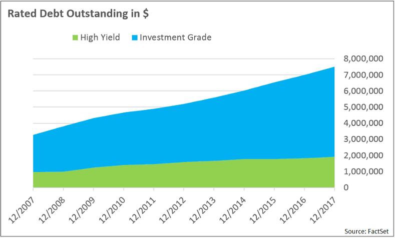
Were you aware that the total amount of corporate debt outstanding has soared by nearly 230% over the past decade? At the end of 2007 there was approximately $3.3 trillion in debt outstanding with a rating from S&P; $2.3 trillion of that was rated investment grade (IG), while $1 trillion was rated high yield (HY). At the boundary between HY and IG, $350 billion was in BB-rated bonds while $880 billion was in BBB-rated bonds. By the end of November 2017, total debt outstanding had exploded to $7.5 trillion, of which $5.6 trillion was in investment grade and $1.9 trillion in high yield. Currently more than half of total debt outstanding sits between HY and IG, with $900 billion in BB and almost $3 trillion in BBB.
[REITs]The increase in total debt is large, but there has been a fundamental shift if you look at the rating buckets. At first glance, it looks like more debt is rated investment grade vs. high yield, but within the investment grade category BBB went from 38% to 53% of all rated debt outstanding. That is a very large increase in the amount of the riskiest debt that investors typically consider to be safe.
Spreads Have Narrowed at the Margin
Bond indices don’t always reflect issuance trends like these because they tend to keep their weights stable over time. However, they are useful for identifying long-term trends in the average spread levels within and between rating buckets.
Many high yield bonds now trade at spreads that their investment grade counterparts traded at not too long ago. A BB bond now trades at around 200bp of spread, where a BBB bond traded at 200bp as recently as one year ago. This holds true for most spread buckets but the one that separates investment grade from high yield is an interesting one to monitor.
Not only has the general spread level tightened, the differences between the rating buckets have also collapsed. Let’s examine the difference in the OAS levels between BBB and BB ratings and how this has evolved over time.
What separates investment grade debt and high yield debt? It turns out that today this difference is only 80bp (see Chart 3). This means that investors see less than 1% in additional compensation to hold the highest-rated high yield debt relative to the lowest-rated investment grade debt. This is a historic low when looking at the spread level over the last 10 years. The five-year average is around 160bp and the 10-year average (which includes the spike in 2008/2009) sits around 200bp.
Drilling down into BB and BBB sectors, we find that the BBB-BB industrials spread has tightened the most. The BBB-BB financial institutions spread has been most volatile but the BBB-BB utility spread, even though it is the least volatile, it’s currently the highest of the three (see Chart 4).


Look at the Fundamentals
One explanation for the differences between the various sectors can be found by looking at the fundamentals of the parent companies issuing the debt. See Charts 5, 6, 7 and 8 for an overview of how fundamentals have developed within each sector across BB and BBB rated bonds.
The BB utilities have seen a large increase in leverage relative to its BBB counterparts. Industrials and financials paint a more consistent picture, but keep in mind that BB financials have almost double the leverage ratio of their BBB counterparts.

The coverage ratio shows a similar, but less extreme, trend. The trend is probably less extreme because the lower coupons hide what the leverage ratio cannot—a mountain of low coupon debt. The ratio has been declining for the BBB and BB sectors overall and drilling down into the utilities sector we see that the BB coverage ratio is below two and declining.
The decline in the coverage ratio coupled with the increase in the leverage ratio is worrying from a spread perspective. Refinancing to lower rates is great, but if cheap refinancing were to disappear over the longer term, coverage ratios would decrease even further and drive spreads higher.

Return to Normal
What would returns look like if spreads were to revert to their long-term averages? As this is unlikely to happen overnight, let’s look at the impact on a 12-month horizon considering two possible scenarios: a return to the five- and 10-year averages. In Table 1, you can see that a return to the less dramatic five-year average (which does not include the 2008/2009 debt crisis) would reduce the price return for BB by 11.37% and BBB would be reduced by 10.25% over 12 months.
The additional yield gained from holding the bonds over 12 months will soften the impact somewhat. The higher current yield, 5.35%, of the BB bonds actually offsets the higher loss in price change for the five-year scenario. Because of this, the total return of both the BB and BBB bonds average around -5.97% for the five-year average. This means that if spreads move back to their five-year averages, you’ll lose the same on average if holding BB vs. BBB’s. This does not seem to be the case when looking at the scenario where rates move back to their 10-year averages. In this case, BBB bonds perform slightly better than BB bonds.
Scenario Analysis for a Shift to 5y and 10y Spread Averages
| Current Yield | 1y Horizon Price change | 1y Horizon Total Return | 1y Horizon Yield | 1y BB-BBB Spread | |||||
| 5y Avg | 10y Avg | 5y Avg | 10y Avg | 5y Avg | 10y Avg | 5y Avg | 10y Avg | ||
| Total | 4.42 | -10.44 | -13.40 | -5.96 | -8.88 | 5.41 | 5.99 | 186.02 | 236.49 |
| BBB | 4.22 | -10.25 | -13.04 | -5.97 | -8.72 | 5.09 | 5.59 | – | – |
| BB | 5.35 | -11.35 | -15.09 | -5.94 | -9.63 | 6.95 | 7.95 | – | – |
Is the Additional Fundamental Risk Worth Those 80bp?
Are investors being compensated enough for the assumed risk in today’s environment? From a brief look at the fundamentals it doesn’t appear that anything has improved over the last 10 years to justify the 80bp spread. If anything, companies now seem to be more indebted and their ability to pay back debt has either stayed flat or even decreased in some sectors. Overall, BB seems to be in significantly worse shape when compared to BBB. A return to the long-term average sees the BB-BBB spread level tripling in the worst case. But even if such a return to normal were to happen, both IG and HY will suffer about the same.
Article by Olivier Verburg, FactSet