“Expect lower returns and rocky markets for the next 2-3 years.”
> Joe Davis, Global Chief Economist, Vanguard Group
I’m writing to you from Chicago where I am attending the Morningstar ETF Conference. Vanguard’s global chief economist, Joe Davis, kicked off the event Wednesday evening advising investors to expect lower returns and rocky markets for the next two to three years. That theme is not new news, but it may feel like “fake news” to many an investor given the 10% move year to date in the S&P. My favorite session was Barry Ritholtz’s interview with behavioral investment expert Professor Richard Thaler. Thaler’s dry wit and fun humor was a real treat. I’m going to try to track down the audio and/or video link for you. Look for it in next Friday’s post.

Speaking of forward returns, as we do early each month, let’s again take a quick look at the most recent valuation metrics and see what it tells us about coming 7-, 10- and 12-year returns. While not perfect, it is hard to ignore the historical correlations. “Expect lower returns and rocky markets?” With record low volatility and markets turning its head to nuclear, geopolitical and levered bets, I believe the average investor is expecting 10 percent, not two.
The following two charts illustrate the secular bull and bear markets since 1900 reflecting both nominal and real (after inflation or deflation) returns. The idea here is to see how markets behave over time. As I’m sure you’d conclude, they cycle. Here’s a look:
Chart 1: Since 1900 Bear Markets Have Occurred Nearly as Much as Bear Markets
Here is how you read the chart:
Bull Market Regimes:
- There have been five secular bull market cycles since 1900.
- Gains varied with the best performing period gaining 24.9% annualized per year. The period occurred from 1921 and peaked in October 1929.
- The lowest annualized gains — 8.5% — were at the turn of the 20th century, March 1900 to January 1906.
- Most of us recall the great bull market, the 18-year period from 1982 to 2000, which produced annualized returns of 16.8% and the current bull market from the great financial crisis low to present, producing 15.3% annualized gains.
- The longest secular bull market lasted nearly 24 years (1942-1966).
- The shortest lasted six years (1900-1906).
Bear Market Regimes:
- There have been four secular bear market cycles since 1900.
- All secular bear markets produced negative annualized returns with the worst period, 1929 to 1942, returning a negative 10.6% annualized return. Compound your money at -10.6% per year for 13 years and your $100,000 turns into $23,302.
- 1966 to 1982 was a different secular bear experience. While the decline over the 16-year period was -1.1% annualized per year, it was a period that experienced high inflation. Therefore, while $100,000 declined to $83,645, after factoring in real after inflation return of -7.9%, $100,000 declined in spending value to just $26,801.
- The average bear market decline is -38%.
- The last two bear markets, 2002 and 2008, saw the S&P 500 Index decline by more than 50%.
- Such declines tend to come during recessions. To which end, equities tend to be an excellent economic indicator. (That’s where trend following can help.)
 Source: Ned Davis Research
The next chart provides long-term historical perspective on the U.S. equity market, looking at both nominal stock prices and real (inflation-adjusted) stock prices. It identifies the long-term, “super-cycle” periods in the market that we call secular bull and bear markets. Secular trends are long-term periods of 10-25 years that can encompass shorter-term cyclical bull and bear markets.
The same is true across all asset classes. Here is how you read this next chart:
- The top section looks at the S&P 500 from 1900 through August 31, 2017.
- The shaded green areas are the BULL markets. Also shown are the annualized returns over the period.
- The shaded white areas are the BEAR markets with annualized return numbers.
- The data box (red arrow) shows the GPA, or gain per annum, for secular bull and secular bear periods. Also shown is the percentage of time in each secular period over the length of the study.
- The middle section looks at yields of long-term U.S. government bonds, while the lower section looks at the commodities market as measured by the NDR Commodity Composite.
Chart 2: 54% of Time in Bull Markets vs. 46% in Bear Markets Since 1900
Source: Ned Davis Research
When one takes a step back and looks at full market cycles, the need for navigating secular trends becomes apparent. This is true for all asset classes.
In this week’s piece, you’ll find the most recent valuation charts (high) along with the forward return statistics (low to negative). What I try to do is simply handicap risk and reward so I know when to allocate more aggressively to equity market exposure and when to underweight and hedge.
Today, risk is high yet the market may go higher. As you’ll see in the latest Trade Signals post (link below), the equity and fixed income trend indictors continue to point to a modestly bullish forward view. And gold has broken to the upside. I suggest a few ideas around portfolio structure below.
So grab a coffee and take a look at the valuation charts and forward return data that follows. And do feel free to share them with your clients if you find appropriate. Expecting 10% in a probable flat-to-negative return environment is a mismatch that will cause behavioral problems. Who needs advice when you can buy the S&P 500 for next to nothing? I believe your clients need you now more than ever.
? If you are not signed up to receive my weekly On My Radar e-newsletter, you can subscribe here. ?
Follow me on Twitter @SBlumenthalCMG.
Included in this week’s On My Radar:
- Valuations and Probable 7-, 10- and 12-Year Returns
- Recessions by Decades – Will This be the First Without One?
- Trade Signals – Secular Bull Markets Occurred Just 54% of the Time Since 1900
- What Do You Do?
- Personal Note
Valuations and Probable 7-, 10- and 12-Year Returns
Chart 1: GMO’s 7-Year Real Return Forecast
Here is how you read the chart:
- Take two Advil
- Drink heavily
- -4.2% compounded annually for seven years means your $100,000 is worth the inflation-adjusted equivalent of $74,056. Consider, too, the seven years of lost income on that money.
- An unpleasant bump in the long-term road of a dollar cost averaging 30 year old. A retirement game changer for the pre-retiree or retiree.
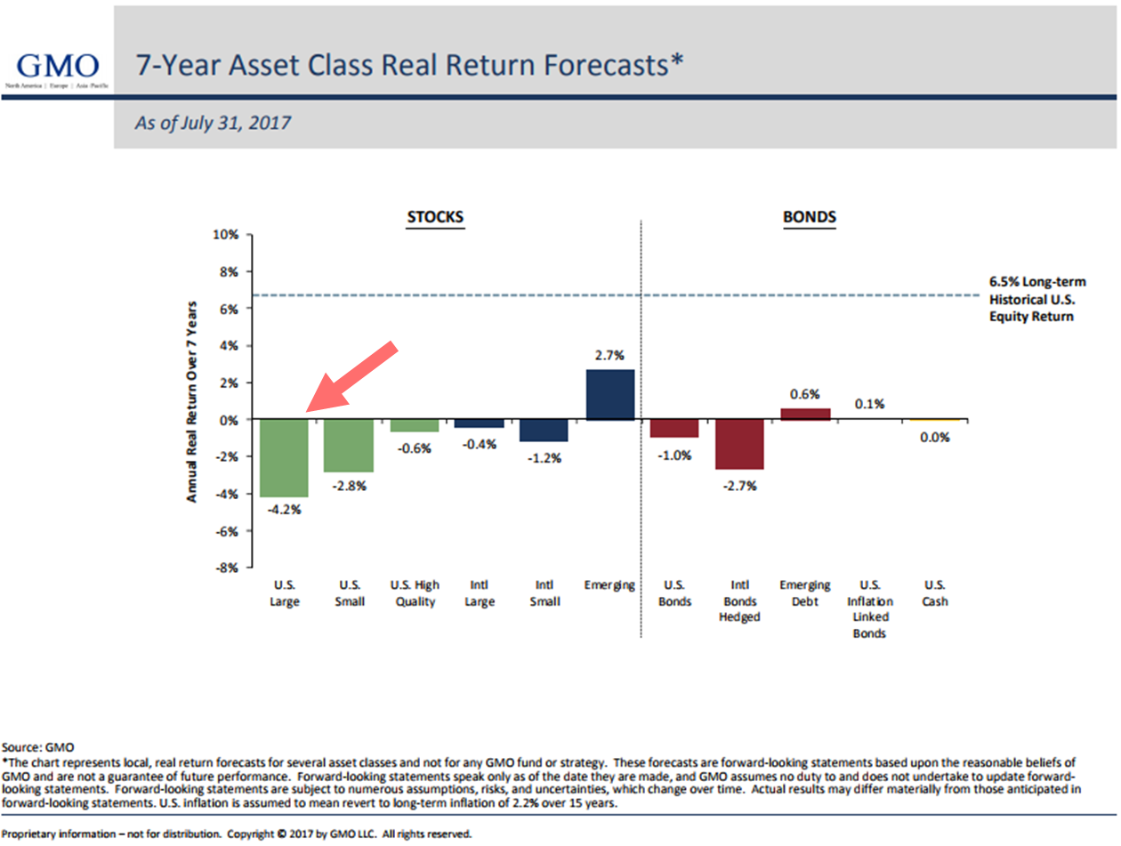
Source: GMO
To better understand how GMO calculates their forward return outlook, see GMO’s “The S&P 500: Just Say No” for the quant geek explanation of how GMO comes up with the forecast. You can find it here.
Bottom line: GMO has been posting their monthly real return forecast for a very long time. Study the data, as others have, and you’ll find a near 0.97 correlation between what they predicted and what turned out to be actual return. That’s a high accuracy rate that should grab our attention. No guarantee but not to be ignored.
Note in the chart that all but three asset classes are expected to produce a negative annualized real (meaning after inflation) return. The long-term historical U.S. equity market real return is 6.5%. Expect low to negative real returns over the coming seven years… from most asset classes. Wish the numbers were better. They are not.
Bottom line: Buy-and-hold is going to be under pressure (low single digits to negative). Seek alternative ways to drive return. They exist.
Chart 2: Median P/E
Median P/E is the price-to-earnings ratio in the middle. That is, if you rank all the price-to-earnings ratios of each of the individual stocks that make up the S&P 500 Index, Median P/E is the one in the middle. It is my favorite P/E measure because it is based on actual earnings (not Wall Street’s over-optimistic forecasts) and, by picking the middle, it in some way removes a lot of the one-off reporting trickery.
Simply see it as a number that enables you to do further analysis. For example, if you look at the Median P/E each and every month going back many years and plot that number on a spreadsheet and next to each monthly number you plot the subsequent actual 10-year annualized return, you can get a feel for what is a good bargain and what is a bad bargain.
When you look at the next chart, you will see that the current Median P/E is 24.3 (red arrow). Again, just see it as a data point. Chart 3 will show our findings as to what subsequent returns turned out to be. As Warren Buffett said, “When the hamburger prices are low, you can buy a lot more with your money. When they are high in price, you don’t get as much.” The markets are the same way.
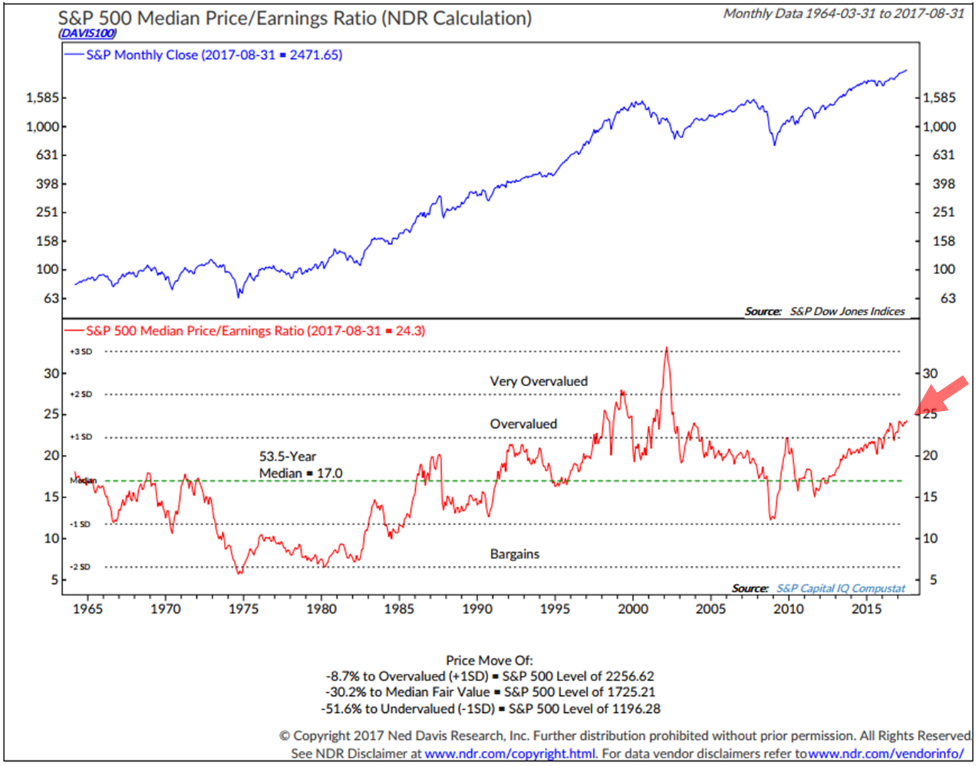
Source: Ned Davis Research
If you exclude the dot-com bubble period, Median P/E sits at its most overvalued level since 1964. Conclusion: The hamburgers are expensive.
Note too, the data in the lower section. Fair value, based on the 53.5-year median P/E number of 17 (a proxy for fair value) puts fair value of the S&P 500 Index at 1725.21. A decline of 30.2% is a probable risk. Look for a sell-off to that level to get aggressive on equities again. A crash-like event would take us toward 1196.28. That would be a buy when everyone else is panicking moment. A long shot but could happen. My sights are set on “fair value” before I get aggressive on equities again.
Chart 3: Forward 10-year returns based on Median P/E (1926 – December 31, 2014)
Ned Davis Research (NDR) broke each month-end Median P/E into five categories (Quintile 1 = lowest Median P/Es to Quintile 5 = highest Median P/Es). Not surprisingly, their results showed that over the entire period from 1926 to 2014, the highest returns occurred when the market was inexpensively priced.
Over a 10-year period, this has a significant effect on the total return. A 15.7% annual return over 10 years comes out to a cumulative return of 330%. Comparatively, a 4.3% annualized return delivered a cumulative return of just 52%.
Next, let’s consider the more recent period from 1981 to 2015. Chart 4 shows the same relationship between market valuation and subsequent returns as seen in the 1926 through 2014 period, and it goes a step further, illustrating the single highest and single lowest subsequent 10-year annualized returns.
For example, when Median P/Es were the lowest (Quintile 1), annualized returns over subsequent 10-year periods were 16%, while the single best 10-year outcome was 18.8% annualized and the single worst was 12.4% annualized. Conversely, when the Median P/Es were the highest (Quintile 5), the annualized returns over subsequent 10-year periods were just 6%, while the single best 10-year outcome was 9.8% and the single worst 10-year outcome was -0.5% annualized.
Chart 4: Forward 10-year Returns 1981 to December 31, 2014
Chart 5: Following are a few select periods in time.
I can tell you few people saw the writing on the wall in December 2000. And who do you know that was buying in December 2008. For the record, I wrote a letter back then titled “It’s So Bad It’s Good.” It was a “buy when everyone was selling” panicking moment. I think another period like that will present again.
Note at today’s 24.3 Median P/E, it is higher than any of the P/Es circled in red in this next chart.
Chart 6: Forward 12-year returns – John Hussman
Here is how you read the chart:
- Take two Advil
- And one anti-depressant
- The blue lines shows his model’s historical prediction for coming 12-year returns. The red line shows what actually happened in regards to market returns.
- It stops short at the point where we don’t yet know the actual 12-year return outcome.
- The point is to note the high correlation between forecast and subsequent returns.
- Skip the anti-depressant, relax and be sure to risk manage what you’ve got. The other side of the next dislocation will be an outstanding return opportunity.
- Stay patient and prepared to act.
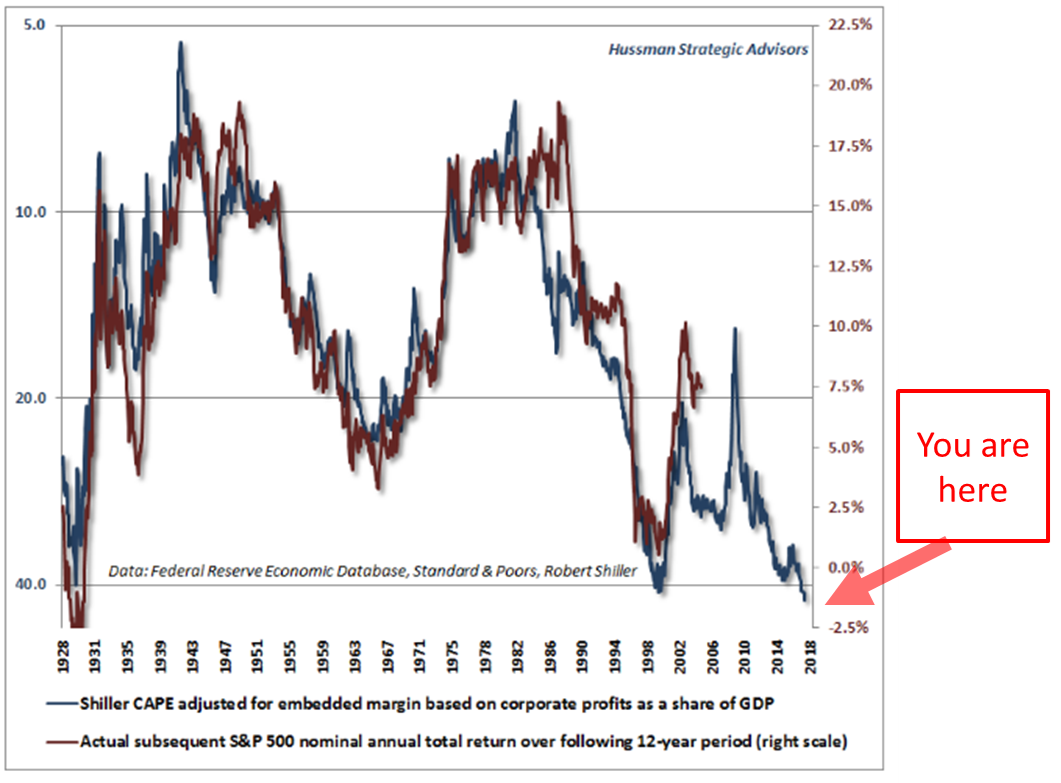
On valuations, John Hussman wrote an important summary this week. Forget the coffee and grab some valium before reading. As he mentions in his piece, he sees “Breathtaking Risks…”
Bottom line: The 12-year forward return outlook for equities is -2% per year. Again, the hamburgers are expensive.
In summary, almost every valuation measure you can look at sees the market richly priced. Price-to-Sales, Price-to-Book, levels in margin debt, etc. Yet when you have global central banks printing and buying risk assets, you get a boost. When you have negative rates in much of the world, where do you put your money? We may go higher in the short run, but it doesn’t change the long-term return probabilities. Vanguard’s Joe Davis is right. Lower returns and likely to get rocky.
Recessions by Decades – Will This be the First Without One?
Take a look at the recession data in the next chart. Since 1930, there have been at least one or two recessions every decade. Three of the post-1930 decades had just one recession and five of the decades had two recessions. There have been zero recessions so far this current decade.
Will this be the first without recession? I doubt it very much. Often I share with you my favorite recession indicator signal charts. There is no current sign of recession within the next six months. I’ll keep you posted. Here are the recessions by decade chart:
Source: Crestmont Research
Let’s continue to keep our eye on leading recession indicators. The best is an inverted yield curve. The equity market is also a good leading indicator. No need to cover this today.
Trade Signals — Secular Bull Markets Occurred Just 54% of the Time Since 1900
S&P 500 Index — 2,464 (9-6-2017)
Notable this week:
Risk on remains as the weight of trend evidence remains bullish.
Click here for the latest Trade Signals.
Important note: Not a recommendation for you to buy or sell any security. For information purposes only. Please talk with your advisor about needs, goals, time horizon and risk tolerances.
What Do You Do?
Asset allocation doesn’t explain all of it but it does explain most of a portfolio’s return. How you allocate determines your portfolio’s return and risk profile. If you are an aggressive investor and you overweight to bonds, you are mismatching your goals and potential outcome. A two percent bond yield on a 10-year bond will earn you two percent per year for 10 years. It won’t give you the 10% return the equity market has given year to date.
My two cents: For a moderate investor, underweight and hedge equity market exposure. I like 30% to equities (with downside stops in place), 30% to fixed income (tactically managed due to ultra-low yields and 40% to tactical ETF trading strategies and some gold). You may want to think entirely differently about your fixed income exposure and find lower vol, return-generating strategies. There are alternative solutions.
When equity market valuations reset and probable forward returns north of 10%, then consider increasing your equity market exposure to 50% or 70% depending on your risk, needs, time horizon and goals. The opportunity will present in the next recession/bear market correction. Until then, remain patient and prepared with risk management front of mind.
Personal Note
I’m late and rushing for the plane home to Philadelphia. I hope you found the bull and bear market stats as eye-opening as I did and the monthly check in on current valuations helpful. I know it helps me to stay focused.
We humans, me included, tend to focus on the recent and lose sight of the bigger picture. Economies cycle from periods of expansion to contraction. Markets cycle. Sometimes it’s nice to take a step back and look at the big picture. The next bear market cycle likely hits at the same time the pre-retirees and retirees can least afford it. Don’t follow the masses. Think differently. Participate and protect. As Art Cashin says, “Stay wary, alert and very, very nimble.”
Chicago has been a productive trip. It was great to see many old friends. There really are some wonderful people in this industry. When this letter hits your inbox, I’ll be on a flight home. And I’m really looking forward to getting home. Brie’s coming in for a wedding and asked dad to golf with her on Sunday. Lucky dad.
I hope you, too, have a wonderful weekend. Let’s send some prayers to the people in the path of Hurricane Irma. She’s packing a punch. Stay safe!
? If you are not signed up to receive my weekly On My Radar e-newsletter, you can subscribe here. ?