
“To refer to a personal taste of mine, I’m going to buy hamburgers the rest of my life.
When hamburgers go down in price, we sing the ‘Hallelujah Chorus’ in the Buffett household.
When hamburgers go up in price, we weep.
For most people, it’s the same with everything in life they will be buying — except stocks.
When stocks go down and you can get more for your money, people don’t like them anymore.”
– Warren Buffett, “The Wit and Wisdom of Warren Buffett,” Fortune (Nov. 19, 2012)
So should we sing or weep? Warren Buffett has a brilliant way of making the complicated simple. Let’s think about valuations like we think about the price of hamburgers and see if we are going to get more or less for our money. Today, I share with you my favorite valuation charts and story them in a way I hope your clients might better understand.
When I speak to advisors and investors, I use Warren’s hamburger analogy. Heads nod. Eyes are locked in. People get it. If I talk about price-to-earnings ratios (P/E), price-to-sales ratios, price-to-book ratios, eyes glaze over. People don’t get it. I’m sure you understand the finance language, but a lot of people don’t. So for now, let’s talk hamburgers.
We didn’t have all of this big data or computing power in my early days with Merrill Lynch in 1984. But we do today. What you’ll see in the data that follows, the hamburgers are richly priced. We’ll define what that means in terms of the probable returns over the coming 7, 10 and 12 years and what it means in terms of the relative risks.
As a quick aside, if you are a long-time reader, you’ll know I update the charts the first week of each new month. I do it because, even after all these years, it helps me stay centered and I hope it helps you as well. Hamburgers: expensive or cheap.… What follows is a summary of the most current equity market valuations and what they tell us about probable forward returns and downside risk.
Grab a coffee and read on. I truly hope you find the messaging in such a way that your retail client can better understand. Please let me know your thoughts.
? If you are not signed up to receive my weekly On My Radar e-newsletter, you can subscribe here. ?
Included in this week’s On My Radar:
- Valuations and Forward Equity Market Returns
- Charts of the Week
- Fed Policy and Rising Rates
- Trade Signals – Ride, Captain Ride Upon that Mystery Ship
- Concluding Thought and Personal Note
Valuations and Forward Equity Market Returns
Following are a number of my favorite valuation metrics. Let’s take a look at them and see what the research data might tell us about probable forward returns (high-priced or low-priced hamburgers):
Chart 1: Median P/E (Price-to-Earnings ratio). The 52.8-year fair value is 16.9. The current median P/E is 24.1. Current state: “Expensive hamburgers”
Think of the P/E ratio like this. Your business has 10,000 shares outstanding and your current share price is $10. That means your company is worth $100,000 (10,000 x $10). Now, let’s say your company earned $20,000 over the last 12 months. That works out to $2 in earnings for every share of outstanding stock ($20,000 in earnings divided by 10,000 shares). So if your stock price is $10 and your current earnings per share is $2, then your stock price is trading at a P/E of 5 (or simply $10 divided by $2 equals 5). It is simply a metric to see if your “hamburger” is expensive or inexpensive.
With this as a basic starting point, we can then see if the hamburgers are expensive or inexpensive. We can look at the S&P 500 Index (a benchmark of “the market”) and we can measure what the average P/E has been over the last 52 years – call that “fair value” or a fair price for a hamburger.
What you’ll see is that a P/E of 5 is a really inexpensive hamburger. Now I believe in you and I believe you can grow your company’s earnings over the coming years but, wow, if I can buy a great company at a low price, the odds are I’m going to make a lot of bank on my investment in you.
We can collectively look at the market as if it was a single company and gauge how expensive or inexpensively priced stocks are at any point in time. Over the last 52.8 years, the median fair value for the S&P 500 is a P/E of 17. That means a fair price for your company would be $2 in earnings times 17 or $34 per share. If I can buy your stock for $10 per share instead of a fair value of $34 per share, good for me.
But what if you earn $2 per share and your stock price is trading today at $48.20 per share or 24.1 times your earnings, I’m buying a very expensive hamburger. So price relative to what your company earns is a good way for us to see if we should sing or weep.
Here is how you read the following chart:
- Median P/E is the P/E in the middle, meaning there are 250 companies out of 500 that have a higher P/E and 250 that have a lower P/E.
- The red line in the middle section shows you how P/Es have moved over time (updated monthly).
- The green dotted line is the 52.8 year median. So a Median P/E of 17 is the historical “fair value.” Simply a point of reference.
- You can see that over time, the red line moves above and below the dotted green line.
- If you remove the 2000 to 2002 period in time (the “great bull market”), we currently sit at the second most over-valued time since 1964 (note 1966 marked a secular bull market high to be followed by a bear market that lasted from 1966 to 1982).
- In the bottom section of the chart, you can also see Ned Davis Research (NDR) marks “Very Overvalued,” “Overvalued,” “Undervalued” and “Very Undervalued.”

One last comment on the above chart. At the very bottom of the chart, NDR shows that the market is 7.9% above where it would consider the market to be overvalued.
- Meaning the market would need to decline from the March 31 S&P 500 Index level of 2362.72 to 2176.07 to get to the “overvalued” threshold.
- It would need to decline to 1665.72 to be get to “fair value.” That’s a drop of 29.5%.
- Also note “undervalued,” which could be achieved in a recession (-51.1% away).
So fair value for your company would be $34 per share (that’s your $2 per share in earnings times a “fair” P/E of 17). But your company is trading at $48.20. I’d be happier if your hamburger were priced at $34 for I’d make much more on my money. I’d be thrilled if your stock was at $20, my forward returns would likely be outstanding. Let’s look at what that looks like next.
Chart 2: Median P/E and Forward 10-Year Returns
Median P/E can help us predict what is likely to be the coming 10-year annualized returns for the S&P 500 Index. Expensive hamburgers or inexpensive hamburgers. The price at which you buy matters.
Data from 1926 through 2014. Here is how you read the chart:
- Median P/E is broken down into quintiles. NDR looked at each month-end median P/E and ranked the numbers with the lowest 20% of all the month-end P/Es going into Quintile 1 and the next 20% into Quintile 2 and so on with the most expensive or highest P/Es going into Quintile 5.
- They then looked at the subsequent 10-year returns by taking each month-end P/E and calculating the subsequent 10-year annualized return.
- Sorting those returns into quintiles and then taking the median 10-year subsequent annualized return, they determined the following (returns were greatest when the P/Es where low and worse when P/Es were high).
- With a current median P/E of 24, we find ourselves in Quintile 5:
We sit today firmly in quintile 5. It is telling us to expect low returns over the coming 10 years. Investors are expecting 10% from equities. If they were invested in your company, you better find a way to rapidly grow your earnings to may your P/E look more attractive and you might be able to do that, but history tells us that the collective market will have a hard time growing much faster than our country’s Gross Domestic Product (GDP).
The hamburgers are expensive. Get yourself mentally prepared to play offense when move into quintiles 3, 2 and 1. For now, time to think differently and play more defense.
As a forward guide, when I share the median P/E with you at the beginning of each month, use this next chart as a guide to see which quintile we are in:
Let’s next look at a number of different valuation measurements.
Chart 3: Shiller’s CAPE or Cyclically Adjusted P/E (a measurement process that smooths P/E over the last 10 years)
The current level is 28.94. Higher than at the market high in 2007. Higher than the bull market peak in 1966. Only 1929 and 2000 were higher.
Source: multpl.com
Chart 4: Jeremy Grantham – GMO’s 7-Year Asset Class Real Return Forecast
Here is how to read the chart:
- Each month for many years, GMO publishes their forward return forecasts. They have a high correlation over time to what they predicted and what turned out to be. An approximate 0.97 correlation. 1.0 is a perfect correlation. -1.0 is non-correlation.
- In 1999, GMO predicted a -1.9% seven-year real return forecast for large-cap stocks. Real means after inflation. Everyone was racing into tech stocks back then. The actual returns turned out worse than forecast.
- As of February 2017, GMO is forecasting a -3.8% for U.S. large-cap equities and a minus 0.8% for U.S. Bonds.
- With a richly priced market (expensive hamburgers) and GMO’s strong return forecast history, I find it illogical and unwise to chase into passive buy-and-hold ETFs and index funds at this time. Yet that is what is happening.
Source: GMO
Chart 5: Hussman’s 12-year Return Forecast on Traditional 60/30/10 Mix (S&P 500, Tsy Bonds, Tsy Bills)
John Hussman shared this next chart — his 12-year forecast is 0% to 2% before inflation.
Here’s how you read the chart:
- The “red” line plots the actual subsequent 12-year return
- The “blue” line plots the estimated 12-year return
- Note the high correlation between the “estimated 12-year forecast” and the actual
Source: Hussman Funds
SBB here: How in the world are pensions going meet their 7.5% actuarial targets? Keep rising pension concerns on your radar.
Chart 6: What about Drawdowns?
Here is a look at the downside risk by quintile. Remember, we sit in the most expensive quintile. The simple point is that risk is highest when valuations are highest.
Not only are returns lower when valuations are highest, risk is also highest when valuations are highest. That sounds logical and it looks like this (data using Shiller P/E broken into quintiles):
Chart 7: Household Equity Ownership Percentage vs. Subsequent Rolling 10-Year S&P 500 Index Total Returns
I find this chart to be really cool. It looks at equity ownership percentage and has a high correlation to what future annualized returns turned out to be.
Here’s how you read the chart:
- Think in terms of buying power. If individuals are largely fully invested in stocks, how much more money do they have available to buy more stocks. More buyers than sellers pushes prices higher. More sellers than buyers pushes prices lower.
- Of course there are other buyers and sellers: institutions, corporation and foreign investors (and now even government central banks). Just stick with me on this point.
- The blue line tracks the equity percentage of total household financial assets and includes mutual funds and pensions.
- Take a look at the top red arrow. At the market top in March 2000, the high level of equity ownership was forecasting a return of -3% annualized for the coming 10-years.
- The black dotted line plots the actual subsequent return that happened over the subsequent 10 years and is plotted on a rolling basis.
- Again focus in on 2000. The dotted black lines shows that the return turned out to be approximately -1%.
- Look how closely the dotted black line (subsequent returns) tracks the blue line over time.
- Note green arrows. Those were great buying opportunities.
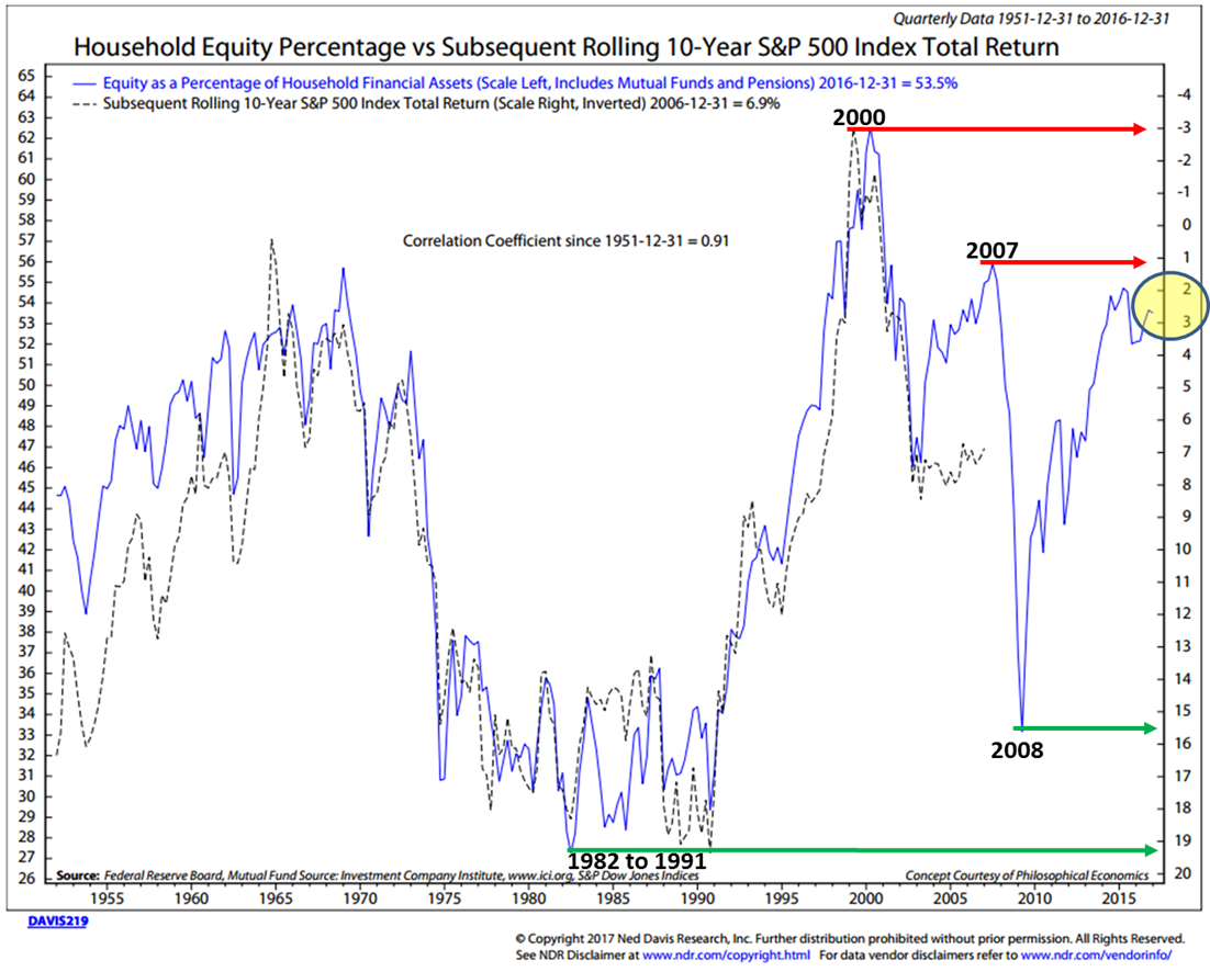
We can use this chart as a guide. I’ll share it with you from time to time. Point is that we want to get our clients prepared to overweight stocks when the getting gets good. The hard part is they’ll need to be a buyer when everyone around them is panicking. That’s when opportunity is always best.
Chart 8: Average of Four Valuation Indicators – Way Above Trend
Here’s how you read this chart:
- The chart is simplified summary of valuations by plotting the average of the four arithmetic series along with the standard deviations above and below.
- Standard deviation measures extreme moves away from normal trend. Above a 2SD is a lot. Currently second highest in data series. Rare event.
- The four valuation metrics are Crestmont P/E, Cyclical P/E10 (similar to Shiller P/E), the Q Ratio and S&P Composite from its Regression.
- Note, the far right number on the chart of 84%. This is a two standard deviation above its trend and is the second most overvalued reading in the data series history.
Source: advisorperspectives.com
Chart 9: Valuations – Everything Else: Price-to-Sales, Price-to-Operating Earnings, Etc.
Here’s how you read the chart:
- There are so many ways to measure valuations – the point in this next dashboard summary is that by most measures, the hamburgers are richly priced.
- Look to the far right (a lot of red) – most valuation metrics are “Moderately or Extremely Overvalued.”
- Red is bad, green is good.
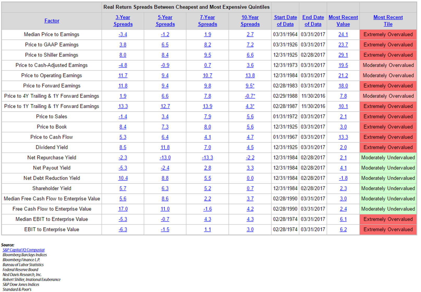
Chart 10: Median P/E – Select Dates
To make this a little more real, I selected several dates to give you an idea as to what the median P/E was then and what the subsequent annualized 10-year return turned out to be.
- Green is low P/E, high return
- Red is high P/E, low subsequent returns
Take a look at the December 2002 median P/E of 18.8. A month prior on November 11, 2002, Buffett said, “The bubble has popped, but stocks are still not cheap.…” He was right. The return over the subsequent 10 years was just 4.94%. Friend, we sit at a median P/E of 24.2 today. Higher than any other point on the above chart. Caution!
By the way, if you are curious, pick a few month-end dates, send them to me and I’ll send you the data on what the returns were 10 years after. I have the data back to 1981, but I’ll see if I can get my friends at NDR to help if the dates are prior.
Chart 11: Earnings Estimates
I use median P/E because analysts are historically too optimistic in their earnings forecasts when compared with what actually happens.… The point in showing this next chart is that I don’t, and don’t believe you should trust, Wall Street estimates.
Here’s how you read the chart:
- The top of each squiggly line is the first Wall Street consensus estimate, the bottom of each line is the last. It shows that as time moved forward, they kept lowering their earnings estimates (way too optimistic at the start).
- Note the orange line (“2016”), the first estimate was for $137 earnings per share for the S&P 500 Index and the last sits at approximately $106. That’s a big miss. And note every year prior.
- We don’t yet have the final December 2016 year-end number. It may end lower than the actual earnings for 2013. Yet stock market prices have shot higher since then.
- That’s a lot of years with very little earnings growth and explains why the market is so overvalued.
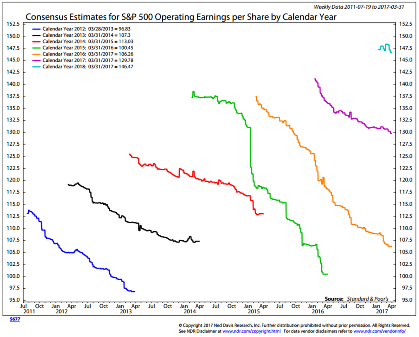
Chart 12: The Buffett Indicator – Corporate Equities to GDP
Let’s finish our valuation discussion today where we started, with Warren Buffett. Mr. Buffett was quoted in Fortune magazine in 2001 saying that his favorite valuation metric is the total value of corporate equities to GDP.
Here’s how you read the chart:
- The idea is that the value of corporate equities (total shares times current stock prices) should have some relationship to what the U.S. can collectively produce in total Gross Domestic Product.
- Think of GDP as everything businesses, persons and governments collectively produce. Most companies are unable to grow their businesses much faster than GDP so looking at the total market value of equities versus GDP gives us a way to see if the prices of the stock market has gotten ahead of itself or if it is more fairly priced relative to other points of time in history.
- Look at the far upper right-hand side of the chart. At 125.2% of GDP, the market sits at the third most overvalued level in history. Higher than 2007, higher than the bull market peak in 1966. Only 2000 was higher.
You get the point. It is not yet time to “sing the Hallelujah Chorus.” The hamburgers remain expensive. Expect low forward 7-year, 10-year and 12-year gains. Call it -2% to +4% worst to best case before fees and expenses. My best guess.
Simply, it’s time to play more defense then offense. Send me a note if you want some ideas on how I am approaching this period ahead.
Charts of the Week
Following are several charts I came across recently that I found of particular interest.
Chart 1: State Street Investor Return Expectation Survey
- State Street asked investors what their return expectations for five years plus.
- Equities 10% (the evidence above suggests -2% to 4% nominal returns at best).
- Bonds 5.5% (how can bonds produce 5.5% in a 2.33% 10-year Tsy yield world).
- “No” means – Not going to happen. Such returns would defy statistical probabilities. But, the point is, this is what your clients are expecting.
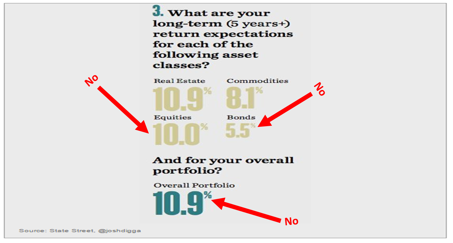
Chart 2: The S&P 500, Dow and Nasdaq Since their 2000 Highs
Source: advisorperspectives.com
Chart 3: The Current Cyclical Bull Market is Aged
Here is how you read the chart (a few highlights):
- Note “we are here” or eight years into the bull market move (this move is aged)
- We are in the second longest cyclical bull market move in history (as defined by CFRA)
- Note “oldest” run was 10-11-90 to 3-24-2000
- The third oldest bull move was from 1949 to 1956
- The post 2000-2002 (bear market) rally lasted five years
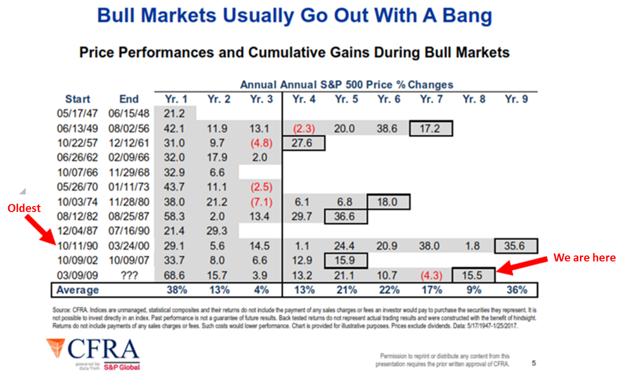
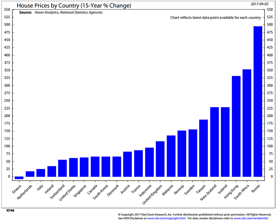
Chart 4: 15-year Percentage Change in Home Prices (just in case you are interested… I was)
Fed Policy and Rising Rates
“Big money is made in the stock market by being on the right side of the major moves.
The idea is to get in harmony with the market.
It’s suicidal to fight trends. They have a higher probability of continuing than not.”
— Martin Zweig
And one last important point to keep front of mind. The Fed is in a rate-raising mode and really does need to find a way to normalize rates. Pensions and savers are starved for income and the Fed needs to be better positioned to deal with the next recession.
The great Edson Gould Fed, the legendary technical analyst from the 1930s through the 1970s, developed a simple rule about Federal Reserve policy that has an excellent record of foretelling a stock market decline.
The rule states that “whenever the Federal Reserve raises either the federal funds target rate, margin requirements or reserve requirements three consecutive times without a decline, the stock market is likely to suffer a substantial, perhaps serious, setback.” (Schade, 2004).
This simple rule is still relevant. Although it tends to lead a market top, it is something that should not be disregarded.
In the mid-1980s, the great Marty Zweig wrote a book titled Winning on Wall Street. He said, “Monetary conditions exert an enormous influence on stock prices. Indeed, the monetary climate – primarily the trend in interest rates and Federal Reserve policy – is the dominant factor in determining the stock market’s major direction.”
Zweig’s Fed policy rule is simple, “three steps and a stumble.” Basically, when the Fed raises interest rates three times, the stock market stumbles. When they lower rates, it’s good for stocks.
I’ve quoted Stan Druckenmiller before. He said, “Earnings don’t move the overall market; it’s the Federal Reserve Board… focus on the central banks and focus on the movement of liquidity… most people in the market are looking for earnings and conventional measures. It’s liquidity that moves markets.”
The Fed has now raised rates three times. Stumble? We’ll see…
The set up for potential return is far different than it was in 2009, or 2002 or 1982. To me, it sure feels like 1999 all over again. Stay nimble my friend.
Trade Signals – Ride, Captain Ride Upon Your Mystery Ship
S&P 500 Index — 2,376 (4-7-2017)
Investor Sentiment has moved to Extreme Pessimism – such readings historically have been short-term bullish for equities. The equity trend remains bullish. The CMG Managed High Yield Bond Program is in a buy signal. The Zweig Bond Model signal remains in a sell signal – the trend for fixed income remains negative (signaling higher interest rates). The long-term gold signal remains in a sell, while the short-term gold indicator remains in a buy signal (suggesting some gold exposure).
Click here for the charts and explanations.
Concluding Thought (Feels like 1999) and Personal Note
“You don’t need a rocket scientist.
Investing is not a game where the 160 IQ guy beats the guy with the 130 IQ.
… Rationality is essential when others are making decisions based on short-term greed or fear.
That is when the money is made.”
– Warren Buffett
I thought I’d conclude today’s piece with one last quote from Warren Buffett. On November 22, 1999, he said, “I think it’s hard to come up with a persuasive case that equities over the next 17 years will perform anything like — anything like — they’ve performed in the past 17. If I had to pick the most probable return, from dividends and appreciation combined, that investors in aggregate … would earn … it would be 6%.”
I admire Warren Buffett and love both his wit and wisdom. His forecast came pretty close to what turned out to be. I was curious so I had my research team run the numbers. Since November 22, 1999, the annualized total return for the S&P 500 Index was 4.97%. Of course, along the road to that low return was a -55.25% decline, and I know from the calls I had with clients… short-term fear ruled reason. Investors were selling when they should have been buying.
I believe you and I have an opportunity to really help people. Broad diversification – yes. Much like 2008, asset class correlation will be very high. That traditional diversification won’t work in the next recession. My friend John Mauldin’s message is to diversify to trading strategies that diversity to asset classes. I think he is on to something.
The travel schedule is picking up. I’ll be NYC April 19-20 and Sonoma, California the following week from April 24-26 for the CMG & Peak Capital Advisor Summit. I’m really looking forward to that (and the wine).
I’ll be in Dallas on May 15-17 for a Mauldin Council advisor event. If you are an independent advisor and interested in learning more, please send me an email. On May 22-25, I’ll be at the Omni Orlando Resort attending John’s annual Strategic Investment Conference. Speakers include David Rosenberg, Dr. Lacy Hunt, Mark Yusko, Neil Howe, Ian Bremmer, David Zervos and more. You can learn more about the conference here. Similar to years past, I’ll be taking a lot of notes and promise to share them with you.
Last night was a joy filled night for Susan and me. We attended a five school chorus challenge and were blown away. Amazing how talented these children are… I’m sure you attended your fair share of lower school, middle school and high school events. Truthfully, some have been more challenging than others. But these kids were the ones who were selected for their teams and wow. Before the schools presented, they did a combined song. It was beautiful. The world faces so many challenges and some unimaginable hardships recently. It was so nice to see so much good. I will try to upload a short video of the performance over the weekend (some technical challenges but we’re on it).
Wishing you a wonderful weekend and a lot of joy!
If you find the On My Radar weekly research letter helpful, please tell a friend … also note the social media links below. I often share articles and charts during the week via Twitter and LinkedIn that I feel may be worth your time. You can follow me on Twitter @SBlumenthalCMG and on LinkedIn.


