
This article looks at two lenses on individual investor asset allocations. Doing this allows us to have a gauge for where the average investor is, compare and contrast our own allocations, and get an insight into any signals that may be present.
Both charts below appeared in a discussion about asset allocation in the latest edition of theWeekly Macro Themes. The first chart shows theAAIIsurvey (direct investments in the stock market and investments in stock funds are aggregated – likewise for bonds).
There’s a couple of observations: equity allocations are high, but lower vs the highs in 2015 and lower than during the dot com boom. Meanwhile cash allocations are at the low end of the range, and ever since the financial crisis there has been a substituting out of cash and into bonds (ZIRP!).

The other view I wanted to show you is the “implied asset allocations” indicators I calculated from the aggregate amount of assets in mutual funds from theICI data. This will obviously miss out some investments, particularly passive investments and direct ownership, but it shows more or less a similar view.
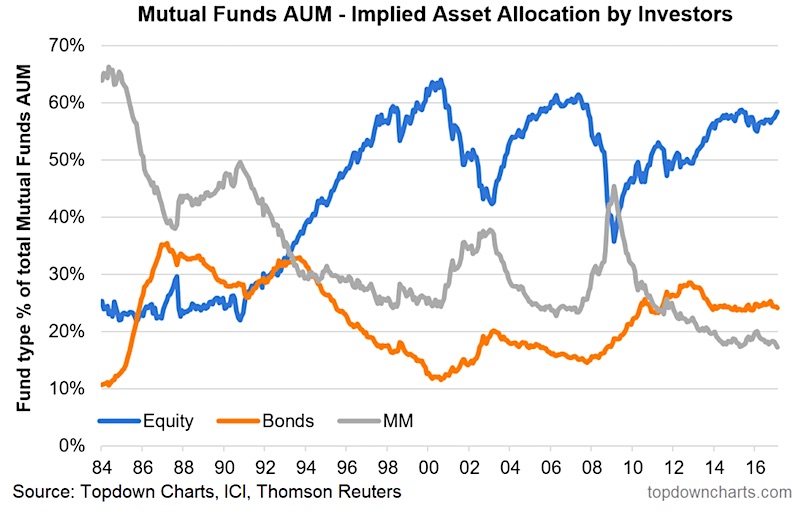
Equity allocations are at the upper end of the range, bond allocations have taken over vs cash, and cash is at all time lows – albeit this measure of cash is just money market funds. What’s also interesting is (longer time series) how an apparent mass migration occurred out of money market funds and into stock funds during the 80’s and 90’s.
To sum-up, these two lenses on individual investor asset allocations should hopefully provide some food for thought on your own allocations, but also add some insight as to what might come next. Indeed, at this point it’s hard to see equity allocations going higher. Likewise, cash is at the bottom end of the range – but then again, at around 15-20% it’s not zero either!
This article appeared here first as a submission atSee it Market
Follow us on:
LinkedInhttps://www.linkedin.com/company/topdown-charts
Twitterhttp://www.twitter.com/topdowncharts


