
I’m going to try to tie two related themes together today. The first, and I have to admit I was surprised when I saw the research, is the incredible shrinking universe of stocks. Think corporate share buybacks, mergers and acquisitions and fewer companies going public. The second is the popularity of index investment products available via mutual funds, ETFs and in large managed accounts (e.g., pension plans simply allocate to index exposure whether it may be large cap, small cap, smart beta, etc.).
So here is what is concerning me. Less supply of available stocks and more and more money in index-based products whose mandate is to buy all the stocks in its index. No fundamental research required. The good are bought along with the less well-run companies. When the flows are positive, they all go up.

A good friend asked me to do some digging, so I had my investment team take a look at the total amount of money in small cap ETFs and mutual funds. I was surprised again; approximately 30% of the total money in small caps is in index-based fund products and that doesn’t include the large institutions. That’s a wow.
The popular thinking is that owning a diversified index is better than picking individual stocks, and that’s been the case the last few years. If you ask active managers, they’ll tell you they are feeling the squeeze and it is sure showing up in the flows — out of active MFs… into ETFs.
It is this high level of concentration that gets me thinking about other past investment crazes, such as tech in 2000, the “Nifty-Fifty” stocks in the 1970s and “portfolio insurance” in 1987. Remember, that stuff was supposed to protect your downside.
So, with fewer stocks outstanding and the passive index investing popularity of today, I can’t help but wonder if we shouldn’t have our antennas up. Then, this crossed my desk a few weeks ago:
In each market cycle, there is usually a new narrative to rationalize excesses in the late stages of a bull market. “Don’t worry about overvaluation in 1987,” it was said, because institutions had no need to sell due to a new concept called “portfolio insurance.”
The concept was well thought out, tested, and sold. I thought it had great validity. Nevertheless, when something becomes too popular and has a large crowd using it, it can malfunction and that likely played a large role in “the crash.”
Again, in 1972-1973, it was, “Don’t worry about overvaluation” if one just bought the “Nifty-Fifty” group of growth stocks that history had proven grew in both good times and bad. Some of these companies are no longer around! There was a similar story in 2000. We were in a “new era” of internet growth. “Don’t worry if stocks had no earnings.” It was “internet clicks” that were important to measure. The internet was indeed a new era, but most dot-com stocks went bust.
In 2007, it was “Yes, housing is pricey,” and nearly anyone could obtain a mortgage loan. However, real estate only went in one direction – upward! Also, don’t worry about mortgage debt – no major bank/broker had gone broke in decades. Besides, as everyone knows, real estate is “local.”
In 2017, I fear the bubble is mainly in passive investing. It has done so well for so long that John Bogle’s great idea has been bought by nearly everyone.
Low fee passive funds that just buy and hold an index fund have largely creamed the high fee active funds the last few years. Not only have index funds outperformed, but the crowd has noticed. Most all of the positive flows are going into passive funds as seen by comparing the flows into mostly active equity mutual funds with passive ETFs.
“Don’t worry about fundamentals, or values; don’t worry about market timing; just buy the market and hold!” Even if there is a small correction, the market has always come back!
Ned Davis sums up his viewpoint, “Sounds “bubbly” to me.” Words of wisdom from one of the world’s great investment minds.
With the smaller inventory of available stocks and positive capital flows to index-based products, the supply/demand dynamics are quite favorable. The stock market goes up. And this may continue for a few more years. The problem comes on the other side of this trade – when there are more sellers than buyers. With so much concentration in index products and fewer shares outstanding, a rush to the exits will result in a downside that will likely be more pronounced.
Those risks will materialize in the next recession or a systemic shock to the system (i.e., Europe, China, Japan, a global banking crisis or a number of other risks that are higher today due to the global debt problem.) So stick to the trend and if you do nothing else, put a 200-day moving average stop-loss trigger on all of your long equity positions (or hedge).
With that said, I do love passive low fee index-based products – especially ETFs. They are great investment tools and, if used correctly, can add great value. Frankly, there is a way to target so many different asset class exposures and there is generally an asset class that is going up when most equities are going down.
The equity bull market is more than eight years old. Valuations are the second highest in history. The positive tailwind from the Fed is no longer at our backs. They are raising rates and in 10 of the last 13 Fed rate-rising cycles since WWII, recession followed. In the three that there was no recession, we were in the third year of recovery, not the eighth. And what does this passive bubble do to asset classes correlations? We likely won’t be getting that MPT diversification across asset classes that the academics say we will get.
Risk remains high. With fewer shares and positive flows continuing into equities, if you are an active investor, it feels to me like 1998 when all the value managers were totally unloved. All the flows went to technology stocks and funds. It was later called the great tech bubble and the “great tech wreck.” Now active is unloved. The current passive trend may continue for longer than I might expect. For now, the overall equity market trend remains bullish and as they say, “let the trend be your friend.”
Grab a coffee and find your favorite chair and read on. I share some bullet points from a Credit Suisse research piece, “The Incredible Shrinking Universe of Stocks.” Supply and demand. More buyers than sellers. For now, anyway.
We’ll also take a look at rising inflation pressures (that could trump the Trump bump) and I share with you one of my favorite inflation watch indicators – currently showing high inflationary pressures. A run up in inflation will kick the Fed into high gear. Keep that too “On Your Radar.”
Read on… and have a great weekend!
? If you are not signed up to receive my weekly On My Radar e-newsletter, you can subscribe here. ?
Included in this week’s On My Radar:
- “The Incredible Shrinking Universe of Stocks”
- Charts that Matter
- Trade Signals – Extreme Pessimism Reading S/T Bullish for Equities; Primary Trend Remains Bullish
- Personal Note
“The Incredible Shrinking Universe of Stocks” by Michael J. Mauboussin, Dan Callahan, CFA and Darius Majd (Credit Suisse)
Following are some of their findings:
- There has been a sharp fall in the number of listed stocks in the U.S. since 1996.
- While listings fell by roughly 50 percent in the U.S. from 1996 through 2016, they rose about 50 percent in other developed countries. As a result, the U.S. now has a listing gap of more than 5,800 companies.
- The propensity to list is now roughly one-half of what it was 20 years ago. The net benefit of listing has declined.
- Mergers and acquisitions (M&A) are the leading reason for delisting, and initial public offerings (IPOs) are the primary source of new listings. In the last decade, M&A has flourished while IPOs have floundered.
- Regulation has increased the cost of listing and facilitated meaningful M&A.
- As a consequence of this trend, industries are more concentrated and the average company that has a listed stock is bigger, older, more profitable, and has a higher propensity to disburse cash to shareholders.
- Exchange-traded funds have filled part of the list gap.
SBB here: But ETFs buy baskets of stocks as we discussed above. This does not add to the number of newly listed stocks.
There is a lot of information in their research piece (29 pages). I’m going to bullet point a few findings to get you started and encourage you to read the entire paper.
Introduction
- The U.S. public equity market has evolved dramatically over the past 40 years. This is important because the U.S. equity market is 53 percent of the global stock market as of December 31, 2016.1 The main feature of this change is a sharp fall in the number of listed equities since 1996, which was preceded by a steady rise in listings in the prior two decades.
- As a result of this drop, there are fewer listed companies today than there were in 1976, despite the fact that the gross domestic product (GDP) is three times larger now than it was then.
- The Wilshire 5000 Total Market Index, established in the mid-1970s to capture the 5,000 or so stocks with readily available price data, now has only 3,816 stocks.
SBB here again: Keep supply and demand in the back of your mind. Less supply, more demand, stronger equity market. This, of course, unless the flows go to international and emerging market equities or other asset classes, such as fixed income, etc. We tend to have home country biases but capital flows globally and those flows help to drive markets.
- The phenomenon is unique to the U.S. and is not easy to explain.
- In the past, economists considered frequent initial public offerings (IPOs) to be a strength of the U.S. and believed that they played an important role in encouraging entrepreneurship.4 But the weak listings in the U.S and the strong listings around the world have created what is now a large gap.
- This is important because it changes the nature of an investor’s opportunity set. In 1976, an institutional investor who wanted exposure to U.S. equities had only to buy a diversified portfolio of public companies and a venture capital (VC) fund. In 2016, that investor would have to buy a diversified portfolio of public companies, a private equity fund, and late-stage as well as early-stage venture capital.
- Individual investors today have a limited ability to access directly the complete U.S. equity market. The companies that are listed on exchanges are bigger, older, and in more concentrated sectors than two decades ago. This likely contributes to public markets that are more informationally efficient than ever before.
- The change in the number of listed companies is a matter of simple addition and subtraction. Stocks that are newly listed expand the population and stocks that are delisted shrink it.
- Additions occur when there is an IPO or a spin-off. Subtractions are the result of mergers and acquisitions (M&A), bankruptcy, and voluntary delisting. M&A includes strategic deals, where one company buys another, and financial deals, where a leveraged-buyout or private equity fund acquires a company. Exhibit 18 in Appendix A provides a breakdown of the listings
- Craig Doidge, Andrew Karolyi, and René M. Stulz, professors of finance, estimate that just under one-half of the listing gap is the result of a rapid rate of subtractions since 1996 and that just over one-half is the result of a dearth of additions.5
- In this report, we (the authors) document these changes and discuss the consequences for investors. In short, equity investors in the U.S. have to cast a much wider net than they did in the past to capture the return of U.S. equities.
The Shrinking Stock Universe in the U.S.
- Exhibit 2 shows the rise and fall in listed companies in the U.S. from 1976 to 2016. Because new lists heavily outnumbered delists, especially in the late 1980s and 1990s, more than 2,500 companies were added from 1976 through 1996. The pattern reverses after 1996, as delists outstrip new lists and the population of listed companies falls by 3,650 companies. The pattern holds for stocks listed on the New York Stock Exchange and the Nasdaq Stock Market.

The authors cite two possible explanations for the gap.
- The first is a decline in the population of firms that are candidates for listing. This is not the case. The number of firms eligible to list has grown modestly in the past 20 years from about 550,000 to 590,000. While the rate of growth of firms that are eligible to list was higher from 1976 to 1996 than it was from 1996 to 2016, there is still a larger population of eligible companies today than there was 20 years ago.
- The second explanation is a fall in the propensity to list. We can frame the propensity to list in terms of costs and benefits. If there is a decline in the net benefit to listing, fewer companies will seek to list and more will choose to delist. This appears to be the case over the past couple of decades. By one measure, the propensity to list in 2016 is half of what it was in 1996.
Delists
- There are three reasons a company delists from an exchange. The first and most common is the company is involved in a merger or an acquisition. This can involve one public company buying another (Microsoft buys LinkedIn), a private company buying a public company (Dell buys EMC), or a company going private with the sponsorship of a private equity firm (Silver Lake acquires Dell).
- Second the exchange can force a company to delist for cause. This means the company failed to meet certain requirements, including maintaining a minimum stock price and market capitalization, or was not current with the filings required by the Securities and Exchange Commission. Bankruptcy is another trigger for delisting for cause (Enron).
- Finally, a company may choose to delist voluntarily. Here, the firm judges that the cost of listing outstrips the benefit. The company may continue to trade but is no longer registered with an exchange.
M&A and Private Equity
- In 1980, there were only 24 private equity firms and deal volume only modestly exceeded $1 billion. Today, there are more than 3,000 U.S. private equity firms and assets under management for buyout funds are roughly $825 billion, up from $80 billion in 1996 and less than $1 billion in 1976.12
- Two of the largest private equity firms, The Carlyle Group and KKR & Co, each have more than 720,000 employees in their portfolio companies, which means they both employ more people than any U.S. listed company except for Wal-Mart Stores, Inc.13
- A company’s decision to be listed comes down to an assessment of costs and benefits. If the benefits exceed the costs, the firm lists. But if the costs subsequently exceed the benefits, a company may choose to again go private.
- Research shows that companies go private 13 years after their IPOs, on average, and have a higher likelihood of going private if they have less analyst coverage, lower institutional ownership, and less liquidity than their peers.14
ETFs
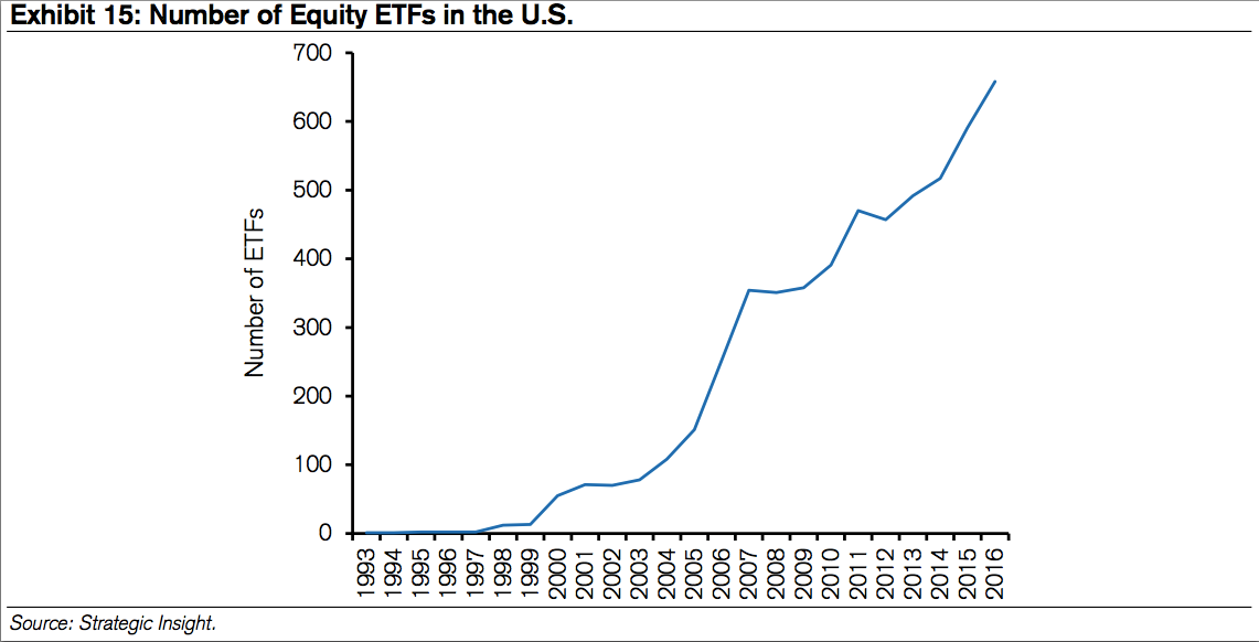
- The growth in equity exchange-traded funds (ETFs), which derive their value from the basket of stocks they reflect, has also been explosive and has offset the listing gap in part.40 Created in 1993, an ETF is an investment fund that trades on an exchange similar to a stock. The ETF holds assets that typically track an index, stocks within a sector, stocks that exhibit certain factors, bonds, or commodities. In principle, the ETF is supposed to trade close to the net asset value of the securities it is tracking. About one-fifth of the assets under management for ETFs track traditional indexes such as the S&P 500.
- ETFs trade all day, unlike mutual funds which are priced once a day, can be bought and sold through a broker, and are more tax efficient than traditional mutual funds because they trigger fewer “tax events.” In 1996, ETFs of U.S. domiciled equity funds had assets under management of just $2 billion. That sum has grown to $1.8 trillion in 2016.
- Exhibit 15 shows that the number of equity ETFs in the U.S. went from 1 in 1993 to 658 in 2016. These are a net sum, as it is common for new ETFs to be listed and others delisted in a given year. ETFs started to gain in popularity right around the time that the population of listed stocks started dropping.
The Authors’ Summary
- The number of listed companies in the U.S. rose 50 percent from 1976 to 1996 and fell 50 percent from 1996 to 2016. This has not happened in other parts of the world, opening a U.S. listing gap. This is important because the U.S. comprises one-half of the value of the world’s stock market.
- A company’s decision to list involves weighing costs and benefits. Net benefits appeared to be positive in the first 20 years of this period and have turned negative in the last 20 years. As a result, delistings have exceeded new listings by a large margin since 1996.
- Regulation appears to have played a role in two ways. The cost of being public, especially after the implementation of the Sarbanes-Oxley Act in 2002, has risen in the past two decades. That said, the shrinkage in the population of listed companies started well before that law was implemented. Further, relatively accommodative anti-trust enforcement allowed for robust M&A activity.
- As a result, listed companies today are on average larger, older, and more profitable than they were 20 years ago. Further, they operate in industries that are generally more concentrated. The overall size and maturity of listed companies means they are more likely to pay out cash to shareholders in the form of dividends and share buybacks than companies were in the past.
- We speculate that the maturation of listed companies has also contributed to informational efficiency in the stock market. Gaining edge in older and well established businesses is likely more difficult than it is in young businesses with uncertain outlooks. In turn, the greater efficiency may be one of the catalysts for the shift that investors are making from active to indexed or rule-based strategies.
I encourage you to read the entire report. There are a number of great charts.
I said I was shocked and I mean that this is something I feel I should have had greater awareness around. I didn’t realize the reduction was that meaningful.
If you’re not thinking globally, I believe you should. This is where global all asset strategies may help you improve returns. Maybe the shrinkage also argues for “higher for longer” U.S. equity market valuations, though that thought scares me. The “this time is different” thinking usually ends badly.
My two cents: Include portfolio allocations to strategies that have the ability to source returns globally. Diversify to trading strategies that have the ability to diversify to global asset classes (as well as U.S.).
Charts that Matter
Chart 1:
Jeff Gundlach of DoubleLine Capital was in the news this week. He expects yields to move lower before they move higher. The 10-year U.S. Treasury bond yield dropped from 2.6% on the day before the March 15 Fed rate hike decision to 2.4%.
- He predicted rates will move lower before they move higher, citing a move below 2.25%.
- He believes a pick-up in inflation will drive the yield above 3%. Lower before they move higher.
- He also suggested that the 10-year has more downside and noted the high correlation between the copper to gold ratio (red line in chart) and the 10-year yield (blue line in chart).
I find myself in Gundlach’s camp, but my favorite fixed income trade signal, the Zweig Bond Model, continues to signal rising rates. It has a high win rate and I’ve followed it with confidence (despite my more emotional views) for years. So I remain bearish on high quality long duration bonds (seeing rising interest rates). More in Trade Signals (link below).
Here is the link to the full ETF.com article.
Chart 2:
Inflationary pressures are building as you’ll see below.
Higher inflation will also mean higher interest rates. That’s not good with the serious debt problems in the U.S. and globally. Rising rates mean higher costs to finance that debt. Less growth.
Globally, producer prices are on the rise (inflation pressure building).
Chart 3:
U.S. Inflation – This from NDR… “High Inflationary Pressures.”
Here’s how you read the chart:
- Top section shows the year-over-year rate of chance in the CPI (Consumer Price Index.
- Bottom section consists of 22 indicators that primarily measure the various rates of change of such indicators as commodity prices, consumer prices, producer prices and industrial production. The model totals all the indicator readings and provides a score ranging from +22 (strong inflationary pressures) to -22 (strong disinflationary pressures). High inflationary pressures are signaled when the model rises to +6 or above. Low inflationary pressures are indicated when the model falls to zero or less.
Chart 4:
Bloomberg’s U.S. Economic Surprise indicator is higher:
As it relates to your investments: Monitoring inflation is important because turning points in inflation often determine turning points in the financial markets.
Chart 5:
Brexit is ON: Expect several years of uncertainty and increased volatility.
Chart 6:
In the insanity department, look at this next chart. The Bank of Japan is buying up everything they can. Note the rise since 2012 in the size of their balance sheet has grown from 30% to 92% of GDP. Wow!
Chart 7:
We’ve continued to see strong price momentum in emerging market ETFs. Look at the flow of capital in this next chart. More buyers than sellers.
As a quick aside, we have been seeing EM price leadership in much of our price momentum / relative strength work.
Chart 8:
Equity investors are the most bullish since 2008.
The great Sir John Templeton comes to mind: He said, “The secret to my success is that I buy when everyone else is selling and I sell when everyone else is buying.”
Chart 9:
Surprisingly, money continues to flow into U.S. fixed income ETFs and mutual funds.
Chart 10:
Consumer debt sector delinquencies – Almost all consumer debt growth continues to be driven by strong growth in a few categories of debt. Without the contributions of new student and auto debt over the past few years, the deleveraging seen after the Great Recession would likely have continued.
The robust growth in auto lending has been fueled in part by a combination of low interest rates, low fuel prices and a strengthening economy following the recession. The interest rate on a 48-month loan from a commercial bank for a new automobile purchase dropped from close to 8 percent prior to the Great Recession to an average of 4.3 percent since the second quarter of 2014.
The credit expansion has included consumers across the credit spectrum, including those with records considered subprime. Softened underwriting standards have raised concerns regarding the risk associated with the robust growth in auto debt.
Concerning are the continued signs of stress in auto delinquency rates and the continued rise in student loan delinquency rates.
Source of charts 4-10: The Wall Street Journal’s Daily Shot by Lev Borodovsky. If you are a WSJ digital customer, you can find the Daily Shot here.
Chart 11:
Debt and spending deficit in the U.S. – This from the CBO:
As you may know, I’m a very big Ned Davis Research fan. I’ve been a subscriber and happy client since the mid 1990’s. They kindly let me share certain charts with you, but I story them in a way to share with you how I’ve been using many of the charts for many years. I love the data and I think NDR is one of the best independent research shops in the business. They serve institutional clients, but also offer a less expensive abridged service.
If you’d like to learn more about their subscription services, contact Dan Dortona via email at [email protected]. Please know I don’t get paid a penny from NDR nor a reduction in my subscription fee. Just a happy client.
Trade Signals – Extreme Pessimism Reading S/T Bullish for Equities; Primary Trend Remains Bullish
S&P 500 Index — 2,358 (3-29-2017)
Investor Sentiment has moved to Extreme Pessimism – you’ll see in the sentiment charts that this is short-term bullish for equities. The equity trend remains bullish. Both the CMG Managed High Yield Bond Program and the Zweig Bond Model signals are bearish – the trend for fixed income remains negative. The long-term gold signal remains in a sell, while the short-term gold indicator is in a buy signal.
Since Wednesday, however, HY has moved back to a buy signal on Thursday.
Click here for the charts and explanations.
Personal Note
At one point on Thursday, the temperature at the bottom of the Mineral Basin lift (elevation 9,000 feet) was 60 degrees and, a short seven minute lift ride later, it was 36 degrees at the Summit Peak (11,000 feet). The sweatshirts the boys had on weren’t quite cutting it. We went from sun to wet rain/snow mix and called it an early last day. The conditions were poor on Thursday but no complaints. We had a great week of snow and one beautiful blue sky powder day (photo with son, Kyle, in view next).

I’ll be presenting at the Bloomberg/Invesco PowerShares ETF event on Wednesday, April 5, in Philadelphia. I’ll be sharing how we use trend-following rankings, fixed income ETF trading approaches and making the point that there are ways to navigate the ultra-low interest rate, high-risk fixed income environment we find ourselves in today.
Dallas follows April 18-19 for another Mauldin Solutions advisor dinner and due diligence meeting. By the way, the man makes a great beef chili and prime rib and his fiancé, Shane’s, bacon and beans might have stolen the day. I’m going to be looking forward to my more frequent trips to Dallas. A trip to Sonoma and San Francisco follows on April 24-26.
ETF Advisor magazine wrote an article last week “Mauldin Brings Four ETF Strategists Into One Fund.” John is quoted as saying, “Diversifying among asset classes won’t work in this next cycle.” He continues, “All asset classes will be struck by rolling bear markets. A buy-and-hold strategy means that at any one given point your portfolio will be in a bear market cycle, so you could see a fairly large drawdown in portfolios not unlike what we saw in 2008 and 2009. There were strategies that worked during that period—essentially, they were trading strategies. I want to do something like that where anyone can invest in it no matter what their income level is.”
Shoot me a reply to this email if you’d like to learn more about what we are doing.
A birthday dinner is planned for Sunday. I’m turning 56 and I hear it will be 60 degrees and sunny back home. It’s time to rush to the airport. Time to put away the skis and break out the golf clubs and walk a few holes with my boys. Hope you have some fun plans on tap this weekend.
Wishing you the very best!
If you find the On My Radar weekly research letter helpful, please tell a friend … also note the social media links below. I often share articles and charts during the week via Twitter and LinkedIn that I feel may be worth your time. You can follow me on Twitter @SBlumenthalCMG and on LinkedIn.
? If you are not signed up to receive my weekly On My Radar e-newsletter, you can subscribe here. ?


