
“There’s only one reason a share goes to a bargain price: Because other people are selling.
There is no other reason. To get a bargain price, you’ve got to look for where the public is most frightened and pessimistic.”
“Looking for a good investment is nothing more than looking for a good bargain.”
– Sir John Templeton
Last week I shared a chart with you that’s done a good job at signaling inflation. We tend to react slowly to news and, over time, we wake up. Then we herd in and out. In the “waking up” category, we better keep rising inflation on our radar.
It was with that thinking that I huddled my senior team last night and pounded the table about the embedded bond risks that are likely sitting in many individual investors’ portfolios.
It kind of goes without saying that I believe inflation is ramping and the Fed (like any government institution) is going to quickly find itself behind the curve. It’s not just ramping in the US—it’s even worse in Europe.
I think this is what happens if you leave rates at zero for eight years and print about four trillion dollars. People have been wondering where the inflation was—well, here it is. And it’s about to get worse before it gets better.
– Jared Dillon, The 10th Man, Mauldin Economics
It’s that 40% bond piece in the average portfolio that I’m concerned about most. When your starting place is a low 2.45% yield (today’s 10-year Treasury yield) or 1.37% as it was last July and rates move up over 1% to 2.45%, well, ouch. We’ll look at that risk in today’s piece (I share with you one of the most asked-for charts I post from time to time…).
And what about inflation as it relates to equities you ask? I was in Dallas this past Wednesday attending the S&P Dow Jones Index symposium and Sam Stovall’s presentation, in particular, stood out. As a quick aside, if you ever get a chance to see him present, don’t miss it. He is as great an entertainer as he is a strategist. He graciously allowed me to share a few of his charts with you.
Earnings growth drives returns over the long-run. We know that. Inflation impacts earnings. Sam presented a case based on something called the “Rule of 20,” which claims there is still room for equities to move higher in 2017. Following are four charts from Sam’s presentation and I’ll walk you through each one.
Chart 1:
This chart looks at possible price targets for the S&P 500 based on earnings and inflation expectations. If you think earnings are going to grow by 20% year-over-year and inflation is going to remain subdued at 1.7%, then the target for the S&P 500 is 2,576. Alternatively, if you think inflation is going to rise to 2.5% year-over-year and earnings are going to only grow at 6.5%, then expect the S&P 500 to fall to 2,186. It closed yesterday at 2,280.
As a correlation proof statement, Chart 2 shows you how closely these two fundamental indicators played out over time. Let’s first look at Chart 1 and consider six points. Take a quick look at the chart, read the six points and then look at the chart again:
- The major point is to note that when inflation increases, S&P 500 price appreciation potential decreases (rising inflation is bad for stocks).
- When operating earnings increase, it is good for stocks.
- The chart looks at both inflation and operating earnings and as you can see, when inflation is low and decreasing and the year-over-year gains in earnings rising, stock returns are best.
- Sam says, “Stocks Can Still Climb in 2017.” To which our CMG trend models agree. I’ve circled in red a S&P 500 potential 2017 range – it shows that if operating earnings grow 11% (top arrow) and inflation is 2.2% (left arrow) then the S&P 500 will target is 2,328 (right arrow).
- Don’t get too focused on the actual number, but do focus on the impact operating earnings and inflation have on stock prices. Better earnings and lower inflation are good for stocks… lower earnings and rising inflation are bad.
- The S&P 500 Index closed at 2,280 yesterday. If we can get 11% earnings growth and 2.2% inflation then 2,328 is probable. That’s a gain of 48 points or just over 2%. That’s not going to make us too happy, but it is better than 6.5% earnings growth and a 2.5% inflation rate or a 2,186 target in the S&P 500.

Source: Ned Davis Research
Give us 20% operating earnings growth and 1.7% inflation and we’ll find ourselves at 2,576 – a gain of 12.98%. Could this happen in 2017? Maybe, but unlikely. Rising inflation means rising costs of goods, which means lower earnings. For me, 11% earnings growth is a reasonable estimate and so is 2.2% inflation, which puts me in the 2,328 upside target range. If my earnings growth and inflation expectations change, Chart 1 can serve as a pretty good guide. So I liked Sam’s Rule of 20 chart.
Chart 2:
Sam’s proof statement for the above is reflected in this next chart. The chart shows there is a high correlation in the implied value based on earnings and inflation and the actual performance outcome of the S&P 500 over time.
- Look at the high correlation between the red/green line vs. what actually happened – the grey S&P 500 index total return line.

There was more from Sam’s presentation that is worth sharing:
1. Valuations are rich (gold bar right side of next chart). We currently sit at the second most overvalued level in history. Bottom line: clearly a concern.
2. Sam said that bull markets usually go out with a bang. This next chart is my favorite from his presentation. It plots the annual price performance and will give you a feel for the duration of prior bull markets.
For example, the 1949 to 1956 bull market lasted seven years. The chart shows the returns each year over that seven-year period.
The longest cyclical bull market move lasted nine years (October 1990 to March 2000). The current cyclical bull market is in its eighth year. The cyclical bull market post the 2000 market peak lasted five years. Bottom line: the current bull run is indeed aged.
OK, you get the point, the current bull market is indeed aged and richly priced.
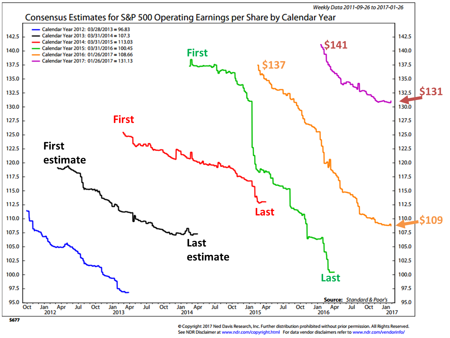
For many reasons, I favor actual reported earnings in making my forward expected return projections. Why? Wall Street analysts tend to be overly optimistic in their return expectations. In the “a picture is worth a thousand words” category, take a look at the next chart a few paragraphs below.
Focus first on the orange line. That zigzag line is a data plot that tracks Wall Street analysts’ consensus earnings estimates. The top of the line was their “First” estimate and as time moved forward each quarterly revision was plotted and the consistent pattern, as you can see, was a revision lower as in almost always lower. I’ve notated the “First” estimates and the “Last” estimates to show you just how untrustworthy these estimates can be.
The blue line is the tracking of 2012 earnings estimates, the black line was for the calendar year 2013, etc. Not once did a line go from low to high.
My point is we just can’t reliably trust earnings estimates. All of this really matters because one advisor will point to next year’s forward earnings to claim the market is inexpensively prices when it is not. It’s based off of estimates that routinely start off way too high and like clockwork adjust lower.
For example, in 2016 (the orange line), Wall Street analysts’ consensus estimates predicting $137 in earnings for the S&P 500 companies. The most recent Wall Street consensus estimate is $109 (orange arrow). That’s a big difference.
The most recent as-reported earnings was $101.42 (Q3 2016). My guess is the final real number comes in at $103 to $105. We’ll know soon enough.
OK, now that you know what you’re looking for here’s the chart:
Source: Ned Davis Research
In late October, Goldman Sachs cut their 2016 full year earnings estimate from $110 per share to $105. We’ll need a strong fourth quarter to get from $101.42 to $105, but that’s not my point. My point is to show that we just can’t trust Wall Street forward earnings estimates.
What to do? Focus on actual reported earnings and see what they tell us about forward returns. I detail that for you in the Median P/E and Forward Probable Equity Market Returns section immediately below. Click on the orange On My Radar link.
I put zero confidence to the purple 2017 estimates except to say the trend from First to Last, high to low will likely continue today, tomorrow, when I retire and beyond. My two cents is to stick to “as-reported earnings” and I favor using median P/E as a tool to assess 10-year equity market return probabilities.
Now, with all that said, I’m a trend following guy and despite my risk concerns (overpriced and aged bull market) the current weight of evidence remains bullish for equities. For now, that “trend is your friend” but keep Sam Stovall’s advice in mind. “Bull markets tend to end with a bang.”
Recession is, historically speaking, the big bad boogie man. All the big corrections have occurred during recessions. To that end, I’ll share with you my favorite recession risk charts in future posts. They are currently signaling low recession risk, so let’s put that one in the plus column.
I can’t say the same for fixed income markets… the rising inflation pressures are not good for bonds so we watch. I’m on record saying the great bull market in bonds is over (Finito! For Bonds and Italian Banks and The Secular Low in Yields is IN). While that remains to be proven correct, I do believe that the bubble of all bubbles is in bonds. Get tactical and flexible with your fixed income allocations.
Grab a coffee and find your favorite chair. Hope you find this post helpful.
? If you are not signed up to receive my weekly On My Radar e-newsletter, you can subscribe here. ?
Included in this week’s On My Radar:
- Median P/E and Forward Probable Equity Market Returns
- Rising Inflation Pressures and What it Means to Your Bond Allocations
- College Endowment Returns Were Negative in 2016 and Negative Since 2007
- Concluding Thoughts
- Trade Signals – Equity Market Trend Remains Bullish, Bonds Bearish and Sentiment Overly Optimistic (Suggesting S/T Caution)
Median P/E and Forward Probable Equity Market Returns
At the beginning of each new month I like to take a look at the most recent valuation metrics. If you have been reading me for some time, you know the drill. Let’s do a speed walk through the latest data today.
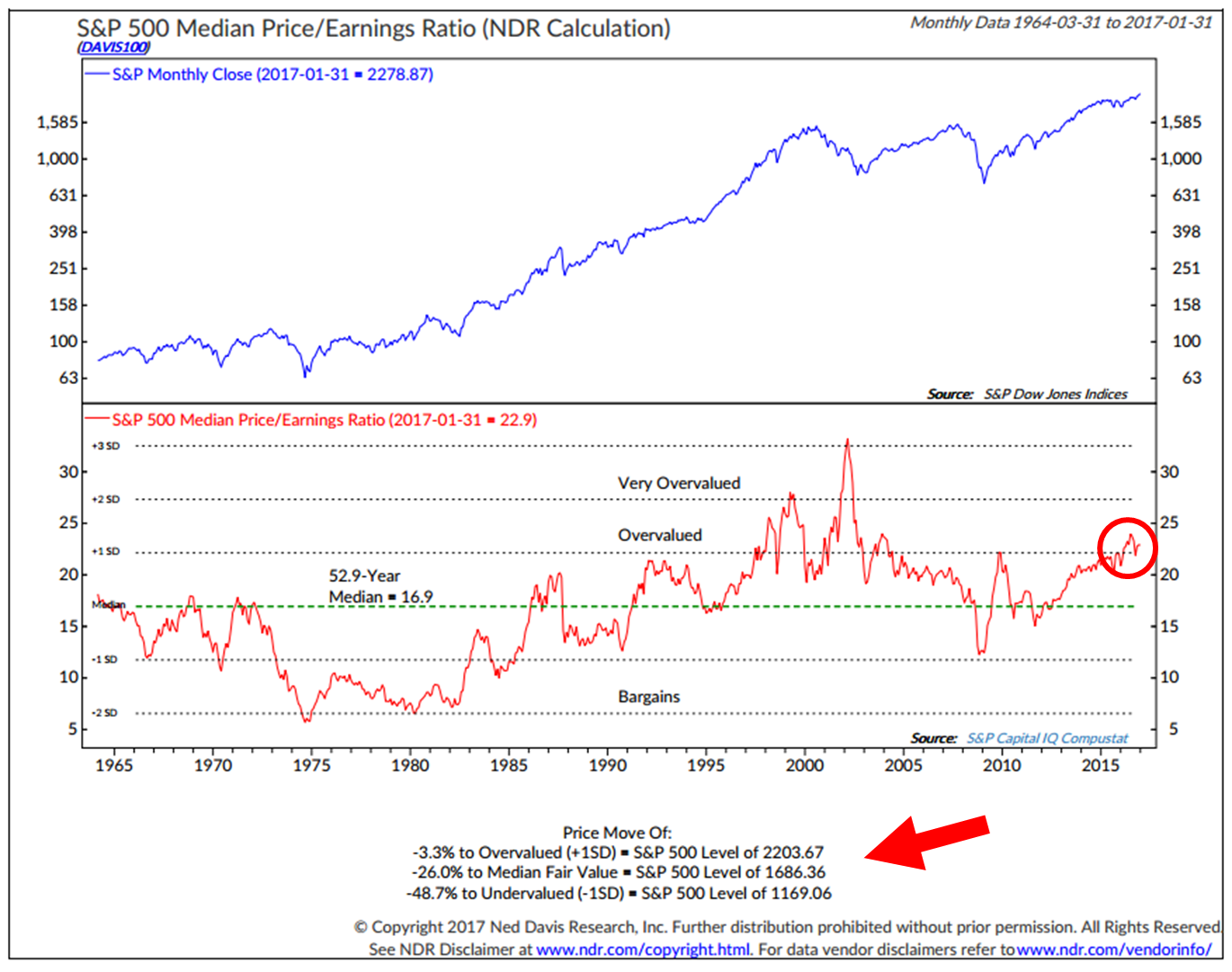
What I like most about median P/E is that it takes out Wall Street forward guesstimates and is based on actual earnings. It then looks at the median P/E (think the one in the middle where 250 S&P 500 companies came in with higher actual P/Es and 250 came in lower).
From there we can get a pretty good sense for just how overvalued the market might be on a historically relative basis. Further, we can see what the current level might project for coming 10-year returns. Simply, when you buy at a good bargain, you get much more return for your money. When you buy at a high price, you get much less.
Here’s how you read this next chart:
- Red circle in the lower section shows the current median P/E to equal 22.9 as of 1/31/2017.
- The red arrow points to an overvalued market target on the S&P 500 Index at 2203.67. The market closed at 2280 yesterday.
- The market is overvalued by 3.3%
- It would be fairly valued at 1686.36. You get to that number by multiplying the current earnings times the 52.9 year median P/E of 16.9.
- Undervalued is 48.7% lower or S&P 500 level of 1169.06. That could happen but less probable.
- The upper blue section tracks the S&P 500 monthly close from 1964 to present.
Source: Ned Davis Research
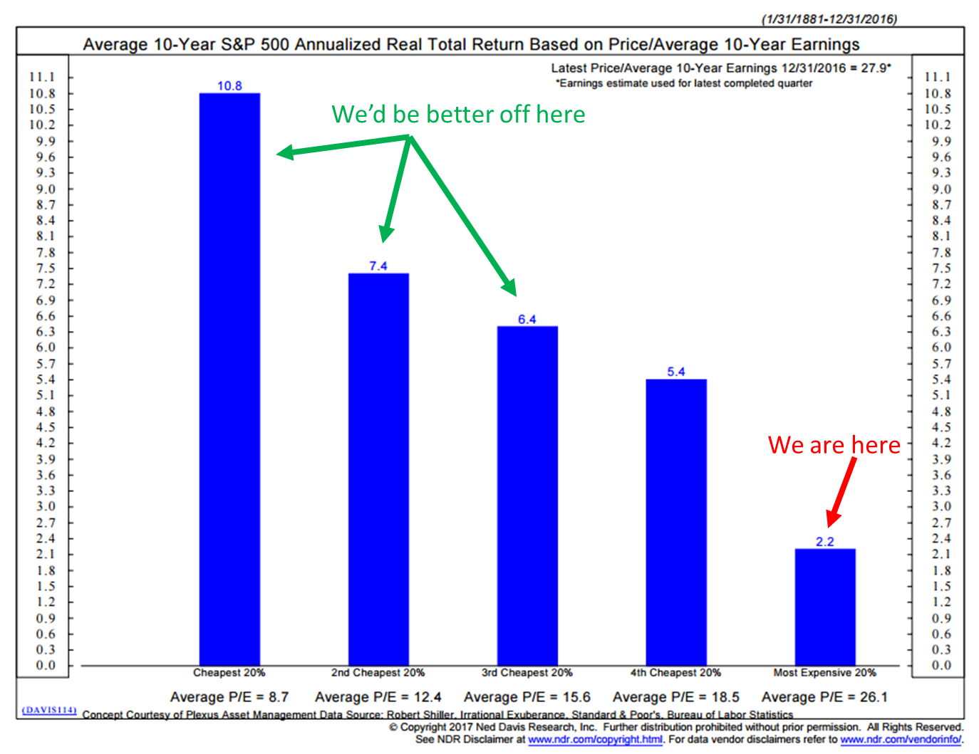
Here is what Median P/E tells us about probable forward returns:
1926 through 2014
1981 through 2015
And here is a selection of Median P/Es, by date and subsequent 10-year returns:
And if you missed this next chart in last week’s post, here it is one more time. It looks at Shiller P/E. Same conclusion:
Source: Ned Davis Research
I realize I’m sounding a bit like a broken record and frankly it is getting somewhat annoying even to me but… and a big but… it does help me stay grounded in reality and I hope it helps you in your work with your clients as well.
OK – just one more valuation chart… Buffett’s reported favorite. Note the red circle in upper right; look at that compared to history. Equity market valuations are in “Bubble Territory” and higher than the 2007 peak. Only the great tech bubble peak in 2000 was higher. Second highest in history.
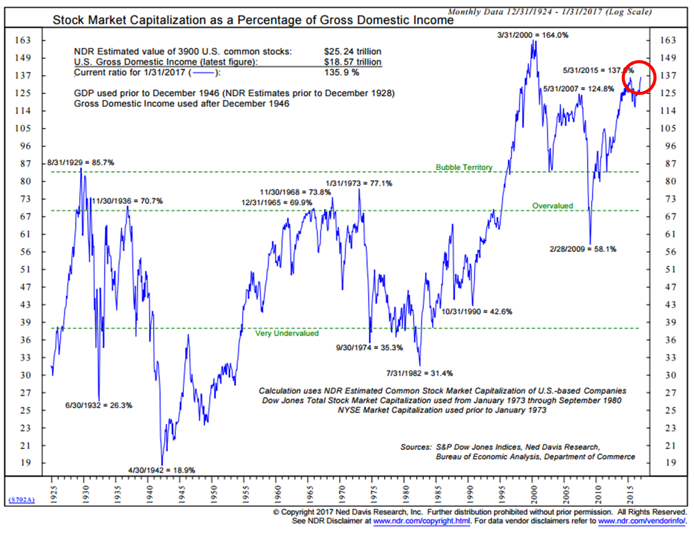
Source: Ned Davis Research
Note the buying opportunity on 2-28-2009. Were any of our clients in the mood to buy stocks? NO! It was pure panic, but it was the right thing to do. I sure wish I went all in. Another great buying opportunity will present in the future… I want to be there with my capital preserved in order to have the opportunity to take action. For now, “stay thirsty my friend.”
Rising Inflation Pressures and What it Means to Your Bond Allocations
I shared this chart with you in Trade Signals. It’s my go to inflation chart. The NDR Inflation Timing Model consists of 22 indicators that primarily measure the various rates of change of such indicators as commodity prices, consumer prices, producer prices, and industrial production. The model totals all the indicator readings and provides a score ranging from +22 (strong inflationary pressures) to -22 (strong disinflationary pressures). High inflationary pressures are signaled when the model rises to +6 or above. Low inflationary pressures are indicated when the model falls to zero or less.
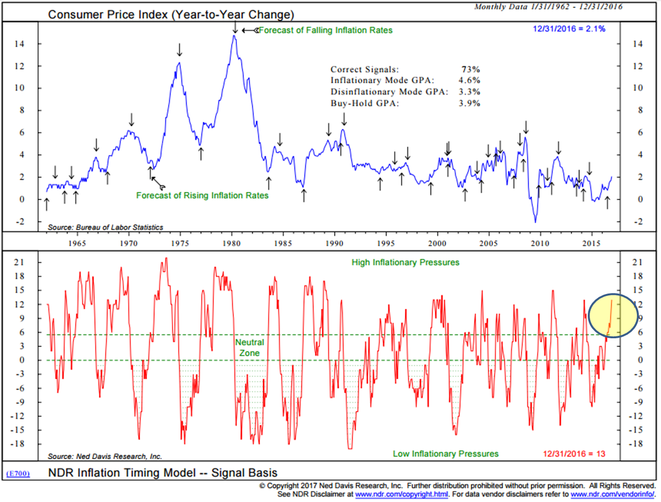
Source: Ned Davis Research
More here in a great piece from The Daily Shot.
Bonds, bond funds and bond ETFs lose money when rates rise. I posted this next chart just a few days before Treasury yields hit a 35-year yield low of 1.37%. What it shows is how much money is lost when rates rise.
If your starting point was a yield of 1.40% (top half of chart), as it was on 7/11/2016, and rates rose to 2.40% (which they did) your loss would be -8.84% if you were invested in 10-year Treasury Notes and -19.07% (bottom section of chart) if yields on the 30-year Treasury Bond rose to 3.25% (which it nearly did). Further, note the risk of loss if the 10-year rises to 5.40%. Note the -53.90% loss on the 30-year if yields rise to 6.25%.
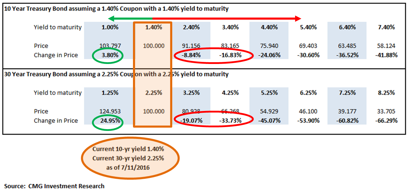
A number of pundits are calling for a 5% yield in the 10-year within a few short years. I’m not in that camp but really… I don’t know. I’m more in the “one more big recession” camp that will properly reset equity valuations and if so then rates should gap lower.
What I do believe is most important, is that investors should see this chart and size up the potential risk-reward for themselves. With rates just coming off 5,000-year lows, my best advice is to think about your bond exposure as if your retirement wealth is dependent on it… and it is.
2.45% Treasury yields suck (as a good friend reminds me is a technical term) and rising inflation will eat into the net real yield and further cause interest rates to spike higher. Treasury yields were north of 5% in 2007.
Be tactical with your bond exposure. Don’t look at the last 35 years, as many people do, and project it forward. The great bond bull market yield low is likely in. Think differently about how you position that 40% of the traditional 60% equity / 40% bond portfolio.
College Endowment Returns Were Negative in 2016 and Negative Since 2007
“You diversify. You have a whole bunch of uncorrelated investment bets.
And then you understand it (the situation) as best you can.”
— Ray Dalio, Bridgewater Associates
U.S. stocks have worked well since the 2008/09 great financial crisis. Modern Portfolio Theory – broad asset class diversification has not. But I didn’t know it was this challenging. I was somewhat surprised to see this from Bloomberg:
Endowments were hampered by investments in non-U.S. equities, which declined 7.8 percent, energy and natural resources, which lost 7.5 percent, and commodities and managed futures, which were down 7.7 percent.
Wealthier schools’ performance was dragged down by their larger allocations to riskier alternatives such as hedge funds. Hedge funds were among the worst performers for endowments of all sizes, with a 4.0 percent loss.
Endowments with more than $1 billion declined 1.9 percent, the same as the average. The blue line tracks the performance. Reflected are negative returns for 2016 and negative overall returns from 2007 – 2016:
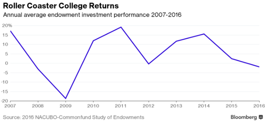
More from Bloomberg: Endowments were hampered by investments in non-U.S. equities, which declined 7.8 percent, energy and natural resources, which lost 7.5 percent, and commodities and managed futures, which were down 7.7 percent.
It causes one to think – who needs diversification anymore? We likely need it most when the risk feels the least (like today) and need it least when the risk feels the most (like early 2000 and 2008/09).
Things just don’t smell right to me. It feels like it is 1999 all over again. This time we are witnessing a massive shift into low-fee passive (non-managed) index products. Active money managers are taking it on the chin.
However, like all that money that raced to technology funds at the market peak in the late 1990’s. The -75% tech wreck followed. That same bad behavioral trend is alive and well today. Stay risk minded. It took 15 years and a 300% recovery gain to overcome that loss and get back to even. Just saying…
Concluding Thoughts
“My metric for everything I look at is the 200-day moving average of closing prices. I’ve seen too many things go to zero, stocks and commodities. The whole trick in investing is: “How do I keep from losing everything?” If you use the 200-day moving average rule, then you get out. You play defense, and you get out.”
– Paul Tudor Jones (source)
As noted in Trade Signals, with the high degree of excessive optimism, a sell-off is likely. The equity market trend remains favorable but let’s keep a close eye on the trend indicators – I believe they will help us assess and manage downside risk.
Our CMG NDR Large Cap Momentum Index-Active Trend remains favorable, suggesting a bullish trend for equities. The largest declines come in recession. We use it to help guide some of our large-cap exposure. We also see strong equity market leadership in the CMG Tactical All Asset Strategy.
As long as the market’s primary trend remains bullish, I believe low single-digit equity market corrections are likely and to be expected. However, should the weight of market trend evidence turn negative and a shift in leadership to safer assets present in our CMG Tactical All Asset Strategy, I believe a 10 to 15 percent drop to be a reasonable expectation.
I would anticipate larger declines should the CMG NDR Large Cap Momentum Index drops below 50 and be in a confirmed down trend. You might think about using the 200-day moving average rule as risk management stop-loss trigger. I favor the broader weight of evidence approach but of course “no guarantees.”
“Bull markets are born in pessimism, grow on skepticism, mature on optimism and die on euphoria.”
– Sir John Templeton
I think we are in the optimism phase. Watch for euphoria and keep Paul Tudor Jones’ advice top of mind.
Finally, I sat down with John Mauldin, Peak Capital Management’s Brian Lockhart and Clint Pekrul at the Inside ETFs conference in Hollywood, Florida. It was a fun discussion. You can access it here.
Trade Signals – Equity Market Trend Remains Bullish, Bonds Bearish and Sentiment Overly Optimistic (Suggesting S/T Caution)
S&P 500 Index — 2,275 (2-1-2017)
Click here for the charts and explanations.
Personal Note
Salt Lake City is up next. I’m flying out Wednesday morning, February 8, and the skis are coming with me! And it’s snowing like crazy. I have a few client meetings and a conference to attend and I’m really looking forward to the trip. I’ll be presenting at a meeting in Kansas City on February 23. March is starting to take shape. We are co-hosting a conference in the NY metro area on March 14 and 15. Details to follow once we have the agenda set.
I’m taking the kids to the local ski mountain (Blue Mountain) on Sunday and of course the Super Bowl is Sunday evening. Should be a fun weekend!
Hope you are doing something fun for you! Wishing you best.
If you find the On My Radar weekly research letter helpful, please tell a friend … also note the social media links below. I often share articles and charts via Twitter that I feel may be worth your time. You can follow me @SBlumenthalCMG.
? If you are not signed up to receive my weekly On My Radar e-newsletter, you can subscribe here. ?


