
“There are three things we should all do every day: Number one is laugh (you should laugh every day),
number two is think (you should spend some time in thought) and
number three is you should have your emotions moved to tears (tears could be for happiness).
Think about it… that’s a heck of a day.”
– Jimmy Valvano
Up Next — The Italian Referendum.
While on the surface the Italian Referendum appears to be only about the structure of government power and Prime Minister Matteo Renzi’s desire to pass economic reforms, beneath the surface is a serious financial issue that has the potential to impact not just Italy, but Europe and beyond. This may sound small and meaningless to you and me but it is not.
A “No” vote or a “Yes” vote?
- A “No” vote means the government remains fat and stuck. A No vote would prolong Italy’s political and economic stagnation. Structural reforms would be put off while Italy’s lawmakers haggle over voting systems. Such government inertia is nothing new in Italy. But the country may no longer be able to afford it.
- A “Yes” vote gives Renzi the authority to shrink the government. His goal is to get it moving.
Here is what is at stake:
That risk centers on trouble at Italy’s third-biggest bank, Monte dei Paschi di Siena. The government is hoping investors will recapitalize it, but they are reluctant to commit their money unless the vote is “Yes.”
Investors are watching the vote closely. The structural reforms that would result from a more streamlined (albeit more concentrated power structure within Parliament) would in theory stimulate the Italian economy, thereby increasing a favorable resolution for the bank and pulling investors in off the sidelines. Should the bank collapse, it could ignite a full-blown (and potentially global) banking crisis.
Polls conducted before a ban on publication (yes – you read that right… a ban) took effect, two weeks before the end of the campaign, showed the “No” camp ahead by approximately four percentage points. But 40% to 60% of voters were still undecided or planning to abstain.
Bottom line, a “No” vote could unleash a devastating financial chain reaction.
You can read more on this in The Economist.
The irony of the vote is that, like the UK Brexit, voters may vote in a referendum that they do not fully understand. Here is the irony:
- Italian households own about €170 bn worth of bank bonds, or 49% of the total. Under new EU rules, bond holders and depositors (bank clients) would be responsible for absorbing some of the losses of the bank.
- The consequences of a “No” vote on their daily lives has a direct impact on their own personal financial interests. I’m not sure voters fully understand this.
- In short, those same “No” vote Italian voters are likely to be the ones bailing out Monti dei Paschi di Siena. Or should I say “bail-in?” Remember Cyprus?
- The EU, especially Germany, is sitting strongly in the “bail-in” camp. With Deutsche Bank on a cliff’s edge, how can Germany demand Italian citizens “bail-in” their bank and not do the same in Germany for DB?
The domino effect of a “No” vote could lead to a crisis of government. No mandate for Renzi… will he resign like David Cameron did after the Brexit vote?
At immediate risk is a run on the Italian banks, a spike in Italian bond yields and new crisis within the European Central Bank (ECB).
There is no shortage of palace intrigue as the head of the ECB, Mario Draghi (an Italian), would once again be tasked with riding to the rescue with ECB resources. In Germany, Angela Merkel would have to walk a fine line as an election looms next year.
If push comes to shove, don’t be surprised if a compromise between Germany and Italy saves not only Monti dei Paschi di Siena, but also helps provide DB the oxygen it needs. Keep this issue “On Your Radar.”
Debt’s a bitch man… and it is getting more and more interesting by the day. The Italian vote is December 4. Keep your eyes on Sunday’s evening news!
Maybe we should heed Jimmy V’s sage advice: “Laugh, think and cry.” I’m going to keep working on that.
Grab a coffee and find your favorite chair. As we do early each month, this week you’ll find updates on valuations (they remain high), forward returns (low), debt and the Fed. I hope you find the information helpful.
? If you are not signed up to receive my weekly On My Radar e-newsletter, you can subscribe here. ?
Included in this week’s On My Radar:
- Valuation Charts and Comments
- Forward Returns
- Debt
- Foreign Policy
- Trade Signals – U.S. Equity Bull, Global Equity Bull, Fixed Income Bear; Sentiment Suggests Caution
Valuation Charts and Comments
Market Cap-to-GDP is a long-term valuation indicator that has become popular in recent years, thanks to Warren Buffett. Back in 2001 he remarked in a Fortune interview that “it is probably the best single measure of where valuations stand at any given moment.” How can’t I agree?
Let’s first look at the current data (next chart) then think about what it means with regard to probable 7-year and 10-year forward returns.
1. Corporate Equities to GDP:
Think of the next chart as the market value of all publicly traded securities as a percentage of the country’s business.
Key points to focus in on:
- Note the levels (33.0% and 32.2% highlighted in yellow) at the beginning of the last two long-term secular bull markets (1954-1966 and the greatest bull market of all time: 1982-2000).
- Next, note the valuation level in January 2000. Crazy… right? Then investors poured record amounts of money into technology funds (the largest single record month of new money inflows occurred in March of 2000).
- As a quick aside: 75% of the money at Fidelity Funds was in their technology-oriented funds. Tech finally made a new all-time high in 2016. Sixteen years of no gain and technology stocks was where most of the money sat. If you lose 75%, your $100,000 drops to $25,000. An investor would need a return of 300% just to get back to even (and in tech’s case… SIXTEEN YEARS!)
- Today, the market sits at a point more expensive than it was before the great dislocation in 2008. It sits at just off of the second highest level in history.

Source: Jill Mislinski (12/2/2016)
Finally, what to do? Buffett opined, “For me, the message of that chart is this: If the percentage relationship falls to the 70% or 80% area, buying stocks is likely to work very well for you.”
Hard to argue with the Oracle.
2. Median P/E = 22.8 (The Market Remains Overvalued)
The next chart looks at median P/E and compares the current reading with each month-end median P/E dating back to 1964. The dotted lines in the middle section show various valuation zones that range from “Very Overvalued” to “Bargains.”
The current reading of 22.8 puts the S&P 500 index in the “Overvalued” zone.
What does this mean in plain English? Well, we can look at the median P/E history and see what the returns were in subsequent 10-year periods of time.
You’ll find that in the next “Forward Returns” section. It is in this way, median P/E can tell us a lot.
Also, note the red arrow at the bottom of the chart. I put that in to show you, from a historical perspective, the level of the S&P 500 relative to 52.8 years of data.
- Median Fair Value on the S&P 500 equals 1635.91.
- Overvalued (or a 1 standard deviation move above fair value) puts the S&P 500 index at 2135.04. The S&P 500 was at 2198.81 at the market close on 11-30-2016.
- By this measure, the market is 2.9% above “Overvalued” and 25.6% above “Median Fair Value”. In short, the market remains richly priced.
One last thought on valuations. Markets can grow to be overvalued for periods that last longer then we might have patience, e.g., 2000. I do not see the crazy euphoria that typically occurs at market tops. The timing of the turn remains unknown.
My point is that valuations do matter and can help us to know when to get more cautious and risk protect and when to aggressively buy (like 2009 or 2002).
When do you want to get more aggressive with equities?
Watch for this: As Buffet said regarding his favorite valuation indicator: “If the percentage relationship falls to the 70% or 80% area, buying stocks is likely to work very well for you.”
For now, hedge that equity exposure. Risk is high.
Let’s next look at probable forward returns.
Forward Returns
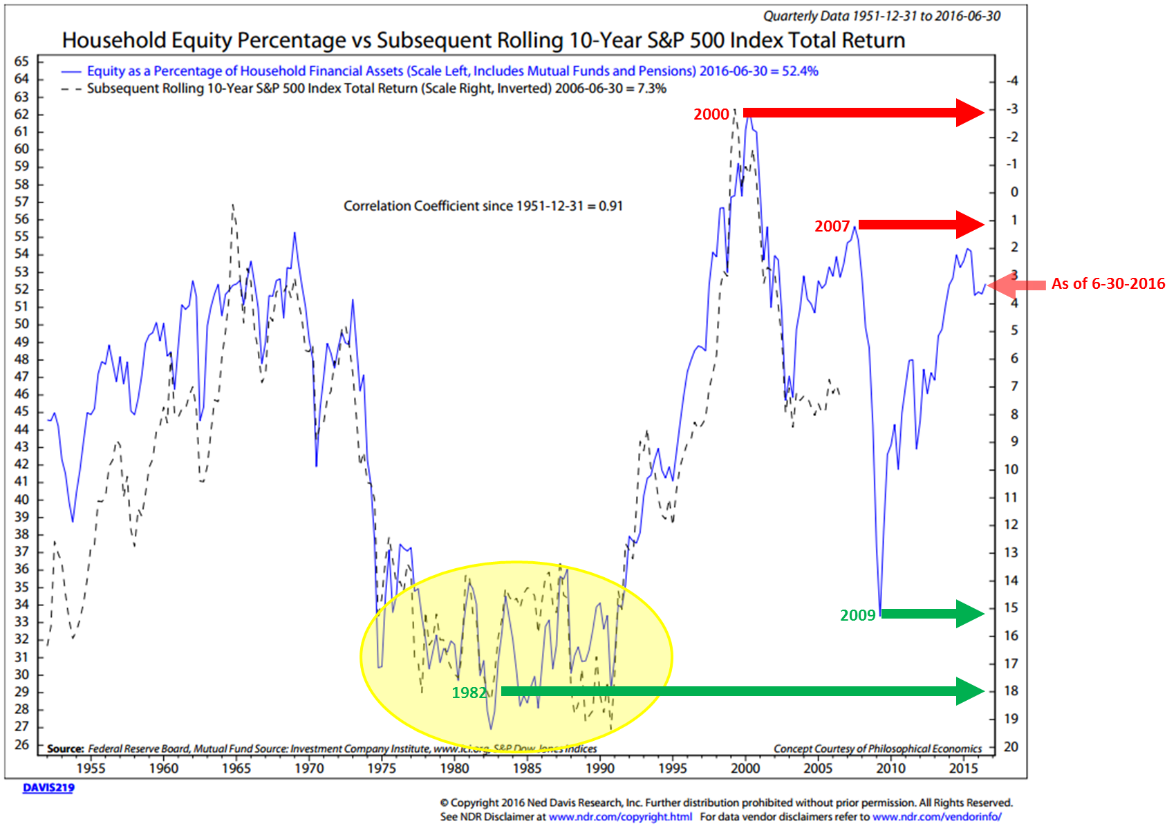
Household Equity Percentage vs. Subsequent Rolling 10-Year S&P 500 Index Total Return
This first chart is one of my favorite predictors of forward returns. Interestingly, it is not based on valuations, it is based on how much money households, you and I and millions of our best friends, have in equities as a percentage of our total household financial assets. Think supply and demand… if we are overweight equities, we have less available resources (buying power) to buy stocks.
Here’s how to read the chart:
- First, the blue line shows the percentage in equities on a quarterly basis all the way back to 1950. The data is on the left axis. The current reading, as of 6-30-2016 is 52.4%.
- Next, the red arrows highlight specific dates. For example, in 2000, the percentage of household financial assets in equities was 62%. The red arrow shows what the probable return was to be. Call it -3% annualized for the coming 10 years.
- The dotted black line plots what the actual return turned out to be. In the case of 2000, the projected return and what turned out to be the actual performance were pretty close. The S&P 500 Index (Total Return) averaged nearly -3% annualized.
- Next, note how closely the dotted black line tracks the blue line over time. The correlation coefficient since 1951 is 0.91. Translated from geek to English, a 1.0 is perfect correlation. 91 is a very high historical correlation.
- The green arrows show you where we were in 2009 and 1982. We won’t know the actual 10-year returns for the 2009 period until 2019 but it is pretty evident by the post-crash low rally that they are likely to be high. But honestly, were your clients/friends buying or selling in 2009?
- Finally, the small red arrow shows us where we are at the most recent data post (6-30-2016). It is telling us the probable annualized return for the coming 10 years is likely to be approximately 3.25%. That seems reasonable enough to me.
Median P/E = 22.8
Median P/E, Price-to-Book, Price-to-Sales, Price-to-Operating Earnings, etc. Of these, I tilt towards Median P/E because it tends to remove a lot of the accounting gimmicks (special one-time adjustments, etc.) and from its level, I believe it gives us a good sense of coming 10-year probable returns (this process based on valuations).
Here are a quick few examples of how helpful median P/E can be:
Note the dates, the starting median P/E on those month-end dates and the subsequent 10-year annualized returns. Green is good, red is bad.
I have a lot more data on this subject. You can find that research in a piece I wrote titled, “The Total Portfolio Solution.” You can find it here.
Last month, I wrote about valuations in a piece titled, “You’ve Only Got to Remember Two Things.” There are a lot of great charts in there… I’ll shorten this week’s comments by saying that after the recent Trump rally, valuations are even higher. Median P/E has risen from 21.9 to 22.8 as of November 30, 2016. Thus, no change in what this tells us about the probability for low forward 10-year returns.
To give you a sense for the depth of data I look at regularly, here is just a small set.
A quick aside and brief, completely uncompensated endorsement for Ned Davis Research. I’ve been a happy client of Ned Davis Research since the mid-1990s. Their practical way of thinking sits well with me. If you are a professional investor, email Dan Dortona at [email protected] if you’d like to learn more about their services (I do not get paid a penny from NDR for this testimonial… just a big fan of their work).
GMO’s Seven-Year Asset Class Real Return Forecast
- U.S. Large Cap Equities: -2.7% annualized
- U.S. Small Cap Equities: -0.80% annualized
- U.S. Bonds: -1.70% annualized
- The equity numbers are slightly better than last month’s GMO forecast though U.S. Bonds is worse.
Debt
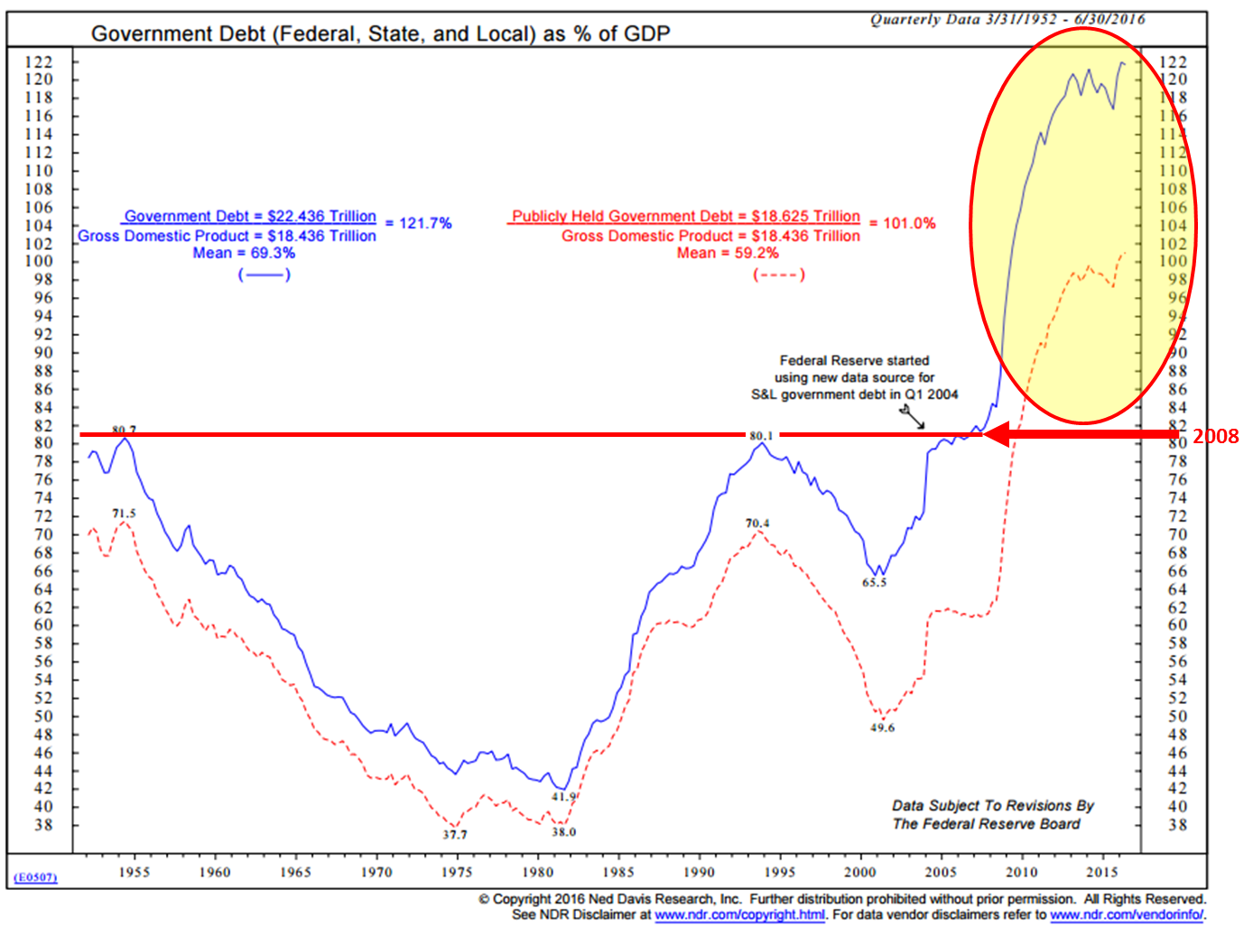
1. U.S. Government Debt – Many credible academic studies suggest that debt becomes unproductive when it exceeds 90% of Debt-to-GDP. Think of it this way, if your brother-in-law earns $100,000 but his credit card, auto and mortgage debt is greater than $90,000, he can no longer borrow and spend, he has to earn and pay back. At a certain point, the stress builds. He’s paying more each month of what he earns to pay down his debt. Plus, what bank is going to loan him more? He is no longer credit worthy. The same goes for states, corporations and governments.
Debt is a drag on growth. How we deal with the issue is what you and I need to keep on our radars. The problem is not going away anytime soon.
As you view the chart, note that I’ve highlighted in yellow the spike in debt since 2008. Let’s call it a giant debt “bubble.” The red arrow points to where we were in 2008. The red line sits on top of the two prior highs in 1955 and 1994.
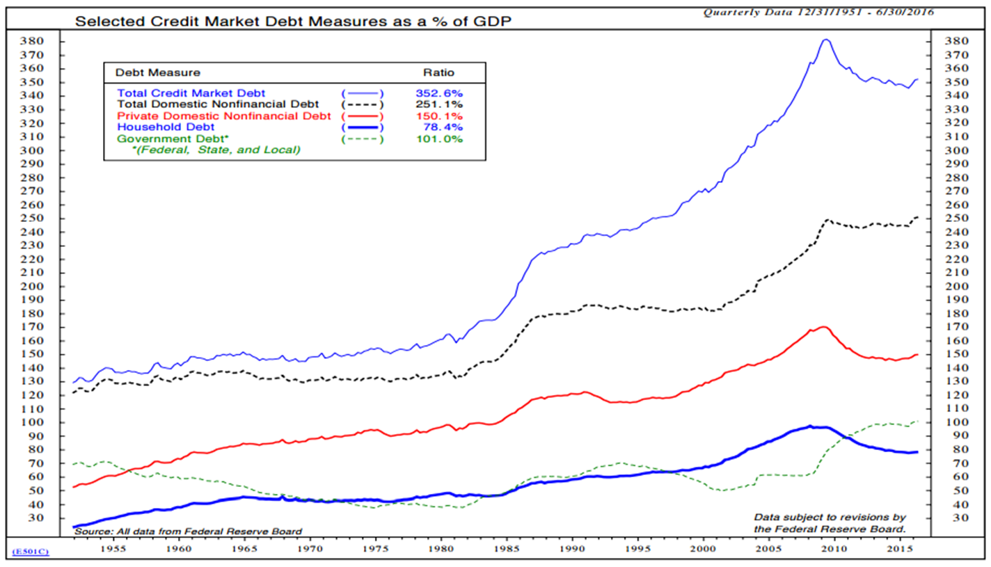
2. Total Credit Market Debt Equals 352.6% of GDP
Oh, but unfortunately, it is bigger than we think. Collectively, this is what the U.S. Total Credit Market Debt looks like (next chart). Government, individuals and corporations.
Low interest rates make debt payments manageable but it is rising interest rates, due to the high levels of debt, and the return of inflation that should concern us. Here you can see that the Total Credit Market Debt is 352.6% of GDP. That’s a big problem should rates rise.
Note too the breakdown by category: Government Debt is over 100% debt-to-GDP, Household Debt (you and me) has come down. Total Domestic Nonfinancial Debt is the total outstanding debt owed by all sectors with the exception of domestic financial companies and foreigners. Both it and Government Debt are at all-time highs.
3. Components of Household Loans
For “fun,” here is a look at where the U.S. consumer debt sits. Mortgage loans have come down, auto loans up, credit card debt higher (but lower than 2008)… Student loans are at a record $1.36 trillion (a big problem we’ll hear more about) and “Other Consumer Loans” has spiked higher as well. OK, maybe not so fun for students and their parents.
The Bottom Line on Debt:
- Debt, when initially taken on, is good for growth.
- It is a steroid shot in the arm to the economy, but it comes at the expense of future consumption and investment.
- And with more money owed to be paid back in the future, there is less money to spend, so future demand is less.
- This is the slowing we are experiencing today.
- At high levels of debt, the rate of GDP growth is about half.
Further:
- Low interest rates make servicing that debt easier; however, we continue to see GDP growth at 1.5% before inflation.
- Rising interest rates make servicing that debt more expensive and puts a further drag on the economy.
- Debt is too high. Too much debt remains our primary issue (here, there and everywhere).
Low interest rates make debt payments manageable, but it is rising interest rates, due to the high levels of debt, and the return of inflation that should concern us.
As I wrote last week, I believe The Secular Low in Yields is IN.
Foreign Policy
As an asset manager, I believe it is imperative that we consider various risks. Valuations and debt levels are two distinct risks. A sovereign debt crisis in Europe is another. A systemic shock to the global banking system stemming from Germany or Italy or as was the case in 2008, the U.S. The risk of war is a risk.
To that end, I do believe that foreign policy matters and this cartoon caught my eye. Kind of funny and kind of not funny. We step forward and watch.
The dragon represents China, the bear represents Russia and Uncle Sam is in the middle.
“There are three things we should all do every day: Number one is laugh (you should laugh every day),
number two is think (you should spend some time in thought) and
number three is you should have your emotions moved to tears (tears could be for happiness).
Think about it… that’s a heck of a day.”
– Jimmy Valvano
Up Next — The Italian Referendum.
While on the surface the Italian Referendum appears to be only about the structure of government power and Prime Minister Matteo Renzi’s desire to pass economic reforms, beneath the surface is a serious financial issue that has the potential to impact not just Italy, but Europe and beyond. This may sound small and meaningless to you and me but it is not.
A “No” vote or a “Yes” vote?
- A “No” vote means the government remains fat and stuck. A No vote would prolong Italy’s political and economic stagnation. Structural reforms would be put off while Italy’s lawmakers haggle over voting systems. Such government inertia is nothing new in Italy. But the country may no longer be able to afford it.
- A “Yes” vote gives Renzi the authority to shrink the government. His goal is to get it moving.
Here is what is at stake:
That risk centers on trouble at Italy’s third-biggest bank, Monte dei Paschi di Siena. The government is hoping investors will recapitalize it, but they are reluctant to commit their money unless the vote is “Yes.”
Investors are watching the vote closely. The structural reforms that would result from a more streamlined (albeit more concentrated power structure within Parliament) would in theory stimulate the Italian economy, thereby increasing a favorable resolution for the bank and pulling investors in off the sidelines. Should the bank collapse, it could ignite a full-blown (and potentially global) banking crisis.
Polls conducted before a ban on publication (yes – you read that right… a ban) took effect, two weeks before the end of the campaign, showed the “No” camp ahead by approximately four percentage points. But 40% to 60% of voters were still undecided or planning to abstain.
Bottom line, a “No” vote could unleash a devastating financial chain reaction.
You can read more on this in The Economist.
The irony of the vote is that, like the UK Brexit, voters may vote in a referendum that they do not fully understand. Here is the irony:
- Italian households own about €170 bn worth of bank bonds, or 49% of the total. Under new EU rules, bond holders and depositors (bank clients) would be responsible for absorbing some of the losses of the bank.
- The consequences of a “No” vote on their daily lives has a direct impact on their own personal financial interests. I’m not sure voters fully understand this.
- In short, those same “No” vote Italian voters are likely to be the ones bailing out Monti dei Paschi di Siena. Or should I say “bail-in?” Remember Cyprus?
- The EU, especially Germany, is sitting strongly in the “bail-in” camp. With Deutsche Bank on a cliff’s edge, how can Germany demand Italian citizens “bail-in” their bank and not do the same in Germany for DB?
The domino effect of a “No” vote could lead to a crisis of government. No mandate for Renzi… will he resign like David Cameron did after the Brexit vote?
At immediate risk is a run on the Italian banks, a spike in Italian bond yields and new crisis within the European Central Bank (ECB).
There is no shortage of palace intrigue as the head of the ECB, Mario Draghi (an Italian), would once again be tasked with riding to the rescue with ECB resources. In Germany, Angela Merkel would have to walk a fine line as an election looms next year.
If push comes to shove, don’t be surprised if a compromise between Germany and Italy saves not only Monti dei Paschi di Siena, but also helps provide DB the oxygen it needs. Keep this issue “On Your Radar.”
Debt’s a bitch man… and it is getting more and more interesting by the day. The Italian vote is December 4. Keep your eyes on Sunday’s evening news!
Maybe we should heed Jimmy V’s sage advice: “Laugh, think and cry.” I’m going to keep working on that.
Grab a coffee and find your favorite chair. As we do early each month, this week you’ll find updates on valuations (they remain high), forward returns (low), debt and the Fed. I hope you find the information helpful.
? If you are not signed up to receive my weekly On My Radar e-newsletter, you can subscribe here. ?
Included in this week’s On My Radar:
- Valuation Charts and Comments
- Forward Returns
- Debt
- Foreign Policy
- Trade Signals – U.S. Equity Bull, Global Equity Bull, Fixed Income Bear; Sentiment Suggests Caution
Valuation Charts and Comments
Market Cap-to-GDP is a long-term valuation indicator that has become popular in recent years, thanks to Warren Buffett. Back in 2001 he remarked in a Fortune interview that “it is probably the best single measure of where valuations stand at any given moment.” How can’t I agree?
Let’s first look at the current data (next chart) then think about what it means with regard to probable 7-year and 10-year forward returns.
1. Corporate Equities to GDP:
Think of the next chart as the market value of all publicly traded securities as a percentage of the country’s business.
Key points to focus in on:
- Note the levels (33.0% and 32.2% highlighted in yellow) at the beginning of the last two long-term secular bull markets (1954-1966 and the greatest bull market of all time: 1982-2000).
- Next, note the valuation level in January 2000. Crazy… right? Then investors poured record amounts of money into technology funds (the largest single record month of new money inflows occurred in March of 2000).
- As a quick aside: 75% of the money at Fidelity Funds was in their technology-oriented funds. Tech finally made a new all-time high in 2016. Sixteen years of no gain and technology stocks was where most of the money sat. If you lose 75%, your $100,000 drops to $25,000. An investor would need a return of 300% just to get back to even (and in tech’s case… SIXTEEN YEARS!)
- Today, the market sits at a point more expensive than it was before the great dislocation in 2008. It sits at just off of the second highest level in history.
Source: Jill Mislinski (12/2/2016)
Finally, what to do? Buffett opined, “For me, the message of that chart is this: If the percentage relationship falls to the 70% or 80% area, buying stocks is likely to work very well for you.”
Hard to argue with the Oracle.
2. Median P/E = 22.8 (The Market Remains Overvalued)
The next chart looks at median P/E and compares the current reading with each month-end median P/E dating back to 1964. The dotted lines in the middle section show various valuation zones that range from “Very Overvalued” to “Bargains.”
The current reading of 22.8 puts the S&P 500 index in the “Overvalued” zone.
What does this mean in plain English? Well, we can look at the median P/E history and see what the returns were in subsequent 10-year periods of time.
You’ll find that in the next “Forward Returns” section. It is in this way, median P/E can tell us a lot.
Also, note the red arrow at the bottom of the chart. I put that in to show you, from a historical perspective, the level of the S&P 500 relative to 52.8 years of data.
- Median Fair Value on the S&P 500 equals 1635.91.
- Overvalued (or a 1 standard deviation move above fair value) puts the S&P 500 index at 2135.04. The S&P 500 was at 2198.81 at the market close on 11-30-2016.
- By this measure, the market is 2.9% above “Overvalued” and 25.6% above “Median Fair Value”. In short, the market remains richly priced.
One last thought on valuations. Markets can grow to be overvalued for periods that last longer then we might have patience, e.g., 2000. I do not see the crazy euphoria that typically occurs at market tops. The timing of the turn remains unknown.
My point is that valuations do matter and can help us to know when to get more cautious and risk protect and when to aggressively buy (like 2009 or 2002).
When do you want to get more aggressive with equities?
Watch for this: As Buffet said regarding his favorite valuation indicator: “If the percentage relationship falls to the 70% or 80% area, buying stocks is likely to work very well for you.”
For now, hedge that equity exposure. Risk is high.
Let’s next look at probable forward returns.
Forward Returns
Household Equity Percentage vs. Subsequent Rolling 10-Year S&P 500 Index Total Return
This first chart is one of my favorite predictors of forward returns. Interestingly, it is not based on valuations, it is based on how much money households, you and I and millions of our best friends, have in equities as a percentage of our total household financial assets. Think supply and demand… if we are overweight equities, we have less available resources (buying power) to buy stocks.
Here’s how to read the chart:
- First, the blue line shows the percentage in equities on a quarterly basis all the way back to 1950. The data is on the left axis. The current reading, as of 6-30-2016 is 52.4%.
- Next, the red arrows highlight specific dates. For example, in 2000, the percentage of household financial assets in equities was 62%. The red arrow shows what the probable return was to be. Call it -3% annualized for the coming 10 years.
- The dotted black line plots what the actual return turned out to be. In the case of 2000, the projected return and what turned out to be the actual performance were pretty close. The S&P 500 Index (Total Return) averaged nearly -3% annualized.
- Next, note how closely the dotted black line tracks the blue line over time. The correlation coefficient since 1951 is 0.91. Translated from geek to English, a 1.0 is perfect correlation. 91 is a very high historical correlation.
- The green arrows show you where we were in 2009 and 1982. We won’t know the actual 10-year returns for the 2009 period until 2019 but it is pretty evident by the post-crash low rally that they are likely to be high. But honestly, were your clients/friends buying or selling in 2009?
- Finally, the small red arrow shows us where we are at the most recent data post (6-30-2016). It is telling us the probable annualized return for the coming 10 years is likely to be approximately 3.25%. That seems reasonable enough to me.
Median P/E = 22.8
Median P/E, Price-to-Book, Price-to-Sales, Price-to-Operating Earnings, etc. Of these, I tilt towards Median P/E because it tends to remove a lot of the accounting gimmicks (special one-time adjustments, etc.) and from its level, I believe it gives us a good sense of coming 10-year probable returns (this process based on valuations).
Here are a quick few examples of how helpful median P/E can be:
Note the dates, the starting median P/E on those month-end dates and the subsequent 10-year annualized returns. Green is good, red is bad.
I have a lot more data on this subject. You can find that research in a piece I wrote titled, “The Total Portfolio Solution.” You can find it here.
Last month, I wrote about valuations in a piece titled, “You’ve Only Got to Remember Two Things.” There are a lot of great charts in there… I’ll shorten this week’s comments by saying that after the recent Trump rally, valuations are even higher. Median P/E has risen from 21.9 to 22.8 as of November 30, 2016. Thus, no change in what this tells us about the probability for low forward 10-year returns.
To give you a sense for the depth of data I look at regularly, here is just a small set.
A quick aside and brief, completely uncompensated endorsement for Ned Davis Research. I’ve been a happy client of Ned Davis Research since the mid-1990s. Their practical way of thinking sits well with me. If you are a professional investor, email Dan Dortona at [email protected] if you’d like to learn more about their services (I do not get paid a penny from NDR for this testimonial… just a big fan of their work).
GMO’s Seven-Year Asset Class Real Return Forecast
- U.S. Large Cap Equities: -2.7% annualized
- U.S. Small Cap Equities: -0.80% annualized
- U.S. Bonds: -1.70% annualized
- The equity numbers are slightly better than last month’s GMO forecast though U.S. Bonds is worse.
Debt
1. U.S. Government Debt – Many credible academic studies suggest that debt becomes unproductive when it exceeds 90% of Debt-to-GDP. Think of it this way, if your brother-in-law earns $100,000 but his credit card, auto and mortgage debt is greater than $90,000, he can no longer borrow and spend, he has to earn and pay back. At a certain point, the stress builds. He’s paying more each month of what he earns to pay down his debt. Plus, what bank is going to loan him more? He is no longer credit worthy. The same goes for states, corporations and governments.
Debt is a drag on growth. How we deal with the issue is what you and I need to keep on our radars. The problem is not going away anytime soon.
As you view the chart, note that I’ve highlighted in yellow the spike in debt since 2008. Let’s call it a giant debt “bubble.” The red arrow points to where we were in 2008. The red line sits on top of the two prior highs in 1955 and 1994.
2. Total Credit Market Debt Equals 352.6% of GDP
Oh, but unfortunately, it is bigger than we think. Collectively, this is what the U.S. Total Credit Market Debt looks like (next chart). Government, individuals and corporations.
Low interest rates make debt payments manageable but it is rising interest rates, due to the high levels of debt, and the return of inflation that should concern us. Here you can see that the Total Credit Market Debt is 352.6% of GDP. That’s a big problem should rates rise.
Note too the breakdown by category: Government Debt is over 100% debt-to-GDP, Household Debt (you and me) has come down. Total Domestic Nonfinancial Debt is the total outstanding debt owed by all sectors with the exception of domestic financial companies and foreigners. Both it and Government Debt are at all-time highs.
3. Components of Household Loans
For “fun,” here is a look at where the U.S. consumer debt sits. Mortgage loans have come down, auto loans up, credit card debt higher (but lower than 2008)… Student loans are at a record $1.36 trillion (a big problem we’ll hear more about) and “Other Consumer Loans” has spiked higher as well. OK, maybe not so fun for students and their parents.
The Bottom Line on Debt:
- Debt, when initially taken on, is good for growth.
- It is a steroid shot in the arm to the economy, but it comes at the expense of future consumption and investment.
- And with more money owed to be paid back in the future, there is less money to spend, so future demand is less.
- This is the slowing we are experiencing today.
- At high levels of debt, the rate of GDP growth is about half.
Further:
- Low interest rates make servicing that debt easier; however, we continue to see GDP growth at 1.5% before inflation.
- Rising interest rates make servicing that debt more expensive and puts a further drag on the economy.
- Debt is too high. Too much debt remains our primary issue (here, there and everywhere).
Low interest rates make debt payments manageable, but it is rising interest rates, due to the high levels of debt, and the return of inflation that should concern us.
As I wrote last week, I believe The Secular Low in Yields is IN.
Foreign Policy
As an asset manager, I believe it is imperative that we consider various risks. Valuations and debt levels are two distinct risks. A sovereign debt crisis in Europe is another. A systemic shock to the global banking system stemming from Germany or Italy or as was the case in 2008, the U.S. The risk of war is a risk.
To that end, I do believe that foreign policy matters and this cartoon caught my eye. Kind of funny and kind of not funny. We step forward and watch.
The dragon represents China, the bear represents Russia and Uncle Sam is in the middle.
Trade Signals – U.S. Equity Bull, Global Equity Bull, Fixed Income Bear; Sentiment Suggests Caution (11-30-2016)
S&P 500 Index — 2,207 (11-30-16)
Posted each Wednesday, Trade Signals looks at several of my favorite stock, investor sentiment and bond market indicators. It is my weekly risk management dashboard, designed to keep me better in sync with the major technical trends. I hope you find the information helpful in your work.
Click here for the most recent Trade Signals blog.
Personal Note
Bonds have gotten clobbered. Rates have moved up more than 1% since July. The 10-year Treasury Note is down more than 8%. The 30-year down more than 16%. That said, it’s been an outstanding period to be in active/tactical bond management and a disaster for buy-and-hold. I’ll share more on this with you next week.
I blink and another month has passed. December already! Hard to believe. I fell asleep on the couch and woke to a replaying of Jimmy V’s 1993 ESPY Speech last night. It was great to watch it again. Jimmy Valvano was nearing the end of his long fight with cancer. He, of course, was one of the all-time great basketball coaches. He shared a great message for all of us along with a really funny coaching story.
He said, “there are three things we should all do every day: Number one is laugh (you should laugh every day), number two is think (you should spend some time in thought) and number three is you should have your emotions moved to tears (tears could be for happiness or sadness). Think about it… that’s a heck of a day.” I’m going to watch it again with my kids.
Speaking of kids, my daughter Brianna is on a flight home from New Zealand. She spent some time off with her childhood friends. They met at age eight and bonded at 14,000 feet hiking the mountains in the Colorado National Forest. She’s now 23, independent and living life fully (Dad’s proud). My two high school boys are heading to Penn State this weekend to visit with cousins (Dad’s worried). Matthew is checking his email every few minutes as he’s praying for acceptance to attend PSU’s business school next fall. I’m all things crazy about Penn State, so Dad’s pretty happy.
Susan and I are going to be mostly solo for the weekend. She coaches a few youth soccer teams so I’ll be on the sideline watching. Her youngest son has an exhibition game, so we have the sideline chairs packed and ready. And finally, CMG hosts its annual Holiday Party tonight so I better hit the send button. The Berwyn Tavern is in our near future – as is an ice cold IPA or two. We are a pretty laid back crew when we get outside the office and the venue and, of course, the company is great fun. Grateful!
I will be in Chicago on December 7-8 and in NYC on the 15th. Thereafter, I have some downtime scheduled until January where I’ll be speaking at the Inside ETFs 2017 Conference in Hollywood, Florida. If you are planning on attending, please let me know. I’d love to grab a coffee or better yet a good beer with you.
Time to find the office party. Have a great weekend and keep your eye on Italy this weekend.
If you find the On My Radar weekly research letter helpful, please tell a friend … also note the social media links below. I often share articles and charts via Twitter that I feel may be worth your time. You can follow me @SBlumenthalCMG.
? If you are not signed up to receive my weekly On My Radar e-newsletter, you can subscribe here. ?
And from the great Jimmy V, laugh, think and cry… and don’t give up, don’t ever give up!
Wishing you “a heck of a day!”
Ciao,
Steve
Stephen B. Blumenthal
Executive Chairman & CIO
CMG Capital Management Group, Inc.
Stephen Blumenthal founded CMG Capital Management Group in 1992 and serves today as its Executive Chairman and CIO. Steve authors a free weekly e-letter entitled, “On My Radar.” Steve shares his views on macroeconomic research, valuations, portfolio construction, asset allocation and risk management.
The objective of the letter is to provide our investment advisors clients and professional investment managers with unique and relevant information that can be incorporated into their investment process to enhance performance and client communication.


