In this video, Crescat fund managers, Kevin Smith and Tavi Costa, share their views on global yield curve inversion.
Macro Trade: The Global Yield Curve Inversion
Q4 2019 hedge fund letters, conferences and more
Trasncript
In this chart here we're looking at the the year over year change in the S&P 500. We're looking at it ex-energy because energy stocks have already started to plunge in, in the last year plus, and, and so we what we have here is is a view of big run ups in the s&p 500. And you typically see them when you're coming out of a recession, like we see here, you know, post the tech bust in 2003, or post the global financial crisis in 2009 and 10. You, you get these big moves, or you can have what's called a late cycle melt up like we had at the end of the 1990s with the tech bubble.
And so you got to ask yourself, Is this an early cycle melt up or is this a late cycle melt up? We're 11 years into an economic expansion, the record longest in US history, and a record long bull market. So we believe that this is a melt up at the end of a cycle now, yeah, this Gavin again, sorry.
Credit markets
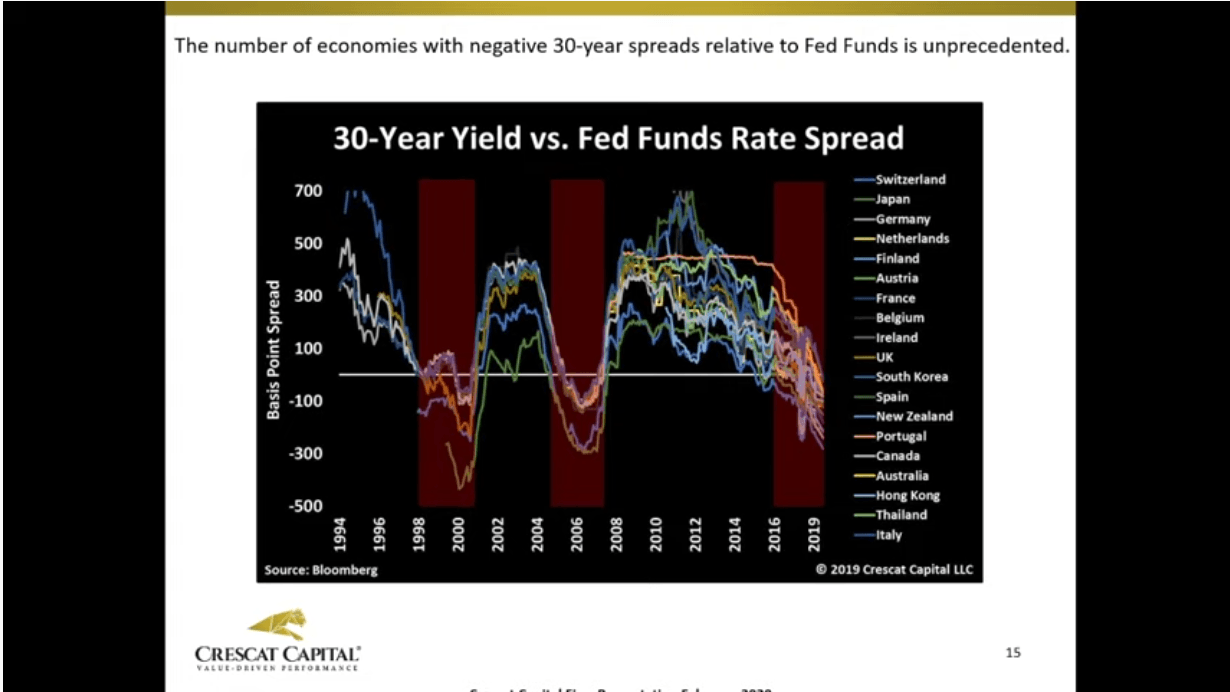
Oh, this one here. Now we're looking at what we call the global yield curve inversion, and we're comparing the US Fed Funds rates to 30 year yields across 25 different countries. And and what we see is an unprecedented number of countries that have 30 year yields below the US overnight rate. And so we call that a global yield curve inversion. We say, well, geez, that's pretty unique phenomena, did that ever happen in the past? And and lo and behold, yeah, it did happen in the past at the peak of the tech bubble, and at the peak of the housing bubble, and and the what we have today is an unprecedented number of countries with this global yield curve inversion, the US being the global reserve currency, and and therefore we think it's a it's significant.
Yeah and if you think back about that macro model that we're looking at, and the first slide pretty much was, you know, that one of the reasons we think that that really didn't turn out to be a recession and caused by that model going above the overvalue of stage is the yield curve inversions problem you can see in this chart very clearly to the back in 2016 and 15 or so there are no yield curve inversions. Today, what we have is, is is close to 73% of the yield curve is inverted or got inverted in August of 2019.
We're looking here at all possible spreads of inversions in the yield curve of all possible spreads in the yield curve itself. So, it's about 45 spreads, you can look at, you know, 30 year yields 10 year yields all the way back to the Fed funds rate. And what you see here, it's actually that the yield curve inversion is starting to creep up again.
Recession warning?
Now, it's close to 50% today, but what's important here is that every time we hit this 70% handle of the percentage of yield curve inversions, we've had a recession either coincided with it or follow in 1998 was close it was actually 69%. Not close, not exactly a 70.
But it's incredible. I mean, it's, it's really let's just look at a more visual part of this chart is just looking out here are all the kind of a busy chart but visually you can see all the possible spreads the 45 spreads and and how it really looks like we're at the late 2007. Here and it's just gives us another conviction of why this is a big trade and you must think about this and consider it what are the best assets that can perform in situations like this.
So when we look at the two year period, after every time that that more than 70% of the yield curve has inverted, which happened by the way, just back in August of last year, we, what we find is that the one of the best macro trades that you want to be in at that time is long precious metals versus short, the s&p 500. And in blue line here, you can see that on average over those next two years, the s&p 500 goes down 27%.
70% of global yield curve is inverted
This this is looking at the last seven recessions that we've had and and then the yellow line this is the average of all seven where the spread between the two if you were equally long gold versus short the s&p 500 you have a 91% return. Now the white line above there indicates two different time periods that we believe are very close to today that that in the past and it was both at the the 1973 74 time period. And and the tech bust time timeframe, where the long gold s&p 500 ratio did even better. And we'll show you why. We think it's comparable today. And the next slide here on this, this, this chart originally was courtesy Incremental AG and what it shows is is the ratio of the s&p 500 to the Goldman Sachs commodities index.
And, and some charts of this go even even back to 1929. But what we what we're seeing here is an unprecedented divergence between the valuation of the equities and the valuation of commodities in the last two times we had this big divergence 1929 was the third one, by the way, was 1972 and the tech and the tech bubble and and 2000 and, and that so when we look at those two timeframes, that's why we we think it's, you know, comparable today to expect even more from this gold s&p 500 ratio and trade that we have on here.
Corona-virus dangers
And what's interesting here is and this is mostly due to the coronavirus impact that it has been impacting commodities overall, is how commodities have been acting, especially in January when copper and oil begin to decline significantly while gold actually rally. And if you look back in history of moves like they did in that month, it looks a lot like we're either in the death of the global financial crises there or right before the emerging markets collapse when oil, oil prices collapse as well.
Commodity prices collapse too and actually caused a correction here in the US. We think this is obviously looks a lot more like the great recession and in any in a lot of ways, but but it's just confirmation of our validation of a timing indicator.
When you think about gold going back to Kevin's chart two charts ago that which was looking at commodities to equities ratio, what we liked about that is precious metals first and foremost. And and when you think about precious metals, how do you really value gold itself and in so many ways, and it's kind of a complex, you know, calculation or process to really figure that out. But one way is to look at alternatives for that.
And one of the alternatives is stocks. And when you see stocks actually not growing earnings anymore, and when you look at that relative to inflation, because you're talking about gold, you want to look at things in real terms.
Global yield curve inversion and equities
So when you look at EPS growth, for the Russell 3000 in real terms, so minus meaning CPI here, you can see that we're at the lowest decline since the global financial crisis and the tech bus as well. We have Joe bonds a very low yields historic low yields, you have investment grade bonds and historic low yields too. So this is all giving you a sort of a painting of a very bullish picture for for commodities like precious metals, especially gold as being the leader. A
We have a setup that is incredible today, especially looking at the Treasury curve, the end thought entire Treasury curve today is below inflation. And it's you know, that it's the second time in history that that happens the first time was in late 2016, actually, and at that time, actually, the Fed was starting to tighten. This time, we have not just a fad, but global central banks in general are easy.
And it is just giving a further confirmation of this idea for gold. We think that gold is is is is poised to rise significantly as this whole issue unfolds. And this is what we call the all stars align chart and it's incredible. It's looking at the other times in history when we had the Federal Reserve cut Interest rates at least twice in the last six months when you have unemployment rate is still falling on a year over year basis. And you have a significant amount of the Treasury curve below core CPI and you know, guess what I mean, it looks a lot like the the mid to late 1970s, when gold started to rise significant from a second leg.
Global yield curve inversion bullish for gold?
So there was a first leg to start in 1970s, gold, you know, rise significantly there, and then kind of pause and then and then after that it went through your its second lag. And I think it looks a lot like today, which 2000 was that first leg and then we had this pause for a few years in which a lot of the mining stocks and mining industry has been in basically in a in a bear market since 2011 or so.
And now we're seeing this days, it's beautiful, technically speaking days and gold prices and silver and so forth. There's so many ways to see this, but it's an incredible opportunity and alongside and how we view a way to capitalise in a downturn here of the business cycle.
Another important thing to point out regarding inflation and inflation expectations, and this is another uncanny timing signal for the peak of the business cycle is when you start to see actual inflation start to surprise to the upside relative to inflation expectations. So here, we're looking at median CPI versus, versus inflation expectations. And we inflation expectations, believe it or not, have been declining for 40 years, just as we've been in a record bond bull market for 40 years since the peak of inflation in 1980. And the peak in interest rates. But But you see this at the peak of every business cycle where actual inflation starts to surprise and we've actually had rising inflation now for 10 years, even as, even as inflation expectations have been continually declining. So this happens again at the peak of every cycle.


