Alpine Capital Research commentary for the second quarter ended June 30, 2018.

Q2 hedge fund letters, conference, scoops etc
In our January 2014 commentary, we made the following observations:
- The 2013 stock market in our opinion crossed the threshold into the realm of unreasonably high prices from the more comfortable confines of reasonably high prices.
- Our equity portfolios are almost certain to under-perform the market significantly in the short term if prices continue rising at their current rapid trajectory.
- We do not know how long this bull market will run but jumping on the bandwagon today for overall price gains is in our opinion a speculative undertaking with Las Vegas type odds.
More than four years later, the bull market is still running, and our view is the same with two minor variations. Stock prices are now firmly within the realm of “unreasonably high”. ACR’s two main strategies operating since 2014 have under-performed modestly rather than significantly. And we still do not know how long this bull will run.
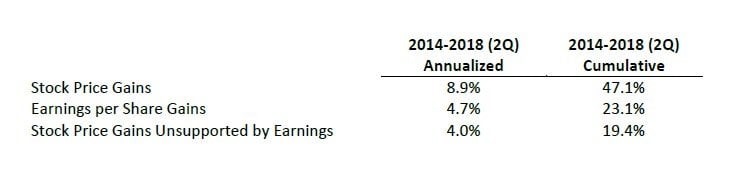
What we do know is the math and its implications for long-term returns. The table below shows how the stock market, as represented by the S&P 500, performed compared to the underlying fundamentals since 2013.
While corporate earnings growth was sound – near its long-term average – stock price gains were the real star, rising more than earnings by nearly 20%. The following chart shows the valuation ramifications of prices rising faster than earnings.
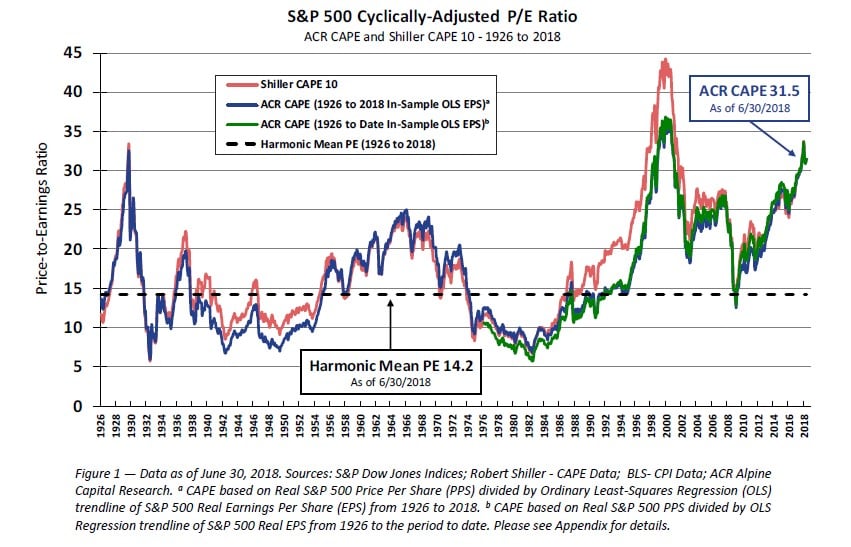
The well-known Shiller CAPE and the ACR CAPE both apply a cyclical adjustment factor to “as reported earnings”. The Shiller CAPE applies a ten-year inflation-adjusted average, and the ACR CAPE applies an inflation-adjusted least squares trend line. Most of the time, the two approaches provide nearly the same P/E. However, they diverged in the 1990s with the Shiller CAPE showing that prices were exceedingly high during the dot-com bubble. ACR’s work suggests that Shiller’s CAPE understated earnings and therefore over-stated P/Es in the late 1990s (see Appendix for further details).
If the ACR CAPE paints a more accurate picture, then the late 1920s, the late 1990s, and today rest on nearly the same historically high valuation plateaus. Market pundits seem wary of calling today’s stock market a bubble. Whether you use the “B” word or not, stock prices appear as expensive today as they ever have been relative to earnings power. If that’s not a bubble, then we’re not sure what is.
ACR proposes our own definition of a bubble: a price which implies a high probability of an unsatisfactory return. In round numbers, a U.S. stock market with a CAPE of 32 implies a 3% inflation-adjusted return if current P/Es hold. If P/Es contract to 22 (note that the long-term harmonic mean is 14), the implication is a 0% inflation-adjusted return over ten years. Most investors would probably consider 0% over ten years an unsatisfactory return for the risk of investing in equities.
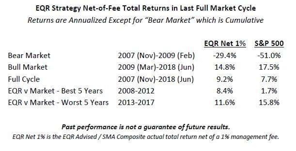
Fortunately, ACR does not invest in widely held stock or bond market indices. We seek to own a very limited number of holdings which today have very different valuation characteristics than the market. Having different valuation characteristics from the market is likely to produce different returns from the market. Over the last full market cycle, our EQR strategy demonstrates this point.
Historical return comparisons today are in our opinion distorted given that prices are near a valuation high-water mark. The asymmetrical nature of gains and losses exacerbates this phenomenon. The following table shows the upside capture required to equal the performance of the market with 67% downside capture.
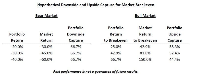
As shown above, given a 30% decline and 67% downside capture, a portfolio would only need 52% upside capture to equal the market return. EQR’s gross historical downside capture has been 51% and upside capture 84%. While we can make no promises about the future, we believe our portfolio positioning and significant cash reserve today bode well for reasonably low downside capture, while our upside capture during this bull market has been a respectable 76%.
The most common sin of greed investors commit is to invest for fear of missing out. The longer the bull market runs, the more investors throw in the towel. As they throw in the towel, they typically buy stocks and funds that have been working best in recent years, which pushes the prices of these stocks and the funds that own them ever higher. Then one day, usually without warning, the speculative artifice of sky-high prices comes tumbling down to the fundamental ground floor. ACR believes that the most reliable way to prosper in financial markets is to remain doggedly committed to fundamental value, knowing that the main things we are likely to miss out on are volatility and heartache.
Nick Tompras
July 2018
Appendix – The Shiller and ACR CAPE
Figure 1 above illustrates two approaches to earnings-based stock valuation. The underpinning for both is that earnings in any given year can be distorted by the economic cycle. These methodologies attempt to accurately reflect “normal” or “cyclically-adjusted” earnings by smoothing out the variation to enable clearer decision-making.
Professor Robert Shiller borrows from Benjamin Graham by employing a simple ten-year average of earnings adjusted for inflation (the red line). ACR employs an exponential least squares regression trend line since 1926 (the dark blue line). However, using the entire historical period is problematic since it includes data that was not available at the time of each intervening year. For example, earnings in 2017 were not known yet in 2007. We solve for this problem by also showing the trend line to date (the green line) with a minimum of fifty years of data. The red, dark blue, and green earnings trend lines shown in Figure 2 below are used to show P/Es with the same color coding in Figure 1 above.
The chart below shows that Shiller earnings per share data are likely distorted by the back-to-back recessions of the 1980s and early 1990s. ACR’s least squares trend-line appears to better reflect the actual path of earnings at that time. Per capita GDP is included since this is another important marker for assessing normalized earnings, due to the close relationship between GDP and corporate profits.
aa


