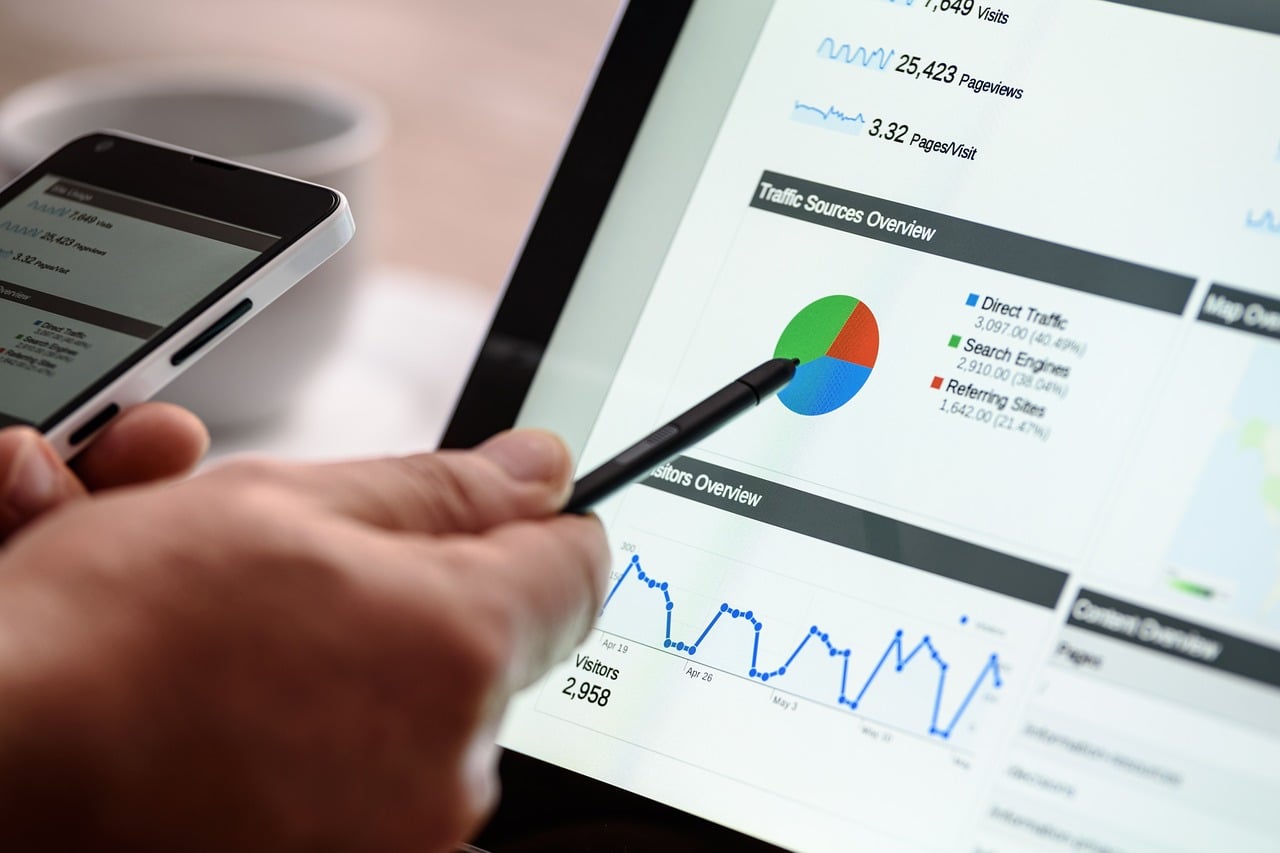
Do you send clients statistics and graphs embedded in PDFs? If you have to email your clients a new, updated file each week, you may as well chisel the stats into a granite stone! Static documents don’t convey information the way people prefer to absorb it: fast and with up-to-the-minute accuracy.
Q2 hedge fund letters, conference, scoops etc
According to Forbes.com, real-time analysis and management allows decision makers to “detect weak signals earlier than before, providing more time for corrective measures for outcomes that have not yet happened.” Lagging metrics can mean a loss of millions of dollars for some corporations.
Consider the amount of time it takes to gather data from several sources, enter it into a graphing program, export the images, create a proper layout in Microsoft Word, and then convert the finished document into a PDF. By the time you’re done, the data is old. PDFs don’t have a ‘refresh’ button.
When you make a mistake, you won’t’ have to start over, but you’ll need to edit your source document and convert the new version to a PDF file. Then, you’ll need to email the new file to your client and do it all over again next week.
Dynamic dashboards are easier to use
Given what today’s software is capable of, manually gathering and presenting static data is like building a website by typing every line of code – it’s not necessary.
A “dashboard” is a fancy term for a central location that displays aggregated data. They’re simple, and you don’t need to be or hire a programmer to create them.
Basic dashboards have been around for years, and you’ll see them when you log into most of your internet marketing accounts like Infusionsoft, ClickFunnels, LeadPages, and Paypal. Each account presents an organized dashboard to display current stats, and you can do the same for your clients.
Piping data through a dashboard makes that data more accessible to analyze and process. Utilizing dashboards will save you from monotony by automatically accessing raw data directly from multiple sources. Dashboards are designed to be customizable in design and functionality so you can display only what’s relevant to each customer or employee. Instead of wasting time gathering data manually, you can spend more time engineering the perfect dashboards for each of your departments and clients.
Interactive dashboards provide more data
These business dashboard examples demonstrate what’s possible when data aggregation becomes interactive. Interaction paints a coherent, simple, and accessible picture of operations.
Being able to navigate intricately through data, view past data, and communicate with team members and clients adds a vital dimension to data analysis. For example, conversion rates mean more when you can compare them by channel, campaign, and landing page.
Dashboards make data and stats relevant
Using software to process raw data won’t always provide relevant data. For instance, say you use Facebook Insights to see how many people your posts reached. One post says it reached 104 people, but that doesn’t account for people who scrolled past it or looked away from their phone while scrolling through their newsfeed. Without collecting other stats over time, and viewing all data together, you won’t know if your post made an impact.
Six months later, statistics for that post will tell a better story. By that time, comments left on that post will tell you if your content made an impact or not. Unless you have access to multiple data points and can access them infinitely into the past, you won’t get the big picture. Some data takes time to paint a clear picture.
Dashboards are fun to use
A graphic designer can create custom skins to let your clients choose their preferred look. For instance, some people prefer rounded corners while others prefer straight lines. Some like textures gradients, and other people like solid colors.
The look of your dashboard matters more than you might think. Following principles of psychology, an aesthetically pleasing dashboard is more likely to support feelings of satisfaction. Their customizable nature has made dashboards the preferred way to convey statistical information to clients.


