A lot of times our perception of something depends on our point of view. We’ve all probably seen examples of trick photography that makes a scene or object appear one way when viewed from the one angle but totally different when viewed from another angle. The classic example is a tourist standing far away from the Eiffel Tower while pretending to crush it with their fingers. Here’s an example I got from a Google Image search.

Q1 hedge fund letters, conference, scoops etc, Also read Lear Capital: Financial Products You Should Avoid?
When you look at the photo, the tourist appears to be holding or crushing the tower. However, if you stood near them while they took the picture, you would see that they were merely holding air between their strategically placed fingers. The Tower would be far in the distance.
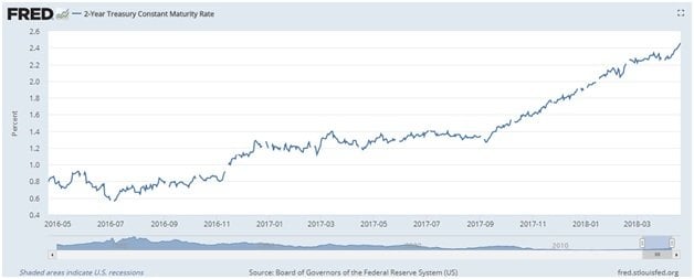
The same types of perspective illusions can occur related to the stock market and interest rates. Suppose I wanted to tell you a scary story about interest rates. Look at the graph below of the two-year US Treasury note.
Wow! It appears just to keep going up! It’s risen by over 200%! It seems interest rates are sky rocketing.
Think about all the bad things that could happen related to skyrocketing interest rates. Mortgages rates might go up. Then home prices will drop. New home construction and home sales will fall. Auto loans will get more expensive. People might start buying bonds (now that interest rates are higher) instead of stocks, and the market could crash.
Just like the tourist who appears to crush the Tower, perhaps things aren’t as they seem. We should take a step back. The chart above showed two-year bond prices over the past two years. Now, look at the chart below.
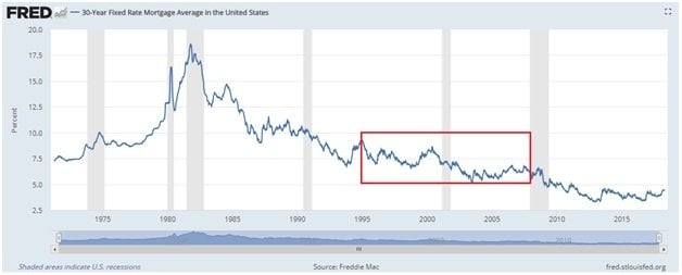
This chart shows the current average new mortgage rate for a 30-year fixed mortgage from 1971 to present. See that little blip at the end? That is the jump in rates everyone is currently scared about.
We can see that the rise in rates looks radically different from this longer span perspective. You might ask, Which perspective is the “true” picture?
Look at the above graph again. See the area highlighted with the red box. The start of the red box marks the very, very beginning of the housing bubble. The bubble started in earnest in the 2000s, but we can trace some of its first signs back to 1995. Mortgages rates were about 7% then. Let me repeat. We had the largest housing bubble in the history of our country with mortgages rates at about 7%.
If we could have a housing bubble with rates at 7%, then I don’t think we need to worry about interest rates rising until we see mortgages up closer to that 7% number.
The economy continues to grow. Labor market slack is decreasing. Oil prices are rising. Plus, we got an enormous tax cut bill, so we will obviously see inflation start to pick up. But when we take a step back and look at things from the perspective of historical context, I don’t see any reason to worry.
No Company Profiled
No Company Profiled This Month.
About Our Portfolios
The Capital Appreciation Fund and the Dividend Fund are innovative, investor friendly alternative to traditional actively managed mutual funds called a Spoke Fund ®. We can also customize portfolios for clients seeking less risk and volatility by including allocations to other asset classes such as bonds and real estate.
Spoke Funds are significantly less expensive and more transparent than a large majority of mutual funds. Both portfolios are managed for the long term using value investing principles. Fees for both portfolios are 1.25% of assets annually. That figure includes both our management fee and all trading costs. We try to minimize turnover and taxes as well in both funds.
Investor accounts are held in your name (we never take investor money) at FOLIOfn or Interactive Brokers*.
For more information visit our website.
*Some older accounts may be custodied at TradePMR.
Disclaimer
Historical results are not indicative of future performance. Positive returns are not guaranteed. Individual results will vary depending on market conditions and investing may cause capital loss.
The performance data presented prior to 2011:
- Represents a composite of all discretionary equity investments in accounts that have been open for at least one year. Any accounts open for less than one year are excluded from the composite performance shown. From time to time clients have made special requests that SIM hold securities in their account that are not included in SIMs recommended equity portfolio, those investments are excluded from the composite results shown.
- Performance is calculated using a holding period return formula.
- Reflect the deduction of a management fee of 1% of assets per year.
- Reflect the reinvestment of capital gains and dividends.
Performance data presented for 2011 and after:
- Represents the performance of the model portfolio that client accounts are linked too.
- Reflect the deduction of management fees of 1% of assets per year.
- Reflect the reinvestment of capital gains and dividends.
The S&P 500, used for comparison purposes may have a significantly different volatility than the portfolios used for the presentation of SIM’s composite returns.
The publication of this performance data is in no way a solicitation or offer to sell securities or investment advisory services.