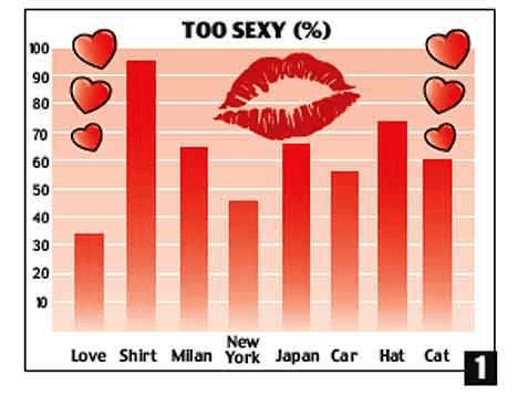
Graphs are ubiquitous in finance. Done properly, they can help us grasp complex ideas or interrelations at a glance—or even transport us back to a silly early 90s pop song, like the chart above. (Sorry if I’ve given you a Right Said Fred earworm!) But a chart gone astray can easily become “porno-graphy”—designed solely for visual excitement with no substance. Even worse, a push to “visualize” everything can produce a rash of clumsy, confused, and even inept graphics, which do more to obscure the data than illuminate it. A properly designed graph is something that should make you go “Hmmm…” not “Huh?”

Rule number one for a graph is that it must contain data (preferably accurate, precise data) that exhibit some type of relationship you wish to illustrate. This may sound like an obvious point, however I often encounter graphs attempting to portray qualitative rather than quantitative elements. Which begs the question, “What is actually being plotted?” Did the author just free-hand sketch this chart? Or perhaps just use a random number generator to produce values to plot? Consider the example below, scavenged from a recent report (which shall remain nameless):
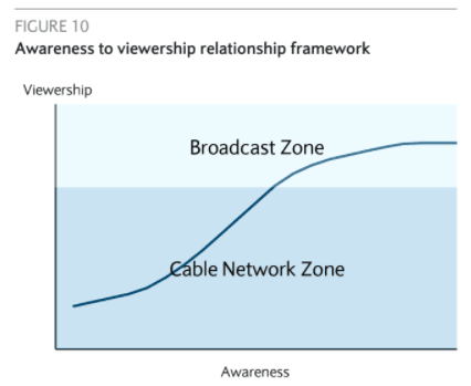
Looking along the y-axis, “Viewership” might very well have a quantity, such as number of people, associated with it though it is not labelled. But I am not sure how one would quantify “awareness” nor why it might be helpful to graph it. The supportive text in the report does not explain this value either. The end result of the graph above is confusion. Whatever the particular point the author is trying to convey about broadcast and cable networks would have been made far better via words rather than in a chart.
But even with good data, a poorly designed chart can be difficult to interpret. The unfortunate truth is that, though we’re taught how to read graphs from early on in our formal schooling, most of us were never taught how to create them properly. Yet the skill of presenting large amounts of complicated data neatly and effectively is central to so many fields. In my science days, a colleague introduced me to a wonderful how-to manual for charts and graphs, The Visual Display of Quantitative Information by Edward Tufte. The book blends art with science as Tufte explains the key elements of a truly illuminating graph.
Tufte wrote the original version before Excel was even invented. This makes the book particularly refreshing, since now most people accept Excel’s sub-par default graphs as the best that we can hope for. But Excel is computational software, designed to crunch numbers—not to communicate or educate. Moreover, it contains far too many fancy software options that we are often seduced into using. And the misapplication of these toys produces many of the muddled graphs that plague our industry and confuse our readers.
This series of posts will lay out a few of Tufte’s pointers about what NOT to do when creating graphs, using real-world examples. And I didn’t need to spend hours searching for them. Regrettably, examples of graphic porn are easy to find. In fact, these graphs are all from research reports that we have read at Broyhill over the past few months, from large and smaller firms alike.
Using Tufte’s design principles, I gathered examples for each “no-no.” I’ve removed any identifying information because my goal isn’t to shame graphic porn offenders. Rather, I hope to help explain how we can create better and more meaningful graphics. Eye candy is fine, but let’s up the quality at least to Ghirardelli and skip the Jujubes .
The point of collecting these graphs gone wild is to show you how to create more effective and meaningful graphs than what results from the default Excel options. Always remember the purpose of a graphic is to show things at a glance that are not easy to convey in a text or table. Computers can readily analyze large datasets directly, but the human brain is uniquely adapted with visual pattern recognition capabilities. We can use graphs to tap into those capabilities and provide our readers quickly with an intuitive feel for our data. Graphs can be informative and sexy (at least this math geek thinks so), but should not be misleading exposés or, even more egregious, silly wastes of space:

Tune in next time for a discussion of what ought to go into a graph (and what shouldn’t!).
Article by Broyhill Asset Management