Ever heard of the MY ratio?
It is put simply, the middle-aged population (40-49 years) relative to young adults (20-29 years).
[REITs]Check out our H2 hedge fund letters here.
We start off in the life-cycle hypothesis, which tries to explain consumption patterns of an individual over a ‘lifetime’, according to Genakoplos, et al. (2004) the MY ratio can explain stock market prices. The idea is that a large middle-aged population who want to invest should drive up prices of investment securities.
Another take is Liu and Spiegel (2011) that looks at the MO ratio (middle-aged 40-49 years versus old 60-69 years) instead, assuming youngsters don’t buy much stocks. And old people change their risk preference close to and in retirement, selling off their assets and putting downward pressure on prices.
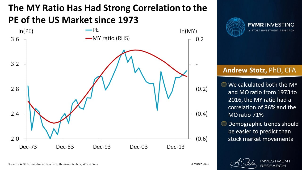
The MY Ratio Has Had Strong Correlation to the PE of the US Market since 1973
We calculated both the MY and MO ratio from 1973 to 2016. The MY ratio has had strong correlation, 86%, to the PE of the US market since 1973, the MO ratio slightly weaker at 71%. Demographic trends may be more stable and easier to predict than stock market movements, so let’s give it a try.
The MY Ratio Supports Higher US Stock Prices in 2020-2035

Using UN estimates to calculate the forward MY ratio until 2035, we can see that the ratio is about to bottom out in 2020. While the long-term trend seems to support increasing stock prices in the US, it doesn’t bring much clarity to the next 1-2 years. Also, this is one single factor and the reality is most likely more complex than the MY ratio.
Article by Become A Better Investor