I spent a lot of time in the 2017 End of Year Special Edition looking back across 2017. I covered some of my best charts and market/macro calls of the year (and some of the worst!), along with my favorite charts, and a few other things. But this article provides a look at the most important part of that report.

As interesting and sometimes even amusing as it is to look back in time, as investors we get paid for looking forward and anticipating, and there’s a few existing trends and themes that will remain front of mind and be key to keep on the radar in 2018.
Following is a selection of the key charts and indicators we will be watching in the new year. The themes span inflation, monetary policy, commodities, China, emerging markets, corporate bonds, global equities, volatility, and bond yields. In other words, all the issues and topics that most active asset allocators should be thinking about. I'll be covering these topics in more detail in the coming weeks.
I've said it before and I'll say it again: 2018 is going to be harder and more complex for investors than 2017. The cross currents of rising valuations across asset classes, maturing of the business cycle at a global level, and the turning of the tides in monetary policy could make 2018 a watershed year.
That all said, here's the charts! Best wishes and best of luck for 2018.
1. No more spare capacity in DM. (Next step = Inflation)

2. A secular bottom in 10-year bond yields looks to be on the cards.
3. The monetary tides are going out. (be careful!)
4. Emerging Markets cross-asset risk pricing is complacent/confident, and for now is engaged in a virtuous cycle as improving economics reinforce the relaxed risk perceptions.
5. Likewise, US HY credit spreads are anchored by solid macroeconomic cycle dynamics… in other words, “expensive” can stay expensive for the time being.
6. US cyclical stocks are closely keeping pace with the very strong ISM manufacturing PMI but the relative performance ratio looks very stretched, likewise absolute and relative valuations. This is a key area to keep on top of as the new bull market in America (and globally) has been driven by solid outperformance by the cyclical stock sectors.
7. An open question for 2018: will the second great moderation continue? Or will global equity volatility reach a turning point?
8. One issue (along side the themes of a maturing business cycle and a turning of the tides in global monetary policy) is a rising incidence of overvaluation across markets (and assets). It’s not at previous extremes yet, and valuation is not by itself a reason for markets to fall, but it is an important fact to incorporate and reflects increasingly optimistic expectations on the growth outlook.
9. Global death-cross watch: a nice & novel chart which tracks the proportion of markets which have a “death cross” (i.e. the 50-day moving average passing below the 200 day) across 70 countries. This is probably the most comprehensive breadth view of global equities and a key early warning chart.
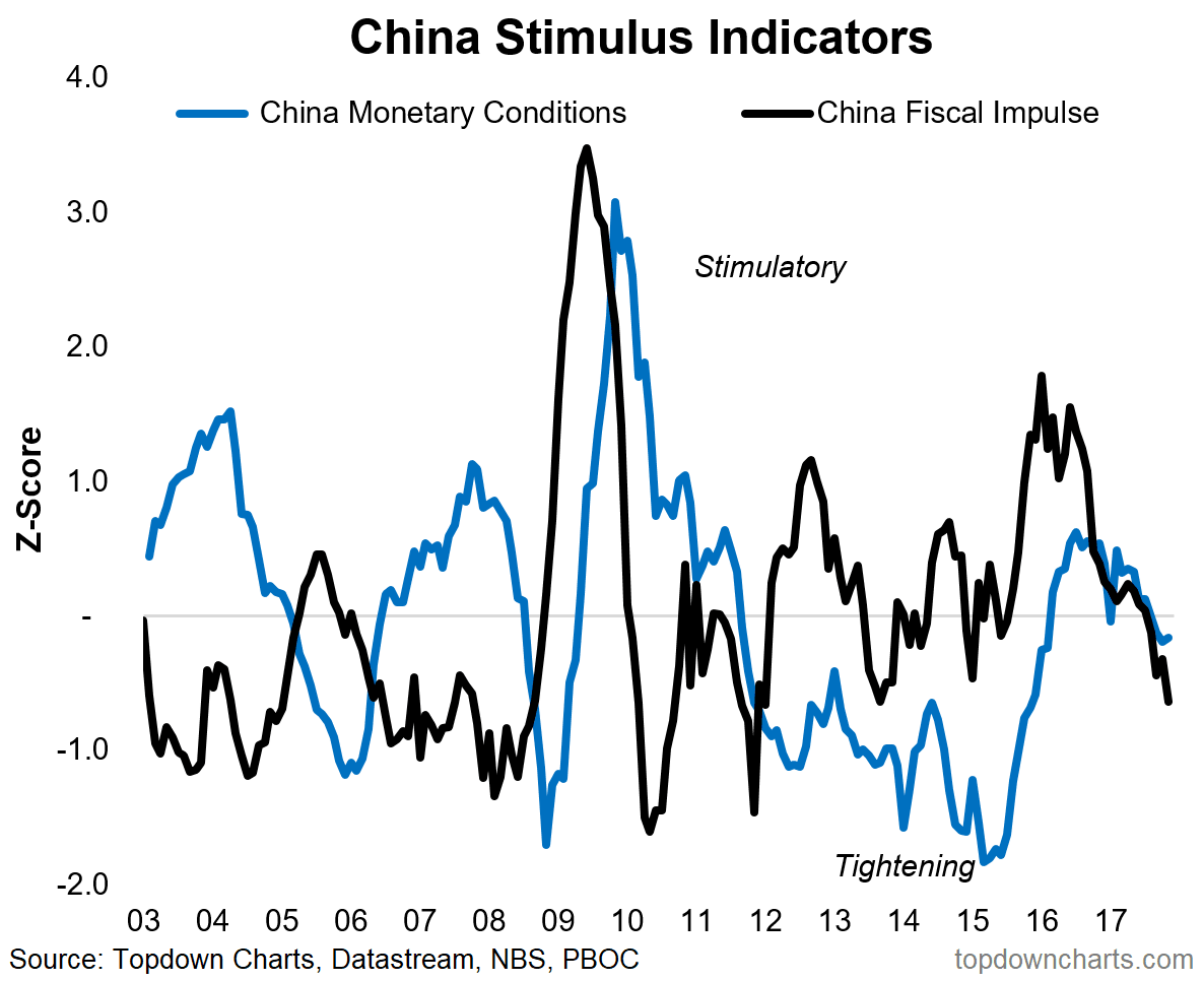
10. Last but certainly not least is China. A number of the big tailwinds (property, exports, stimulus) that helped China avoid a recession in 2015/16 are starting to turn. The fiscal/monetary policy stimulus indicators in this chart helped us pick the upturn in China before most others caught on, and I think this will be a key one to monitor when thinking about the outlook for China in 2018 and beyond.
These charts were featured in the 2017 End of Year Special Edition - click through for a one-off free download of the full report.
For more and deeper insights on global economics and asset allocation, and some more good charts you may want to subscribe to the Weekly Macro Themes. Click through for free look or a trial.


