
“Don’t be afraid of change for it is the catalyst of opportunity.”
– Unknown
We want it short, we want it easy to understand and we want it right. Here’s my best guess:
- U.S. stocks will remain in an uptrend fueled by a strong dollar
- Tax cuts, infrastructure spending and $2 trillion in tax repatriation will drive capital flows to the U.S.
- The European sovereign debt crisis will be the first major crack to crack. Unmanageable debt in Portugal, Italy, Greece and S Include France and Germany in their dysfunctional union. Confidence in government/political leadership is lost.
- The European banks sit on the fault line. Watch the banks. Hope so… Not so sure.
- The smart money races out of EU banks to U.S. dollars and U.S. assets.
- In China, debt too is the major concern. Ghost cities lacking rental income will prove unable to support the structured debt that financed the construction. Defaults mount.
- Drastic measures are put in place to prevent the flow out capital to the U.S.
- Gates, tariffs, currency wars escalate – trade wars escalate.
- Loss of confidence in government here, there and most everywhere.
- Global and U.S. inflation become a major concern as global growth remains well below the average of the last six post-recession expansions (great chart below).
- Stagflation returns. Low growth/high inflation. Interest rates move higher with the 10-year touching 3% this year and 6% within a few short years.
- The great bond bull market is over. Bond investors lose money.
I hate making predictions. I got the tech wreak and sub-prime right, but was far too early on those predictions. Importantly, the above could most certainly be wrong. It’s a highly complex world. We can measure instability, we can score up risk but we can’t precisely know timing. Tech made no sense, sub-prime was easy to see. The clear risk to me today is in the bond market.
We can all see that interest rates at 5,000-year lows and negative rates in many places are unattractive. But it is curious as to why record amounts of hard earned investor capital chased into bonds last year. A secular bond market top? Likely, in my view.
We can understand human tendencies (e.g., herd mentality), we can measure market valuations, we can measure degrees of risk and we can identify trends. We can get pretty close on probable future 10-year returns but we can’t know what will happen this year, how it will happen (good or bad) or when it might happen.
I have some really great charts for you today. You are going to see charts on debt, recession probabilities and inflation risk.
Let’s first take a look at debt by country relative to GDP. Recall that debt north of 90% of GDP is identified by academics as the point in which growth becomes impacted. To give you a sense of just how deep a debt hole we are in, go grab a Prozac and then take a look at this next chart:

Source: Ned Davis Research (includes disclosure)
If 90% is the line in the sand, what do we do with 335.4%, or 577% or 469.5%? It’s pretty safe to say that debt is our greatest global issue. We must find a way to deleverage, restructure, and default. It is not sustainable and, as you’ll see next, the evidence visible.
In a picture, this next chart is the proof statement that debt has become a drag on growth.
Here’s how you read the chart:
- The dotted red line shows the average of the last six post-World War II expansions.
- The start date begins at the end of the last recession (vertical black line) in June 2009.
- Comparisons are from prior recession end dates – right of vertical black line.
- The solid blue line shows the path of the current expansion.
- The 2001 expansion and the 1981 expansions are also plotted.
- Simply look at the path of the dotted red line vs. the solid blue line.
- In my view, debt is the drag on the economy.
Source: Ned Davis Research (includes disclosure)
Here’s my call: We are at the end of a long-term leveraging up cycle and the beginning of a long-term secular deleveraging cycle. I think that this is the most important global macro big picture issue for you and me to understand.
Stocks may continue to rally this year and I think they will; however, equities are expensively priced and the cyclical bull market is aged. A rally in stocks doesn’t mean we should avert our heads. A simple 10% correction takes the S&P 500 Index (stocks) annualized returns back to 0%. That’s in zero over the prior three years.
Just how aged is the current bull market? I found the following from John Hussman to be interesting in a piece called “The Economic Risk of Ignoring Arithmetic.”
The stock market bubble that ended with the September 1929 peak began in August 1921, running just a few days beyond 8 years in duration.
The bubble that ended with the March 2000 peak began in October 1990, running fully 9 years and 5 months in duration.
Those two episodes represent the longest bull markets in U.S. history.
The current half-cycle began at the March 2009 low, and has now run 7 years and 10 months in duration, making it the third-longest advance in history, placing it just 2 months short of the 1929 instance, but a full year and 7 months short of the 2000 instance.
Big picture? Got it… debt’s a drag. Big picture? Got it… the bull market’s overpriced and aged. Big picture? Got it… ultra-low yielding bonds and the size of debt outstanding makes the bond market the king of all bubbles.
And speaking of bonds and bond kings, let’s jump back into that prediction thing. Did you catch Bill Gross on Bloomberg’s Surveillance last Friday? The “bond king” said that 2.60% on the 10-year Treasury is “the most important level for the markets this year.” Maybe he’s right.
Some say the current bond king is Jeffrey Gundlach. Let’s call him King II. King II is saying that 3% is the problem threshold.
My friends at Ned Davis Research put out a nice piece this week saying 2.76% (red arrow next chart) is the most important level. The reason? That’s the point at which yields cross above the long-term dotted trend line.
Source: Ned Davis Research (includes disclosure)
Take a look at the chart again. Note the series of lower highs. For example, in late 1987 the yield peaked at 10.23%. It then made a series of lower highs with each lower high failing to move above the long-term trend line. Also note the series of lower lows with the lowest low touching 1.37% last June 2016. I think the line in the sand is 3.04% (circled in red on the chart). That point would confirm a break above the long-term down trend (dotted upper line).
My friend Lacy Hunt believes interest rates are ultimately headed lower. Call it 1% on the 10-year Treasury and something like 2% on the 30-year Treasury. He’s a smart player who’s been winning at the fixed income poker table for a very long time. So I take note. Lacy says growth and inflation will remain low. He says, “The secular downward trend in Treasury bond yields is still intact.” I share his quarterly letter with you below.
So back to this “prediction” thing with some thoughts about what you might do. Predictions often turn out to be wrong and most prognosticators will remind you past performance means nothing. We live in a complex world with many moving parts.
My best example of what’s wrong with predictions is this:
In December of 2014, 25 out of 26 economists thought that the yield on the 10-year Treasury Note would rise from 2.75% to 3.25%. The low estimate was 3% and the high was north of 3.50%. I too felt rates would rise. We were all wrong. The yield finished 2015 at 2.25%. It was an exceptionally strong year to be invested in Treasury bonds.
The best and brightest missed one of the single best performing years for the bond market! Despite my higher rate view, the Zweig Bond Model (trend based) said to stay invested in bonds. So I did.
Twenty-five of the twenty-six lost out. If you follow my “Trade Signals” blog, you’ll know we stayed invested in long-dated bond funds and ETFs. And that’s my point. Find a risk management process that works for you. When to shorten exposure (reduce risk) and when to put risk back on. With rates so low, my best two cents is to encourage you to diversify to several fixed income ETF trading strategies.
My belief is that most of what we need to know is imbedded in price. Let the “trend be your friend” as the saying goes. Some religiously stick to buy-and-hold. That’s ok over 30 years if you can do it. It’s not ok if you get run over by a 50% market correction if you are a pre-retiree or retired.
Your average client thinks you should know exactly what is going to happen and when. However, far too many expert predictions turn out to be wrong. What would have caused any of the 25 Wall Street economists to get back into longer-dated bonds in 2015?
What’s my point? Investing is a probability and risk management game. Complexity exists. As the great Paul Tudor Jones once said, “If trading is like chess, then macro is like three-dimensional chess.” View all predictions will both eyes open.
Keep a close eye on the broader markets trends (equities and fixed income). You’ll see in the “Trade Signals” post that the equity market trend remains strong and the fixed income market trend remains bearish. The high yield bond market remains in a buy signal.
The macro challenges remain. Debt tops the list. It is pretty clear that we are going to get change. Like it or not, we have a disrupting force who will take the oath of office next week.
“Don’t be afraid of change for it is the catalyst of opportunity.”
I’m not sure when the bull market peaks, but I do know that recessions are when all the bad stuff happens. We tend to get one or two recessions per decade. The last two were in 2001 and 2008/09. I keep front of mind Jones’ sage advice, “At the end of the day, the most important thing is how good you are at risk control.”
So grab a coffee and find your favorite chair. The balance of this week’s OMR is a quick read. You’ll find a few pretty cool “recession watch” charts below and an interesting chart that is currently signaling “high inflation risk.”
Rising interest rates may be the most important trend for us to keep our eye on. If you owe a lot of debt and your interest rate rises, so does your monthly payment. That’s not a good thing when collectively debt in the developed world is north of 300%. Change and opportunity. Complex indeed.
Also take a look at the latest “Trade Signals.” I tried to reorganize the flow so that it reads easier (dashboard of latest signals at the top). Let me know what you think.
I hope you find this week’s post helpful for you personally and for your work with your clients. It sure helps me to spend the time to put my thoughts to paper. Thank you for spending your time with me each week. Very much appreciated!
? If you are not signed up to receive my weekly On My Radar e-newsletter, you can subscribe here. ?
Included in this week’s On My Radar:
- My Favorite Recession Risk Probability Charts
- Inflation Risk is High
- Trade Signals – Rising Inflation, Low Probability of Global and U.S. Recession, Equity Cyclical Bull Trend Remains in Place
Recession Risk Probability Charts
Chart 1: The Economy (The Index of Coincident Economic Indicators)
Current conclusion: No sign of U.S. recession
Here is how you read this chart:
- The bottom level charts the S&P 500 level against its five-month smoothed moving average.
- Economic expansion signals are generated when the S&P 500 (red line) rises above the smoothing (dotted green line) by 3.6%.
- Economic contraction signals are generated when the S&P 500 (red line) falls below the smoothing by 4.8%.
- Note the up and down arrows in the top of the chart. Not all signals turned out result in recession but 79% of the signals were correct overall.
- This process tells us that the stock market is a good economic leading indicator.
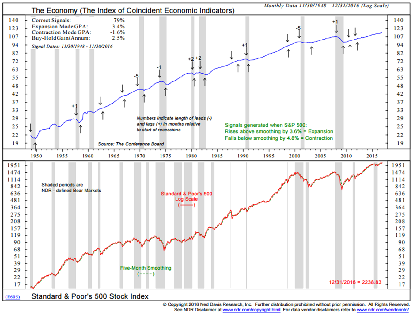
Source: Ned Davis Research (includes disclosure)
Chart 2: U.S. Recession Probability Model Based on State Conditions
Here is how you read this chart:
- Recession is likely when the blue line crosses above the dotted 50 level. Center of chart.
- Prior recessions are shaded.
- Recession risk is low. No sign of U.S. recession.
Source: Ned Davis Research (includes disclosure)
Chart 3: U.S. Coincident Index
Here is how you read this chart:
- Economic expansion signals are generated when the employment trends index rises by 0.4%. Up arrows on chart.
- Economic contraction signals are generated when the employment trends index falls by 4.8%. Down arrows on chart.
- Prior recessions are shaded in gray.
- Note that sometimes the signal came a little bit after recession started but overall a great track record.
- Currently signaling no U.S. recession.
Source: Ned Davis Research (includes disclosure)
Chart 4: Global Recession Probability Model
Here is how you read this chart:
- The blue line is the plotted trend data of 35 countries. Calculated is a wide range of economic indicators such as money supply, yield curve, building permits, consumer and business conditions, share prices and manufacturing production.
- When the blue lines rises above the dotted red 70 line, there is a high recession risk.
- When the blue line falls below the dotted green 30 line, there is a low recession risk probability.
- Currently, there is a low recession risk probability. Note that it recently left the high risk zone with no resulting recession.
- Draghi’s “whatever it takes” ???
Source: Ned Davis Research (includes disclosure)
As you may know by now, I’m a very big Ned Davis Research fan. I’ve been a subscriber and happy client since the mid 1990’s. They kindly let me share certain charts with you, but I story them in a way to share with you how I’ve been using many of the charts for many years. I love the data and I think NDR is one of the best independent research shops in the business.
If you’d like to learn more about their subscription services, contact Dan Dortona via email at [email protected]. Please know I don’t get paid a penny from NDR nor a reduction in my research fee. Just a happy client.
Inflation Risk is High
Here is how you read this chart:
- Monitoring inflation can be critical since turning points in inflation often determine turning points in the financial markets.
- The NDR Inflation Timing Model consists of 22 indicators that primarily measure the various rates of change of such indicators as commodity prices, consumer prices, producer prices, and industrial production. The model totals all the indicator readings and provides a score ranging from +22 (strong inflationary pressures) to -22 (strong disinflationary pressures).
- That data is plotted in red – lower section of chart.
- High inflationary pressures are signaled when the model rises to +6 or above. Low inflationary pressures are indicated when the model falls to zero or less.
- Current reading is “High Inflationary Pressures.”
- Signals in the upper section – up and down arrows.
- Correct signals 73% of the time. Pretty good historical record.
Source: Ned Davis Research (includes disclosure)
Rising inflation is bad for bond investors and generally bad for stocks but is bonds I worry about most today.
I mentioned in last week’s post that Paul Schmelzing, a Ph.D. candidate at Harvard University and a visiting scholar at the Bank of England, said if the latest bond market bubble bursts, it will be worse than in 1994 when global government bonds suffered the biggest annual loss on record.
“Looking back over eight centuries of data, I find that the 2016 bull market was indeed one of the largest ever recorded,” wrote Schmelzing in an article posted on Bank Underground, which is a blog run by Bank of England staff. “History suggests this reversal will be driven by inflation fundamentals and leave investors worse off than the 1994 ‘bond massacre’.”
The gist of his message is this:
- Schmelzing said, “The current bond market is facing the “perfect storm” of potential steepening of the bond yield curve, monetary policy tightening and a multi-year period of sustained losses due to a “structural” return of inflation resembling that of 1967.”
- Last quarter was the worst for government bonds since 1987, according to data compiled by Bloomberg.
When you have some additional time, download and print out Lacy Hunt’s most recent quarterly letter. As I mentioned above, he feels rates will continue lower… believing the great bull market in bonds has some more room to run.
The Zweig Bond Model would have helped you avoid the recent -15% approximate butt kicking that happened to bonds in the fourth quarter of last year.
So we keep our eye on inflation. Today, risk is high.
Trade Signals – Rising Inflation, Low Probability of Global and U.S. Recession, Equity Cyclical Bull Trend Remains in Place
S&P 500 Index — 2,265 (1-12-2017)
You’ll find “Trade Signals” to be organized into three sections:
- Trade Signals – Dashboard
- Executive Summary (What I am seeing this week)
- Detailed review of the Trade Signals with charts (how it works)
I hope you find the information helpful in your work. For informational purposes only… Not a recommendation to buy or sell any security.
Trade Signals — Dashboard
Equity Trade Signals (Green is Bullish, Orange is Neutral and Red is Bearish):
- CMG Ned Davis Research (NDR) Large Cap Momentum Index-Active Trend: Buy Signal – Bullish for Equities
- Long-term Trend (13/34-Week EMA) on the S&P 500 Index: Buy Signal – Bullish Cyclical Trend for Equities
- Volume Demand (buyers) vs. Volume Supply (sellers): Buy Signal – S/T Bullish for Equities
- NDR Big Mo: See note below (active signal: Buy Signal on March 4, 2016 at 1999.99)
- Don’t Fight the Tape or the Fed: Indicator Reading = -1 (Neutral for Equities)
Investor Sentiment Indicators:
- NDR Crowd Sentiment Poll: Extreme Optimism (S/T Bearish for Equities)
- Daily Trading Sentiment Composite: Extreme Optimism (S/T Bearish for Equities)
Fixed Income Trade Signals:
- Zweig Bond Model: Sell Signal
- CMG Managed High Yield Bond Program: Buy Signal
- CMG Tactical Fixed Income Index: JNK & BIL (HY Bonds and Treasury Bills)
Economic Indicators:
- Global Recession Watch Indicator – Low Global Recession Risk
- Recession Watch Indicator – Low U.S. Recession Risk
- Inflation Watch – High Inflation Risk. The focus has shifted from deflation to inflation.
Gold:
- 13-week vs. 34-week exponential moving average: Sell Signal
- Daily Gold Diffusion Model: Buy Signal
- Daily Gold Model: Buy Signal
- Gold Technical Composite Model: Buy Signal
Click here for the most recent “Trade Signals” blog.
Concluding Thought and Personal Note
One more prediction. It is my hope that we push through the collective muck inside of DC and get moving on fixing our problem. My belief is that “we the people” have had enough both in the U.S. and abroad. My hope is that we will collectively figure out how to hold hands and reorganize the debt in some way.
How we address this matters and maybe globally we need a few leaders willing to upset the apple cart. Thus the quote in this week’s piece, “Don’t be afraid of change for it is the catalyst of opportunity.”
What will happen and when? We hope and hold a vision to the best outcome for all of us, yet we just don’t know because the path we decide to take is yet to be determined. But there will most certainly be change and most certainly opportunity. Let’s do our best to stay on the right side of opportunity.
I find myself feeling happy and grateful. Grateful for over two feet of fresh powder snow in Colorado over the week. And happy for the new jacket, ski pants and clothes that American Airlines just bought me. My bags were due to arrive last Sunday afternoon and two of three of them showed up at 11pm Tuesday evening. My flight home was Wednesday. But the rental skis were great and the boots sufficient… and the powder snow was a happy drug for the soul.
I’m flying to Dallas on Monday for dinner with John Mauldin and his team. A compliance meeting on Tuesday than back home Tuesday evening. We are working on something exciting and I’ll share it with you in the near future.
The Inside ETFs conference in Hollywood, Florida is fast approaching — January 22-25. I’ll be sharing several trend charts on gold (you’ll find those charts inside of this week’s “Trade Signals” – near the bottom of the post). I present on Monday, January 23, at 2pm. Here’s the agenda. Let me know if you’ll be attending. Would love to grab a coffee with you.
I head back to Dallas on February 1 for an S&P Index conference. If you are in the Dallas area, the agenda for the S&P Conference is here. The Salt Lake City area follows February 8-10 for a large advisor get-together. February travel concludes in Kansas City on February 23 where I’m keynote speaker at one of our large advisor client events. I think I enjoy those presentations the most.
Wishing you and those you love most a wonderful weekend!


